Cloud hosting services operate in a highly competitive and performance-driven market. Customers expect 99.9% uptime. Businesses demand instant scalability. Moreover, companies require strong security and cost efficiency at the same time. Therefore, cloud service providers must track performance carefully and consistently.
However, many cloud hosting companies still rely on static Excel reports or disconnected tools. As a result, managers spend hours preparing reports instead of improving performance. Furthermore, leadership teams struggle to see real-time KPI status across infrastructure, finance, and customer support.
So, how can cloud hosting companies monitor uptime, SLA compliance, cost efficiency, and customer performance in one interactive system?
The answer is simple.
You need a Cloud Hosting Services KPI Dashboard in Power BI.
This ready-to-use Power BI dashboard transforms Excel data into powerful visuals and real-time insights. In addition, it helps IT heads, operations managers, and executives monitor MTD and YTD performance instantly.
In this detailed guide, you will learn:
-
What a Cloud Hosting Services KPI Dashboard in Power BI is
-
Why cloud service providers need it
-
Complete explanation of all 3 dashboard pages
-
Key cloud hosting KPIs you should track
-
Advantages of Cloud Hosting Services KPI Dashboard in Power BI
-
Best Practices for the Cloud Hosting Services KPI Dashboard
-
Frequently Asked Questions with Answers
Let’s explore everything step by step.
Click to Purchases Cloud Hosting Services KPI Dashboard in Power BI
What Is a Cloud Hosting Services KPI Dashboard in Power BI?
A Cloud Hosting Services KPI Dashboard in Power BI is an interactive performance monitoring solution built using Power BI Desktop. It connects with Excel as a data source and transforms structured data into dynamic dashboards.
Instead of reviewing static reports, you can:
-
Filter KPIs by month
-
Analyze KPI groups
-
Compare Actual vs Target
-
Evaluate Current Year vs Previous Year
-
Drill through detailed KPI definitions
Moreover, Power BI provides interactive slicers, dynamic visuals, and real-time filtering. Therefore, decision-makers gain instant clarity.
Why Do Cloud Hosting Companies Need a KPI Dashboard in Power BI?
Cloud hosting businesses manage infrastructure, service reliability, customer performance, and revenue growth simultaneously. Therefore, they need a centralized performance system.
Here’s why this dashboard becomes critical:
1️⃣ It Improves Visibility
You see all KPIs in one summary view.
2️⃣ It Enhances Decision Speed
Interactive visuals reduce analysis time.
3️⃣ It Supports SLA Monitoring
You instantly track MTD and YTD SLA compliance.
4️⃣ It Highlights Performance Gaps
Visual ▲ and ▼ icons clearly indicate success or underperformance.
5️⃣ It Aligns Technical and Business Teams
Infrastructure KPIs and financial KPIs stay aligned.
As a result, leadership makes faster and smarter decisions.
Click to Purchases Cloud Hosting Services KPI Dashboard in Power BI
What Pages Are Included in the Cloud Hosting Services KPI Dashboard in Power BI?
This dashboard includes 3 powerful pages:
-
Summary Page
-
KPI Trend Page
-
KPI Definition Page (Drill-through page)
Now let’s understand each page in detail.
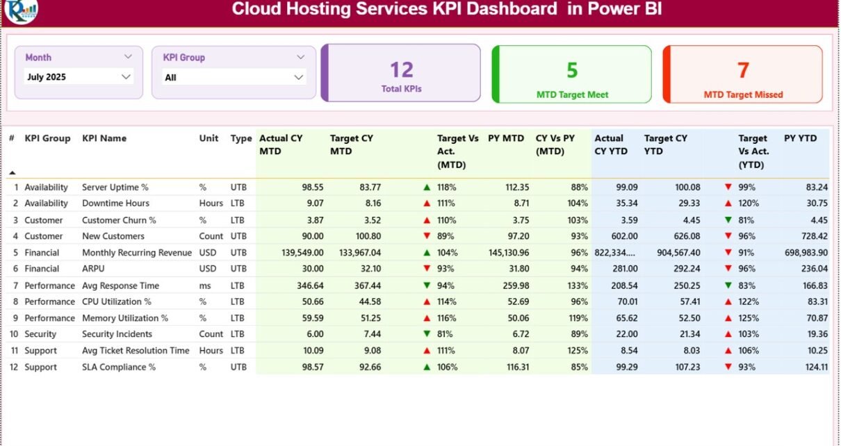
1️⃣ What Does the Summary Page Show?
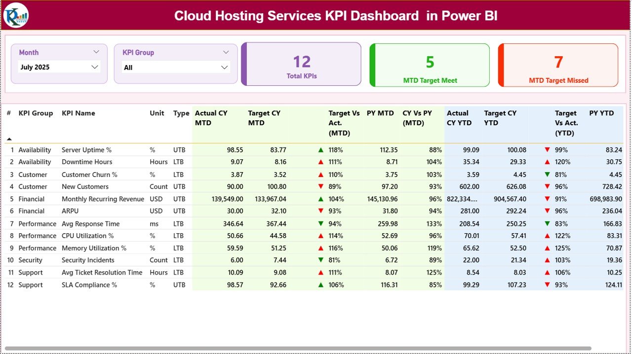
The Summary Page serves as the main dashboard.
At the top, you see:
-
Month slicer
-
KPI Group slicer
These slicers allow you to filter performance instantly.
KPI Cards Display
The dashboard includes 3 KPI cards:
-
Total KPIs Count
-
MTD Target Meet Count
-
MTD Target Missed Count
Therefore, managers immediately understand overall performance health.
Click to Purchases Cloud Hosting Services KPI Dashboard in Power BI
Detailed KPI Table Explanation
Below the cards, you see a detailed KPI table with the following columns:
-
KPI Number
-
KPI Group
-
KPI Name
-
Unit
-
Type (LTB or UTB)
-
Actual CY MTD
-
Target CY MTD
-
MTD Icon (▲ Green / ▼ Red)
-
Target vs Actual % (MTD)
-
PY MTD
-
CY vs PY % (MTD)
-
Actual CY YTD
-
Target CY YTD
-
YTD Icon (▲ Green / ▼ Red)
-
Target vs Actual % (YTD)
-
PY YTD
-
CY vs PY % (YTD)
How Do the Icons Work?
-
▲ Green indicates performance above target.
-
▼ Red indicates performance below target.
Therefore, even without reading numbers, you understand performance quickly.
Click to Purchases Cloud Hosting Services KPI Dashboard in Power BI
2️⃣ What Does the KPI Trend Page Show?
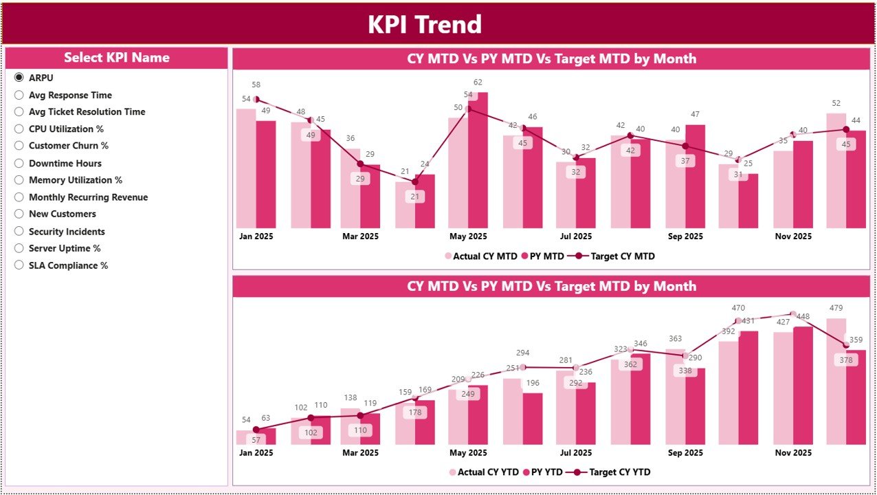
The KPI Trend Page provides historical trend analysis.
On the left side, you select a KPI from the slicer. Immediately, the charts update.
This page includes:
-
MTD Combo Chart
-
YTD Combo Chart
Each chart displays:
-
Current Year Actual
-
Previous Year Actual
-
Target
Because combo charts combine bars and lines, you clearly see performance direction and target alignment.
For example:
If uptime improves month after month, you see upward movement.
If infrastructure cost exceeds target, you detect the deviation immediately.
Therefore, this page supports strategic planning.
Click to Purchases Cloud Hosting Services KPI Dashboard in Power BI
3️⃣ What Is the KPI Definition Page?
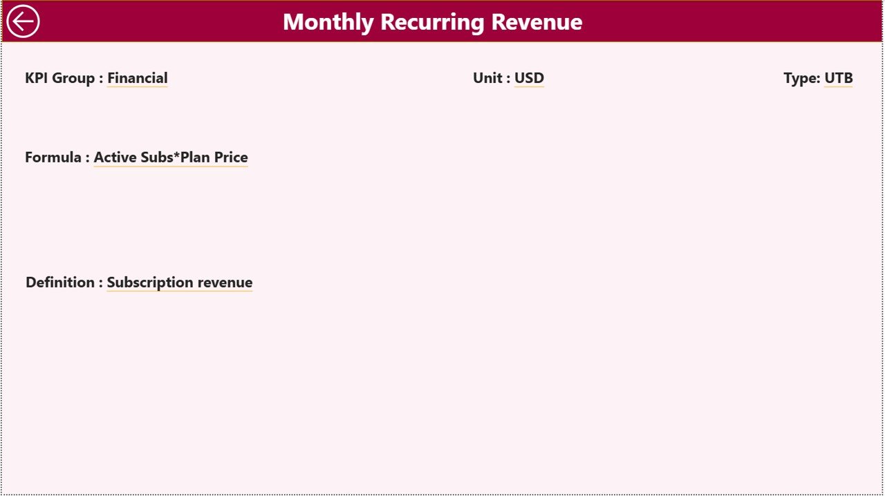
The KPI Definition Page works as a drill-through page.
You can right-click on any KPI from the Summary page and drill through to view:
-
KPI Formula
-
KPI Definition
-
KPI Type
-
KPI Unit
This page remains hidden to keep the dashboard clean. However, it provides transparency whenever needed.
To return to the Summary page, simply click the back button on the top left corner.
What Is the Excel Data Structure Behind the Dashboard?
This Power BI dashboard uses an Excel file as its data source.
You must fill 3 worksheets:
1️⃣ Input_Actual Sheet
Here you enter:
-
KPI Name
-
Month (first date of month)
-
MTD Number
-
YTD Number
Because Power BI connects directly to this sheet, updates reflect instantly after refresh.
2️⃣ Input_Target Sheet
Here you enter:
-
KPI Name
-
Month (first date of month)
-
MTD Target
-
YTD Target
Targets provide performance benchmarks.
3️⃣ KPI Definition Sheet
Here you define:
-
KPI Number
-
KPI Group
-
KPI Name
-
Unit
-
Formula
-
Definition
-
Type (LTB or UTB)
Clear definitions eliminate confusion.
Click to Purchases Cloud Hosting Services KPI Dashboard in Power BI
What KPIs Should Cloud Hosting Companies Track?
Cloud hosting services must measure both technical and business performance.
🔹 Infrastructure KPIs
-
Server Uptime %
-
Downtime Hours
-
CPU Utilization %
-
Storage Utilization %
🔹 SLA & Service KPIs
-
SLA Compliance %
-
Average Response Time
-
Incident Resolution Time
🔹 Financial KPIs
-
Monthly Recurring Revenue (MRR)
-
Customer Acquisition Cost
-
Gross Margin %
-
Infrastructure Cost per User
🔹 Customer KPIs
-
Churn Rate
-
Customer Satisfaction Score
-
Support Ticket Volume
Because cloud services rely on reliability and scalability, tracking these KPIs ensures balanced growth.
Advantages of Cloud Hosting Services KPI Dashboard in Power BI
Now let’s explore the major benefits.
✅ Interactive Filtering
You can filter by month and KPI group instantly.
✅ Real-Time Visualization
Power BI refresh updates visuals immediately.
✅ Clear Performance Indicators
▲ and ▼ icons simplify interpretation.
✅ Year-over-Year Analysis
CY vs PY comparisons reveal growth trends.
✅ Drill-Through Transparency
Users can access formula-level details.
✅ Professional Presentation
Power BI dashboards enhance executive reporting.
✅ Scalable Architecture
You can add new KPIs easily.
Click to Purchases Cloud Hosting Services KPI Dashboard in Power BI
Best Practices for the Cloud Hosting Services KPI Dashboard
To maximize value, follow these best practices:
1️⃣ Define KPIs Carefully
Choose KPIs that align with uptime, cost control, and growth.
2️⃣ Keep Data Clean
Ensure month values use the first date of the month consistently.
3️⃣ Review Monthly
Conduct structured KPI review meetings.
4️⃣ Monitor Trends, Not Just Numbers
Trend analysis reveals performance direction.
5️⃣ Align Targets Realistically
Set achievable yet challenging benchmarks.
6️⃣ Train Teams to Interpret KPIs
Data literacy improves strategic decisions.
7️⃣ Refresh Data Regularly
Update Excel input sheets monthly and refresh Power BI.
How Does This Dashboard Improve Strategic Planning?
First, it centralizes data.
Second, it highlights performance gaps instantly.
Third, it enables predictive analysis using trends.
For example:
If churn increases for three consecutive months, leadership takes corrective action.
If SLA compliance improves, sales teams use it as a marketing advantage.
Therefore, this dashboard supports operational excellence and growth strategy.
Conclusion
Cloud hosting services demand high reliability, operational efficiency, and strong financial control. However, without structured monitoring, businesses lose visibility.
The Cloud Hosting Services KPI Dashboard in Power BI provides:
-
Interactive filtering
-
MTD and YTD performance tracking
-
Target vs Actual comparison
-
Year-over-Year analysis
-
Drill-through KPI transparency
Therefore, if you want to scale your cloud hosting business with confidence, you must implement a structured KPI dashboard in Power BI today.
Click to Purchases Cloud Hosting Services KPI Dashboard in Power BI
Frequently Asked Questions with Answers
1. What is a Cloud Hosting Services KPI Dashboard in Power BI?
It is an interactive Power BI dashboard that tracks cloud hosting KPIs using Excel as a data source.
2. What does LTB and UTB mean?
LTB means Lower the Better.
UTB means Upper the Better.
3. Why compare Current Year vs Previous Year?
Year-over-year comparison helps evaluate growth and improvement.
4. How often should we refresh the dashboard?
Refresh it monthly after updating Excel input sheets.
5. Can we add new KPIs later?
Yes. You can expand the Excel data model and update Power BI visuals.
6. Is this dashboard suitable for startups?
Yes. Startups and enterprises both can use it.
7. Does this dashboard support executive reporting?
Yes. It provides professional visuals suitable for board-level presentations.
Click to Purchases Cloud Hosting Services KPI Dashboard in Power BI
Visit our YouTube channel to learn step-by-step video tutorials