Ports and harbors play a critical role in global trade. Every day, thousands of vessels move cargo across continents. However, managing port operations becomes complex very quickly. Revenue fluctuates. Fuel costs change. Delays increase expenses. Customer satisfaction drops if service slows down.
So, how can port authorities and maritime companies track performance in a clear and structured way?
You need a Ports and Harbors Dashboard in Power BI.
This powerful dashboard transforms raw maritime data into actionable insights. Instead of reviewing long reports and scattered spreadsheets, you can monitor revenue, operating costs, fuel expenses, cargo trends, and customer satisfaction in one interactive Power BI file.
Click to Purchases Ports and Harbors Dashboard in Power BI
In this detailed guide, you will learn:
-
What a Ports and Harbors Dashboard in Power BI is
-
Why ports need it
-
Detailed explanation of all 5 dashboard pages
-
Advantages of Ports and Harbors Dashboard in Power BI
-
Best Practices for the Ports and Harbors Dashboard
-
Frequently Asked Questions with Answers
Let us explore everything step by step.
What Is a Ports and Harbors Dashboard in Power BI?
A Ports and Harbors Dashboard in Power BI is an interactive performance tracking system built using Microsoft Power BI. It connects operational data with financial data and converts it into visual insights.
Instead of analyzing separate Excel sheets, you can:
-
Track Revenue by Cargo Type
-
Monitor Operating Cost by Region
-
Measure Fuel Cost by Country
-
Analyze Customer Satisfaction by Port Name
-
Identify Delay Reasons impacting revenue
Moreover, you can use slicers (filters) to drill down by region, vessel type, cargo type, or month. Therefore, decision-makers can respond faster and reduce operational risks.
Why Do Ports and Harbors Need a Power BI Dashboard?
Port operations involve multiple moving parts. Cargo arrives from different countries. Various vessel types dock daily. Fuel costs fluctuate due to global market changes. Meanwhile, customers expect timely service.
Without a centralized dashboard:
-
Teams struggle to identify cost overruns
-
Managers cannot track revenue trends easily
-
Fuel expenses remain unclear
-
Delay reasons go unnoticed
-
Customer satisfaction declines
However, when you use a Ports and Harbors Dashboard in Power BI, you gain complete visibility.
As a result:
-
You detect performance gaps early
-
You control costs more effectively
-
You improve operational efficiency
-
You increase profitability
What Are the 5 Pages of the Ports and Harbors Dashboard in Power BI?
This dashboard contains 5 powerful analytical pages. Each page focuses on a specific operational dimension.
Let us explore each page in detail.
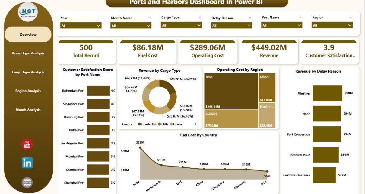
1️⃣ Overview Page – The Central Command Center
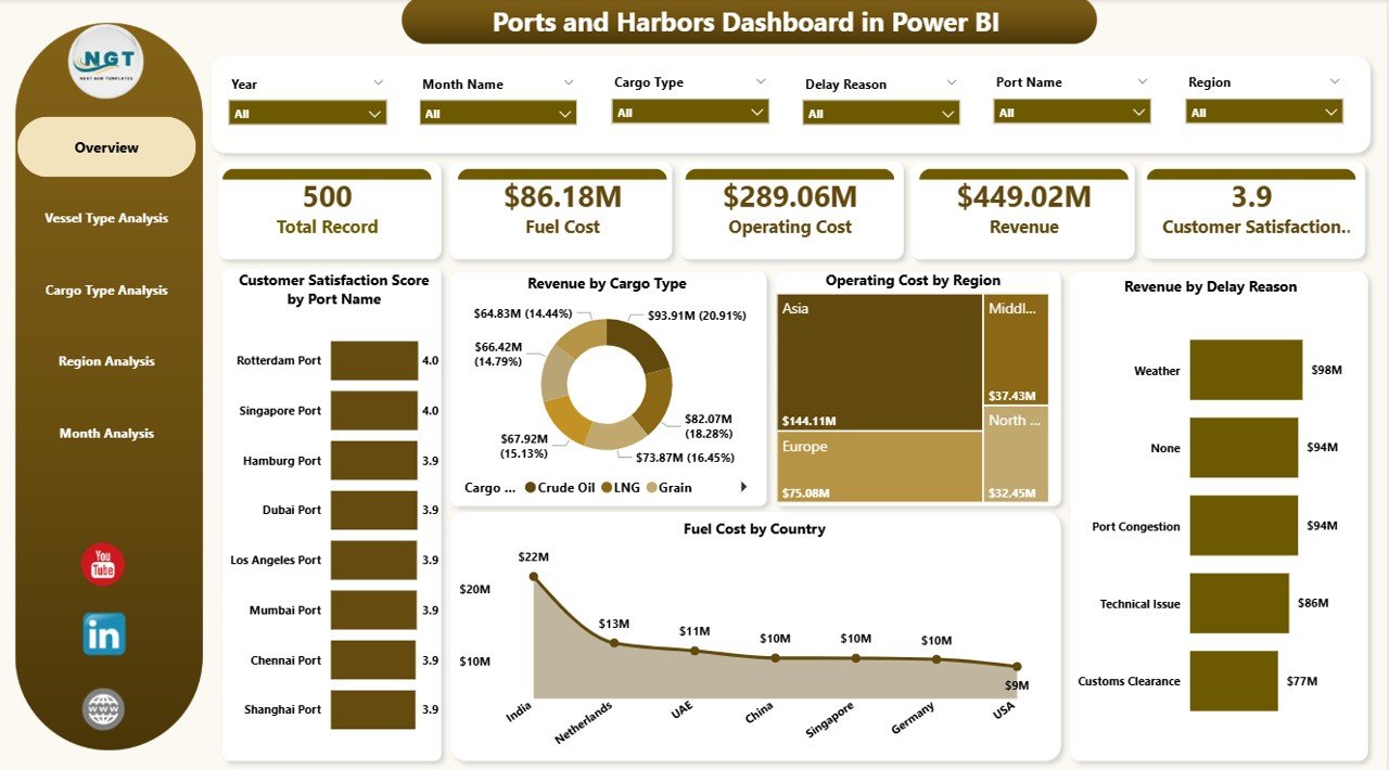
The Overview Page acts as the main performance hub. It provides a complete snapshot of port operations.
Key Features of the Overview Page:
-
Interactive slicers for filtering data
-
5 powerful visual cards
-
Clean layout for executive decision-making
Charts Included:
-
Customer Satisfaction Score by Port Name
-
Revenue by Cargo Type
-
Operating Cost by Region
-
Revenue by Delay Reason
-
Fuel Cost by Country
Why Is the Overview Page Important?
Because executives need quick insights. Therefore, this page helps them:
-
Identify top-performing ports
-
Spot high-cost regions
-
Detect delay-related revenue impact
-
Compare fuel expenses across countries
Instead of searching through reports, leaders can instantly understand performance trends.
Click to Purchases Ports and Harbors Dashboard in Power BI
2️⃣ Vessel Type Analysis – How Do Different Vessels Impact Performance?
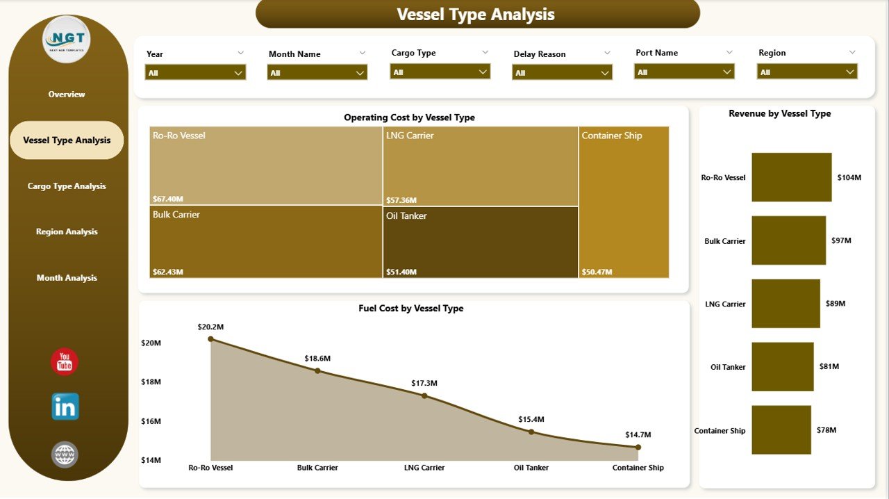
Different vessels carry different cargo loads. Some vessels consume more fuel. Others generate higher revenue.
Therefore, this page analyzes vessel-level performance.
Charts Included:
-
Revenue by Vessel Type
-
Operating Cost by Vessel Type
-
Fuel Cost by Vessel Type
What Insights Can You Gain?
-
Which vessel type generates the highest revenue?
-
Which vessel type incurs the highest operating cost?
-
How does fuel consumption vary across vessel categories?
As a result, port authorities can:
-
Optimize vessel allocation
-
Negotiate better contracts
-
Improve operational efficiency
3️⃣ Cargo Type Analysis – Which Cargo Drives Profitability?
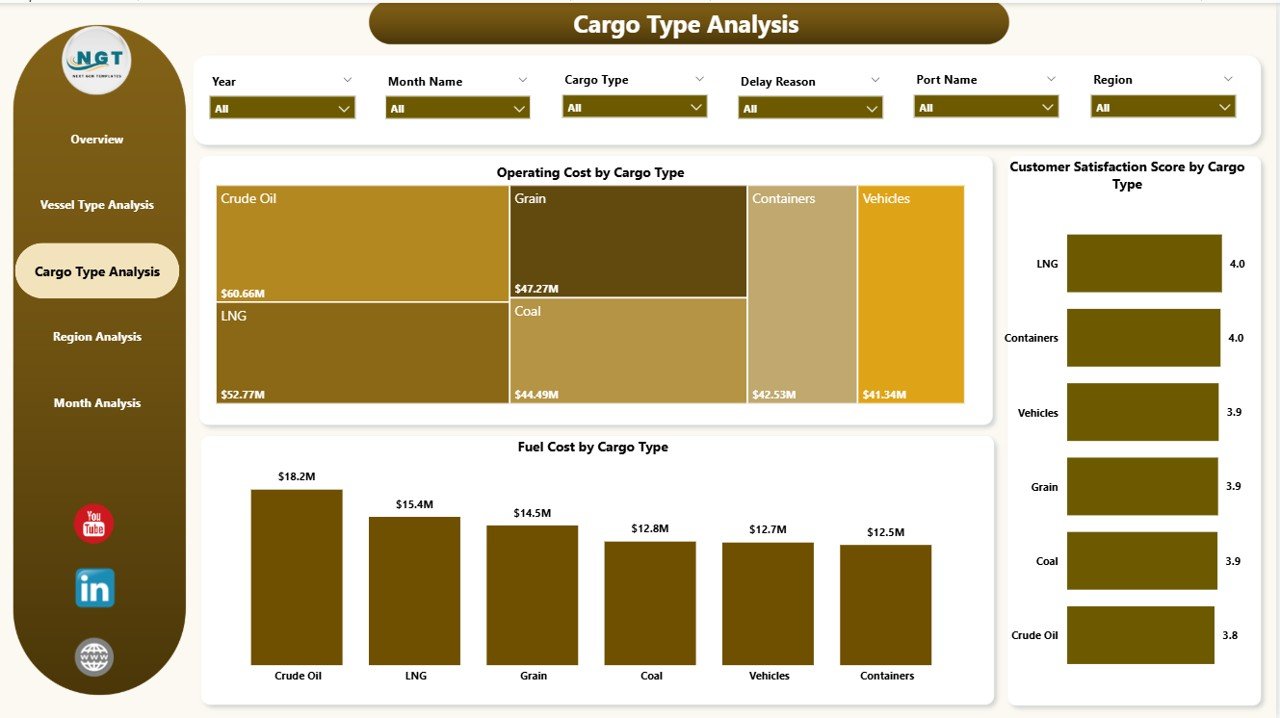
Ports handle various cargo types such as containers, bulk cargo, liquid cargo, and general goods. However, not all cargo types generate equal profit.
This page focuses on cargo-level performance.
Charts Included:
-
Customer Satisfaction Score by Cargo Type
-
Operating Cost by Cargo Type
-
Fuel Cost by Cargo Type
Why Does Cargo Analysis Matter?
Because cargo type directly impacts revenue, cost, and service quality.
For example:
-
Bulk cargo may generate high revenue but require high handling cost
-
Container cargo may deliver better satisfaction
-
Some cargo types may cause delays
Therefore, this page helps managers balance cost and customer satisfaction.
Click to Purchases Ports and Harbors Dashboard in Power BI
4️⃣ Region Analysis – Which Region Performs Best?
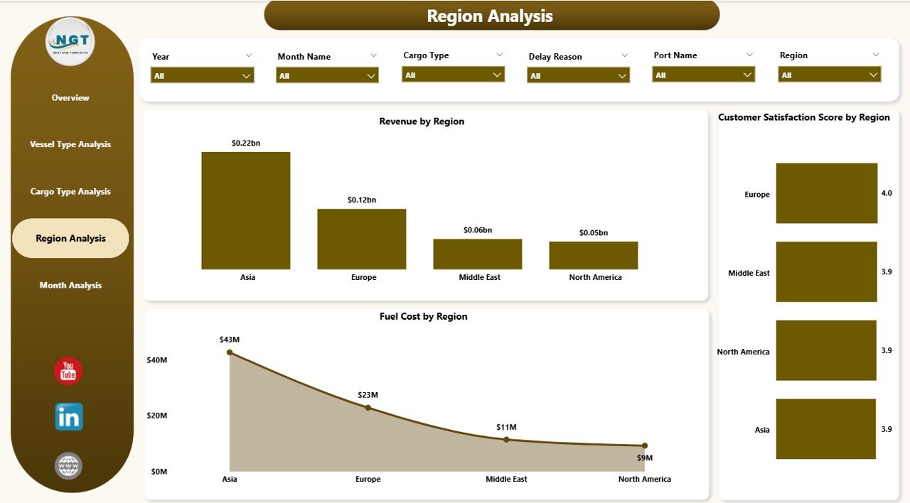
Ports operate across multiple regions. Each region may show different performance trends.
This page focuses on geographic analysis.
Charts Included:
-
Customer Satisfaction Score by Region
-
Revenue Cost by Region
-
Fuel Cost by Region
Key Benefits of Region Analysis:
-
Compare revenue performance across regions
-
Identify high-cost operational areas
-
Measure satisfaction trends region-wise
As a result, management can allocate resources more effectively.
5️⃣ Month Analysis – How Does Performance Change Over Time?
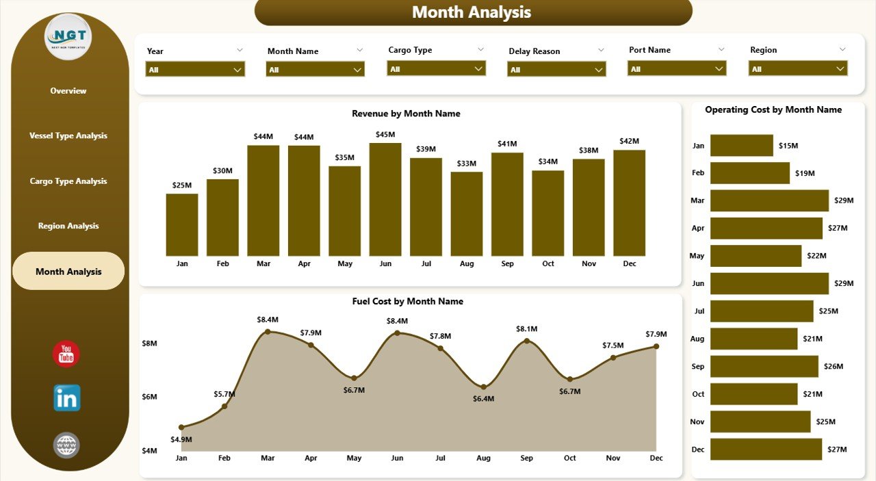
Performance changes month by month. Fuel prices fluctuate. Cargo demand shifts seasonally. Revenue trends vary.
Therefore, the Month Analysis page tracks time-based performance.
Charts Included:
-
Operating Cost by Month
-
Revenue Cost by Month
-
Fuel Cost by Month
Why Is Monthly Tracking Critical?
Because trends tell a story.
For example:
-
Rising fuel costs may reduce margins
-
Seasonal revenue spikes may indicate demand patterns
-
Cost increases may signal inefficiencies
Consequently, managers can take proactive decisions.
Advantages of Ports and Harbors Dashboard in Power BI
Now let us explore the major benefits of this dashboard.
1. Real-Time Performance Monitoring
You can connect live data sources. Therefore, you always see updated insights.
2. Centralized Reporting
Instead of using multiple reports, you get everything in one file.
3. Better Cost Control
You can monitor fuel and operating costs clearly. As a result, you reduce waste.
4. Improved Customer Satisfaction
You can track satisfaction trends by port, cargo, and region. Therefore, you can improve service quality.
5. Data-Driven Decisions
You can replace guesswork with insights. Consequently, you improve strategic planning.
6. Interactive Filtering
Slicers allow deep analysis. So, users can explore data easily.
How Does This Dashboard Improve Operational Efficiency?
Operational efficiency improves when leaders make informed decisions.
Because this dashboard provides:
-
Cost breakdown by region
-
Fuel analysis by vessel
-
Revenue insights by delay reason
-
Monthly performance tracking
Managers can:
-
Reduce delay-related revenue losses
-
Optimize fuel consumption
-
Identify profitable cargo categories
-
Improve resource allocation
Therefore, ports can increase profitability while controlling expenses.
Click to Purchases Ports and Harbors Dashboard in Power BI
Best Practices for the Ports and Harbors Dashboard in Power BI
To get maximum value, follow these best practices:
1. Use Clean and Structured Data
Ensure your data includes:
-
Port Name
-
Region
-
Vessel Type
-
Cargo Type
-
Revenue
-
Operating Cost
-
Fuel Cost
-
Delay Reason
-
Month
Clean data improves dashboard accuracy.
2. Update Data Regularly
Schedule automatic refresh in Power BI. Therefore, you always see current performance.
3. Define Clear KPIs
Before building the dashboard, define KPIs such as:
-
Revenue Growth Rate
-
Cost per Vessel
-
Fuel Cost Ratio
-
Customer Satisfaction Score
Clear KPIs improve decision-making.
4. Keep Visuals Simple
Avoid clutter. Use clear charts. Focus on actionable insights.
5. Train Users
Provide basic training to managers. Therefore, they can use filters and drill-down features effectively.
Who Should Use the Ports and Harbors Dashboard in Power BI?
This dashboard suits:
-
Port Authorities
-
Maritime Logistics Companies
-
Shipping Line Operators
-
Port Finance Teams
-
Operations Managers
-
Strategy Teams
Because each stakeholder needs performance visibility.
How Can This Dashboard Increase Profitability?
Profit increases when you control costs and improve revenue.
This dashboard helps you:
-
Identify profitable vessel types
-
Reduce fuel waste
-
Detect delay patterns
-
Improve customer satisfaction
-
Monitor regional performance
As a result, you improve margins.
Conclusion
Ports and harbors operate in a highly competitive and complex environment. However, when you rely on manual reports, you limit your ability to respond quickly.
The Ports and Harbors Dashboard in Power BI changes that.
It provides:
-
Clear visibility
-
Cost control
-
Revenue insights
-
Regional performance analysis
-
Monthly trend tracking
Therefore, you can make faster and smarter decisions.
If you want structured maritime performance monitoring, this dashboard delivers exactly what you need.
Frequently Asked Questions with Answers
1. What is a Ports and Harbors Dashboard in Power BI?
It is an interactive performance tracking tool that monitors revenue, cost, fuel, and satisfaction metrics in one Power BI file.
2. Can I customize the dashboard?
Yes. You can modify KPIs, add new visuals, and connect new data sources.
3. Does the dashboard support monthly analysis?
Yes. The Month Analysis page tracks revenue, cost, and fuel trends over time.
4. Who can benefit from this dashboard?
Port authorities, logistics managers, finance teams, and maritime operators can benefit from it.
5. Why should I use Power BI instead of Excel?
Power BI offers advanced visuals, automatic refresh, and interactive filtering, which improve analysis quality.
Visit our YouTube channel to learn step-by-step video tutorials