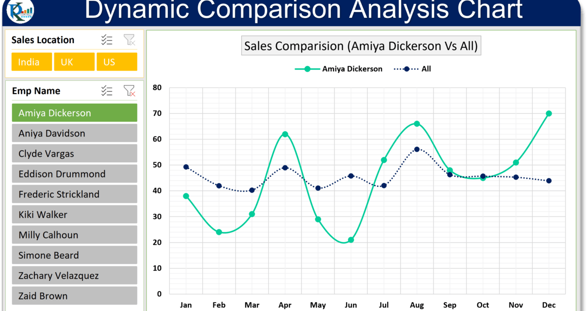
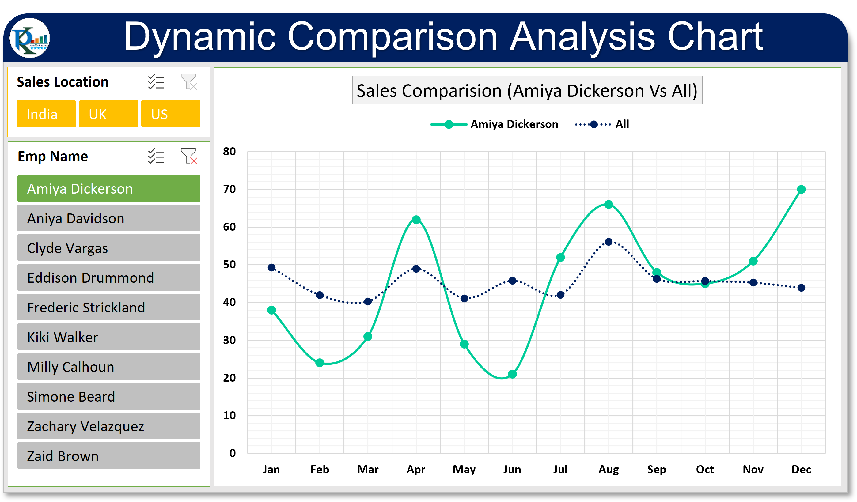
In this article, you will learn how to create a dynamic comparison Analysis Chart in Microsoft Excel. Using this chart you can compare one employee’s performance with other all employees average performance. We have used Pivot Chart and Slicers to create this chart. In this chart, we have used dynamic legend and dynamic Chart Title.
- Learn how to design Comparative Analysis Dashboard in Power BI
- Learn Employee wise Deficit/Surplus Sales Chart in Excel
Why Use a Dynamic Comparison Analysis Chart?
So, why should you care about Dynamic Comparison Analysis Charts? Well, they’re super handy for tracking and comparing performance metrics. Whether you’re managing a team or crunching numbers, these charts give you a clear visual on how an individual stacks up against the group average. Plus, using dynamic legends and chart titles makes your charts way more engaging and informative. And guess what? The big advantage here is that you can spot performance trends and discrepancies in a flash, helping you make better decisions.
Click to buy Dynamic Comparison Analysis Chart in Excel
Visit our YouTube channel to learn step-by-step video tutorials
Watch the step by step video tutorial to learn this chart:
Click to buy Dynamic Comparison Analysis Chart in Excel