The wine industry runs on precision, timing, and quality. However, many wineries still struggle to track production efficiency, fermentation quality, sales performance, and operational health in one place. As a result, decision-makers often rely on scattered spreadsheets and delayed reports.Therefore, wineries need a smart and centralized performance system. More importantly, they need real-time visibility into their most critical KPIs.That is exactly where the Winemaking KPI Dashboard in Power BI becomes essential.This ready-to-use dashboard helps winery owners, production managers, and business analysts monitor key metrics, compare targets, and improve decision-making — all from one interactive Power BI interface.In this detailed guide, you will learn everything about the Winemaking KPI Dashboard in Power BI, including features, structure, advantages, best practices, and frequently asked questions.
Click to buy Winemaking KPI Dashboard in Power BI
What Is a Winemaking KPI Dashboard in Power BI?
A Winemaking KPI Dashboard in Power BI is a structured performance monitoring solution built using Microsoft Power BI. It consolidates production, quality, and financial metrics into a single interactive view.
Instead of reviewing multiple reports, you can:
- Track MTD and YTD performance
- Compare actual vs target values
- Monitor year-over-year trends
- Identify underperforming KPIs quickly
- Make faster, data-driven decisions
Because the dashboard connects with Excel data, it remains flexible and easy to maintain.
Why Do Wineries Need a KPI Dashboard?
Running a winery involves many moving parts. However, without proper measurement, even well-managed operations can face hidden inefficiencies.
Common Challenges Without a Dashboard
Many wineries experience these problems:
- Scattered data across multiple files
- Delayed performance visibility
- Difficulty tracking production efficiency
- Poor target monitoring
- Manual reporting errors
- Limited year-over-year comparison
Consequently, management teams struggle to act quickly.
How Power BI Solves These Problems
The Winemaking KPI Dashboard in Power BI helps you:
- Centralize KPI monitoring
- Automate calculations
- Visualize trends clearly
- Compare targets instantly
- Improve operational control
As a result, wineries gain full performance transparency.
Key Features of the Winemaking KPI Dashboard in Power BI
This ready-to-use solution includes three powerful pages inside the Power BI file. Each page serves a specific analytical purpose.
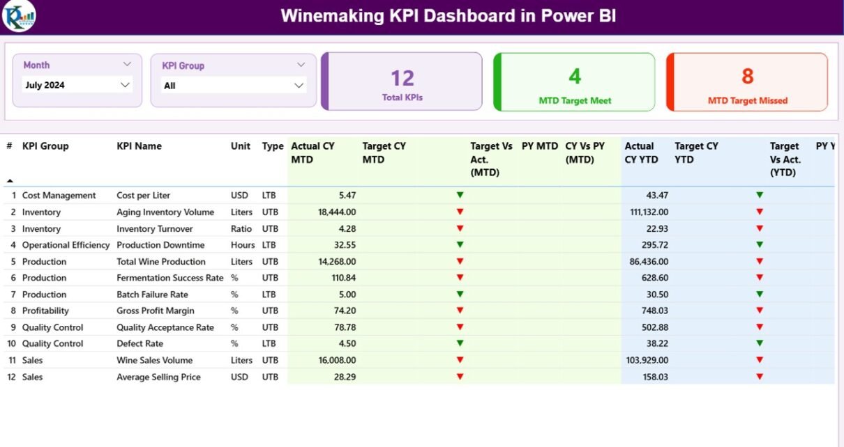
Summary Page: The Command Center
The Summary Page acts as the main control panel of the dashboard. It provides an instant overview of KPI performance.
Top-Level Slicers
At the top of the page, you will find:
- Month slicer — filters the dashboard by selected month
- KPI Group slicer — filters by KPI category
Because of these slicers, users can quickly focus on specific performance areas.
KPI Performance Cards
The dashboard displays three important KPI cards:
- Total KPIs Count
- MTD Target Meet Count
- MTD Target Missed Count
These cards immediately highlight overall performance health.
Detailed KPI Performance Table
Below the cards, the dashboard shows a comprehensive KPI table. This table provides deep insights into each metric.
KPI Identification Fields
- KPI Number — unique sequence number
- KPI Group — category of the KPI
- KPI Name — metric title
- Unit — measurement unit
- Type — LTB (Lower the Better) or UTB (Upper the Better)
These fields help users understand KPI context quickly.
MTD Performance Metrics
The dashboard tracks Month-to-Date performance using:
- Actual CY MTD
- Target CY MTD
- MTD Status Icon
- Target vs Actual (MTD)
- PY MTD
- CY vs PY (MTD)
Smart Visual Indicators
The dashboard uses:
- ▲ Green arrow → Target achieved
- ▼ Red arrow → Target missed
Therefore, users can identify performance gaps instantly.
YTD Performance Metrics
In addition, the dashboard tracks Year-to-Date performance:
- Actual CY YTD
- Target CY YTD
- YTD Status Icon
- Target vs Actual (YTD)
- PY YTD
- CY vs PY (YTD)
Because of this structure, decision-makers can evaluate both short-term and long-term performance.

Click to buy Winemaking KPI Dashboard in Power BI
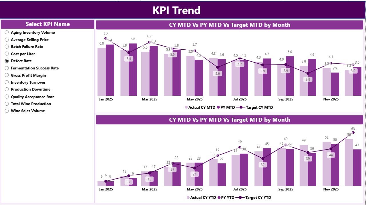
KPI Trend Page: Performance Over Time
While the summary page shows the current status, the KPI Trend Page reveals performance movement over time.
Interactive KPI Selector
On the left side, users can select the KPI name using a slicer. As soon as the selection changes, the charts update automatically.
This dynamic behavior makes the dashboard highly interactive.
Combo Charts for Deep Analysis
The page includes two combo charts:
- MTD Trend Chart
This chart compares:
- Current Year Actual
- Previous Year Actual
- Current Year Target
Therefore, users can easily spot monthly performance patterns.
- YTD Trend Chart
Similarly, the YTD chart shows cumulative performance progress.
Because of these visuals, wineries can:
- Detect seasonal trends
- Monitor growth patterns
- Identify performance dips
- Improve forecasting accuracy
Click to buy Winemaking KPI Dashboard in Power BI
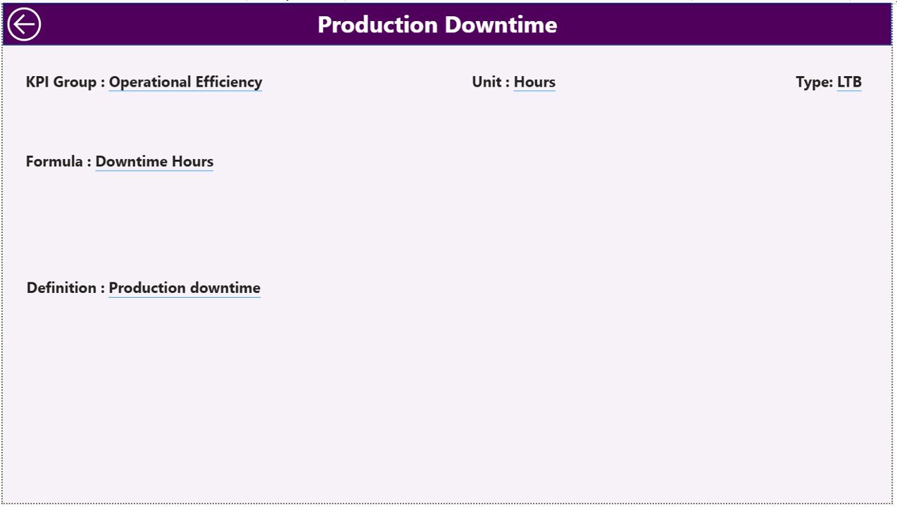
KPI Definition Page: Drill-Through Intelligence
The KPI Definition Page works as a hidden drill-through page. Although users do not see it directly, it plays a critical role.
What Happens During Drill-Through?
When users drill through from the summary page, they can view:
- KPI Formula
- KPI Definition
- KPI Type
- Measurement Unit
Therefore, business users always understand what each KPI means.
Easy Navigation
To return to the main page, users simply click the Back button located at the top left corner.
This improves usability significantly.
Click to buy Winemaking KPI Dashboard in Power BI
Excel Data Structure Behind the Dashboard
The dashboard uses Excel as the data source. Because of this design, data maintenance remains simple and flexible.
You only need to populate three worksheets.
Input_Actual Sheet: Recording Actual Performance
In this sheet, users enter actual KPI values.
Required Fields
You need to fill:
- KPI Name
- Month (first date of the month)
- MTD value
- YTD value
Because the dashboard reads this sheet automatically, updates appear instantly after refresh.
Input_Target Sheet: Defining Goals
This sheet stores target values for each KPI.
Required Fields
Enter:
- KPI Name
- Month
- MTD target
- YTD target
Therefore, the dashboard can calculate performance variance automatically.
Click to buy Winemaking KPI Dashboard in Power BI
KPI Definition Sheet: KPI Master Data
This sheet acts as the KPI master table.
Required Columns
You must populate:
- KPI Number
- KPI Group
- KPI Name
- Unit
- Formula
- Definition
- Type (LTB or UTB)
Because of this structured approach, the dashboard maintains consistency and clarity.
Important Winemaking KPIs to Track
A strong dashboard depends on meaningful KPIs. Therefore, wineries should monitor metrics across production, quality, and sales.
Production KPIs
- Fermentation Efficiency
- Production Yield
- Batch Completion Rate
- Crush Capacity Utilization
- Production Cycle Time
Quality KPIs
- Defect Rate
- Quality Compliance %
- Lab Test Pass Rate
- Temperature Variance
- Aging Consistency
Sales & Financial KPIs
- Revenue per Case
- Inventory Turnover
- Sales Growth %
- Order Fulfillment Rate
- Gross Margin %
When wineries track these KPIs, they gain full operational visibility.
Advantages of Winemaking KPI Dashboard in Power BI
Implementing this dashboard delivers significant business value.
Real-Time Performance Visibility
- Monitor KPIs instantly
- Identify issues early
- Reduce reporting delays
- Improve response speed
Centralized Data Monitoring
- Eliminate scattered spreadsheets
- Create single source of truth
- Improve data accuracy
- Simplify reporting workflow
Better Target Management
- Track MTD and YTD progress
- Compare against targets
- Highlight underperformance
- Drive accountability
Improved Decision-Making
- Visualize trends clearly
- Detect production gaps
- Optimize resource allocation
- Support strategic planning
High Interactivity
- Dynamic slicers
- Drill-through capability
- Interactive charts
- User-friendly navigation
Because of these benefits, wineries can significantly improve operational control.
Best Practices for the Winemaking KPI Dashboard in Power BI
To get maximum value, you should follow proven implementation practices.
Maintain Clean Source Data
- Use consistent KPI names
- Avoid blank rows
- Standardize date formats
- Validate monthly entries
Clean data ensures accurate dashboards.
Define KPIs Clearly
Always document:
- KPI formula
- Business definition
- Measurement unit
- KPI type (LTB or UTB)
Clear definitions prevent confusion.
Refresh Data Regularly
You should:
- Update Excel monthly
- Refresh Power BI dataset
- Validate key metrics
- Monitor anomalies
Regular refresh keeps insights reliable.
Use Meaningful KPI Groups
Group KPIs into logical categories such as:
- Production
- Quality
- Sales
- Finance
This improves dashboard usability.
Monitor Both MTD and YTD
Many teams focus only on monthly data. However, you should always track both:
- Short-term performance (MTD)
- Long-term progress (YTD)
This provides complete visibility.
Train End Users
Even the best dashboard fails without proper adoption. Therefore:
- Train managers
- Provide KPI definitions
- Share usage guidelines
- Encourage data-driven culture
User adoption drives success.
How Can Wineries Implement This Dashboard Successfully?
If you plan to deploy the Winemaking KPI Dashboard in Power BI, follow this step-by-step approach.
Step 1: Define Your KPI Framework
First, identify the most important metrics for your winery.
Step 2: Prepare Excel Data
Next, populate:
- Input_Actual
- Input_Target
- KPI Definition
Step 3: Validate Data Quality
Then, check for:
- Missing values
- Incorrect dates
- Duplicate KPIs
Step 4: Load Data into Power BI
After that, refresh the dataset and verify visuals.
Step 5: Review Insights with Stakeholders
Finally, share the dashboard with decision-makers and gather feedback.
Because of this structured rollout, adoption becomes smoother.
Conclusion: Transform Winery Performance with Power BI
The wine business demands precision, speed, and clarity. However, manual reporting cannot keep up with modern operational needs.
The Winemaking KPI Dashboard in Power BI solves this problem by delivering real-time visibility, automated calculations, and powerful analytics in one centralized platform.
Because it connects seamlessly with Excel, it remains flexible and easy to maintain. Moreover, its interactive design helps wineries detect issues early, improve efficiency, and achieve performance targets consistently.
If you want smarter decisions and better winery control, this dashboard provides the perfect solution.
Frequently Asked Questions (FAQs)
What is a Winemaking KPI Dashboard in Power BI?
It is an interactive performance monitoring tool that tracks winery KPIs using Power BI visuals and Excel data.
Who should use this dashboard?
Winery owners, production managers, finance teams, and business analysts can use this dashboard to monitor performance.
Do I need Power BI expertise to use it?
No. You only need basic knowledge to refresh data and use slicers. The dashboard already contains prebuilt visuals.
How often should I update the Excel data?
You should update the data monthly. However, high-volume wineries may update it weekly.
What does LTB and UTB mean?
- LTB — Lower the Better
- UTB — Upper the Better
These indicators define KPI performance direction.
Can I add more KPIs?
Yes. You can extend the KPI Definition sheet and update the Excel data. After refresh, the dashboard will include new KPIs.
Does the dashboard support year-over-year analysis?
Yes. The dashboard compares current year performance with previous year for both MTD and YTD metrics.
Visit our YouTube channel to learn step-by-step video tutorials
Watch the step-by-step video tutorial:
Click to buy Winemaking KPI Dashboard in Power BI