User experience (UX) and user interface (UI) design play a critical role in modern digital products. Businesses depend on intuitive interfaces, seamless navigation, and engaging designs to improve customer satisfaction and increase conversions. However, many design teams struggle to measure performance because UX/UI outcomes often appear subjective without structured metrics.
Therefore, organizations increasingly adopt measurable performance frameworks. One practical and effective solution is the UX/UI Design KPI Scorecard in Excel.
This comprehensive article explains everything about the UX/UI Design KPI Scorecard in Excel, including its structure, features, benefits, implementation steps, best practices, and real-world applications. Moreover, this ready-to-use Excel template helps design teams transform creative performance into measurable insights.
Click to Purchases UX/UI Design KPI Scorecard in Excel
What Is a UX/UI Design KPI Scorecard in Excel?
A UX/UI Design KPI Scorecard in Excel is a structured performance monitoring tool that tracks key design metrics using dashboards, automated calculations, and visual indicators.
Instead of relying on assumptions or subjective opinions, teams evaluate UX/UI performance using measurable KPIs. Additionally, the scorecard compares actual results with targets and historical performance.
Typically, the scorecard tracks:
-
User engagement metrics
-
Interface usability performance
-
Conversion rates
-
User satisfaction scores
-
Design efficiency metrics
-
Accessibility compliance indicators
-
Product interaction analytics
Because Excel remains familiar and flexible, organizations can implement this solution quickly without specialized analytics software.
Why Do UX/UI Teams Need a KPI Scorecard?
Design decisions directly impact business outcomes. However, without structured measurement, teams cannot evaluate success accurately.
Common Challenges Without KPI Tracking
-
Difficulty measuring design impact
-
Lack of performance visibility
-
Subjective feedback dominating decisions
-
Inconsistent reporting formats
-
Limited trend analysis
However, a KPI scorecard converts design performance into clear, data-driven insights.
Click to Purchases UX/UI Design KPI Scorecard in Excel
Key Features of UX/UI Design KPI Scorecard in Excel
This ready-to-use template includes four structured worksheets, each serving a specific analytical purpose.
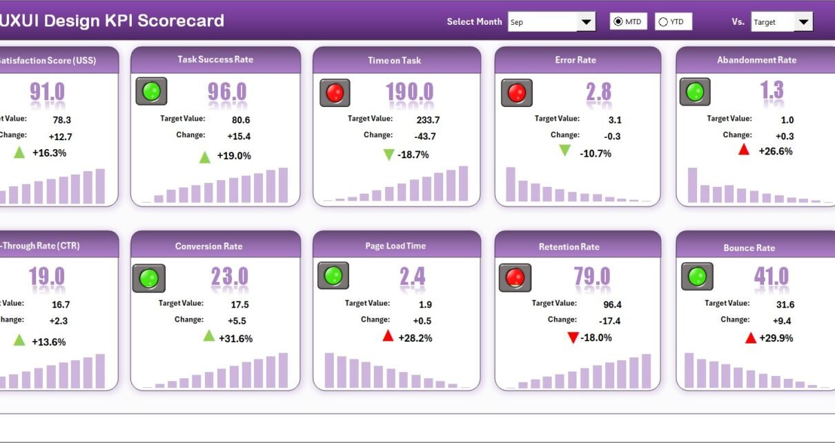
1. Scorecard Sheet – Main UX/UI Performance Dashboard
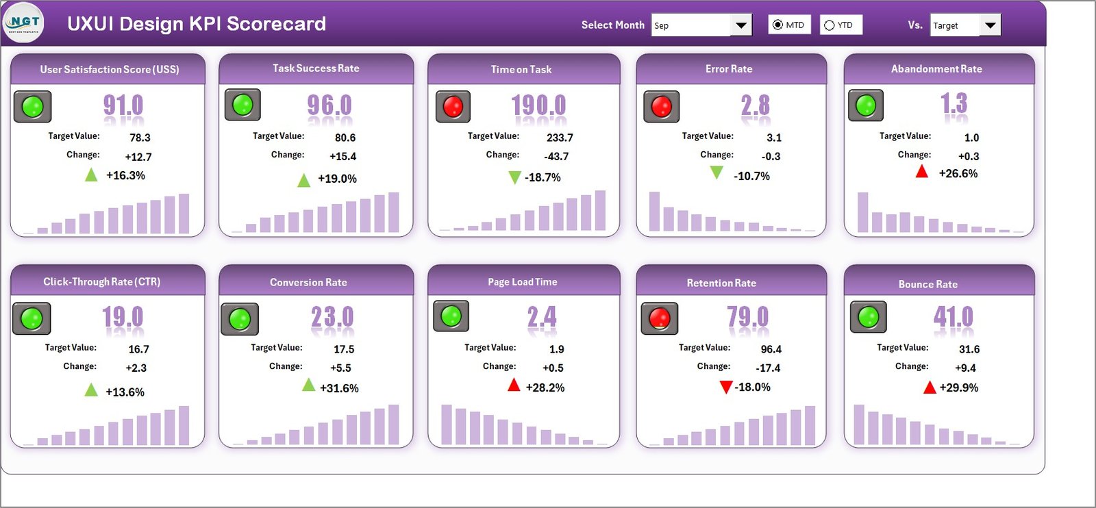
The Scorecard Sheet serves as the central interface where users monitor overall KPI performance.
Core Features
Dropdown Menus for Analysis
Users can select:
-
Month
-
MTD (Month-to-Date)
-
YTD (Year-to-Date)
Therefore, teams can analyze both short-term and long-term performance easily.
Actual vs Target Comparison
The dashboard compares actual KPI values against predefined targets. As a result, teams instantly identify performance gaps.
Visual Performance Indicators
Color-coded formatting highlights KPI status:
-
Green → Target achieved
-
Yellow → Needs improvement
-
Red → Below expectations
These visuals allow quick performance interpretation.
Comprehensive KPI Overview
The dashboard displays all KPIs together, including:
-
MTD values
-
YTD values
-
Target comparisons
-
Performance indicators
Thus, managers gain a complete performance overview on one screen.
Click to Purchases UX/UI Design KPI Scorecard in Excel
2. KPI Trend Sheet – Design Performance Over Time
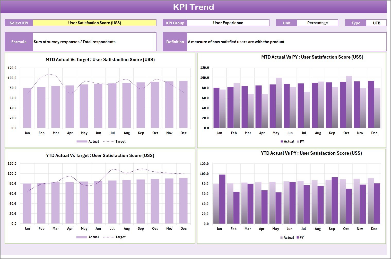
While the scorecard shows current performance, the KPI Trend Sheet provides historical insights.
KPI Selection Feature
Users select a KPI from dropdown cell C3, and the sheet updates automatically.
KPI Information Displayed
-
KPI Group
-
Unit of Measurement
-
KPI Type (Lower the Better / Upper the Better)
-
KPI Formula
-
KPI Definition
This ensures clarity and transparency in measurement.
Trend Charts
The sheet includes trend charts comparing:
-
Actual performance
-
Target values
-
Previous Year (PY) performance
Therefore, teams identify performance improvements and design trends easily.
Click to Purchases UX/UI Design KPI Scorecard in Excel
3. Input Data Sheet – Central Data Entry Area
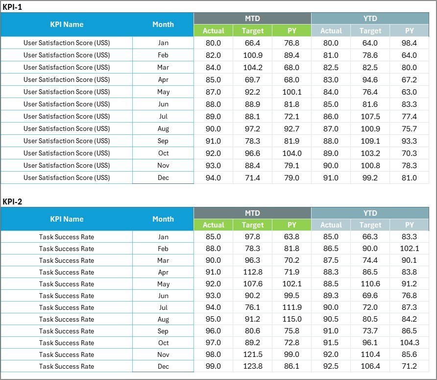
The Input Data Sheet stores all KPI performance data.
Key Functions
-
Enter actual KPI values
-
Record targets
-
Update performance metrics regularly
Once data updates, the scorecard refreshes automatically.
Benefits
-
Centralized data management
-
Easy updates
-
Accurate reporting
4. KPI Definition Sheet – KPI Knowledge Repository
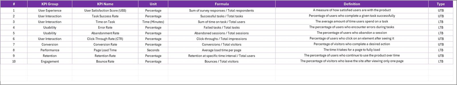
The KPI Definition Sheet standardizes KPI understanding across teams.
Fields Included
-
KPI Name
-
KPI Group
-
Unit
-
Formula
-
KPI Definition
Because definitions remain documented, teams avoid misinterpretation.
Click to Purchases UX/UI Design KPI Scorecard in Excel
What KPIs Can UX/UI Teams Track?
UX/UI performance includes both qualitative and quantitative metrics.
Example UX/UI KPIs
-
User Satisfaction Score (CSAT)
-
Task Completion Rate
-
Bounce Rate Reduction
-
Conversion Rate Improvement
-
Page Load Experience Score
-
Accessibility Compliance Rate
-
User Retention Rate
-
Design Iteration Cycle Time
-
Error Rate Reduction
-
Engagement Time per Session
These KPIs help teams evaluate user-centered design effectiveness.
How Does the KPI Scorecard Improve Design Decision-Making?
A KPI scorecard bridges the gap between creativity and analytics.
Key Improvements
-
Data-driven design decisions
-
Objective performance evaluation
-
Improved stakeholder communication
-
Faster optimization cycles
-
Continuous design improvement
Therefore, design teams align creativity with business goals.
Click to Purchases UX/UI Design KPI Scorecard in Excel
Advantages of UX/UI Design KPI Scorecard in Excel
✅ Centralized Performance Monitoring
All UX/UI KPIs remain in one dashboard.
✅ Real-Time Insights
Updates reflect immediately after data entry.
✅ Easy Implementation
No advanced analytics tools required.
✅ Visual Performance Indicators
Quickly identify strengths and weaknesses.
✅ Trend Analysis
Understand long-term design performance.
✅ Customizable KPIs
Adapt scorecard to any product or platform.
Who Should Use This KPI Scorecard?
This template benefits multiple digital roles.
Ideal Users
-
UX designers
-
UI designers
-
Product managers
-
Digital analysts
-
Design agencies
-
SaaS companies
-
Product development teams
Thus, both startups and enterprises can use the scorecard effectively.
Click to Purchases UX/UI Design KPI Scorecard in Excel
Real-World Applications of UX/UI KPI Tracking
Product Performance Monitoring
Evaluate user interaction improvements.
Website Optimization
Measure conversion and usability success.
App Experience Analysis
Track mobile UX performance.
Design Team Evaluation
Measure productivity and efficiency.
Stakeholder Reporting
Present structured design performance metrics.
How to Use the UX/UI Design KPI Scorecard Step-by-Step?
Step 1: Define KPIs
Enter KPI details in the KPI Definition sheet.
Step 2: Input Targets
Define expected performance levels.
Step 3: Enter Actual Data
Update KPI values regularly.
Step 4: Select Analysis Period
Choose Month, MTD, or YTD.
Step 5: Review Scorecard
Analyze performance indicators.
Step 6: Study Trends
Use KPI Trend sheet for deeper insights.
Click to Purchases UX/UI Design KPI Scorecard in Excel
Best Practices for the UX/UI Design KPI Scorecard
-
Focus on user-centered metrics
-
Update data consistently
-
Define clear KPI formulas
-
Monitor trends regularly
-
Align KPIs with business objectives
-
Avoid tracking too many metrics
Following these practices ensures meaningful insights.
Common Mistakes to Avoid
-
Measuring vanity metrics only
-
Ignoring qualitative feedback
-
Updating KPIs irregularly
-
Using unclear KPI definitions
-
Setting unrealistic targets
Avoiding these mistakes improves measurement accuracy.
Why Excel Is Ideal for UX/UI KPI Tracking?
Excel offers flexibility that suits evolving design environments.
Key Benefits
-
Easy customization
-
Quick implementation
-
Familiar interface
-
Low cost
-
Flexible KPI structure
Therefore, Excel remains an excellent starting point for performance analytics.
Click to Purchases UX/UI Design KPI Scorecard in Excel
Future Scope of UX/UI Performance Analytics
UX analytics continues evolving rapidly.
Future enhancements may include:
-
Power BI integrations
-
User behavior analytics integration
-
AI-driven design insights
-
Automated reporting dashboards
-
Predictive UX analytics
Thus, Excel scorecards can grow into advanced analytics ecosystems.
Conclusion
The UX/UI Design KPI Scorecard in Excel provides a structured and measurable approach to evaluating design performance. By combining automated dashboards, trend analysis, and KPI definitions, the template transforms creative outputs into actionable insights.
Moreover, organizations gain improved decision-making, better collaboration, and continuous design optimization. Because the system remains simple and customizable, teams can implement it immediately and start measuring UX success effectively.
Ultimately, measuring UX/UI performance ensures better user experiences and stronger business results.
Click to Purchases UX/UI Design KPI Scorecard in Excel
Frequently Asked Questions (FAQs)
What is a UX/UI Design KPI Scorecard?
It is an Excel-based dashboard used to measure UX and UI performance using KPIs.
Can beginners use this template?
Yes. The template uses simple dropdowns and structured sheets.
What is MTD and YTD analysis?
MTD shows current month performance, while YTD shows performance from the start of the year.
Can I add custom KPIs?
Yes. You can modify KPIs in the KPI Definition sheet.
Does the scorecard update automatically?
Yes. Charts and indicators update after data entry.
Who benefits most from this template?
UX designers, product teams, and digital analysts benefit the most.
How often should KPI data be updated?
Teams should update KPI data monthly or weekly.
Click to Purchases UX/UI Design KPI Scorecard in Excel
Visit our YouTube channel to learn step-by-step video tutorials