In today’s fast-changing financial ecosystem, microfinance institutions (MFIs) play a critical role in supporting small businesses, rural entrepreneurs, and financially underserved communities. However, managing thousands of small loans, monitoring repayment behavior, tracking interest income, and evaluating branch performance can quickly become overwhelming without structured analytics.
Therefore, organizations increasingly rely on data-driven tools to simplify financial monitoring. One powerful and practical solution is the Microfinance Institutions Dashboard in Excel — a ready-to-use analytical system designed to transform raw loan data into actionable insights.
Click to Purchases Microfinance Institutions Dashboard in Excel
In this comprehensive guide, you will learn everything about the Microfinance Institutions Dashboard in Excel, including its structure, features, benefits, implementation strategy, best practices, and frequently asked questions.
What Is a Microfinance Institutions Dashboard in Excel?
A Microfinance Institutions Dashboard in Excel is an interactive reporting and analysis tool that helps microfinance organizations monitor loan portfolios, repayment trends, branch performance, and financial indicators using dynamic charts and automated calculations.
Instead of reviewing multiple reports manually, decision-makers can analyze performance from a centralized dashboard. As a result, managers gain faster insights and make better lending decisions.
Moreover, Excel dashboards provide flexibility, affordability, and ease of customization. Therefore, even small MFIs can implement professional analytics without investing in expensive software.
Why Do Microfinance Institutions Need a Dashboard?
Microfinance operations involve high transaction volumes and complex tracking requirements. Consequently, manual monitoring often leads to delays and errors.
A structured dashboard solves these challenges because it:
-
Consolidates loan data into one view
-
Improves transparency across branches
-
Tracks repayment performance instantly
-
Identifies risk areas early
-
Enhances operational decision-making
Furthermore, management teams can compare regions, loan types, and borrower categories simultaneously. Hence, organizations improve both financial sustainability and social impact.
Key Features of the Microfinance Institutions Dashboard in Excel
The Microfinance Institutions Dashboard is a ready-to-use Excel solution designed for professional financial analysis.
Page Navigator
Located on the left side, the Page Navigator enables smooth movement between analytical pages. Users can quickly switch views without searching through worksheets.
Because navigation remains simple, users spend more time analyzing data rather than managing files.
How Is the Dashboard Structured?
The dashboard contains five interactive analytical pages, each focusing on a specific performance dimension.
Click to Purchases Microfinance Institutions Dashboard in Excel
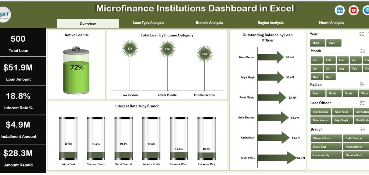
1. Overview Page – What Does the Main Dashboard Show?
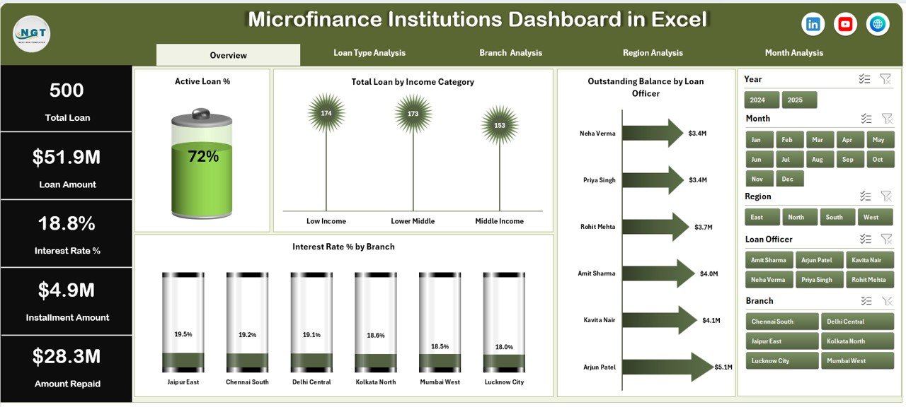
The Overview Page acts as the central performance hub.
Key Elements
-
Right-side slicer for filtering data dynamically
-
Four KPI cards showing performance indicators
-
Visual charts for high-level analysis
Charts Included
-
Active Loan %
-
Total Loan by Income Category
-
Outstanding Balance by Loan Office
-
Interest Rate % by Branch
Because this page summarizes overall operations, executives can instantly evaluate institutional health.
Additionally, slicers allow users to filter data by specific criteria. Therefore, managers can focus on targeted performance areas within seconds.
2. Loan Type Analysis – How Do Different Loan Products Perform?
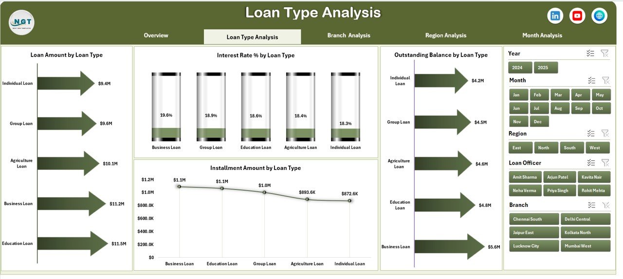
Microfinance institutions often offer multiple loan products such as agriculture loans, business loans, education loans, and group lending programs.
The Loan Type Analysis page helps evaluate product-level performance.
Available Charts
-
Loan Amount by Loan Type
-
Interest Rate % by Loan Type
-
Outstanding Balance by Loan Type
-
Instalment Amount by Loan Type
As a result, management can identify which loan products generate higher returns and which require restructuring.
Moreover, organizations can adjust lending strategies based on borrower behavior patterns.
3. Branch Analysis – Which Branch Performs Best?
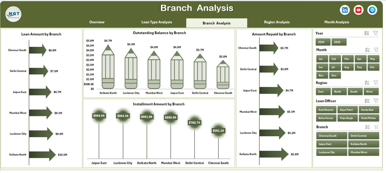
Branch performance directly affects profitability and portfolio quality. Therefore, monitoring branch-level metrics becomes essential.
Charts Included
-
Loan Amount by Branch
-
Interest Amount by Branch
-
Outstanding Balance by Branch
-
Instalment Amount by Branch
Because branch managers operate independently, comparative analytics help leadership detect performance gaps.
Consequently, institutions can:
-
Reward high-performing branches
-
Support underperforming locations
-
Optimize resource allocation
-
Click to Purchases Microfinance Institutions Dashboard in Excel
4. Region Analysis – How Does Geographic Performance Compare?
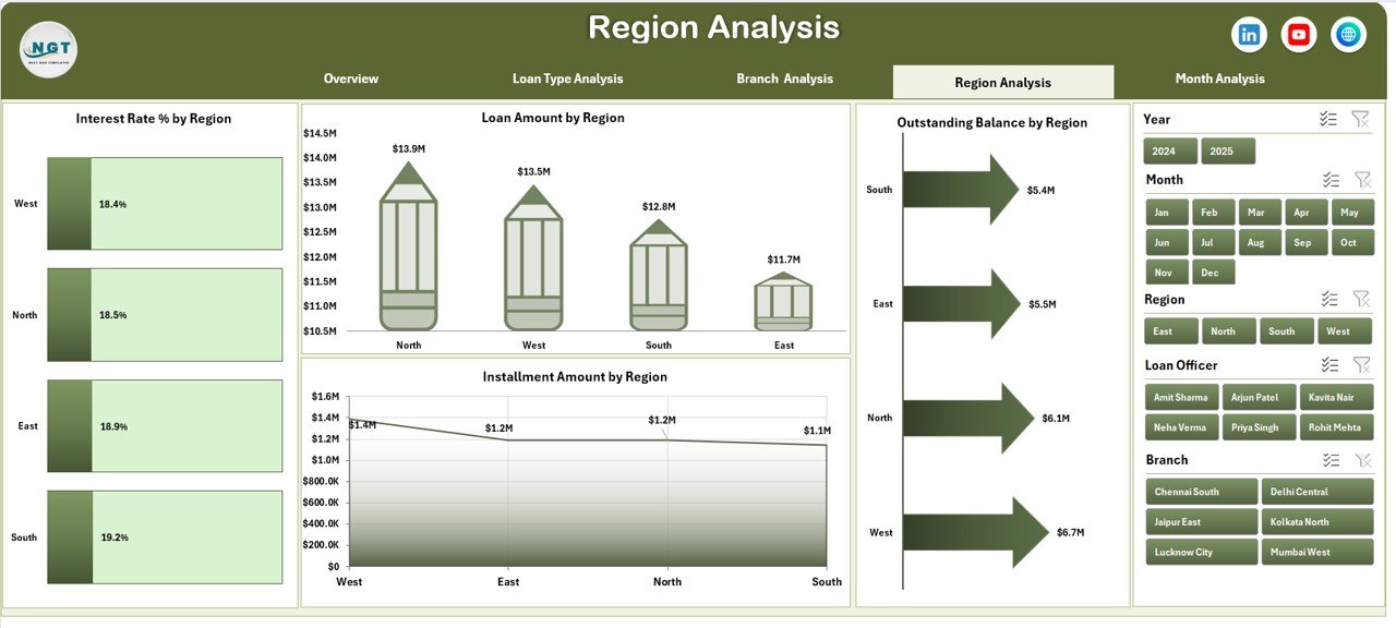
Regional differences significantly influence repayment trends and loan demand.
The Region Analysis Page enables geographic performance tracking.
Charts Available
-
Loan Amount by Region
-
Interest Rate % by Region
-
Outstanding Balance by Region
-
Instalment Amount by Region
For example, rural regions may show higher loan demand but slower repayments. Meanwhile, urban regions might deliver faster collections.
Therefore, regional insights help institutions design localized lending strategies.
5. Month Analysis – What Trends Appear Over Time?
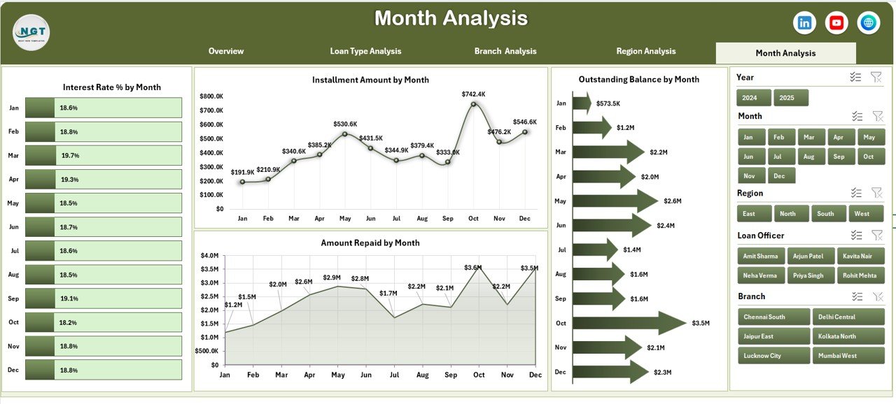
Financial performance changes throughout the year. Hence, time-based analysis becomes essential.
Monthly Charts
-
Interest Rate % by Month
-
Outstanding Balance by Month
-
Instalment Amount by Month
-
Amount Repaid by Month
Because this page shows trends over time, managers can forecast cash flow more accurately.
Additionally, seasonal repayment behavior becomes easier to understand.
What Supporting Sheets Exist in the Dashboard?
Click to Purchases Microfinance Institutions Dashboard in Excel
Behind every interactive dashboard lies structured data architecture.
Support Sheet
The Support Sheet performs background calculations and prepares datasets for visualization.
It helps:
-
Maintain formulas
-
Create lookup tables
-
Enable chart automation
Data Sheet
The Data Sheet serves as the primary data entry area.
Users input:
-
Loan details
-
Borrower information
-
Branch and region data
-
Interest values
-
Instalment records
Once data updates, the dashboard refreshes automatically.
How Does This Dashboard Improve Microfinance Decision-Making?
A dashboard converts numbers into visual intelligence.
Because visuals simplify interpretation, teams quickly recognize performance patterns.
Key Improvements
-
Faster reporting cycles
-
Accurate portfolio monitoring
-
Early detection of repayment risks
-
Improved financial planning
-
Better stakeholder reporting
Furthermore, management teams gain confidence while presenting results to investors and regulators.
Advantages of Microfinance Institutions Dashboard in Excel
1. Centralized Data Management
All loan information stays in one system. Therefore, teams avoid scattered spreadsheets.
2. Real-Time Insights
As soon as users update data, charts refresh automatically.
3. Easy Customization
Excel allows organizations to modify KPIs according to operational needs.
4. Cost-Effective Solution
Unlike enterprise BI tools, Excel requires minimal investment.
5. Improved Transparency
Clear visuals help teams understand institutional performance instantly.
6. Better Risk Management
Managers identify overdue loans early and take corrective actions.
How to Use the Microfinance Institutions Dashboard in Excel?
Step 1: Enter Data
Open the Data Sheet and input loan records accurately.
Step 2: Verify Support Calculations
Ensure formulas work correctly in the Support Sheet.
Step 3: Apply Filters
Use slicers to analyze specific branches or loan categories.
Step 4: Review KPI Cards
Observe performance indicators on the Overview page.
Step 5: Analyze Trends
Move across pages using the Page Navigator.
Because navigation remains intuitive, even non-technical users can operate the dashboard easily.
Who Can Benefit from This Dashboard?
This dashboard suits multiple stakeholders.
Microfinance Organizations
Track lending performance efficiently.
Financial Analysts
Perform portfolio analysis quickly.
Branch Managers
Monitor local loan performance.
NGO Finance Teams
Measure social finance impact.
Investors & Stakeholders
Review operational transparency.
What KPIs Can Be Monitored Using This Dashboard?
Typical KPIs include:
-
Active Loan Percentage
-
Outstanding Loan Balance
-
Interest Rate Performance
-
Instalment Collection Amount
-
Loan Distribution by Category
-
Monthly Repayment Trends
Because KPIs remain customizable, institutions can align metrics with strategic goals.
Best Practices for the Microfinance Institutions Dashboard in Excel
Click to Purchases Microfinance Institutions Dashboard in Excel
To achieve maximum value, organizations should follow proven practices.
Maintain Clean Data
Always validate entries before analysis.
Update Data Regularly
Frequent updates ensure accurate reporting.
Standardize Loan Categories
Consistency improves comparison accuracy.
Use Filters Strategically
Focus on specific regions or branches when analyzing trends.
Monitor Monthly Trends
Regular reviews prevent financial surprises.
Protect Formula Cells
Lock calculation areas to avoid accidental changes.
Common Challenges and How to Overcome Them
Data Inconsistency
Use dropdown lists and validation rules.
Manual Entry Errors
Create structured input templates.
Large Data Volume
Archive historical data periodically.
Misinterpretation of Metrics
Provide KPI definitions inside the workbook.
Future Scope of Microfinance Analytics
Microfinance analytics continues evolving rapidly.
Organizations increasingly integrate:
-
Predictive repayment analysis
-
Risk scoring models
-
Digital lending analytics
-
Automated reporting systems
However, Excel dashboards still provide the foundation for structured data management.
Conclusion
The Microfinance Institutions Dashboard in Excel empowers financial organizations to manage loan portfolios with clarity and confidence. Instead of relying on manual reports, institutions gain visual insights that improve decision-making and operational efficiency.
Because the dashboard organizes performance across overview, loan type, branch, region, and monthly analysis pages, users obtain a complete understanding of institutional performance.
Moreover, its user-friendly structure, cost efficiency, and customization flexibility make it an ideal solution for microfinance organizations of all sizes.
Ultimately, organizations that adopt structured dashboards improve financial monitoring, strengthen repayment performance, and support sustainable growth.
Frequently Asked Questions (FAQs)
1. What is a Microfinance Institutions Dashboard in Excel used for?
It helps institutions monitor loan performance, repayment trends, and financial metrics through interactive visual reports.
2. Can small microfinance organizations use this dashboard?
Yes. Excel dashboards work perfectly for small and medium institutions because they require minimal technical expertise.
3. Do I need advanced Excel skills to use it?
No. Users only need basic Excel knowledge to update data and use filters.
4. Can I customize KPIs in the dashboard?
Yes. Organizations can modify KPIs, charts, and calculations according to operational requirements.
5. How often should data be updated?
You should update data weekly or monthly for accurate performance tracking.
6. Does the dashboard support multiple branches?
Yes. The Branch Analysis page allows detailed comparison across locations.
7. Is this dashboard suitable for reporting to investors?
Absolutely. Visual summaries make stakeholder reporting clear and professional.
Visit our YouTube channel to learn step-by-step video tutorials