In today’s rapidly evolving energy ecosystem, utilities and smart grid service providers generate massive volumes of operational data every day. Power distribution networks, renewable integration systems, smart meters, grid automation tools, and energy monitoring platforms continuously produce performance metrics. However, many organizations still struggle to transform this raw data into meaningful insights.
As a result, decision-making becomes slow, performance gaps remain unnoticed, and operational efficiency declines. Therefore, energy organizations increasingly adopt Power BI KPI dashboards to monitor smart grid performance in real time.
One powerful and practical solution is the Smart Grid Services KPI Dashboard in Power BI — a ready-to-use analytics system designed to track, compare, and analyze smart grid KPIs using interactive visualizations.
In this comprehensive guide, you will learn everything about this dashboard, including its structure, features, benefits, implementation steps, best practices, and frequently asked questions.
Click to Purchases Smart Grid Services KPI Dashboard in Power BI
What Is a Smart Grid Services KPI Dashboard in Power BI?
A Smart Grid Services KPI Dashboard in Power BI is an interactive business intelligence solution that helps energy companies monitor operational performance using Key Performance Indicators (KPIs).
Instead of reviewing multiple spreadsheets and manual reports, teams can analyze all smart grid metrics from a centralized dashboard.
The dashboard converts Excel-based operational data into:
-
Visual KPI scorecards
-
Trend analysis charts
-
Target vs actual comparisons
-
Year-over-year performance insights
-
Drill-through KPI definitions
Consequently, managers quickly identify performance issues and take corrective actions faster.
Why Do Smart Grid Organizations Need KPI Dashboards?
Smart grid environments involve complex infrastructure and continuous monitoring. Therefore, organizations must track performance accurately.
Without a structured dashboard:
-
Data remains scattered across files
-
KPI monitoring becomes inconsistent
-
Performance tracking consumes time
-
Decision-making slows down
However, when organizations implement a Power BI KPI dashboard, they gain real-time visibility and strategic control.
Key Challenges Solved
-
Monitoring multiple KPIs simultaneously
-
Comparing targets vs actual performance
-
Tracking monthly and yearly progress
-
Understanding historical performance trends
-
Standardizing KPI definitions
Overview of the Smart Grid Services KPI Dashboard
This ready-to-use dashboard operates inside Power BI Desktop and uses an Excel file as its data source. The solution follows a structured three-page design that simplifies analysis while maintaining professional analytics standards.
The dashboard contains:
-
Summary Page
-
KPI Trend Page
-
KPI Definition (Drill-Through) Page
Each page serves a specific analytical purpose.
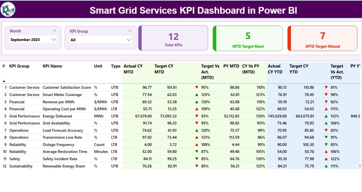
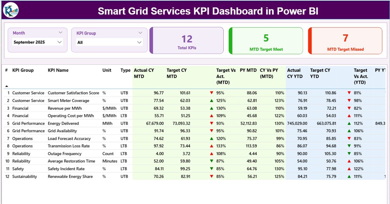
What Does the Summary Page Show?
Click to Purchases Smart Grid Services KPI Dashboard in Power BI
The Summary Page acts as the central control panel of the dashboard. Users immediately understand overall KPI performance from this page.
Interactive Slicers
At the top section, users find:
-
Month Slicer — filters performance by selected month
-
KPI Group Slicer — filters KPIs by category
These slicers instantly update all visuals.
KPI Performance Cards
Three powerful KPI cards provide quick insights:
-
Total KPI Count – displays total monitored KPIs
-
MTD Target Meet Count – shows KPIs achieving targets
-
MTD Target Missed Count – highlights underperforming KPIs
Therefore, management instantly understands performance status.
Detailed KPI Table Explained
Below the cards, a comprehensive KPI table displays performance metrics.
KPI Information Columns
-
KPI Number — sequential identifier
-
KPI Group — category classification
-
KPI Name — performance metric title
-
Unit — measurement unit
-
Type — LTB (Lower the Better) or UTB (Upper the Better)
Monthly Performance Metrics (MTD)
-
Actual CY MTD — current year month-to-date value
-
Target CY MTD — target value for MTD
-
MTD Icon — ▲ green or ▼ red indicator
-
Target vs Actual (MTD) — Actual ÷ Target percentage
-
PY MTD — previous year MTD value
-
CY vs PY (MTD) — year-over-year comparison
These metrics allow quick monthly performance evaluation.
Yearly Performance Metrics (YTD)
-
Actual CY YTD — current year YTD performance
-
Target CY YTD — yearly target value
-
YTD Icon — visual performance indicator
-
Target vs Actual (YTD) — achievement percentage
-
PY YTD — previous year YTD value
-
CY vs PY (YTD) — annual performance comparison
Thus, decision-makers analyze both short-term and long-term performance simultaneously.
How Does the KPI Trend Page Help Analysis?
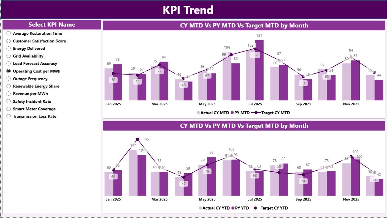
While the summary page provides snapshots, the KPI Trend Page focuses on performance movement over time.
Key Features
-
KPI Name slicer on the left
-
Two combo charts for comparison
-
Current Year vs Previous Year vs Target analysis
Charts Included
-
MTD Trend Chart
-
Current Year Actual
-
Previous Year Actual
-
Target Values
-
-
YTD Trend Chart
-
Long-term performance tracking
-
Growth pattern visualization
-
Because trends reveal patterns, organizations identify recurring issues early.
What Is the KPI Definition Page?
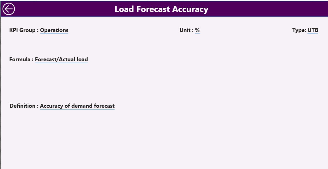
The KPI Definition Page works as a hidden drill-through page.
Users can right-click any KPI from the summary page and open detailed information such as:
-
KPI Formula
-
KPI Definition
-
Measurement Logic
-
KPI Type (LTB or UTB)
This feature ensures transparency and eliminates confusion about KPI calculations.
A back button allows easy navigation to the main page.
How Does the Excel Data Source Work?
Click to Purchases Smart Grid Services KPI Dashboard in Power BI
The dashboard connects to an Excel file containing structured data. Users only update Excel sheets, and Power BI refreshes visuals automatically.
1. Input_Actual Sheet
Users enter:
-
KPI Name
-
Month (first date of month)
-
MTD Actual values
-
YTD Actual values
This sheet captures real operational performance.
2. Input_Target Sheet
Users enter:
-
KPI Name
-
Month
-
Target MTD values
-
Target YTD values
This sheet defines performance expectations.
3. KPI Definition Sheet
Users maintain KPI master data:
-
KPI Number
-
KPI Group
-
KPI Name
-
Unit
-
Formula
-
Definition
-
Type (LTB / UTB)
Therefore, the dashboard remains structured and scalable.
How Does This Dashboard Improve Smart Grid Operations?
Smart grid systems require continuous monitoring. This dashboard enhances operations in several ways.
Real-Time Performance Monitoring
Managers instantly track grid efficiency and service KPIs.
Faster Decision Making
Visual indicators highlight issues immediately.
Historical Comparison
Year-over-year analysis reveals improvement trends.
Standardized Reporting
Every department follows consistent KPI definitions.
Reduced Manual Reporting
Automation eliminates repetitive report creation.
Advantages of Smart Grid Services KPI Dashboard in Power BI
✅ Centralized Performance Monitoring
All KPIs appear in one unified dashboard.
✅ Interactive Data Exploration
Users filter data dynamically using slicers.
✅ Visual Performance Indicators
Icons simplify complex analysis.
✅ Scalable Architecture
Organizations easily add new KPIs.
✅ Improved Accountability
Teams clearly see performance results.
✅ Data Accuracy
Automated calculations reduce errors.
✅ Executive-Level Insights
Leadership receives clear performance summaries.
Who Can Benefit from This Dashboard?
Click to Purchases Smart Grid Services KPI Dashboard in Power BI
Many stakeholders within the energy ecosystem benefit from this solution.
Utility Companies
Monitor distribution efficiency and service reliability.
Smart Grid Operators
Track automation and infrastructure KPIs.
Energy Consultants
Provide data-driven recommendations.
Operations Managers
Analyze performance trends quickly.
Regulatory Teams
Ensure compliance monitoring.
How to Implement the Smart Grid KPI Dashboard?
Implementation remains simple because the system uses Excel and Power BI.
Step 1 — Prepare KPI Definitions
Define KPIs clearly before data entry.
Step 2 — Enter Actual Data
Update monthly performance values.
Step 3 — Enter Targets
Input expected KPI benchmarks.
Step 4 — Load Data into Power BI
Connect Excel data source.
Step 5 — Refresh Dashboard
Click refresh to update visuals.
Step 6 — Analyze Insights
Use slicers and drill-through features.
Best Practices for the Smart Grid Services KPI Dashboard in Power BI
Following best practices ensures maximum value.
✔ Define KPIs Clearly
Avoid ambiguous KPI definitions.
✔ Maintain Data Consistency
Use standardized units and formats.
✔ Update Data Regularly
Refresh monthly data without delay.
✔ Use Meaningful KPI Groups
Organize KPIs logically.
✔ Monitor Trends, Not Only Results
Focus on patterns rather than single numbers.
✔ Validate Data Before Refresh
Ensure accuracy in Excel inputs.
✔ Train Users
Teach teams how to interpret dashboard visuals.
Common Smart Grid KPIs You Can Track
Organizations can monitor multiple performance areas.
Operational KPIs
-
Grid availability
-
Outage response time
-
Energy distribution efficiency
Financial KPIs
-
Service cost per unit
-
Maintenance expenses
Reliability KPIs
-
System downtime
-
Fault detection rate
Sustainability KPIs
-
Renewable energy integration
-
Carbon reduction metrics
Why Power BI Is Ideal for Smart Grid Analytics?
Power BI provides powerful analytical capabilities.
-
Interactive visuals
-
Easy Excel integration
-
Drill-through analytics
-
Real-time updates
-
Scalable enterprise reporting
Moreover, Power BI enables non-technical users to analyze complex datasets easily.
Future of Smart Grid Analytics with Power BI
Smart grids continue evolving with AI, IoT, and automation technologies. Therefore, analytics dashboards will play an even bigger role.
Future dashboards may include:
-
Predictive maintenance analytics
-
AI-based anomaly detection
-
Real-time IoT streaming data
-
Automated alerts and forecasting
Organizations adopting KPI dashboards today prepare themselves for tomorrow’s intelligent energy systems.
Conclusion
The Smart Grid Services KPI Dashboard in Power BI provides a structured, powerful, and easy-to-use solution for monitoring smart grid performance. Instead of relying on manual reporting, organizations gain a centralized analytics platform that delivers clear insights through visual KPI tracking.
Because the dashboard integrates Excel data with Power BI visualization, teams implement it quickly without complex system changes. Furthermore, interactive slicers, KPI comparisons, trend charts, and drill-through definitions make performance analysis simple and effective.
Ultimately, organizations that adopt KPI-driven dashboards improve operational efficiency, enhance decision-making, and strengthen smart grid management strategies.
Frequently Asked Questions (FAQs)
1. What is a Smart Grid KPI Dashboard?
It is a Power BI dashboard that tracks smart grid performance using KPIs, targets, and trend analysis.
2. Do I need advanced Power BI skills to use this dashboard?
No. Users only update Excel data and refresh the dashboard.
3. Can I add new KPIs?
Yes. You can easily add KPIs through the KPI Definition sheet.
4. What does LTB and UTB mean?
LTB means Lower the Better, while UTB means Upper the Better.
5. How often should I update data?
You should update KPI data monthly or as required.
6. Can this dashboard work with large datasets?
Yes. Power BI handles large datasets efficiently.
7. Is the dashboard customizable?
Yes. You can modify visuals, KPIs, and groups based on business needs.
8. Why use Excel as a data source?
Excel offers flexibility, simplicity, and easy maintenance for KPI inputs.
Visit our YouTube channel to learn step-by-step video tutorials