Modern manufacturing continues to evolve rapidly. Among all innovations, Additive Manufacturing (3D Printing) stands out as one of the most transformative technologies. However, while companies invest heavily in advanced machines and materials, many still struggle to measure performance effectively.
Therefore, organizations need a structured way to monitor productivity, quality, efficiency, and operational outcomes. This is exactly where an Additive Manufacturing KPI Dashboard in Power BI becomes essential.
In this detailed guide, you will learn:
- What an Additive Manufacturing KPI Dashboard is
- Why manufacturers need KPI tracking
- How this ready-to-use Power BI dashboard works
- Dashboard pages and features explained
- Data structure and Excel integration
- Advantages and best practices
- Frequently asked questions
Click to buy Additive Manufacturing KPI Dashboard in Power BI
What Is an Additive Manufacturing KPI Dashboard in Power BI?
An Additive Manufacturing KPI Dashboard in Power BI is an interactive performance monitoring system designed to track key production metrics related to 3D printing operations.
Instead of reviewing multiple reports or spreadsheets, teams can analyze all KPIs in one centralized dashboard. As a result, managers quickly identify performance gaps and take corrective action faster.
This ready-to-use dashboard captures data through an Excel file and transforms it into powerful visual insights using Power BI.
The dashboard helps organizations:
- Monitor production efficiency
- Compare Actual vs Target performance
- Analyze Month-to-Date (MTD) and Year-to-Date (YTD) trends
- Evaluate improvement against previous year performance
- Make data-driven manufacturing decisions
Because Power BI provides interactive visuals and slicers, users can instantly explore performance from multiple angles.
Why Do Additive Manufacturing Companies Need KPI Dashboards?
Many additive manufacturing teams rely on machine logs or manual reports. However, those methods create delays and confusion.
A KPI dashboard solves these problems.
Common Challenges Without KPI Tracking
- Data scattered across different systems
- No real-time performance visibility
- Difficult target tracking
- Slow decision-making
- Lack of performance accountability
Therefore, organizations need structured analytics.
How KPI Dashboards Improve Manufacturing Performance
When companies use KPI dashboards:
- Managers detect production issues early.
- Teams track goals clearly.
- Engineers optimize machine utilization.
- Leadership evaluates strategic performance.
Consequently, operations become more predictable and efficient.
Overview of the Additive Manufacturing KPI Dashboard
This Power BI dashboard works as a ready-to-use analytical solution. Users only need to update Excel data, and the dashboard refreshes automatically.
The dashboard contains three interactive pages:
- Summary Page
- KPI Trend Page
- KPI Definition (Drill-Through) Page
Each page serves a unique purpose, which we explain below.
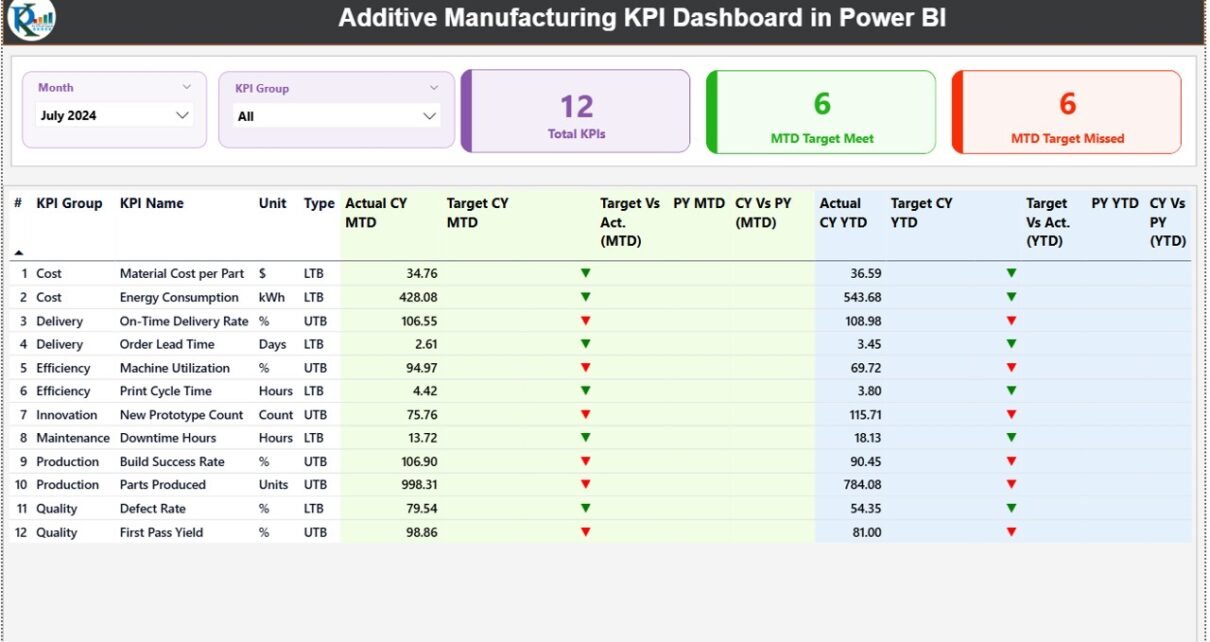
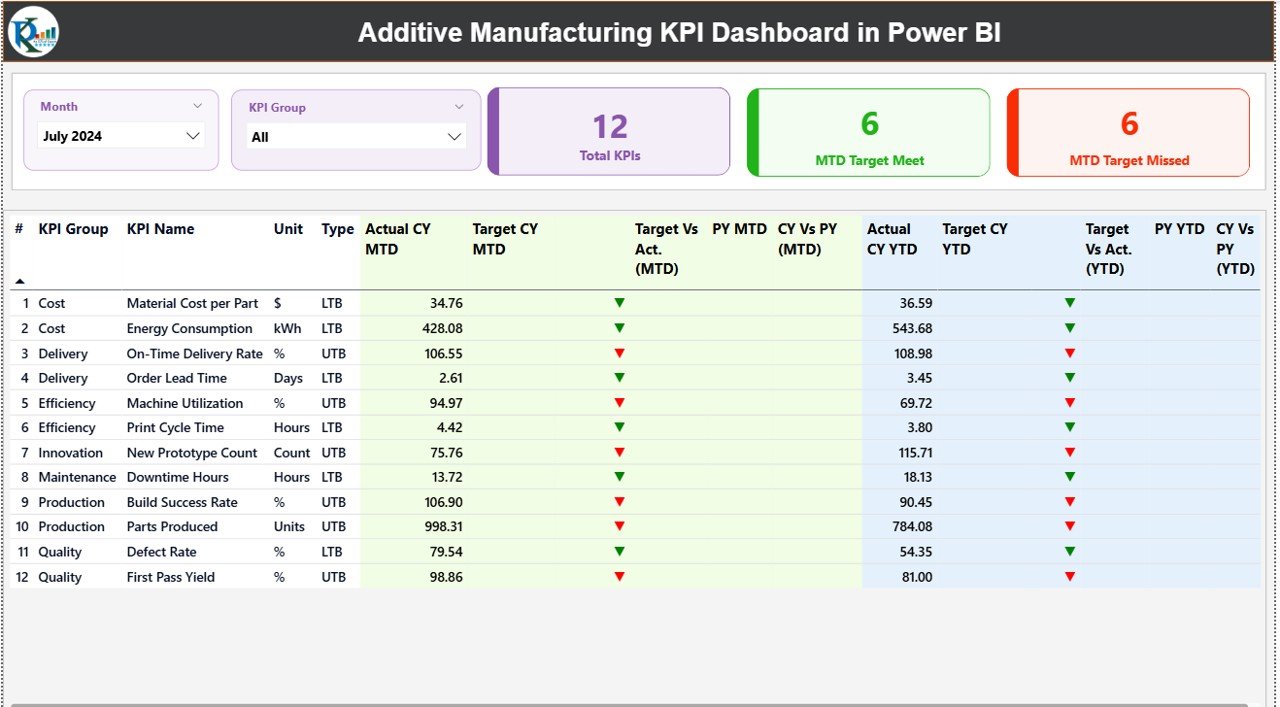
Summary Page – The Central Performance Hub
The Summary Page acts as the main control center of the dashboard. Users immediately understand overall performance from this page.
Top Section: Interactive Slicers
At the top, users find:
- Month Slicer – Select reporting period
- KPI Group Slicer – Filter KPIs by category
Because of these slicers, users can analyze specific departments or timeframes instantly.
KPI Performance Cards
Three important KPI cards appear at the top:
- Total KPIs Count – Shows total monitored KPIs
- MTD Target Meet Count – KPIs achieving targets
- MTD Target Missed Count – KPIs below expectations
These cards provide a quick performance snapshot.
Detailed KPI Performance Table
Below the cards, a detailed analytical table displays complete KPI information.
KPI Information Fields Explained
KPI Number
Sequential identifier for each KPI.
KPI Group
Category such as Production, Quality, Efficiency, or Cost.
KPI Name
Name of the performance metric.
Unit
Measurement unit (%, Hours, Parts, Cost, etc.).
Type (LTB or UTB)
- LTB: Lower value indicates better performance
- UTB: Higher value indicates better performance
MTD Performance Metrics
- Actual CY MTD – Current year Month-to-Date actual value
- Target CY MTD – Planned MTD target
- MTD Icon – ▲ Green or ▼ Red performance indicator
- Target vs Actual (MTD)
Formula:
Actual ÷ Target - PY MTD – Previous year MTD value
- CY vs PY (MTD)
Formula:
Current Year ÷ Previous Year
These comparisons help teams evaluate short-term performance.
YTD Performance Metrics
The dashboard also tracks long-term progress:
- Actual CY YTD
- Target CY YTD
- YTD Icon (Performance indicator)
- Target vs Actual (YTD)
- PY YTD
- CY vs PY (YTD)
Because both MTD and YTD exist together, decision-makers understand immediate and annual trends simultaneously.
Click to buy Additive Manufacturing KPI Dashboard in Power BI
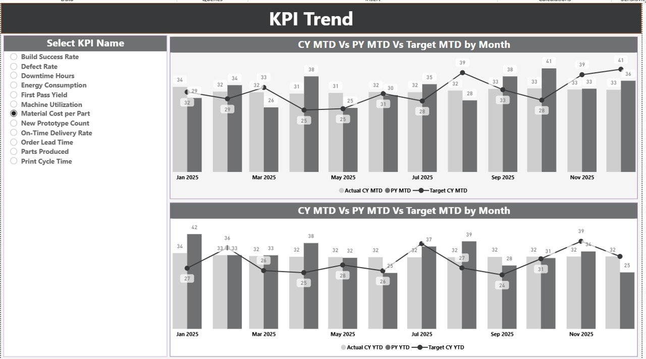
KPI Trend Page – Performance Over Time
While the Summary page shows status, the KPI Trend Page explains performance movement.
Key Features
- KPI Name slicer on the left
- Two combo charts:
- MTD Trend Analysis
- YTD Trend Analysis
Each chart compares:
- Current Year Actual
- Previous Year Actual
- Target Values
Therefore, users easily identify patterns such as:
- Continuous improvement
- Seasonal variations
- Performance decline
- Target alignment
Trend visualization supports proactive planning rather than reactive management.
Click to buy Additive Manufacturing KPI Dashboard in Power BI
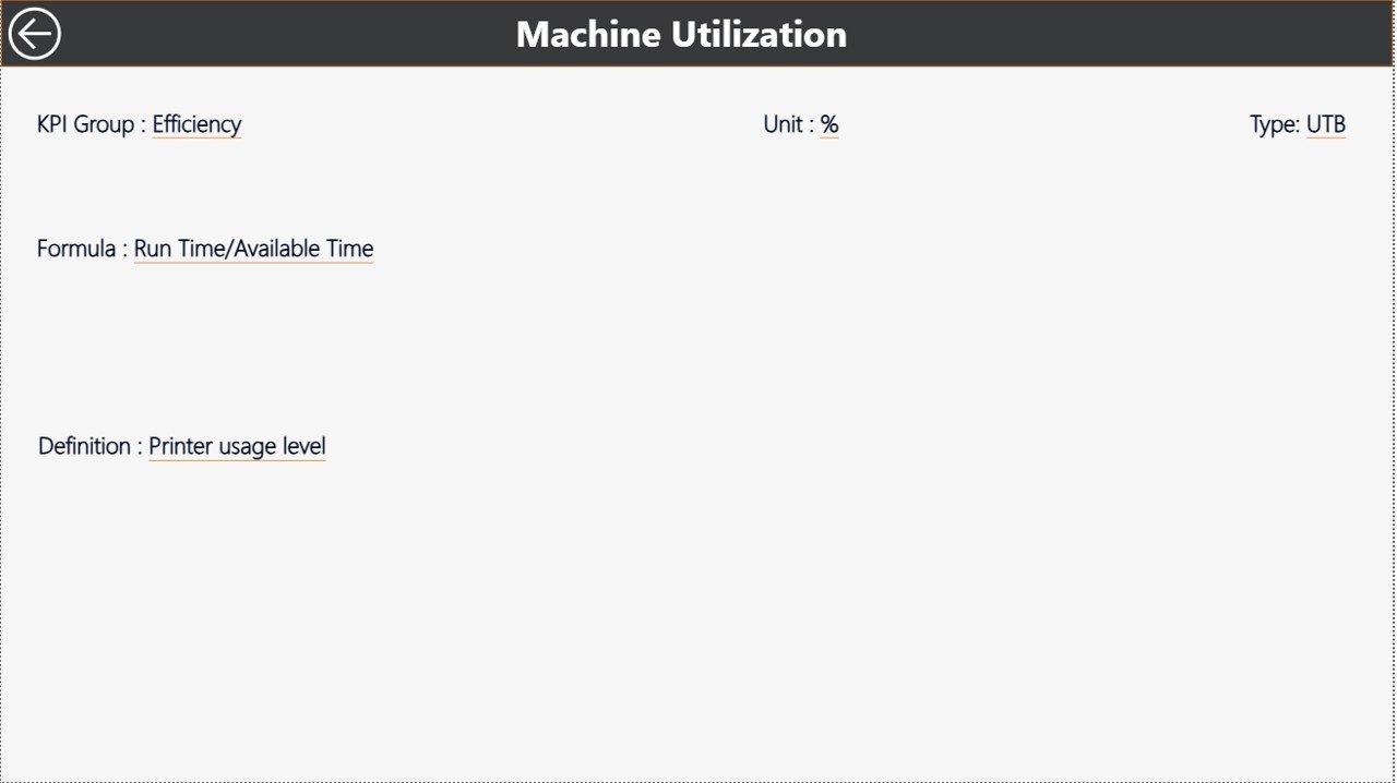
KPI Definition Page – Drill-Through Intelligence
The KPI Definition Page works as a hidden drill-through page.
Users can right-click any KPI from the Summary page and open detailed information.
Information Available
- KPI Formula
- KPI Definition
- KPI Group
- Measurement Unit
- KPI Type (LTB/UTB)
This feature ensures clarity because every KPI includes documented logic.
To return, users simply click the Back Button at the top-left corner.
Click to buy Additive Manufacturing KPI Dashboard in Power BI
Excel Data Source Structure
The dashboard connects directly to an Excel file. This design keeps data entry simple and flexible.
Users must fill three worksheets.
Input_Actual Sheet
Here users enter actual performance values.
Required Columns
- KPI Name
- Month (First date of month)
- MTD Value
- YTD Value
After updating data, Power BI refresh automatically updates visuals.
Click to buy Additive Manufacturing KPI Dashboard in Power BI
Input_Target Sheet
This sheet stores planned targets.
Users enter:
- KPI Name
- Month
- Target MTD
- Target YTD
Because targets exist separately, organizations can revise goals without affecting historical actual data.
KPI Definition Sheet
This sheet defines KPI logic.
Required Fields
- KPI Number
- KPI Group
- KPI Name
- Unit
- Formula
- Definition
- Type (LTB or UTB)
Maintaining definitions improves reporting consistency across teams.
How Does This Dashboard Help Additive Manufacturing Operations?
Additive manufacturing involves complex workflows including printing, post-processing, inspection, and delivery. Therefore, performance tracking becomes critical.
This dashboard enables:
- Production monitoring
- Quality control tracking
- Cost management analysis
- Machine utilization review
- Efficiency improvement planning
As a result, companies achieve higher operational transparency.
Advantages of Additive Manufacturing KPI Dashboard in Power BI
- Centralized Performance Monitoring
All KPIs appear in one dashboard. Teams avoid switching between reports.
- Real-Time Decision Support
Updated Excel data instantly reflects in Power BI visuals.
- Clear Target Tracking
Users quickly identify which KPIs meet or miss targets.
- Visual Performance Indicators
Arrow icons provide immediate understanding without deep analysis.
- Historical Comparison
Previous year comparisons reveal growth trends.
- Interactive Analysis
Slicers allow flexible exploration of performance.
- Easy Implementation
Organizations use Excel as a data source, so adoption remains simple.
Best Practices for the Additive Manufacturing KPI Dashboard
To maximize dashboard value, organizations should follow proven practices.
Define Clear KPIs
Choose KPIs aligned with business objectives such as:
- Print success rate
- Material utilization
- Production cycle time
- Cost per part
Clear KPIs improve decision quality.
Maintain Data Accuracy
Always:
- Update data monthly
- Validate entries
- Avoid duplicate KPI names
Accurate data ensures reliable insights.
Use Standard KPI Definitions
Document formulas and meanings in the KPI Definition sheet. This practice prevents misunderstanding across departments.
Review KPIs Regularly
Conduct monthly reviews using the dashboard. Continuous monitoring drives improvement.
Train Teams on Dashboard Usage
When teams understand filters and drill-through features, they gain deeper insights.
Align KPIs with Strategic Goals
Link operational KPIs with business outcomes such as profitability and customer satisfaction.
How to Use the Dashboard Step-by-Step?
- Open Excel data file.
- Update Actual values in Input_Actual sheet.
- Enter targets in Input_Target sheet.
- Maintain KPI definitions.
- Refresh Power BI dataset.
- Select Month or KPI Group using slicers.
- Analyze Summary page results.
- Review trends on KPI Trend page.
- Drill through KPIs for detailed definitions.
Within minutes, users gain full performance visibility.
Who Can Benefit from This Dashboard?
This dashboard serves multiple roles:
- Manufacturing Managers
- Production Engineers
- Operations Leaders
- Quality Assurance Teams
- Data Analysts
- Plant Directors
Because Power BI simplifies analytics, both technical and non-technical users benefit.
Why Power BI Is Ideal for Manufacturing KPI Dashboards?
Power BI offers several advantages for industrial analytics.
- Interactive visuals
- Fast data refresh
- Drill-through capabilities
- Advanced calculations
- Scalable reporting
- Professional dashboard design
Therefore, many smart factories adopt Power BI as their analytics platform.
Future of KPI Monitoring in Additive Manufacturing
Additive manufacturing continues to integrate AI, IoT sensors, and predictive analytics.
Soon, KPI dashboards will include:
- Machine health monitoring
- Predictive failure alerts
- Automated anomaly detection
- Real-time production feeds
Organizations that start KPI tracking today prepare themselves for Industry 4.0 transformation.
Conclusion
Additive manufacturing delivers innovation, flexibility, and customization. However, success depends on measurable performance.
The Additive Manufacturing KPI Dashboard in Power BI provides a powerful yet simple solution to monitor operations effectively. It combines Excel-based data entry with advanced Power BI visualization to create actionable insights.
Because the dashboard tracks MTD, YTD, target comparison, and historical trends, decision-makers gain a complete operational view.
Ultimately, organizations improve productivity, reduce inefficiencies, and achieve continuous improvement through structured KPI monitoring.
Frequently Asked Questions (FAQs)
What is an Additive Manufacturing KPI Dashboard?
It is a Power BI dashboard that tracks performance metrics related to 3D printing operations using structured KPIs.
Do I need Power BI expertise to use this dashboard?
No. You only update Excel data and refresh the dashboard.
Can I customize KPIs?
Yes. You can add or modify KPIs in the KPI Definition sheet.
How often should I update data?
You should update data monthly or whenever new performance data becomes available.
What does LTB and UTB mean?
- LTB: Lower value indicates better performance
- UTB: Higher value indicates better performance
Can this dashboard work for other industries?
Yes. You can adapt KPI definitions and data to fit different industries.
Does the dashboard support historical comparison?
Yes. It compares current year performance with previous year data for both MTD and YTD.
Click to buy Additive Manufacturing KPI Dashboard in Power BI
Visit our YouTube channel to learn step-by-step video tutorials
Watch the step-by-step video tutorial: