The short-term rental industry has grown rapidly in recent years. Platforms like Airbnb, Vrbo, and Booking.com have transformed how people travel and how property owners generate income. Today, thousands of hosts manage apartments, vacation homes, and shared spaces across different cities.
However, managing rental properties without proper analytics can quickly become difficult. Hosts and property managers must track bookings, occupancy rates, revenue, cancellation trends, and property performance. When data spreads across multiple spreadsheets, it becomes challenging to identify trends and make informed decisions.
Click to Purchases Airbnb-style Rentals Dashboard in Excel
Therefore, businesses increasingly rely on data-driven dashboards to manage short-term rental performance.
One powerful solution is the Airbnb-style Rentals Dashboard in Excel. This ready-to-use Excel dashboard helps hosts and property managers analyze bookings, revenue, and occupancy trends using interactive charts and slicers.
Moreover, Excel dashboards make data visualization simple. As a result, users can instantly identify trends, monitor key metrics, and improve property performance.
In this comprehensive guide, we will explore the Airbnb-style Rentals Dashboard in Excel, including its features, structure, advantages, and best practices.
What is an Airbnb-Style Rentals Dashboard in Excel?
An Airbnb-style Rentals Dashboard in Excel is a data visualization tool that analyzes short-term rental performance using interactive charts, KPI indicators, and filters.
This dashboard converts raw booking data into clear visual insights. Consequently, property managers can monitor performance without manually analyzing large spreadsheets.
The dashboard tracks important rental metrics such as:
-
Total bookings
-
Occupancy rate
-
Revenue performance
-
Cancellation trends
-
Host performance
-
Booking methods
-
City-wise performance
Because Excel updates calculations automatically, the dashboard refreshes instantly when users update data.
Therefore, hosts and rental businesses can monitor performance in real time.
Why Do Airbnb Hosts Need a Rental Analytics Dashboard?
Managing rental properties involves multiple operational challenges. For example, hosts must track reservations, analyze demand patterns, and optimize pricing.
Without analytics tools, hosts often struggle with the following issues:
-
Difficulty tracking revenue trends
-
Poor visibility into occupancy performance
-
Lack of insights into booking cancellations
-
Limited understanding of city-wise demand
-
Difficulty analyzing property types
However, a dashboard solves these problems.
Because the Airbnb-style Rentals Dashboard in Excel consolidates all information in one place, property managers gain a clear overview of their business.
As a result, they can make smarter decisions.
Key Components of the Airbnb-Style Rentals Dashboard
The dashboard organizes data into multiple interactive pages. Each page focuses on a different area of rental analytics.
In addition, the dashboard includes slicers and navigation tools to simplify analysis.
Main components include:
-
Page navigator
-
KPI cards
-
Interactive charts
-
Data tables
-
Filters (slicers)
-
Support sheet
-
Data sheet
Together, these components provide a complete rental analytics solution.
Page Navigator for Easy Dashboard Navigation
The dashboard includes a page navigator located on the left side. This navigation panel allows users to move between dashboard pages quickly.
Because each page focuses on different analytics, the navigation panel improves usability.
For example, users can jump between:
-
Overview page
-
Revenue analysis
-
Host property analysis
-
Booking trends analysis
-
Month analysis
Therefore, users can explore insights without scrolling through multiple sheets.
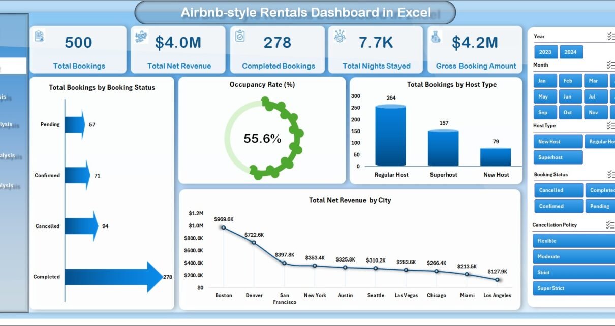
Overview Page – How Can You Monitor Rental Performance Quickly?
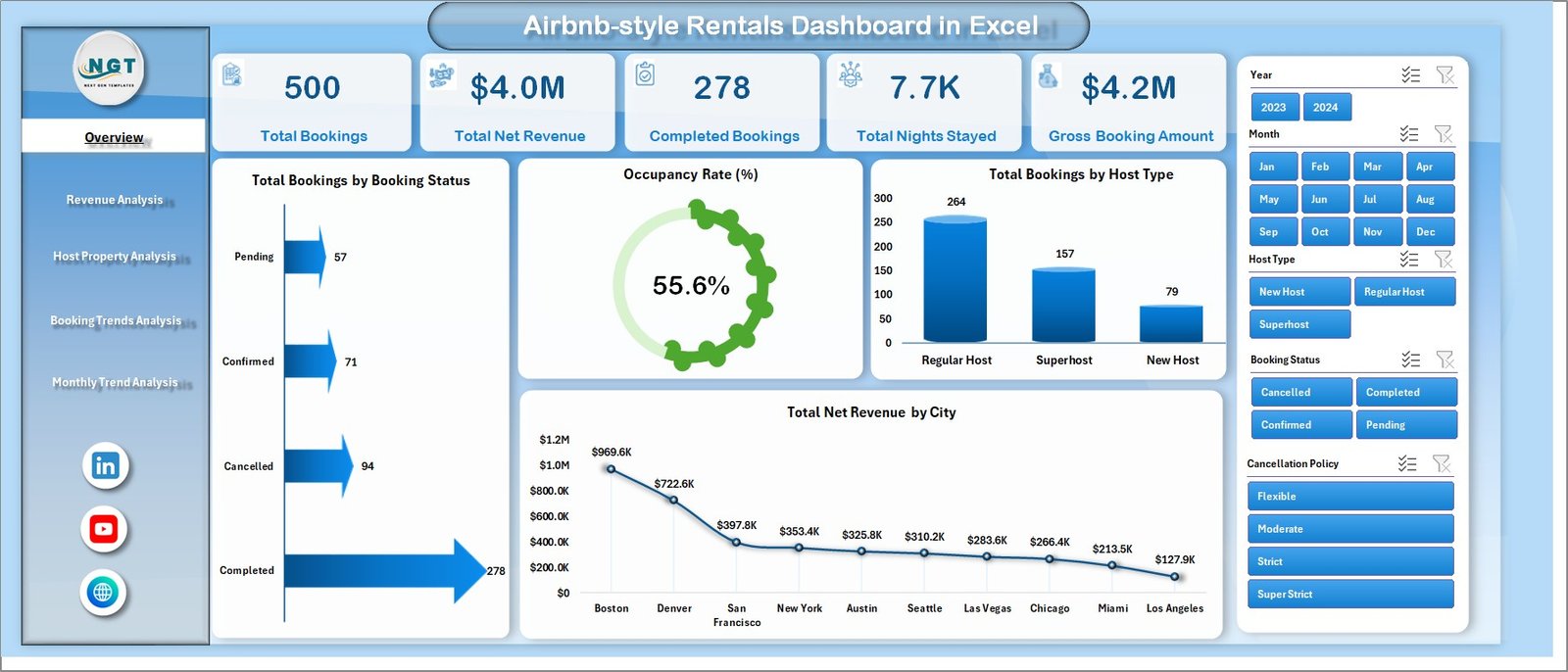
The Overview Page acts as the central hub of the dashboard.
It provides a quick snapshot of rental performance using KPI cards and visual charts.
The page also includes a slicer on the right side that allows users to filter data instantly.
KPI Cards on the Overview Page
The dashboard displays four important KPI cards:
-
Total Bookings
-
Occupancy Rate %
-
Total Guests
-
Total Net Revenue
These KPIs allow users to measure performance at a glance.
For example, if occupancy decreases, managers can quickly investigate the cause.
Charts on the Overview Page
Click to Purchases Airbnb-style Rentals Dashboard in Excel
The Overview page includes four visual charts:
Total Booking by Booking Status
This chart displays booking distribution across different statuses such as:
-
Completed
-
Cancelled
-
Pending
As a result, managers can monitor booking success rates.
Occupancy Rate %
This chart shows the percentage of occupied properties compared to available inventory.
Therefore, users can evaluate demand and property utilization.
Total Booking by City
This visualization highlights which cities generate the most bookings.
Consequently, managers can identify high-demand locations.
Total Net Revenue by City
This chart shows revenue performance across different cities.
Because revenue varies by location, this insight helps hosts prioritize profitable markets.
Revenue Analysis – How Can Hosts Track Revenue Performance?
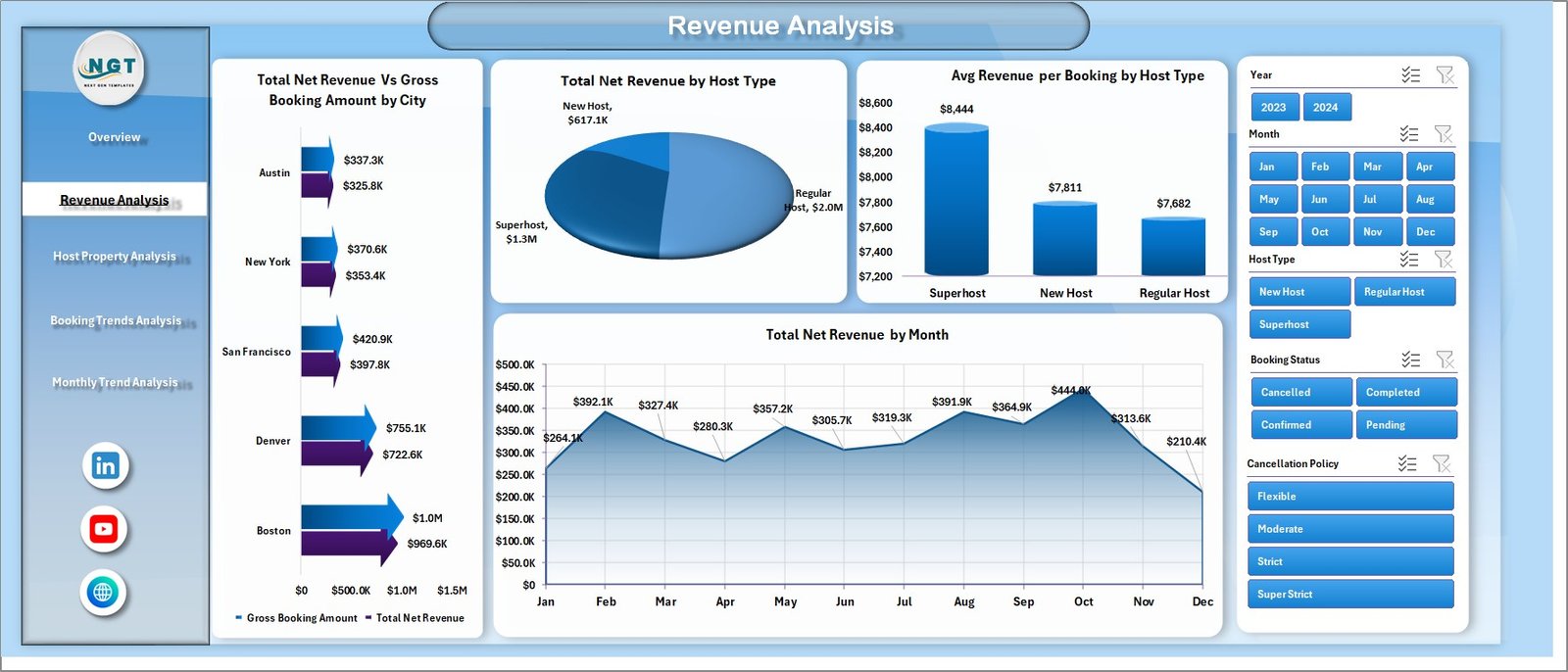
Revenue plays a critical role in rental success. Therefore, the dashboard includes a Revenue Analysis page.
This page focuses on income trends and host performance.
The right-side slicer allows users to filter revenue data easily.
Charts in Revenue Analysis
Total Net Revenue vs Gross Booking Amount by City
This chart compares gross booking value with net revenue.
Therefore, users can analyze platform fees, discounts, and commissions.
Total Net Revenue by Host Type
Hosts often fall into different categories such as:
-
Individual hosts
-
Professional property managers
-
Superhosts
This chart shows how each host category contributes to revenue.
Average Revenue per Booking by Host Type
Click to Purchases Airbnb-style Rentals Dashboard in Excel
This metric reveals which host category generates higher revenue per booking.
Therefore, property managers can evaluate pricing strategies.
Total Net Revenue by Month
This chart tracks revenue across months.
As a result, hosts can identify seasonal demand patterns.
Host Property Analysis – Which Properties Perform Best?
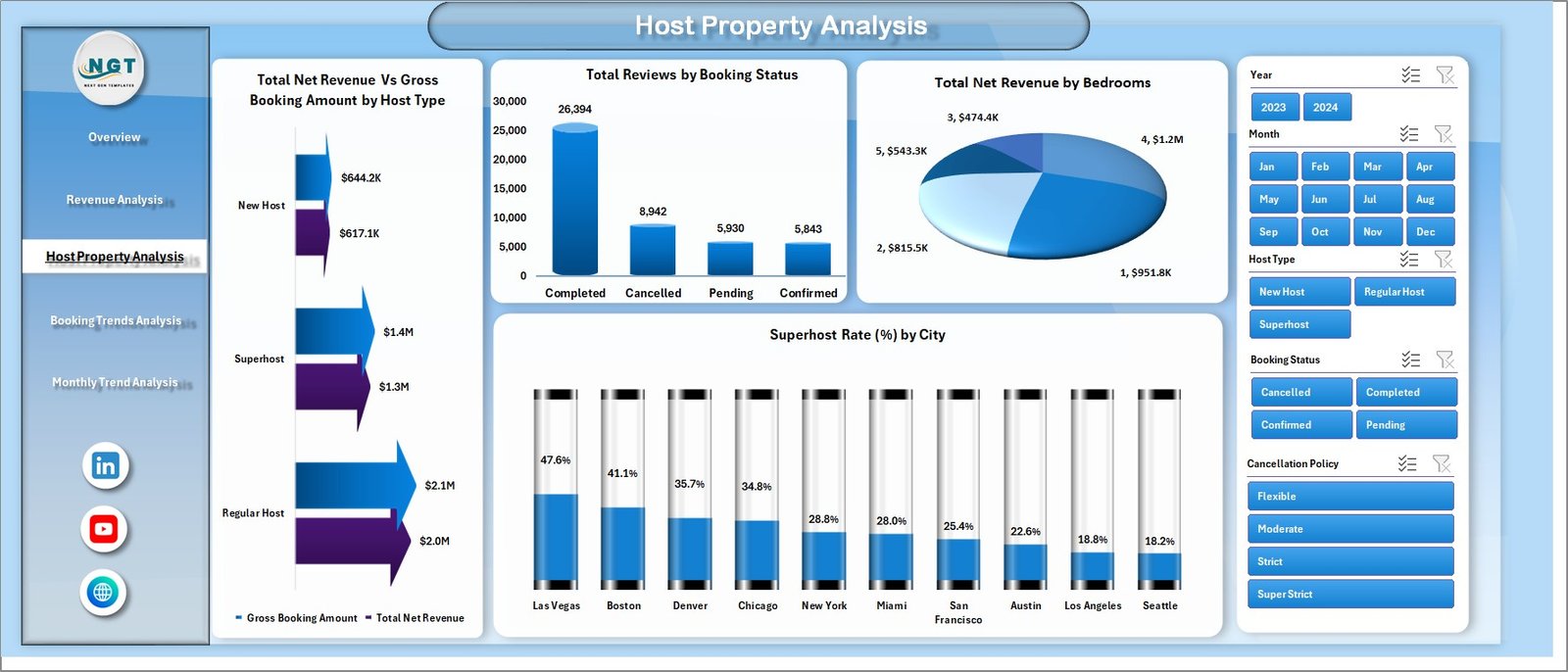
Hosts often manage different property types such as:
-
Apartments
-
Villas
-
Shared rooms
-
Entire homes
Therefore, the Host Property Analysis page focuses on property performance.
Again, the dashboard includes a right-side slicer for filtering.
Charts in Host Property Analysis
Total Net Revenue vs Gross Booking Amount by Host Type
This chart compares revenue generated by different host types.
Consequently, managers can identify top-performing hosts.
Total Net Revenue by Booking Status
This visualization shows revenue distribution across booking outcomes.
For example:
-
Completed bookings generate revenue
-
Cancelled bookings reduce revenue potential
Therefore, hosts can evaluate cancellation impact.
Total Net Revenue by Bedrooms
Property size often affects pricing.
This chart analyzes revenue based on bedroom count.
Thus, hosts can identify the most profitable property sizes.
Superhost Rate % by City
Superhosts often attract more bookings.
This chart shows the percentage of superhosts across cities.
Therefore, property managers can evaluate service quality.
Booking Trends Analysis – What Booking Patterns Exist?
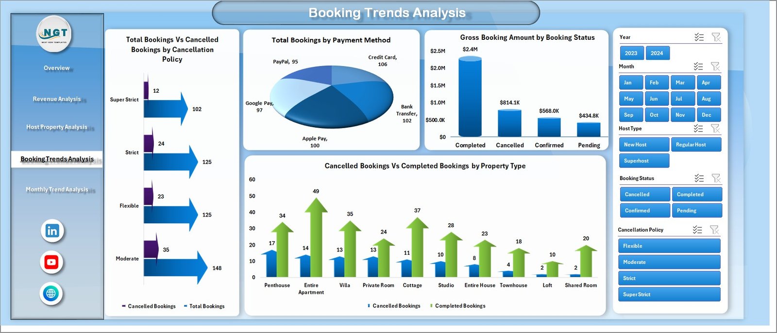
Understanding booking trends helps hosts forecast demand.
Therefore, the dashboard includes a Booking Trends Analysis page.
This page reveals patterns related to cancellations, payments, and property types.
Charts in Booking Trends Analysis
Total Bookings vs Cancelled Bookings by Cancellation Policy
Different cancellation policies influence booking behavior.
This chart compares completed bookings with cancelled bookings.
Consequently, hosts can evaluate policy effectiveness.
Total Booking by Payment Method
Guests use different payment methods such as:
-
Credit card
-
Debit card
-
Online wallets
This chart shows the most popular payment methods.
Gross Booking Amount by Booking Status
Click to Purchases Airbnb-style Rentals Dashboard in Excel
This visualization tracks the value of bookings based on status.
Therefore, hosts can analyze revenue risks caused by cancellations.
Cancelled vs Completed Booking by Property Type
Different property types experience different cancellation rates.
As a result, hosts can improve policies for high-risk property types.
Month Analysis – How Do Seasonal Trends Affect Rentals?
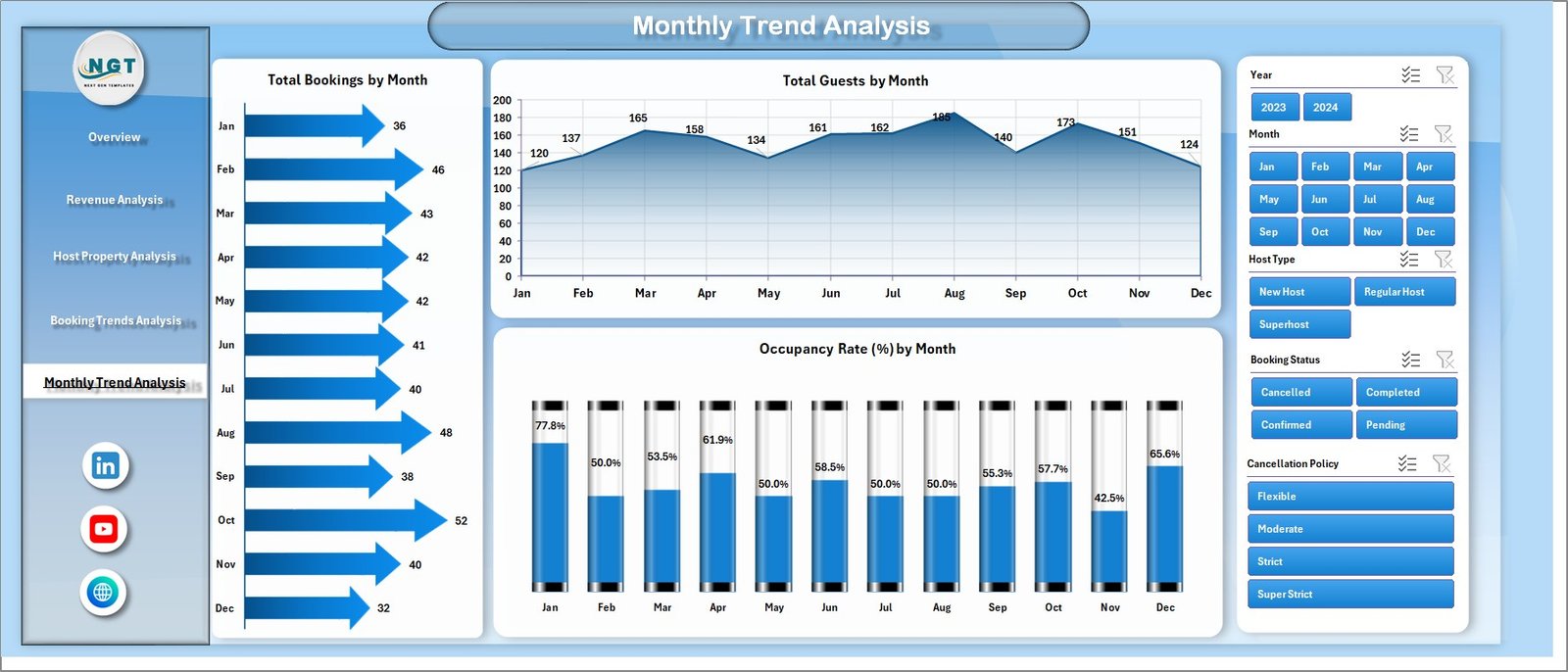
Short-term rentals often experience seasonal demand.
Therefore, the dashboard includes a Month Analysis page.
This page focuses on time-based performance trends.
Charts in Month Analysis
The page includes three key charts:
-
Total Bookings by Month
-
Total Guests by Month
-
Occupancy Rate % by Month
These charts help hosts understand:
-
High demand seasons
-
Low demand periods
-
Guest volume patterns
Therefore, hosts can optimize pricing strategies.
Advantages of the Airbnb-Style Rentals Dashboard in Excel
This dashboard offers several benefits for rental businesses.
Better Decision Making
The dashboard visualizes complex data clearly. Therefore, hosts can make informed decisions.
Improved Revenue Monitoring
Users can track revenue trends easily. As a result, they can optimize pricing strategies.
Real-Time Data Insights
Because Excel updates automatically, the dashboard reflects the latest data.
Easy Performance Tracking
Managers can analyze:
-
city performance
-
host performance
-
property performance
Thus, they can focus on profitable areas.
Better Occupancy Management
The dashboard highlights occupancy trends.
Consequently, hosts can improve property utilization.
Opportunities for Improvement
Click to Purchases Airbnb-style Rentals Dashboard in Excel
Although the dashboard provides powerful insights, users can enhance it further.
Possible improvements include:
-
Adding predictive analytics for future bookings
-
Integrating dynamic pricing models
-
Including guest satisfaction metrics
-
Adding property maintenance tracking
-
Incorporating marketing campaign performance
These improvements can make the dashboard even more powerful.
Best Practices for the Airbnb-Style Rentals Dashboard
To maximize the value of the dashboard, users should follow these best practices.
Maintain Clean Data
Always update the data sheet with accurate booking data.
Clean data ensures reliable analytics.
Update Data Regularly
Update booking information frequently.
This ensures the dashboard reflects the latest performance.
Use Filters Effectively
The dashboard includes slicers.
Use these filters to analyze:
-
cities
-
host types
-
booking status
-
months
Monitor Key Metrics
Focus on important KPIs such as:
-
occupancy rate
-
total bookings
-
cancellation rate
-
net revenue
These metrics provide valuable insights.
Review Seasonal Trends
Analyze monthly trends to identify seasonal patterns.
Then adjust pricing accordingly.
Who Can Use the Airbnb-Style Rentals Dashboard?
This dashboard benefits many professionals in the rental industry.
Airbnb Hosts
Individual hosts can track booking performance and revenue trends.
Property Managers
Managers handling multiple properties can analyze portfolio performance.
Rental Agencies
Agencies can monitor city-wise and host-wise performance.
Hospitality Analysts
Data analysts can study booking patterns and guest behavior.
How Does the Data Sheet Power the Dashboard?
The data sheet stores all booking information.
Typical data fields may include:
-
Booking ID
-
Property ID
-
City
-
Host Type
-
Property Type
-
Booking Date
-
Guest Count
-
Bedrooms
-
Payment Method
-
Cancellation Policy
-
Gross Booking Amount
-
Net Revenue
-
Booking Status
Because the dashboard uses this dataset, users must keep the data sheet updated.
Conclusion
The Airbnb-style Rentals Dashboard in Excel provides a powerful analytics solution for short-term rental businesses.
Instead of relying on manual reports, hosts can use this dashboard to monitor bookings, revenue, occupancy, and property performance.
Moreover, the dashboard organizes data into multiple analytical pages. As a result, users can explore insights quickly.
Because the dashboard includes interactive charts, slicers, and KPI cards, it simplifies rental analytics.
Therefore, hosts and property managers can improve decision-making, increase revenue, and optimize rental performance.
Frequently Asked Questions (FAQs)
What is an Airbnb-style Rentals Dashboard?
An Airbnb-style Rentals Dashboard is an Excel analytics tool that tracks rental performance metrics such as bookings, occupancy rate, revenue, and cancellations.
Why should hosts use a rental dashboard?
Hosts should use a dashboard because it simplifies performance monitoring. It also provides clear insights into revenue, occupancy trends, and booking behavior.
Can beginners use this Excel dashboard?
Yes. The dashboard uses simple Excel features such as pivot tables, charts, and slicers. Therefore, beginners can use it easily.
What metrics does the dashboard track?
The dashboard tracks several important metrics including:
-
Total bookings
-
Occupancy rate
-
Revenue performance
-
Booking cancellations
-
Guest volume
-
Host performance
Can this dashboard support multiple properties?
Yes. The dashboard can analyze multiple properties, cities, and hosts using a single dataset.
Does the dashboard support monthly trend analysis?
Yes. The Month Analysis page tracks bookings, guests, and occupancy trends across months.
Visit our YouTube channel to learn step-by-step video tutorials