Climate Change NGOs Dashboard in Excel is a powerful, pivot-based analytics template designed to help environmental organizations track budgets, expenditures, carbon offsets, beneficiaries, volunteers, and funding sources across multiple dimensions. If you manage climate-focused programs and need a structured, visual, and dynamic way to analyze your operational data, this Excel dashboard template delivers exactly what you need.
Unlike static reports and scattered spreadsheets, this dashboard uses pivot tables and pivot charts to create fully interactive and refreshable analysis. It covers five analysis pages, a data input sheet, and a support sheet—giving your team a complete, self-service reporting system inside Excel. Whether you are preparing reports for donors, tracking regional impact, or evaluating program effectiveness, this dashboard puts the data at your fingertips.
Click here to Purchase Climate Change NGOs Dashboard in Excel
Key Features of Climate Change NGOs Dashboard in Excel
This dashboard is built around pivot tables and pivot charts, which means every chart refreshes automatically when you update the underlying data. Here are the standout features that make it an essential tool for climate-focused NGOs:
- Five Dedicated Analysis Pages – Overview, Regional Analysis, Program Insights, Funding Analysis, and Impact Tracking provide multi-dimensional visibility into your operations.
- Interactive Slicers – The Overview page includes multiple slicers that allow you to filter the entire dashboard by Region, Program Type, Focus Area, Funding Source, and other dimensions instantly.
- KPI Summary Cards – High-level metrics including Total Budget, Total Expenditure, Total Beneficiaries, Total Carbon Offset, and Total Records give you a quick snapshot of overall performance.
- Dynamic Pivot Charts – Every chart is connected to a pivot table in the Support Sheet, ensuring data accuracy and easy maintenance.
- One-Click Data Refresh – Simply update the Data Sheet, go to the Data tab, and click Refresh All. Every pivot table and chart updates instantly across all pages.
- No VBA or Macros – This dashboard runs entirely on native Excel features, making it lightweight, safe, and compatible with all Excel versions.
These features make it easy for NGOs of all sizes to adopt the dashboard without any technical expertise. You can also explore the Climate Change NGOs KPI Dashboard in Power BI if you need more advanced visualization capabilities.
Dashboard Pages Explained
1. Overview Page
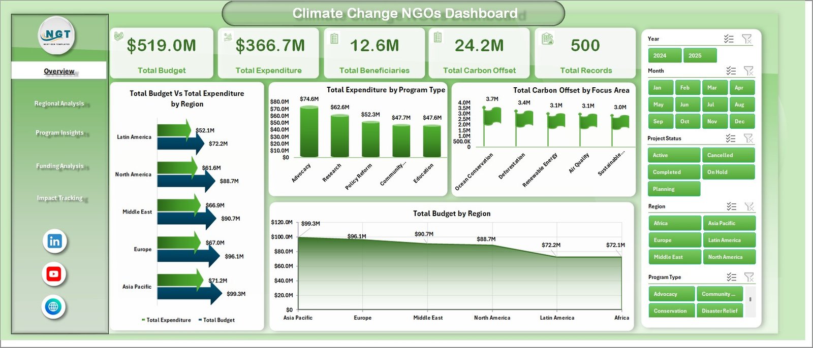
The Overview Page is the main landing page of the dashboard. At the top, you will find five KPI summary cards displaying Total Budget, Total Expenditure, Total Beneficiaries, Total Carbon Offset, and Total Records. These give you an instant high-level view of your NGO’s performance.
Below the cards, the page features four interactive charts: Total Budget vs Total Expenditure by Region helps compare spending efficiency across geographies. Total Expenditure by Program Type breaks down how funds are being utilized across different program categories. Total Carbon Offset by Focus Area shows which environmental focus areas are delivering the most impact. Total Budget by Region provides a clear view of resource allocation across different regions.
Multiple slicers on this page allow you to filter the dashboard quickly and see the results in real time.
Climate Change NGOs Dashboard2. Regional Analysis Page
The Regional Analysis page dives deeper into geographic performance. It includes four key charts: Total Beneficiaries by Country shows which countries are receiving the most support from your programs. Total Carbon Offset by Region measures environmental results across different geographic areas. Total Volunteers by Region evaluates community engagement and volunteer participation. Total Budget by Program Type reveals how different programs are funded across regions.
This page is especially useful for NGOs operating across multiple countries or regions, as it helps identify geographic strengths and areas that need more attention.
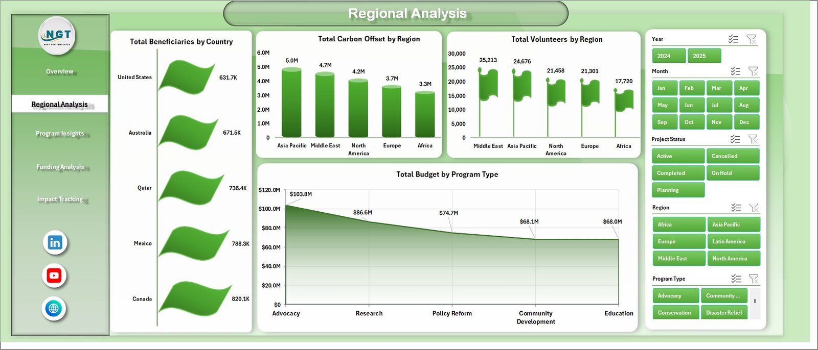 Regional Analysis
3. Program Insights Page
The Program Insights page focuses on program-level effectiveness. It features: Total Carbon Offset by Program Type which compares the environmental results delivered by each program. Total Beneficiaries by Focus Area analyzes how many people each focus area is reaching. Total Budget by Focus Area shows how resources are distributed among different environmental priorities. Total Budget by Funding Source links budget allocation to specific funding channels.
This page helps program managers understand which initiatives are performing well and where adjustments may be needed. For a more KPI-focused approach, check out the Climate Change NGOs KPI Dashboard in Excel.
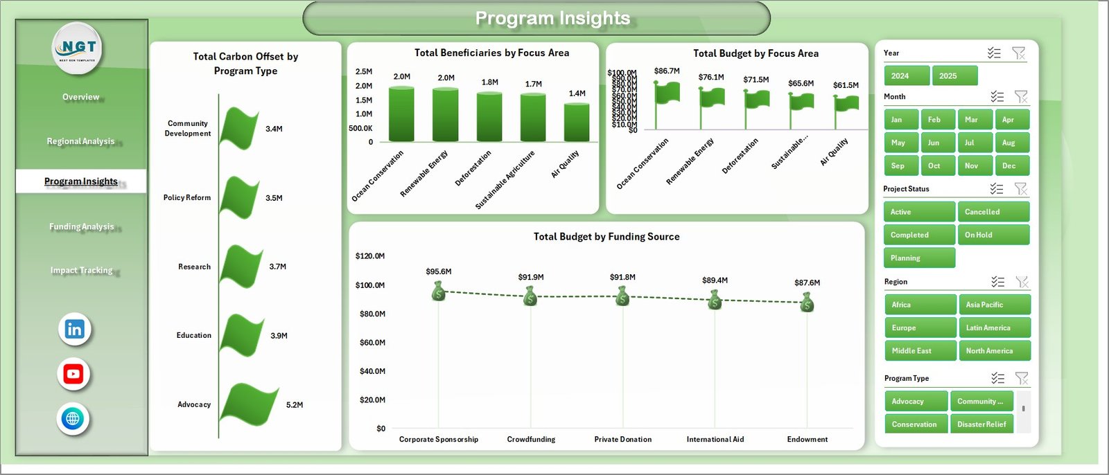 Program Insights
4. Funding Analysis Page
The Funding Analysis page provides critical visibility into how funding flows through the organization. The charts include: Total Expenditure by Funding Source reveals spending patterns by each funding channel. Total Carbon Offset by Year tracks long-term environmental impact trends. Total Records by Funding Source shows the volume of activities tied to each funding source. Total Beneficiaries by Funding Source connects donor investments directly to the people they help.
This page is invaluable for donor reporting and grant management, as it provides clear evidence of how funds are being utilized.
Click here to Purchase Climate Change NGOs Dashboard in Excel
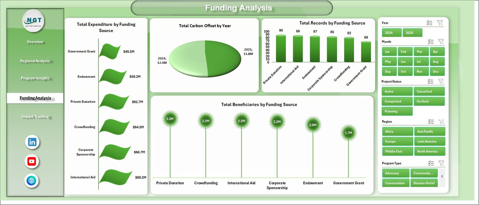 Funding Analysis
5. Impact Tracking Page
The Impact Tracking page monitors the tangible results of your climate programs over time. It includes: Total Beneficiaries by Month visualizes how beneficiary reach changes over the course of the year. Avg. Impact Score by Organization Name compares the average impact scores across different partner organizations. Total Records by Project Status shows the distribution of projects across different statuses such as active, completed, and planned.
This page helps leadership teams evaluate whether programs are gaining momentum and delivering sustained results.
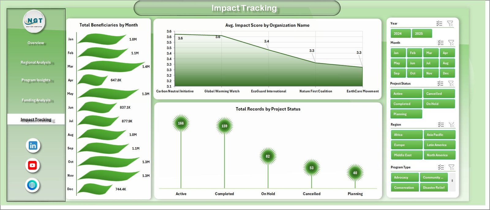 Impact Tracking
6. Data Sheet Tab
The Data Sheet is where you input all your NGO operational data in a structured, tabular format. Each row represents a record, and the columns capture key dimensions like Region, Country, Program Type, Focus Area, Funding Source, Organization Name, Budget, Expenditure, Carbon Offset, Beneficiaries, Volunteers, Impact Score, Project Status, Year, and Month. This sheet powers all the pivot tables and charts across the dashboard.
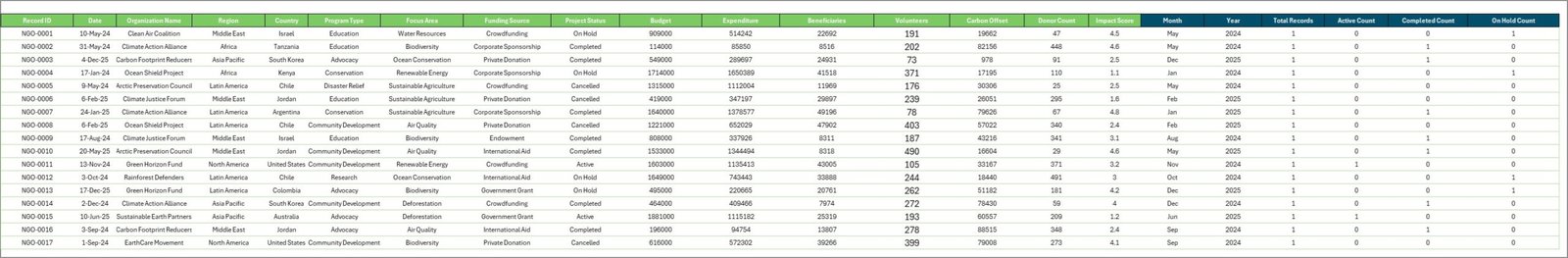 Data Sheet Tab
7. Support Sheet
The Support Sheet contains all the pivot tables that power the entire dashboard. Each pivot table is connected to a specific chart on one of the five analysis pages. When you update the Data Sheet and click Refresh All from the Data tab in Excel, all these pivot tables refresh simultaneously, and all charts update automatically. You can keep this sheet hidden for a cleaner user experience.
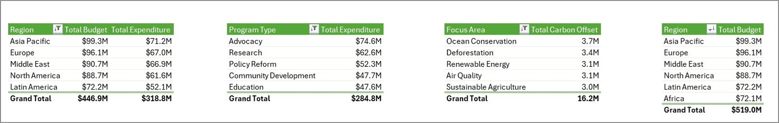 Support Sheet Tab
Advantages of Climate Change NGOs Dashboard in Excel
- Complete Visibility – Five analysis pages cover every critical dimension of NGO operations from budgets to impact.
- Fully Dynamic – Pivot tables and charts refresh automatically with one click, eliminating manual chart updates.
- Donor-Ready Reports – Clean, professional visualizations that can be used directly in donor presentations and grant reports.
- No Technical Skills Required – Built on standard Excel features without VBA, macros, or external dependencies.
- Scalable – Add more records to the Data Sheet as your programs grow, and the dashboard scales automatically.
- Interactive Filtering – Slicers on the Overview page make it easy to drill down into specific regions, programs, or funding sources.
- Click here to Purchase Climate Change NGOs Dashboard in Excel
Opportunities for Improvement
- Additional Slicers on Sub-Pages – Adding slicers to the Regional Analysis, Program Insights, and other pages would enhance granular filtering capabilities.
- Conditional Formatting on KPI Cards – Adding color-coded thresholds to the summary cards would make it easier to spot performance issues at a glance.
- Year-over-Year Comparison – Adding a dedicated page for year-over-year trend analysis would strengthen long-term impact reporting.
- Power BI Integration – Organizations with advanced needs could connect this data to Power BI for enhanced visualizations and sharing capabilities.
Best Practices for Using This Dashboard
- Maintain Consistent Data Entry – Always use the same naming conventions for Regions, Program Types, and Focus Areas in the Data Sheet to ensure pivot tables group data correctly.
- Refresh After Every Update – After adding or modifying data, always go to Data → Refresh All to update all pivot tables and charts.
- Hide the Support Sheet – Right-click the Support Sheet tab and select Hide to keep the dashboard clean for presentations.
- Back Up Regularly – Save a copy of the file before making major changes to protect your data and dashboard structure.
- Use Slicers for Presentations – During meetings or donor calls, use the interactive slicers to filter data dynamically and answer questions in real time.
Explore Relevant Templates
If you found this dashboard useful, explore these related templates on NextGenTemplates.com to enhance your NGO analytics toolkit:
- Climate Change NGOs KPI Dashboard in Excel – A KPI-focused scorecard with MTD, YTD, targets, and trend analysis for climate NGOs.
- Climate Change NGOs KPI Dashboard in Power BI – A Power BI version with advanced interactive visuals and drill-through capabilities.
- Ocean Conservation KPI Scorecard in Excel – Track marine conservation KPIs with color-coded indicators and trend charts.
- Greenhouse Farming KPI Dashboard in Excel – Monitor greenhouse farming performance with a structured KPI tracking system.
Frequently Asked Questions
What is the Climate Change NGOs Dashboard in Excel?
It is a ready-to-use Excel dashboard template designed for climate-focused NGOs. It uses pivot tables and charts to visualize budgets, expenditures, carbon offsets, beneficiaries, and more across five interactive analysis pages.
Do I need any special Excel skills to use this dashboard?
No. The dashboard is built using standard Excel features like pivot tables, pivot charts, and slicers. You just need to enter data in the Data Sheet and click Refresh All. No VBA or macros are involved.
How do I update the dashboard with new data?
Simply add new rows of data to the Data Sheet in the existing format, then go to the Data tab in Excel and click Refresh All. All pivot tables and charts will update automatically across every page.
Can I customize the dashboard pages?
Yes. Since it is built on pivot tables, you can modify chart types, add new fields, create additional analysis pages, or adjust slicers to match your specific reporting needs.
Is this dashboard compatible with all Excel versions?
This dashboard works with Excel 2016 and later versions, including Microsoft 365. Some features like slicers may have limited functionality in older Excel versions.
Who can benefit from this dashboard?
Climate change NGOs, environmental non-profits, monitoring and evaluation teams, donor reporting teams, sustainability managers, and government policy organizations can all benefit from this dashboard.
Conclusion
The Climate Change NGOs Dashboard in Excel is a comprehensive, dynamic, and easy-to-use analytics solution that empowers environmental organizations to visualize their operational data effectively. With five analysis pages covering budgets, regions, programs, funding, and impact, this dashboard delivers the insights NGOs need to improve accountability, optimize resources, and communicate results confidently.
👉 Click here to Purchase Climate Change NGOs Dashboard in Excel
🎥 Visit our YouTube channel for step-by-step tutorials: Youtube.com/@PK-AnExcelExpert