Climate Change NGOs Dashboard in Power BI is a professionally designed, ready-to-use analytics solution that helps environmental organizations visualize budgets, expenditures, carbon offsets, beneficiaries, volunteers, and regional performance across their climate programs. If your NGO is still struggling with scattered data and manual reports, this Power BI dashboard will revolutionize the way you track, analyze, and communicate your climate impact.
Click here to Purchase Climate Change NGOs Dashboard in Power BI
Built with interactive visuals, filterable slicers, and multi-page analysis, this dashboard empowers program managers, donors, and stakeholders to explore NGO performance data from every angle—without any technical complexity. Whether you manage reforestation programs, emission reduction projects, or community outreach campaigns, this dashboard gives you the clarity and confidence to make data-driven decisions.
Key Features of Climate Change NGOs Dashboard in Power BI
- Multi-Page Interactive Dashboard – Five dedicated analysis pages covering Overview, Regional Analysis, Program Insights, Funding Analysis, and Impact Tracking provide complete visibility into NGO operations.
- High-Level KPI Cards – Track Total Projects, Total Budget, Total Beneficiaries, Total Expenditure, Avg Impact Score, and Completion Rate % at a glance on the Overview page.
- Interactive Slicers – Filter data instantly by Region, Program Type, Focus Area, Funding Source, and more to drill into specific segments.
- Carbon Offset Tracking – Analyze Total Carbon Offset by Focus Area and by Region for environmental impact measurement.
- Budget vs Expenditure Analysis – Compare Total Budget and Total Expenditure by Region to identify spending efficiency and resource allocation gaps.
- Beneficiary and Volunteer Analysis – Track outreach through Total Beneficiaries by Focus Area, Total Volunteers by Region, and beneficiary trends by month.
- Funding Source Breakdown – Detailed analysis of Total Beneficiaries, Total Expenditure, and Total Projects by Funding Source for donor accountability.
- Impact and Completion Monitoring – Track Total Projects by Project Status and Completion Rate % by Funding Source for timely project delivery.
- Click here to Purchase Climate Change NGOs Dashboard in Power BI
Dashboard Pages Explained
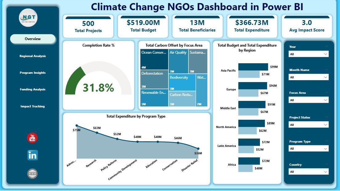
1. Overview Page
The Overview page serves as the main command center of the Climate Change NGOs Dashboard in Power BI. At the top, you will find high-level KPI cards displaying Total Projects, Total Budget, Total Beneficiaries, Total Expenditure, Avg Impact Score, and Completion Rate %. These cards give an instant executive-level snapshot of your NGO’s overall performance.
Below the cards, interactive charts provide deeper analysis. You can see Total Carbon Offset by Focus Area to understand which environmental programs contribute the most to emission reduction. The Total Budget and Total Expenditure by Region chart helps compare financial allocation against actual spending across different geographies. The Total Expenditure by Program Type chart reveals how funds are distributed across various program categories. Multiple slicers allow quick filtering to view specific data segments instantly.
Climate Change NGOs Dashboard in Power BI
2. Regional Analysis
The Regional Analysis page dives deep into geographic performance. This page contains Total Carbon Offset by Region which shows environmental impact distribution across regions. The Total Volunteers by Region chart highlights community engagement levels, while Total Budget by Program Type reveals how different programs are funded within each region. This page is essential for understanding regional strengths and identifying areas that need more support or investment.
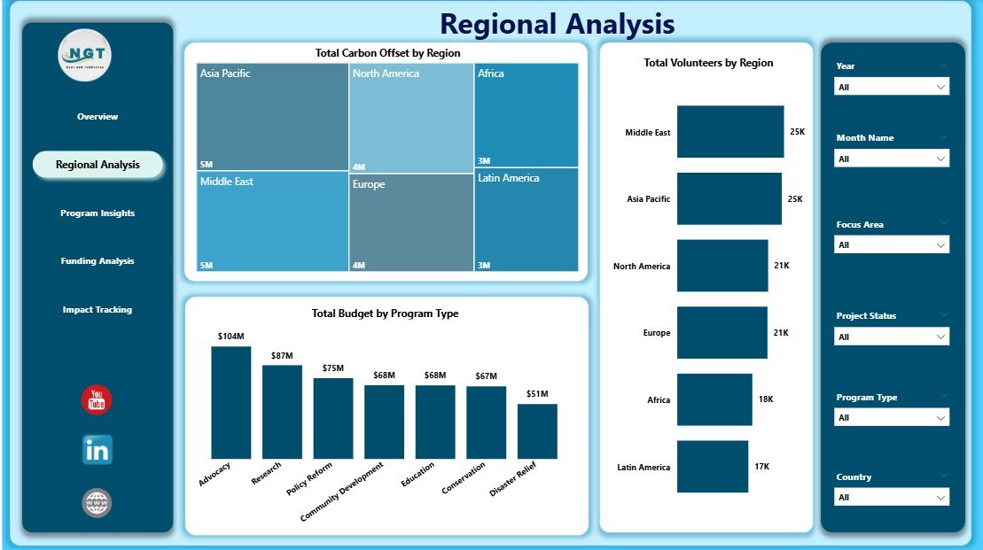
Regional Analysis
3. Program Insights
The Program Insights page focuses on program-level effectiveness. It displays Total Beneficiaries by Focus Area to evaluate which focus areas reach the most people. Total Carbon Offset by Program Type helps measure environmental outcomes by program category. Total Budget by Funding Source reveals which donors fund which programs, enabling better resource optimization and strategic planning for future initiatives.
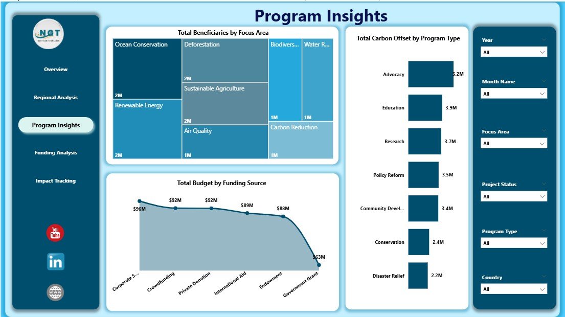
Program Insights
4. Funding Analysis
The Funding Analysis page provides a comprehensive view of financial transparency and donor performance. Charts include Total Beneficiaries by Funding Source to understand which funding channels serve the most beneficiaries. Total Expenditure by Funding Source tracks spending accountability, and Total Projects by Funding Source shows how project distribution aligns with funding commitments. This page is critical for donor reporting and grant management.
Click here to Purchase Climate Change NGOs Dashboard in Power BI
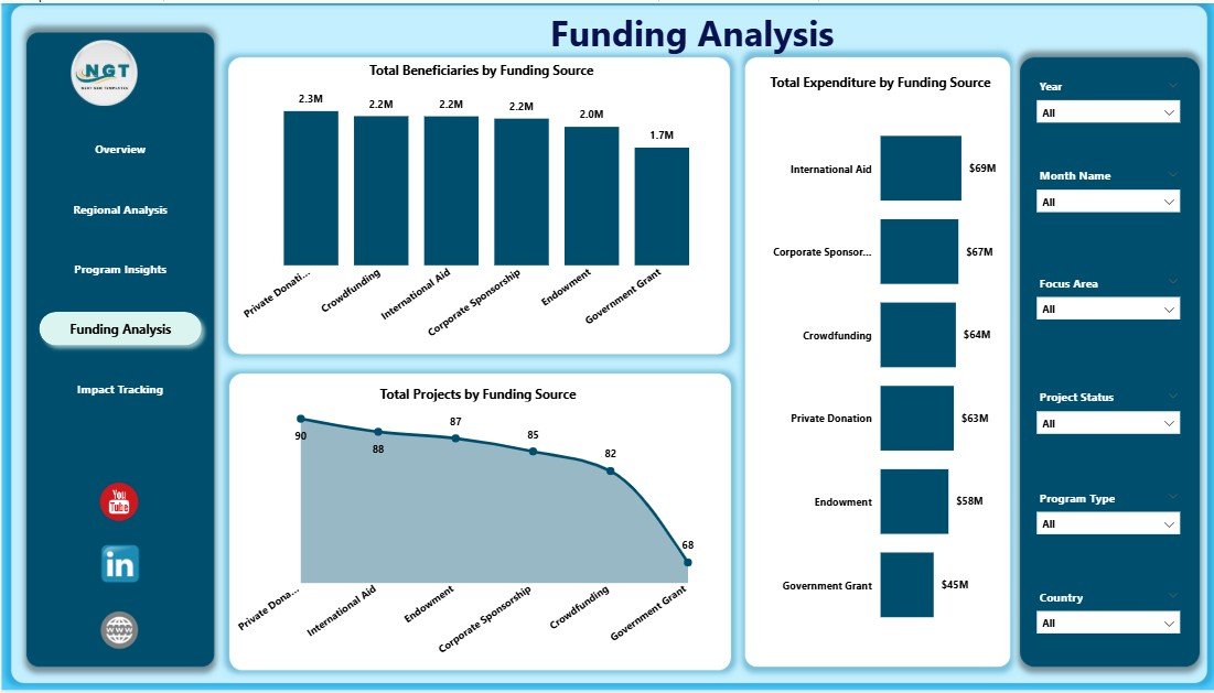
Funding Analysis
5. Impact Tracking
The Impact Tracking page monitors the long-term effectiveness of climate programs. It includes Total Projects by Project Status to understand how many projects are completed, ongoing, or pending. Completion Rate % by Funding Source reveals which funding channels deliver the best results. Total Beneficiaries by Month Name tracks community reach over time, helping organizations spot seasonal trends and plan future campaigns strategically.
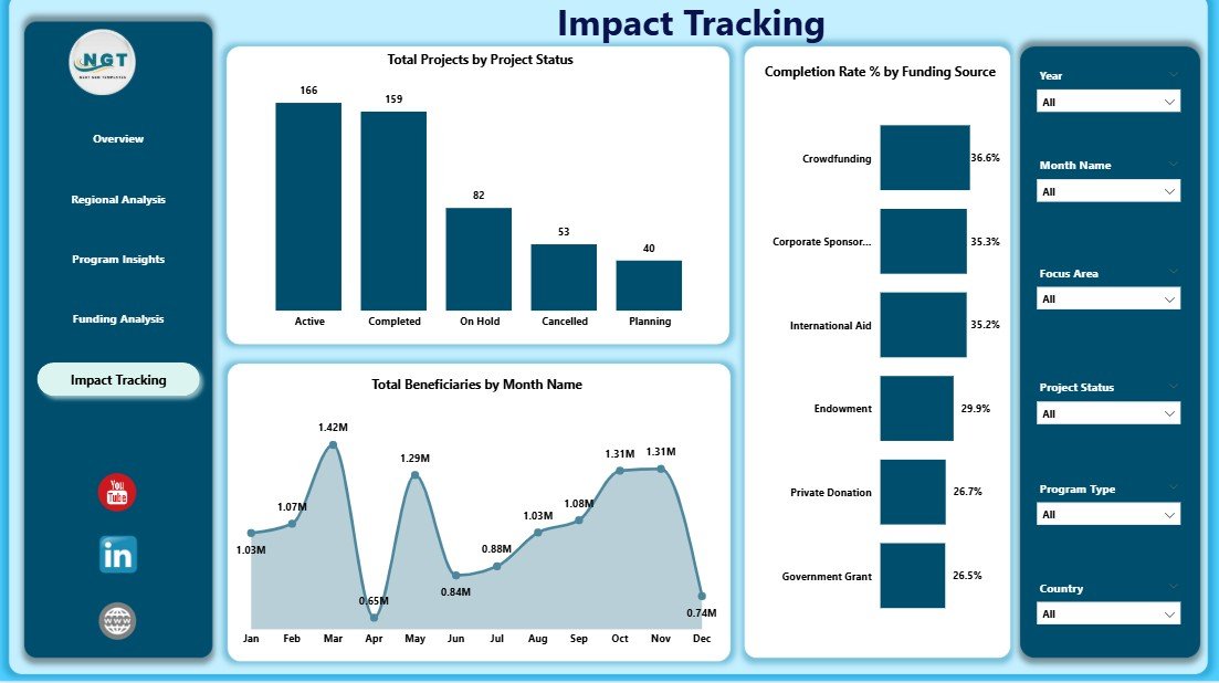
Impact Tracking
Advantages of Climate Change NGOs Dashboard in Power BI
- Instant Visual Insights – Transform raw NGO data into compelling, interactive visuals that tell the story of your climate impact without manual effort.
- Multi-Dimensional Analysis – Explore data across five dedicated pages covering overview metrics, regions, programs, funding, and impact for comprehensive organizational visibility.
- Donor-Ready Reporting – Present transparent, data-backed reports to donors, funders, and stakeholders with confidence using professional Power BI visuals.
- Time-Saving Automation – Simply connect your data and refresh—all charts, cards, and slicers update automatically without recalculating anything manually.
- Data-Driven Decision Making – Identify underperforming regions, optimize budget allocation, and improve program delivery based on actual performance data.
- Flexible and Scalable – Works for NGOs of all sizes—from small environmental nonprofits to large international conservation organizations.
Opportunities for Improvement
- Custom KPI Addition – Organizations can add additional KPIs specific to their programs, such as specific emission targets, species recovery metrics, or community satisfaction scores.
- Data Source Integration – Connect the dashboard to live data sources such as SharePoint, SQL databases, or cloud APIs for real-time data updates instead of manual file refreshes.
- Drill-Through Pages – Add drill-through pages for project-level details so users can click on a region or program and see granular data beneath the summary visuals.
- Mobile Optimization – Create a Power BI mobile layout so field teams can access dashboard insights directly from their phones or tablets.
Best Practices for Using This Dashboard
- Update your data source regularly (monthly or quarterly) to keep all visuals current and accurate.
- Use slicers on the Overview page to create focused views for specific donor reports or board presentations.
- Compare regional performance side by side to identify areas that need more investment or support.
- Monitor Completion Rate % closely to ensure projects stay on track and funding is used efficiently.
- Share the Power BI report with stakeholders via Power BI Service for collaborative access and commenting.
- Refer to Microsoft Power BI documentation for advanced customization and data modeling tips.
Explore Relevant Templates
If you found the Climate Change NGOs Dashboard in Power BI useful, explore these related templates from NextGenTemplates:
- Climate Change NGOs Dashboard in Excel – The Excel version with pivot tables and pivot charts for organizations that prefer working in Excel.
- Climate Change NGOs KPI Dashboard in Power BI – A KPI-focused dashboard with MTD, YTD, target vs actual tracking, and trend analysis.
- Climate Change NGOs KPI Dashboard in Excel – Track climate KPIs in Excel with structured input sheets and automated formulas.
- Ocean Conservation KPI Scorecard in Excel – Track marine conservation KPIs including water quality, biodiversity, and pollution.
- Charity Fundraising KPI Dashboard in Google Sheets – Monitor donation success, donor retention, and fundraising ROI.
Frequently Asked Questions
What software do I need to use this dashboard?
You need Microsoft Power BI Desktop, which is free to download from the official Microsoft website. The dashboard comes as a .pbix file that opens directly in Power BI Desktop.
Can I replace the sample data with my own NGO data?
Yes, the dashboard is fully customizable. You can connect your own data source or replace the existing Excel data file with your organization’s operational data and refresh the dashboard.
How many pages does this dashboard have?
The dashboard includes five interactive pages: Overview, Regional Analysis, Program Insights, Funding Analysis, and Impact Tracking. Each page is designed to provide specific analytical perspectives.
Is this dashboard suitable for donor reporting?
Absolutely. The Funding Analysis and Impact Tracking pages are specifically designed to present transparent, data-backed reports that donors and stakeholders expect from climate organizations.
Can I add more KPIs or charts to the dashboard?
Yes. Since it is built in Power BI, you can easily add new visuals, KPI cards, calculated measures, or additional pages to suit your specific program requirements.
Do I need coding skills to use this dashboard?
No. The dashboard requires no coding or technical expertise. Simply update the data, click Refresh, and use the interactive slicers and charts to explore your NGO’s performance data.
Conclusion
The Climate Change NGOs Dashboard in Power BI is a must-have analytics tool for any environmental organization serious about tracking impact, improving transparency, and making data-driven decisions. With five interactive pages, high-level KPI cards, dynamic slicers, and detailed charts, this dashboard transforms complex NGO data into clear, actionable insights.
Click here to Purchase Climate Change NGOs Dashboard in Power BI
Visit our YouTube channel for step-by-step video tutorials: Youtube.com/@PK-AnExcelExpert