SaaS Financial Model Dashboard in Power BI is a comprehensive, ready-to-use Power BI template built for SaaS founders, finance leaders, and data analysts who need to track monthly recurring revenue, customer acquisition, churn, and profitability from a single interactive report. SaaS Financial Model Dashboard in Power BI With 5 professionally designed dashboard pages, this template transforms your raw SaaS financial data into actionable insights that drive smarter business decisions. Whether you are preparing for a board meeting, investor pitch, or quarterly business review, this dashboard gives you everything you need to present your SaaS financial health with confidence.
Click to Purchases SaaS Financial Model Dashboard in Power BI
Key Features of the SaaS Financial Model Dashboard in Power BI
This Power BI SaaS dashboard template is packed with features that make financial modeling and reporting effortless for subscription-based businesses:
- 5 Interactive Dashboard Pages – Overview, Revenue Breakdown, Customer Metrics, Profitability, and Retention Analysis provide a 360-degree view of your SaaS business performance.
- Real-Time KPI Cards – Five key metrics (Total MRR, Total Revenue, Total New Customers, Total Expansion Revenue, Total Records) are displayed prominently on the Overview page for instant visibility.
- Dynamic Slicers and Filters – Filter your entire dashboard by plan, region, industry, sales channel, and payment method to analyze specific segments of your business.
- Revenue and Cost Tracking – Compare total revenue against cost of revenue month over month, track MRR by plan, and analyze revenue by sales channel to understand your unit economics.
- Churn and Acquisition Analysis – Monitor new customers by plan and region, track churned customers by month, and evaluate average customer acquisition cost (CAC) by plan.
- Profitability Insights – Analyze revenue by region, expansion revenue by plan, and cost of revenue trends to identify where your margins are strongest.
- Plug-and-Play Design – Replace the sample data with your own SaaS metrics and every chart, card, and visual updates automatically. No DAX expertise required.
Dashboard Pages Explained
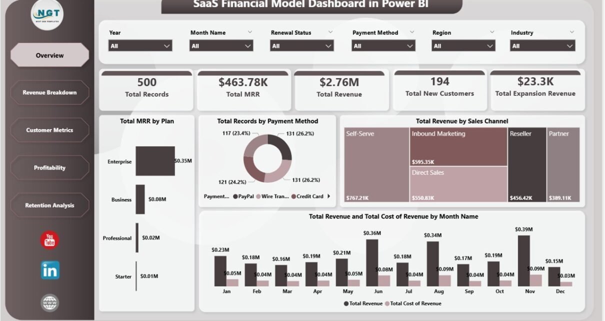
1. Overview Page
The Overview page serves as the command center of your SaaS financial model. At the top, five KPI cards display Total Records, Total MRR, Total Revenue, Total New Customers, and Total Expansion Revenue. These cards give you an instant pulse check on your business health without scrolling through multiple reports. Below the cards, you will find four key visualizations: Total MRR by Plan shows how your revenue distributes across pricing tiers, Total Records by Payment Method reveals customer payment preferences, Total Revenue by Sales Channel highlights which acquisition channels generate the most revenue, and a combined view of Total Revenue and Total Cost of Revenue by Month Name helps you track profitability trends over time. Multiple slicers on this page allow you to apply filters and see the filtered dashboard instantly.
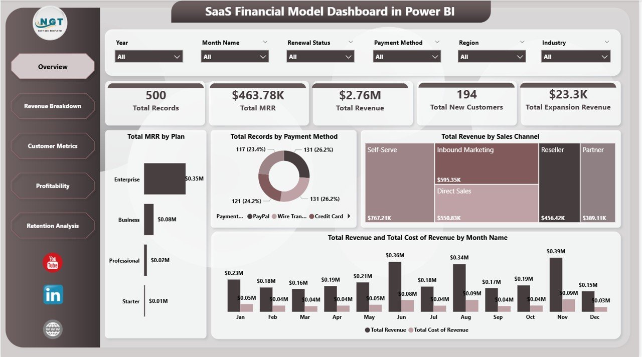
Overview Page
2. Revenue Breakdown
The Revenue Breakdown page lets you dive deeper into where your money is coming from. This page features three powerful visualizations: Total MRR and Total Revenue by Industry reveals which verticals are your strongest performers, Total Revenue by Plan breaks down income across your pricing tiers to show which plans drive the most value, and Total Expansion Revenue by Sales Channel tracks upsell and expansion revenue by how customers found you. This page is essential for SaaS leaders who want to understand revenue concentration risk and identify growth opportunities across different market segments.
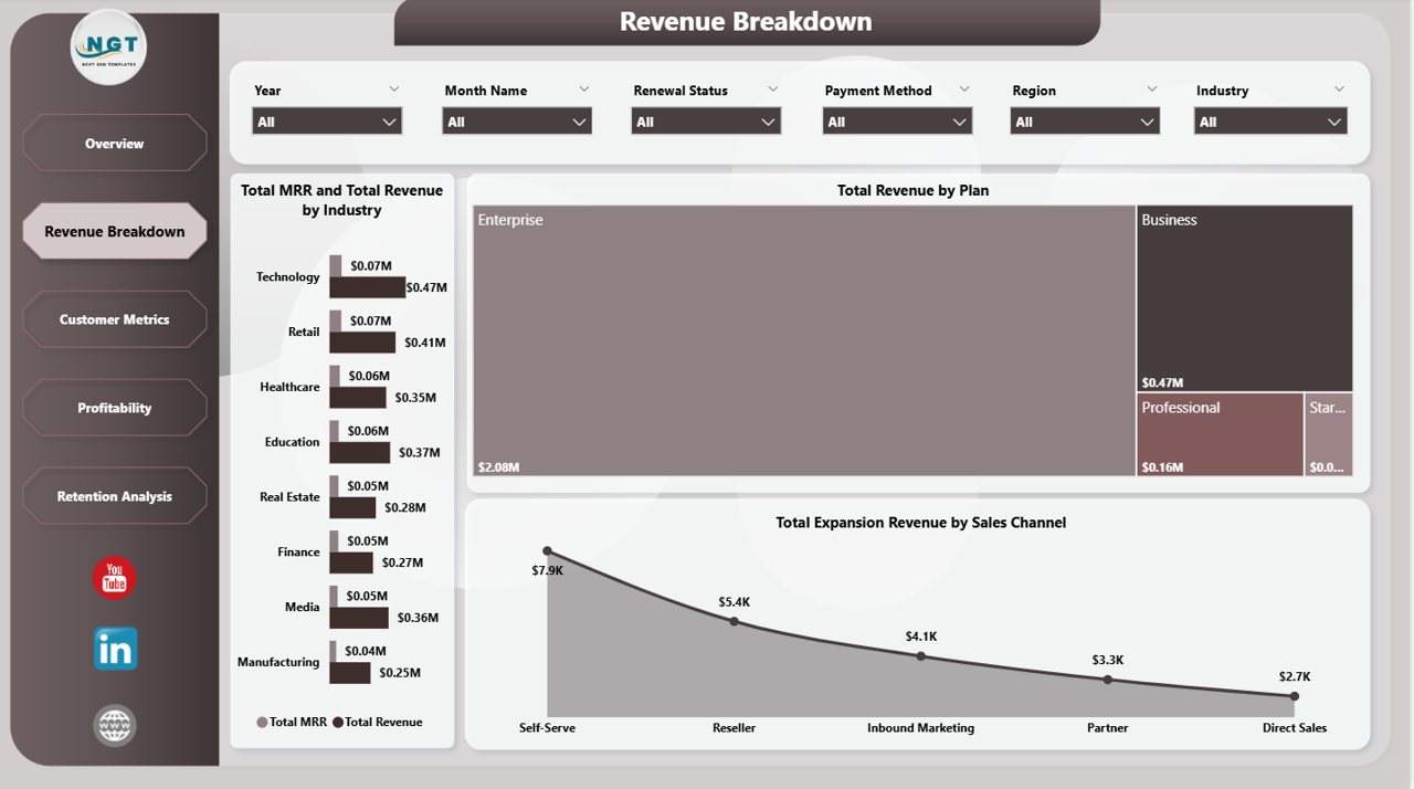
Revenue Breakdown
3. Customer Metrics
The Customer Metrics page focuses entirely on your customer lifecycle. It features Total New Customers by Plan to show which pricing tiers attract the most signups, a combined view of Total Churned Customers and Total New Customers by Month Name that lets you compare acquisition against attrition over time, and Total New Customers by Region to identify geographic trends in your customer base. This page is critical for product and marketing teams who need to understand where customers are coming from and why they leave.
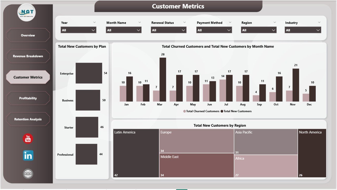
Customer Metrics
4. Profitability
The Profitability page gives you clear visibility into your margin health. It tracks Total Revenue by Region so you can see which geographies generate the most income, Total Expansion Revenue by Plan to understand which tiers drive the most upsell revenue, and Total Cost of Revenue by Month Name to monitor whether your costs are scaling proportionally with growth. For CFOs and finance teams, this page provides the data needed to make strategic decisions about resource allocation, pricing adjustments, and market expansion.
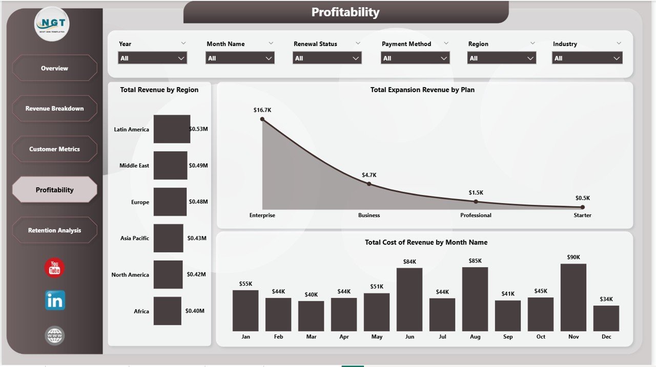
Profitability
5. Retention Analysis
The Retention Analysis page focuses on customer retention health and acquisition efficiency. It visualizes Total Revenue by Payment Method to show how different payment types correlate with revenue, Total Churned Customers by Month Name to identify seasonal churn patterns, and Avg CAC by Plan to evaluate how efficiently you are acquiring customers across each pricing tier. This page is invaluable for growth teams and investors who want to understand the sustainability of your customer acquisition strategy.
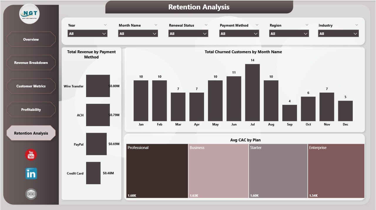
Retention Analysis
Advantages of the SaaS Financial Model Dashboard in Power BI
- Complete Financial Visibility – Five dedicated pages cover every critical dimension of SaaS financial health from revenue to retention.
- Investor-Ready Reporting – Professional layout and clear KPI presentation make this ideal for board decks and investor updates.
- Time-Saving Automation – No need to build visuals from scratch. Replace data and your entire dashboard is ready in minutes.
- Cross-Functional Insights – Useful for finance, product, marketing, and leadership teams to make data-driven decisions.
- Flexible Filtering – Dynamic slicers let you drill into any segment — by plan, region, industry, channel, or payment method.
Opportunities for Improvement
- You could add cohort-based retention analysis to track how different customer cohorts behave over time.
- Connecting to a live database (SQL Server, Azure) would enable real-time data refresh instead of manual data replacement.
- Adding a dedicated forecasting page with DAX time-intelligence functions could help predict future MRR and churn.
- Including a Net Revenue Retention (NRR) metric would provide deeper insight into expansion vs. contraction revenue.
Best Practices for Using This SaaS Dashboard
- Update Monthly – Refresh your data at least once a month to keep KPIs current and spot trends early.
- Use Bookmarks – Create Power BI bookmarks for common filter combinations so you can switch views instantly during presentations.
- Share via Power BI Service – Publish to Power BI Service to share interactive reports with your team without sending files.
- Combine with Other Dashboards – Pair this with the SaaS Metrics Dashboard in Power BI for a complete operational and financial reporting suite.
Explore Relevant Templates
If you found this SaaS Financial Model Dashboard useful, check out these related templates on NextGenTemplates.com:
- SaaS Metrics Dashboard in Power BI – Track operational SaaS KPIs including churn rate, LTV, and customer health scores.
- Subscription Business Dashboard in Power BI – Comprehensive subscription analytics with renewal tracking and cohort analysis.
- SaaS Financial Model Dashboard in Excel – Prefer Excel? Get the same financial model in a spreadsheet format.
- SaaS Metrics Dashboard in Google Sheets – Cloud-based SaaS analytics you can access from anywhere.
Also read: SaaS Metrics Dashboard in Power BI | Subscription Business Dashboard in Power BI | SaaS Financial Model Dashboard in Excel
Frequently Asked Questions
What KPIs does the SaaS Financial Model Dashboard in Power BI track?
This dashboard tracks 5 key performance indicators: Total MRR, Total Revenue, Total New Customers, Total Expansion Revenue, and Total Records. It also provides analysis of churn trends, average customer acquisition cost by plan, revenue by industry and region, and cost of revenue by month across 5 interactive pages.
Do I need advanced Power BI skills to use this template?
No. The SaaS Financial Model Dashboard in Power BI is a plug-and-play template. Open the .pbix file in Power BI Desktop, replace the sample data with your own, and all visuals update automatically. No DAX coding or advanced configuration is needed.
What is the best Power BI dashboard for tracking SaaS MRR and revenue?
The SaaS Financial Model Dashboard in Power BI is one of the best templates for tracking MRR, total revenue, expansion revenue, customer churn, and profitability in one interactive report. It is designed specifically for subscription and SaaS businesses.
Can I connect this dashboard to a live data source?
Yes. Power BI Desktop supports direct connections to SQL Server, Azure SQL, Excel files, Google Sheets (via connectors), and many other data sources. You can replace the sample data source with your live database for automatic refresh.
Click to Purchases SaaS Financial Model Dashboard in Power BI
How is this different from the SaaS Metrics Dashboard in Power BI?
The SaaS Metrics Dashboard in Power BI focuses on operational metrics and customer health. This SaaS Financial Model Dashboard emphasizes financial modeling — profitability analysis, cost of revenue tracking, expansion revenue by sales channel, and revenue by industry — making it ideal for CFOs and finance teams.
Who should use this SaaS financial dashboard?
This dashboard is built for SaaS founders, CFOs, FP&A analysts, data analysts, product managers, venture capital analysts, and business consultants who need comprehensive financial visibility into subscription-based businesses.
Conclusion
The SaaS Financial Model Dashboard in Power BI is your all-in-one solution for tracking MRR, revenue, customer metrics, profitability, and retention in a single interactive Power BI report. With 5 professionally designed pages, dynamic slicers, and a plug-and-play design, this template saves hours of manual reporting and gives your team the financial insights they need to grow faster. Click here to Purchase the SaaS Financial Model Dashboard in Power BI and take control of your SaaS financial reporting today!
🎥 Visit our YouTube channel for step-by-step video tutorials: Youtube.com/@PK-AnExcelExpert