Cement manufacturers deal with one of the most data-intensive supply chains in heavy industry: dozens of product grades, multiple plant locations, shifting regional demand, and complex distribution channels. Most plant managers and sales directors still piece together this picture from scattered Excel reports and monthly summary emails. The Cement Products Dashboard in Power BI changes that — consolidating every commercial and operational metric into five interactive report pages that update in seconds from a single Excel data file.
This post walks through every page of the dashboard, explains what each chart reveals, and shows you how to get it running on your own data with Microsoft Power BI Desktop (free). Whether you manage one cement plant or a multi-regional distribution network, this template gives your team a shared analytics language.
Why Cement Manufacturers Need a Dedicated Power BI Dashboard
The global cement industry produces over 4 billion metric tonnes annually, with margins heavily influenced by regional demand, fuel costs, product quality, and distribution efficiency. A generic sales dashboard misses the sector-specific signals that matter: bag volume by quality grade, plant-level revenue-to-cost ratios, and customer satisfaction scores tied to production output. The Cement Products Dashboard in Power BI is built around these specific KPIs, giving operations teams a tool that speaks their language rather than a generic BI template they have to retrofit.
Power BI’s strength for cement analytics lies in its ability to cross-filter across multiple pages. Selecting a region on the Overview page instantly narrows every chart on every page to that region — a workflow that would take minutes of manual pivot table re-sorting in Excel. For multi-plant cement companies running daily reporting cycles, that speed difference compounds into hours of analyst time saved each month.
Dashboard Structure: 5 Pages at a Glance
The dashboard ships with five report pages, each focused on a distinct layer of the cement business. Here’s what each page covers and the specific analytical questions it answers.
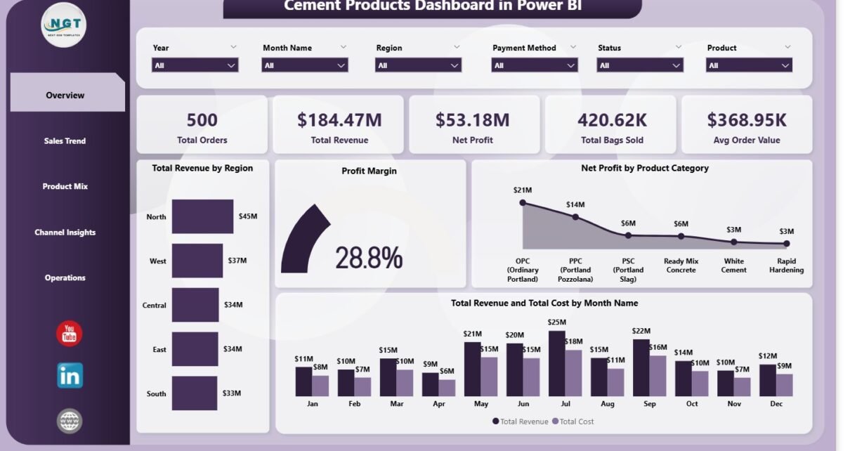
Page 1: Overview
The Overview is the landing page for executives and senior managers. Five KPI cards at the top give an instant pulse on business health:
- Total Orders — the number of cement orders processed in the selected period
- Total Revenue — gross revenue across all products, regions, and customer types
- Net Profit — revenue minus total cost, giving the bottom-line figure
- Total Bags Sold — a volume metric critical for production planning and logistics
- Avg Order Value — average revenue per order, a proxy for product mix quality and pricing effectiveness
Below the KPI cards, four charts give analytical depth:
- Total Revenue by Region — a bar or map visual showing where revenue is concentrated geographically, helping identify high-growth and underperforming territories
- Profit Margin — the blended margin percentage, enabling period-over-period comparison to track whether profitability is improving or eroding
- Net Profit by Product Category — breaks down bottom-line contribution by cement type (OPC, PPC, PSC, white cement, etc.), revealing which grades drive returns and which drag margins
- Total Revenue and Total Cost by Month Name — a dual-series chart tracking the gap between revenue and cost month by month, surfacing seasonal patterns in both demand and input cost volatility
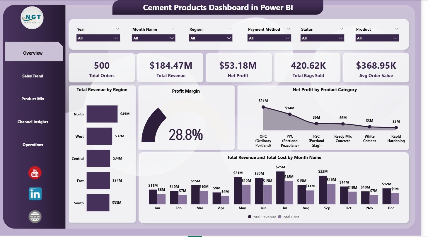
Overview Page — KPI cards and four analytical charts with dynamic slicers
Multiple slicers across the top or side panel let users filter every visual simultaneously by Region, Product Category, Customer Type, Plant, and Date Range — making the Overview page a fully interactive command center rather than a static summary.
Page 2: Sales Trend
The Sales Trend page is designed for finance and commercial teams who need to understand how performance evolves over time. Three visualizations form the analytical core:
- Total Revenue by Month Name — plots monthly revenue across the year, making seasonal peaks (typically aligned with construction activity peaks in Q1 and Q3 in most markets) immediately visible
- Profit Margin by Month Name — shows how margin fluctuates month to month, surfacing the months where fuel surcharges, raw material costs, or freight increases compressed profitability
- Net Profit by Region — adds the geographic dimension to time-series analysis, allowing managers to identify whether margin erosion is a company-wide issue or concentrated in specific distribution regions
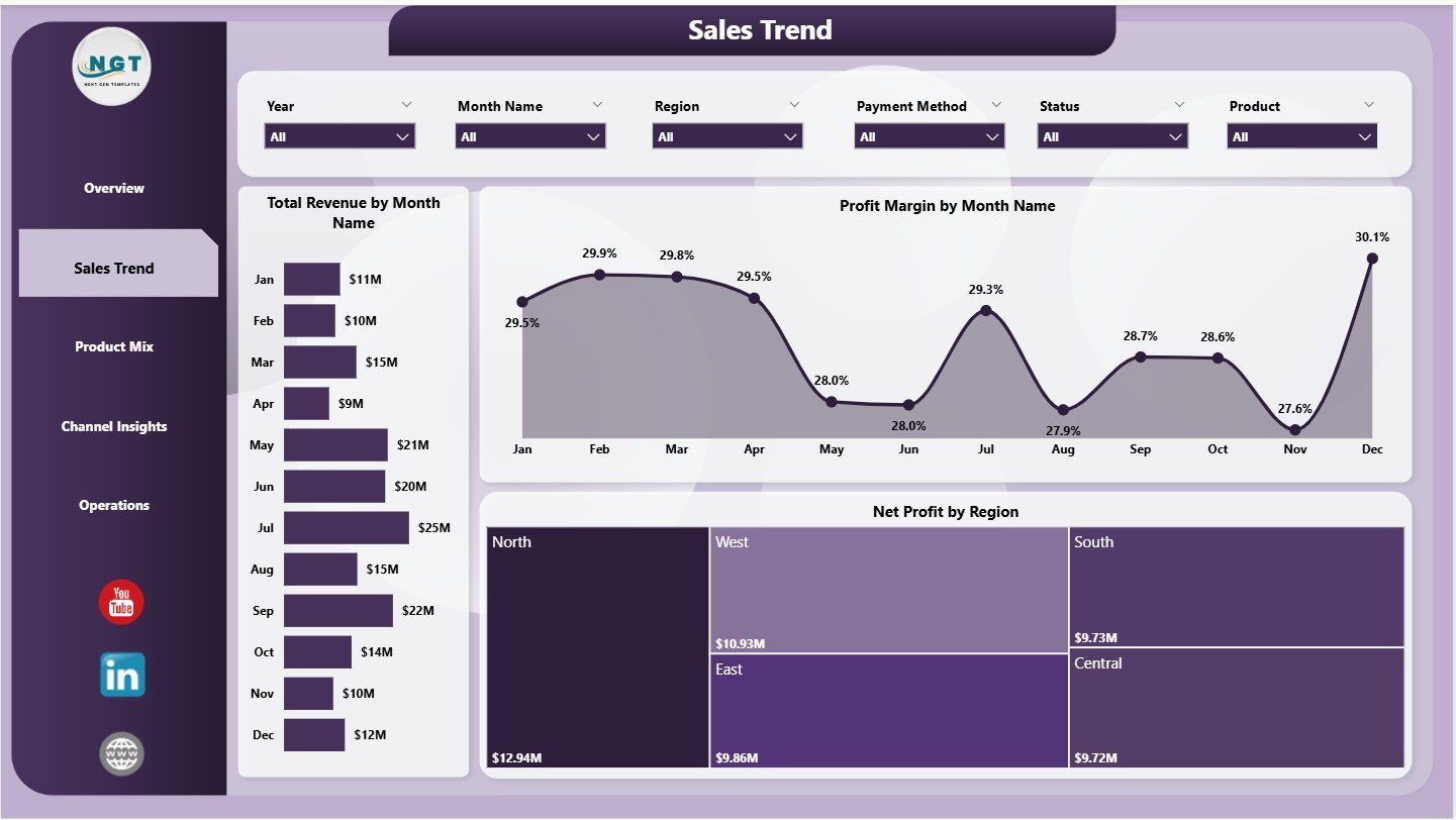
Sales Trend Page — Monthly revenue, margin, and regional profit trend analysis
This page pairs naturally with the Overview for root-cause analysis: when the Overview shows a margin dip in Q2, the Sales Trend page pinpoints exactly which months and which regions drove the compression. That combination typically answers the question in one dashboard session rather than three report requests.
Page 3: Product Mix
Product portfolio decisions in cement manufacturing hinge on understanding which grades generate margin and which drive volume. The Product Mix page addresses both dimensions with three charts:
- Profit Margin by Product Category — compares margin rates across OPC, PPC, PSC, SRC, white cement, and other specialty grades; this is the foundational view for production mix optimization
- Total Orders by Quality Grade — shows customer demand distribution across standard, premium, and specialty grades; a high volume of standard-grade orders with low premium uptake signals a pricing or product positioning opportunity
- Total Revenue by Product Category — reveals revenue contribution per category, which often tells a different story from volume share; a category with 30% of orders but only 15% of revenue indicates systematic underpricing or a value-destructive product mix
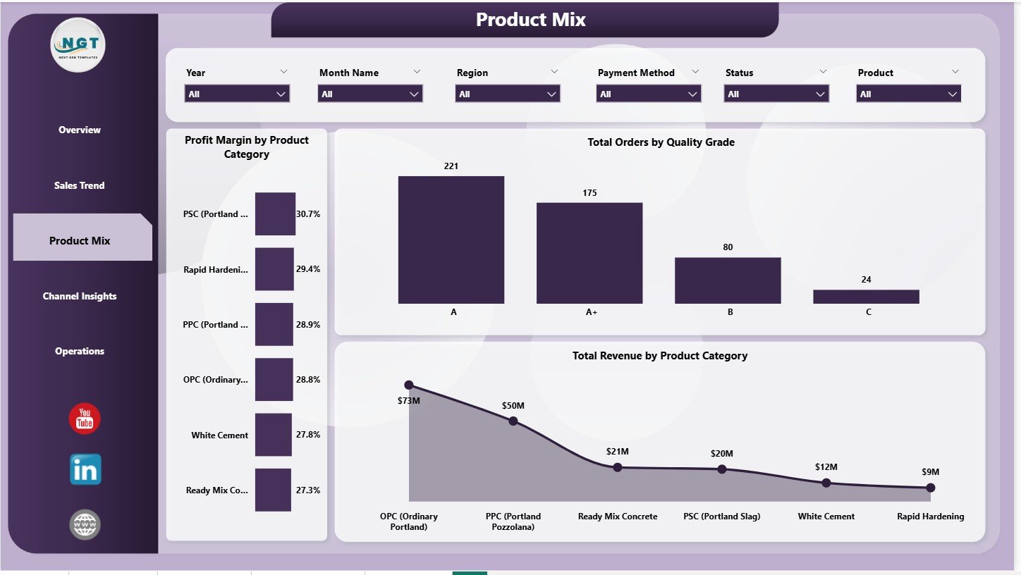
Product Mix Page — Margin by category, orders by quality grade, and revenue by product
For product managers and pricing teams, this page often surfaces the clearest action items: deprioritize low-margin, high-volume grades that tie up kiln capacity without proportional revenue contribution, and double down on high-margin specialty products where demand exists.
Page 4: Channel Insights
How cement reaches end users varies enormously: wholesale distributors bulk-buying at thin margins, retail dealers serving small contractors, direct institutional buyers like government road agencies, and large-project direct-supply deals. The Channel Insights page maps revenue and volume across these segments:
- Total Bags Sold by Customer Type — shows volume distribution across customer segments, revealing whether the business is volume-driven by one dominant channel or balanced across multiple
- Total Revenue by Customer Type — the revenue view of the same split; when revenue share per segment diverges significantly from volume share, it signals margin differential between channels worth investigating
- Total Revenue by Payment Method — tracks the cash/credit/advance split, which directly impacts working capital and collection cycles; a heavy credit exposure with slow payment terms is a cash flow risk that this chart makes immediately visible
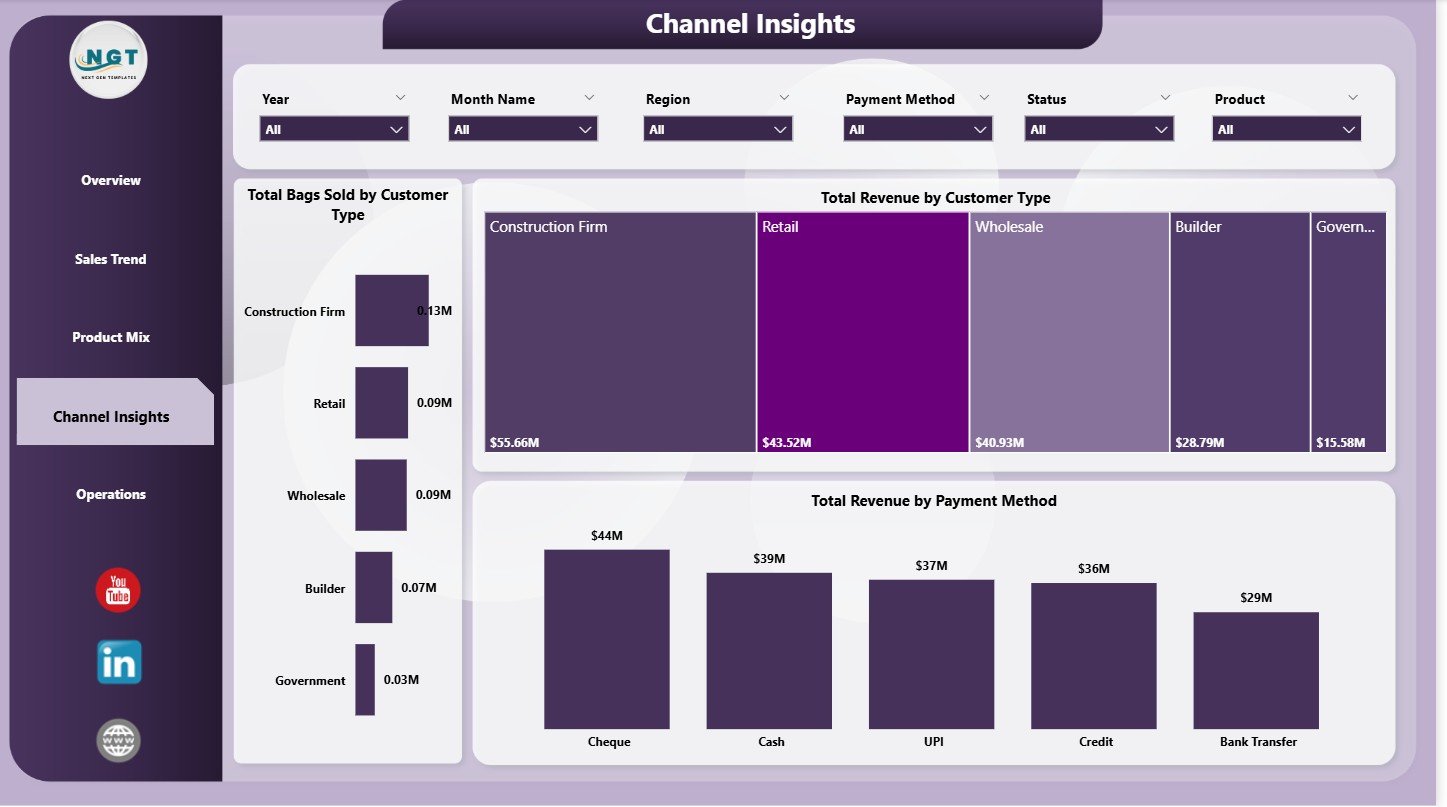
Channel Insights Page — Volume, revenue, and payment analysis by customer type
Finance directors use this page to make the case for channel mix adjustments: shifting volume from low-margin wholesale channels toward higher-margin direct institutional contracts, or tightening credit terms for customer types with poor collection histories.
Page 5: Operations
The Operations page brings the production and supply chain perspective into the dashboard, closing the loop between commercial performance and manufacturing reality:
- Avg Customer Rating by Plant — links output quality to customer satisfaction at the plant level; a consistently low rating at one plant is a signal of quality control, packaging, or logistics issues specific to that facility
- Total Revenue and Total Cost by Plant — the plant-level P&L view, showing which facilities generate the highest contribution margin and which have cost structures out of line with their revenue output; essential for multi-plant capital allocation decisions
- Total Orders by Status — tracks the order fulfillment pipeline across statuses (confirmed, in-production, dispatched, delivered, cancelled); a growing stack of in-production orders without a corresponding rise in dispatched orders signals a logistics or scheduling bottleneck
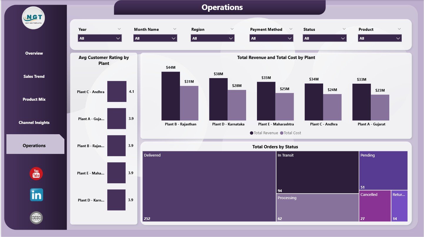
Operations Page — Plant-level P&L, customer ratings, and order status pipeline
This page is where production managers and COOs spend most of their time. Combined with the Overview’s regional filters, it answers the question that dominates multi-plant cement operations reviews: which plants are performing well, which need intervention, and where are orders stacking up in the pipeline.
How to Set Up the Dashboard with Your Data
- Download the ZIP file from your NextGenTemplates account and extract it to a local folder
- Open Data.xlsx and review the column structure — it includes order date, product category, quality grade, region, plant, customer type, payment method, revenue, cost, bags sold, and customer rating fields
- Replace the sample data with your own cement sales and operations records, keeping the column headers exactly as provided
- Open the .pbix file in Power BI Desktop — the free version from Microsoft works fully for local use
- Click Transform Data > Data Source Settings to point the file path to your updated Data.xlsx location
- Click Refresh — all 5 pages update instantly with your real data
- Use the slicers to filter by any dimension and share the .pbix with colleagues, or publish to Power BI Service for browser-based access
Download the Cement Products Dashboard in Power BI
The template is available now at NextGenTemplates for $17.99 (regular price $24.99). The ZIP file contains the complete .pbix dashboard and the structured Data.xlsx file ready for your data. No Power BI Pro license required for local use.
➡ Download the Cement Products Dashboard in Power BI
Also available: the Cement Products Dashboard in Excel for teams who prefer pivot tables and slicers over Power BI.
Related Power BI Dashboards for Manufacturing
- Contract Manufacturing Dashboard in Power BI
- Packaging Machine Downtime Dashboard in Power BI
- Oil and Gas Analysis Dashboard in Power BI
For more Power BI templates and tutorials, visit our Power BI tutorial archive or subscribe to @PK-AnExcelExpert on YouTube for weekly dashboard walkthroughs.