Cryogenics Dashboard in Power BI is built for teams that manage cryogenic gases, industrial gas distribution, specialty gas logistics, production cost, compliance checks, and regional operations. Cryogenic operations can involve high-value shipments, strict handling requirements, vessel controls, technician work, and compliance results that must be reviewed with care. When this information lives in disconnected spreadsheets, manual reports, and emails, weekly and monthly reviews become slow.
This Power BI template turns those records into a 5-page interactive report with KPI cards, 16+ visuals, and slicers. You can review total volume, transport cost, shipments, production cost, revenue, gas type, application, technician cost, compliance result, facility volume, gross margin, and regional performance in one .pbix file.
Download the product here: Cryogenics Dashboard in Power BI.
Key Features of Cryogenics Dashboard in Power BI
- 5 report pages: Overview, Shipment Trends, Gas Analysis, Safety Quality, and Regional Ops.
- Executive KPI cards: Total Volume, Total Transport Cost, Total Shipments, and Total Production Cost show the operational headline numbers.
- 16+ visuals: Analyze gas type, month, quarter, application, customer segment, technician, region, facility, compliance, and shipment status.
- Native slicers: Filter the report quickly during review meetings without editing the report layout.
- Power BI Desktop ready: Open the .pbix in the free Power BI Desktop application and replace the sample data source.
- Editable model: Modify visuals, DAX measures, colors, slicers, and pages to match your internal reporting process.
Dashboard Pages Explanation
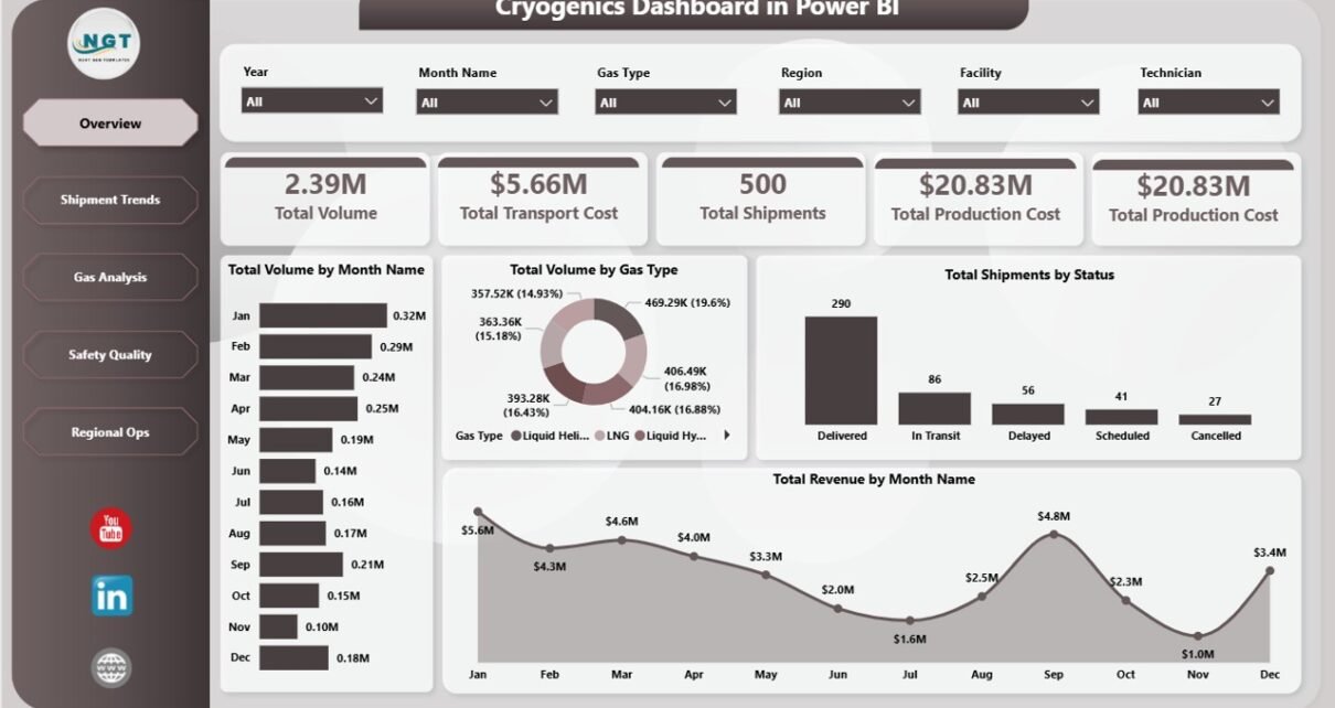
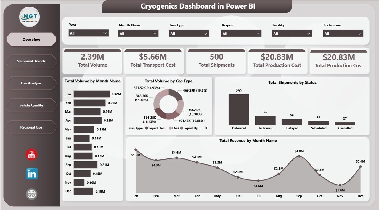
1. Overview Page
The Overview page gives leaders the fastest read on cryogenic operations. At the top, KPI cards show Total Volume, Total Transport Cost, Total Shipments, and Total Production Cost, so managers can immediately understand activity, cost pressure, and shipment scale.
Total Volume by Month Name shows month-wise gas movement. It helps teams identify seasonal demand, operating peaks, and abnormal movement patterns.
Total Volume by Gas Type compares volume across the gas categories in the dataset. This is useful for understanding which gases drive production, shipment workload, and storage planning.
Total Shipments by Status summarizes delivery progress by shipment status. Operations teams can quickly identify pending, delayed, completed, or cancelled shipments.
Total Revenue by Month Name shows revenue movement over the selected period. Pair it with volume and cost visuals to understand whether changes are driven by price, margin, or demand.
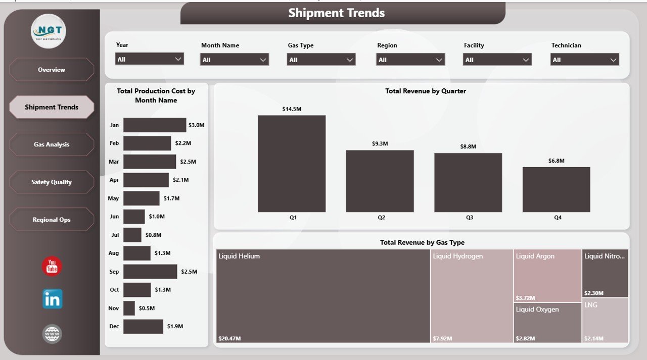
2. Shipment Trends
The Shipment Trends page is focused on cost and revenue movement across time and gas type. It helps operations and finance teams understand whether production cost and revenue are moving together or diverging.
Total Production Cost by Month Name highlights monthly production cost patterns. If one month shows an unusual spike, the team can investigate facility output, technician mix, application type, or gas mix.
Total Revenue by Quarter gives a leadership-friendly quarterly view. It is useful for board reporting, commercial reviews, and comparing quarter-on-quarter growth.
Total Revenue by Gas Type shows which gases generate the most revenue. This helps sales, production, and operations teams focus attention on the highest-value gas categories.
3. Gas Analysis
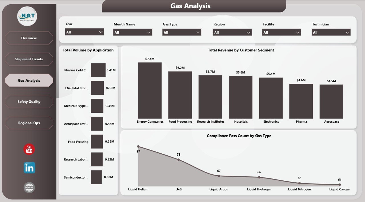
The Gas Analysis page explains how usage patterns, customers, and compliance results vary across the cryogenic operation. It is the page to open when the team wants to understand demand mix and compliance distribution.
Total Volume by Application shows which use cases consume the most gas. This helps production planners and sales managers understand where demand is concentrated.
Total Revenue by Customer Segment compares revenue across customer groups. It can highlight whether industrial, healthcare, research, laboratory, or other customer segments are driving commercial performance.
Compliance Pass Count by Gas Type compares successful compliance outcomes by gas. Quality teams can use this to spot gases that need tighter handling, documentation, or review.
4. Safety Quality
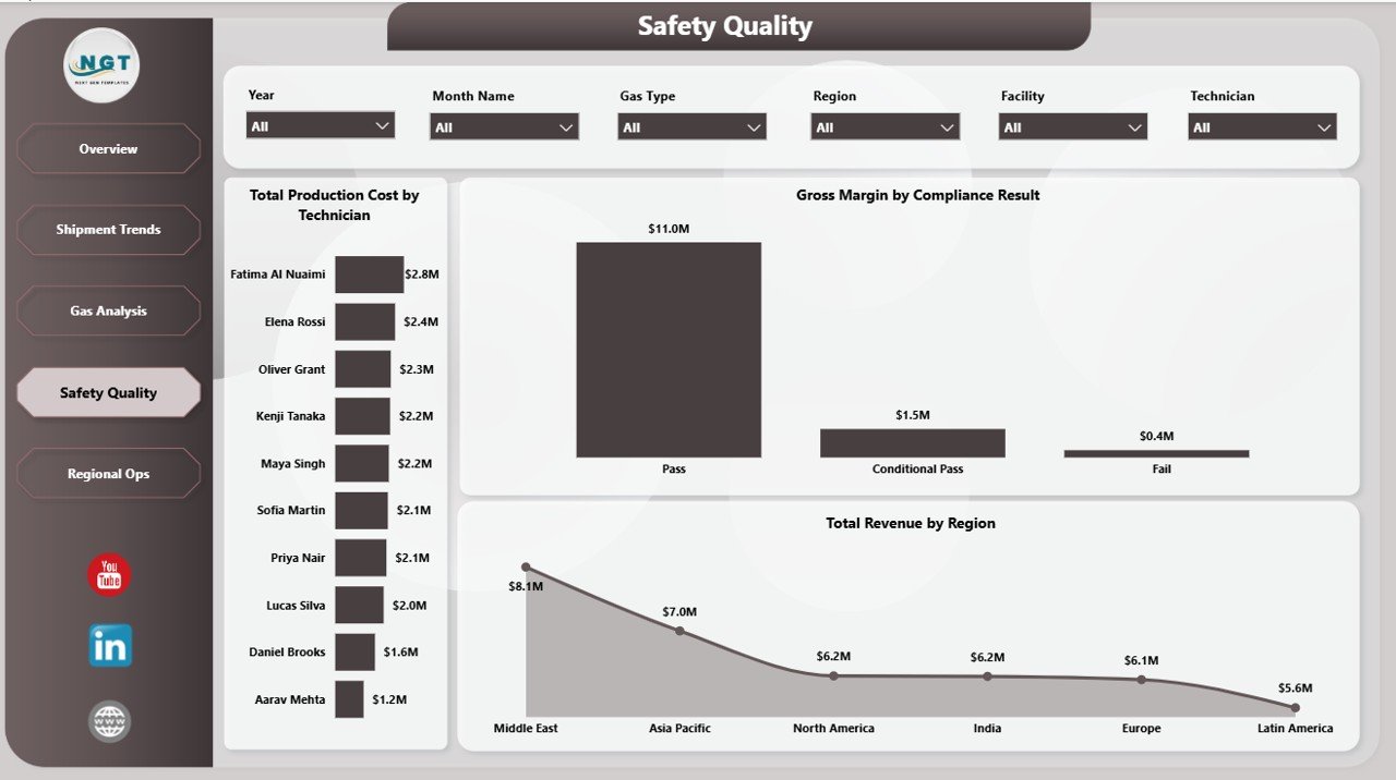
The Safety Quality page connects people, compliance, margin, and geography. This page is useful for quality managers, operations heads, and finance analysts who want to see whether safe and compliant operations are also profitable.
Total Production Cost by Technician shows how production cost is distributed across technicians. It can support workload review, training discussion, and process consistency checks.
Gross Margin by Compliance Result compares financial outcome by compliance status. This helps teams understand whether failed or conditional compliance events affect profitability.
Total Revenue by Region adds the commercial view. Regional managers can compare revenue contribution while still seeing quality and compliance performance on the same page.
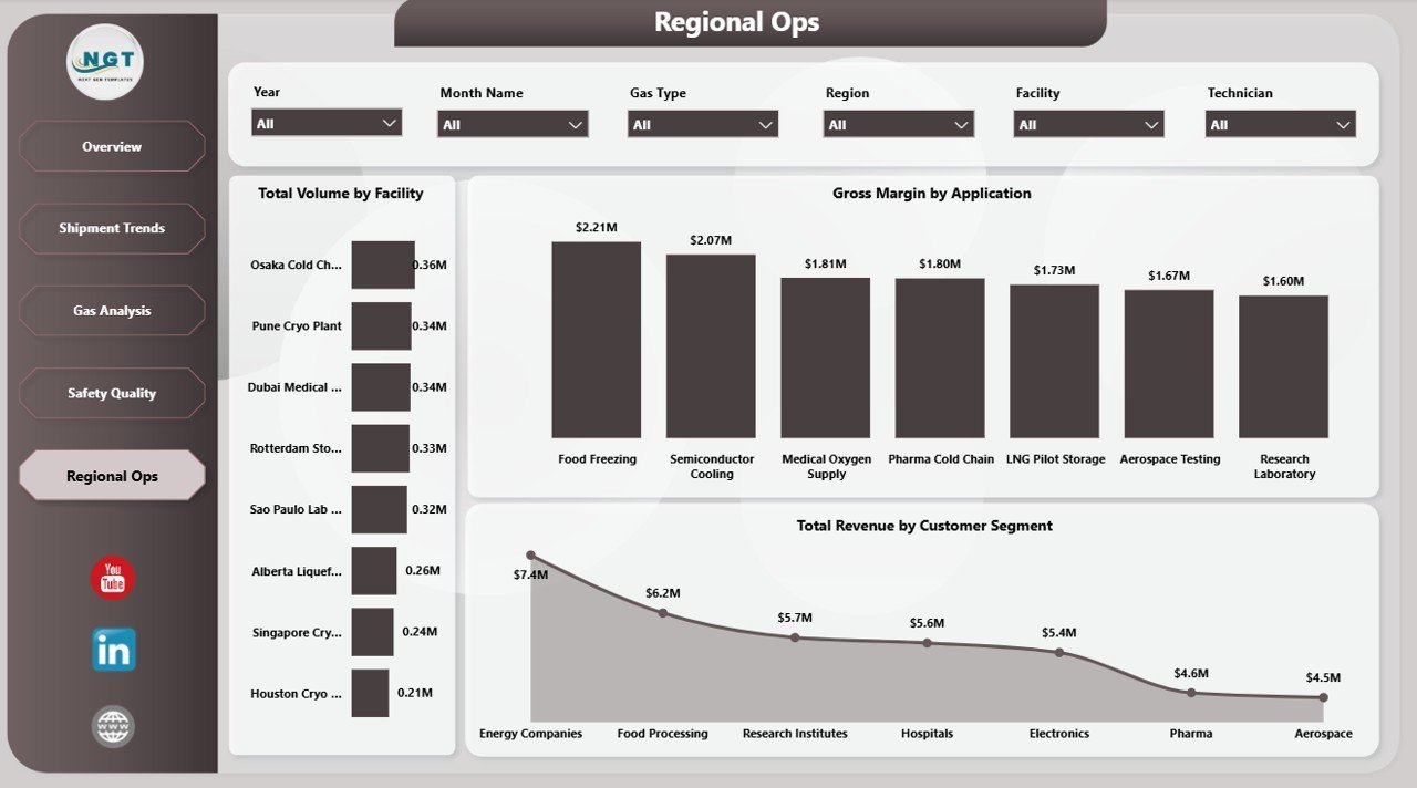
5. Regional Ops
The Regional Ops page compares facilities, applications, and customer segments. It is useful for operations reviews where regional managers need to understand where workload, margin, and customer value are concentrated.
Total Volume by Facility reveals which facilities handle the most gas volume. This helps capacity planning and can support decisions about staffing, maintenance, or expansion.
Gross Margin by Application shows profitability by gas application. Finance and operations teams can identify which use cases deserve more attention or pricing review.
Total Revenue by Customer Segment shows how revenue is distributed across customer groups. Use it to prioritize high-value segments and review low-revenue categories.
Cryogenics Dashboard in Power BI vs. Tableau/Qlik vs. Paid Operations SaaS – Feature Comparison
| Feature | Cryogenics Dashboard in Power BI | Tableau / Qlik Alternative | Paid Operations SaaS |
|---|---|---|---|
| Cost | $17.99 one-time template purchase | Monthly user licensing | Monthly or annual subscription |
| Platform | Power BI Desktop and optional Power BI Service | Tableau or Qlik ecosystem | Vendor cloud platform |
| Setup time | Open, connect data, refresh | Build data model and visuals manually | Configuration, onboarding, and user setup |
| Real-time team collaboration | Available when published to Power BI Service | Available in paid cloud plans | Usually included |
| Mobile access | Available through Power BI mobile after publishing | Available in cloud plans | Usually included |
| Customizable fields | Fully editable .pbix report | Fully editable if built internally | Depends on vendor configuration |
| Share with link | Yes, through Power BI Service permissions | Yes, through cloud sharing | Yes, through user accounts |
| Year-1 cost at 5 users | $17.99 plus optional Power BI Pro licenses | Often thousands of dollars | Often hundreds or thousands of dollars |
| Cryogenic gas metrics included | Yes, pre-built pages and visuals | Manual build required | May require customization |
Who Should Use This Template
This dashboard is ideal for cryogenic gas distributors, industrial gas companies, specialty gas teams, logistics coordinators, facility managers, production planners, safety teams, quality leaders, and finance analysts who want a repeatable Power BI report for monthly and quarterly reviews.
It is not a replacement for ERP, SCADA, live telemetry, dispatch routing, or fleet management software. The dashboard is best used as an analytics and management reporting layer that sits above exported or connected operational data.
Real-World Use Cases
Operations review: A regional operations manager opens the Overview and Shipment Trends pages every Monday to review shipment status, volume, transport cost, and revenue before the dispatch meeting.
Safety and quality review: A quality lead uses the Safety Quality and Gas Analysis pages to compare compliance pass counts, technician production cost, and compliance result margin before internal audits.
Quarterly finance reporting: A finance analyst uses Total Revenue by Quarter, Gross Margin by Application, and Total Revenue by Customer Segment for leadership reporting.
Advantages of Cryogenics Dashboard in Power BI
- It turns cryogenic operations data into interactive visuals without starting from a blank Power BI canvas.
- The report pages separate executive review, shipment trends, gas analysis, safety quality, and regional operations clearly.
- Native slicers make it easier to filter during meetings.
- The .pbix file can be customized with your own colors, logo, measures, and fields.
- Power BI Service can be used later for scheduled refresh, sharing, permissions, and mobile access.
Opportunities for Improvement
The dashboard is refresh-based, so teams needing live telemetry should connect it to a governed data source or use it beside a real-time system. Very large organizations may also want to add row-level security, separate dimension tables, or direct database connections. Microsoft documents Power BI Desktop and publishing options here: What is Power BI Desktop?
Best Practices
- Keep one clean fact table for shipment, production, revenue, cost, gas type, facility, application, region, and compliance fields.
- Standardize gas type names before loading the data.
- Use clear customer segment and application values so slicers remain useful.
- Refresh the model after every source update.
- Publish to Power BI Service only after validating data permissions and audience access.
- Archive a copy of the report for closed monthly or quarterly reporting periods.
Explore Relevant Templates
You can download this product here: Cryogenics Dashboard in Power BI. Excel-first teams can use the Cryogenics Dashboard in Excel. You may also like Oil and Gas Analysis Dashboard in Power BI, Oil and Gas Dashboard in Power BI, and Contract Manufacturing Dashboard in Power BI.
Frequently Asked Questions
What does the Cryogenics Dashboard in Power BI track?
It tracks total volume, transport cost, shipments, production cost, revenue, gas type, shipment status, application, customer segment, compliance pass counts, technician production cost, gross margin, facility volume, and regional revenue.
Do I need a paid Power BI license to use it?
No. Power BI Desktop is free and can open the .pbix file locally. A paid Power BI Pro license is only required if you want to publish and share the report through Power BI Service.
Can I replace the sample data with my own data?
Yes. Replace or connect the sample source to your own structured data and refresh the model. Keeping the same field structure gives the smoothest result.
Can I customize the visuals?
Yes. You can edit visuals, slicers, colors, titles, measures, pages, and report layout inside Power BI Desktop.
Is there an Excel version?
Yes. The related Cryogenics Dashboard in Excel is available for users who prefer pivot-table reporting in Microsoft Excel.
Can I share it with my team?
Yes. You can share the .pbix file directly, export report pages, or publish to Power BI Service for controlled browser and mobile access.
About the Author
Built by PK – Microsoft Certified Professional with 15+ years of Excel, Google Sheets, and Power BI experience. Founder of NextGenTemplates, reaching 300K+ subscribers across YouTube channels. Every template is hand-built and tested before release.
Conclusion
The Cryogenics Dashboard in Power BI gives industrial gas and cryogenic operations teams a clean way to monitor volume, cost, shipments, revenue, safety quality, compliance, and regional performance. Instead of building every page from scratch, teams can open the .pbix file, connect their own source, refresh the model, and use slicers to move from executive summary to detailed analysis.
For step-by-step Excel and Power BI tutorials, visit YouTube.com/@PKAnExcelExpert.
Last updated: May 23, 2026