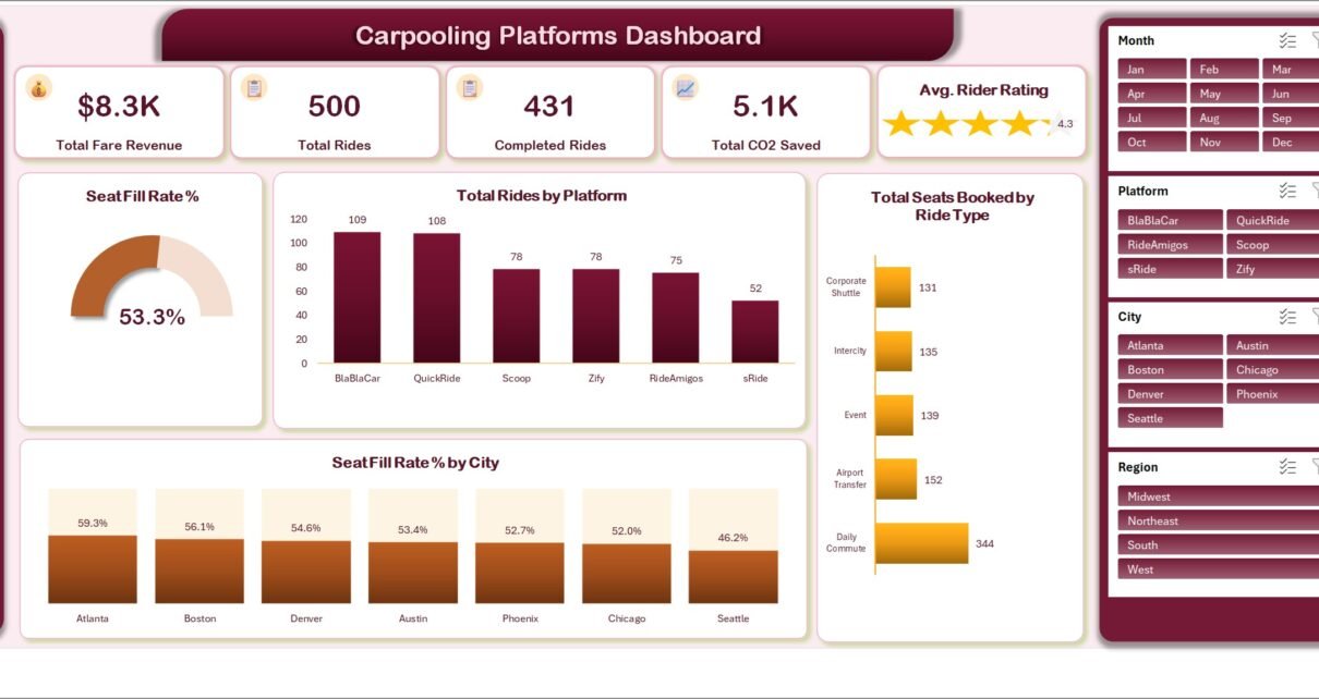
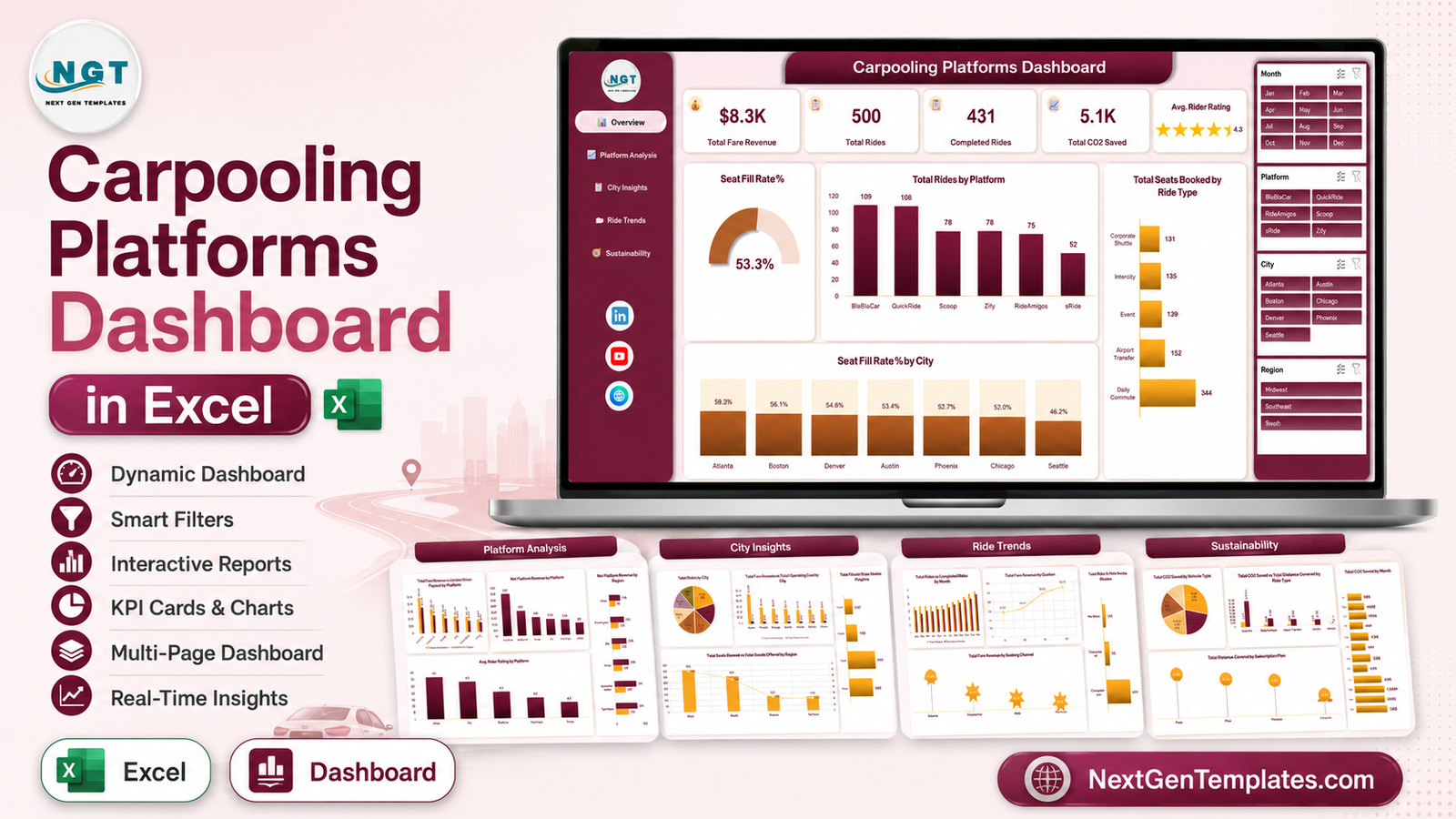
Carpooling operators sit on a lot of ride data and very little reporting. Every completed trip produces a fare, a driver payout, a seat count, a distance and a carbon figure – and most teams still answer “how did last month go?” by filtering a spreadsheet by hand. The Carpooling Platforms Dashboard in Excel is built to end that. It takes one flat table of ride records and produces five linked report pages: Overview, Platform Analysis, City Insights, Ride Trends and Sustainability. The sample file ships with 500 rides across six platforms, seven cities and four regions, reporting $8.3K in fare revenue, 431 completed rides, a 53.3% seat fill rate and 5.1K units of CO2 saved.
Two things to state up front. Every number in this article and in the screenshots is sample data generated for the template – the platform names, the cities, the revenue, all of it. And the workbook is deliberately an aggregate reporting model: it counts rides, seats, fares, distance and carbon by category. It does not ask for rider or driver names, phone numbers, addresses or plate numbers, and none of the charts need them.
Key Features of Carpooling Platforms Dashboard in Excel
- Five linked pages with a left-hand navigation sidebar on every sheet, so moving from Overview to Sustainability is one click.
- Four synced slicers – Month, Platform, City and Region – down the right edge of each page. Click one and every chart on that page re-filters together.
- Five KPI cards on the Overview page, including an Avg. Rider Rating card rendered as stars.
- A seat-utilisation gauge, because in carpooling the seat fill rate is the number that decides whether the economics work.
- Revenue against payout on the platform page, so gross fare and net platform revenue are never confused.
- A dedicated sustainability page reporting CO2 saved by vehicle type, by ride type against distance, and month by month.
- Native Excel throughout – pivot tables, pivot charts and slicers. No VBA, no add-ins, no external connections.
Dashboard Pages Explanation
Page 1 – Overview
The top strip carries five KPI cards: Total Fare Revenue ($8.3K), Total Rides (500), Completed Rides (431), Total CO2 Saved (5.1K) and Avg. Rider Rating (4.3). Underneath, the Seat Fill Rate % gauge reads 53.3% – roughly half the offered seats are actually being used, which is the single most useful headline a carpool operator can have.
Total Rides by Platform ranks the six sample platforms: BlaBlaCar 109, QuickRide 108, Scoop 78, Zify 78, RideAmigos 75 and sRide 52. Total Seats Booked by Ride Type shows how lopsided demand is – Daily Commute takes 344 seats, with Airport Transfer (152), Event (139), Intercity (135) and Corporate Shuttle (131) sharing the rest. Seat Fill Rate % by City closes the page, running from Atlanta at 59.3% down to Seattle at 46.2%.
Page 2 – Platform Analysis
This is the page that settles partner arguments. Total Fare Revenue vs Driver Payout by Platform puts the two bars side by side: QuickRide books $2.4K of fares against $1.8K paid out to drivers, BlaBlaCar $1.6K against $1.2K, down to sRide at $905 against $687.
Net Platform Revenue by Platform then reduces that to what the platform actually keeps – $347 for QuickRide, $207 for BlaBlaCar, $152 for Scoop, $135 for Zify, $126 for RideAmigos and $99 for sRide. Seats Booked vs Seats Offered by Platform explains the gap: BlaBlaCar offers 384 seats and fills 187, QuickRide offers 380 and fills 216. Avg. Rider Rating by Platform adds the quality dimension, with sRide top at 4.4 and Scoop, QuickRide and BlaBlaCar clustered at 4.2.
Page 3 – City Insights
Total Rides by City is a pie led by Austin (105), then Chicago (73), Seattle (70), Denver (68), Atlanta (63), Phoenix (62) and Boston (59). Total Fare Revenue vs Total Operating Cost by City pairs each city’s revenue against its cost – Austin at $1.8K revenue against $228 cost, Denver at $924 against $122.
The right column moves up a level: Net Platform Revenue by Region puts West at $417 and South at $365, well ahead of Midwest ($146) and Northeast ($137). Total Seats Booked vs Total Seats Offered by Region overlays booked seats on offered seats so you can see West filling 355 of 696 offered seats – plenty of headroom before adding supply.
Page 4 – Ride Trends
Total Rides vs Completed Rides by Month plots both series January to December, so a bad month reads immediately as either a demand problem or a completion problem. Total Fare Revenue by Quarter steps up from $1.5K in Q1 to $1.7K, $2.4K and $2.7K.
Total Rides by Ride Status is the reliability chart: 431 completed, 55 cancelled, 14 no-shows. Total Fare Revenue by Booking Channel shows where the money actually comes in – Mobile App $4.7K, Corporate Portal $1.7K, Web $1.3K and Partner API $537.
Page 5 – Sustainability
Total CO2 Saved by Vehicle Type splits the 5.1K total: SUV 1.5K (29%), Sedan 1.0K (20%), Electric 1.0K (20%), Van 901 (18%) and Hatchback 652 (13%). Total CO2 Saved vs Total Distance Covered by Ride Type shows Intercity covering 15.1K distance units for 3.0K of the saving, far ahead of Daily Commute at 4.0K distance for 688.
Total CO2 Saved by Month runs from 149 in February to 680 in December, and Total Distance Covered by Subscription Plan ranks Free (8.5K), Plus (7.0K), Premium (6.6K) and Corporate (4.1K). That last chart is quietly useful – it tells you which plan tier is producing the mileage that the carbon number rests on.
Carpooling Platforms Dashboard in Excel vs. Google Sheets vs. Paid Mobility SaaS – Feature Comparison
| This template (Excel) | Google Sheets dashboard | Paid mobility / BI SaaS | |
|---|---|---|---|
| Cost | One-off $17.99 | One-off, lower price point | Typically $50-$200 per user per month |
| Platform | Microsoft Excel, desktop | Browser, Google account | Vendor cloud |
| Setup time | Paste data, refresh – under an hour | Copy file, paste data | Implementation project, often weeks |
| Real-time team collaboration | Via OneDrive / SharePoint co-authoring | Yes, natively | Yes |
| Mobile access | Excel mobile app, read-friendly | Yes, browser | Yes, native apps |
| Customisable fields | Full – it is your workbook | Full | Limited to the vendor’s schema |
| Share with link | Via OneDrive link | Yes | Yes |
| Year-1 cost at 5 users | $17.99 total | Under $20 total | $3,000-$12,000 |
| Multi-platform comparison | Built in – six platforms side by side | Built in | Usually single-operator only |
| CO2 / sustainability reporting | Dedicated page | Depends on the template | Often a paid add-on module |
Who Should Use This Template
Mobility operations analysts who work with several carpooling apps at once and need them on one page. Corporate travel, HR and facilities teams running an employee ride-share scheme who report utilisation and carbon internally. City, campus and district transport offices that fund or subsidise shared rides and have to show seat utilisation. Sustainability and ESG leads who need a monthly CO2-saved figure with a visible method behind it. And consultants and analysts putting together a mobility market view who would rather start from working charts than from a blank sheet.
It is a poor fit if you need live dispatch or ride matching, an automated payout engine, or per-rider trip histories. Those belong in your operational platform, not in a reporting workbook.
Real-World Use Cases
Renegotiating a partner deal. On the Platform Analysis page, QuickRide nets $347 while BlaBlaCar nets $207 on comparable ride volume. The seats chart shows why – BlaBlaCar offers 384 seats and fills 187. That is a specific, evidenced conversation to have with the partner rather than a general complaint about performance.
Reporting a staff carpool scheme. A facilities manager filters City Insights to one region, reads seat fill rate per city, and lifts the Sustainability page’s CO2 figure straight into the quarterly ESG pack – without ever exporting a list of who travelled with whom.
Diagnosing a weak month on campus. Ride Trends shows 55 cancellations and 14 no-shows against 431 completed rides. Because total and completed rides are plotted together by month, a transport officer can tell a demand dip from a reliability problem, and the booking channel chart shows whether the app or the portal is carrying the load.
Advantages of Carpooling Platforms Dashboard in Excel
- No new software. It runs in the Excel you already have – no licence, no seat count, no vendor onboarding.
- Fast to adopt. Paste an export into the Data sheet, hit Refresh All, and the five pages are populated.
- Transparent maths. Every number traces back to a pivot table you can open and inspect, which matters when a CO2 figure lands in a public report.
- Portable. One file to email, store in SharePoint, or print to PDF for a board pack.
- Privacy-friendly by design. The model works at ride level with categories only, so your monthly report never becomes a personal-data asset you have to protect.
- Fully editable. Add a chart, change the theme colours, or add a page – it is an ordinary workbook, not a locked product.
Opportunities for Improvement
Honest limitations, so you can decide before you buy. The workbook does not connect to any carpooling API – refreshing means exporting from your platform and pasting. It is a single-file model, so two people editing at once needs OneDrive co-authoring rather than a shared database. Very large histories (hundreds of thousands of ride rows) will make refreshes sluggish; at that scale the Power BI version is the better home. The CO2 figures come from whatever your source system calculates – the dashboard reports them, it does not model emissions itself. And the sample workbook covers one year of data; multi-year comparisons need you to extend the date handling.
Best Practices
- Keep the column order. The pivot tables are bound to the Data sheet’s structure – add columns at the end rather than inserting in the middle.
- Export at ride level, not rider level. Aggregate before you paste and you keep personal data out of the workbook entirely.
- Refresh, do not rebuild. Use Data > Refresh All after every paste. If a chart looks stale, it almost always means the refresh was skipped. Microsoft’s guide to using slicers to filter data is worth five minutes if slicers are new to your team.
- Clear slicers before sharing. A page saved with a slicer active will confuse the next reader. Use the eraser icon on each slicer.
- Archive a copy each month. Save a dated copy before you overwrite the data – it is the cheapest audit trail you will ever build.
- Recolour once, centrally. Page Layout > Colors restyles every chart at the same time instead of chart by chart.
Explore Relevant Templates
- Carpooling Platforms Dashboard in Excel – the template covered in this article.
- Carpooling Platforms Dashboard in Power BI – the same five pages as a PBIX report.
- School Transportation Services Dashboard in Excel – routes, fleet and ridership.
- Roadside Assistance Networks Dashboard in Excel – response times and coverage.
- Airline Loyalty Programs Dashboard in Excel – travel-side loyalty and tier reporting.
- Transportation Services Dashboard in Google Sheets – a lighter browser-based option.
Frequently Asked Questions
Which versions of Excel does it support?
Excel 2016, 2019, 2021 and Microsoft 365 on Windows. Everything used – pivot tables, pivot charts, slicers – is a native feature. The file also opens in Excel for Mac, though slicer styling renders a little differently.
Are the figures in the screenshots from a real carpooling company?
No. All 500 rides, the six platform names and every currency figure are sample data created for the template so the model can be tested before you load your own export.
Does it hold any rider or driver personal data?
No. The data model is ride level with categorical fields – platform, city, region, ride type, vehicle type, subscription plan, booking channel – plus numeric measures. There is no name, phone, email, address or plate column anywhere in it.
Can I add platforms, cities or ride types of my own?
Yes. Those lists are read from your data, not hard-coded. Paste rows containing new values, refresh, and the slicers and charts pick them up.
Does it need macros?
No. It is a plain .xlsx file with no VBA, so it opens without a macro security warning and works offline.
How do I change the colour scheme?
Page Layout > Colors applies a new theme palette to every chart at once. Individual charts can then be adjusted with the normal chart formatting tools.
Is there a Power BI version of the same dashboard?
Yes – the Carpooling Platforms Dashboard in Power BI covers the same five pages if you publish to the Power BI service rather than sharing a workbook.
About the Author
Built by PK – Microsoft Certified Professional with 15+ years of Excel, Google Sheets, and Power BI experience. Founder of NextGenTemplates, reaching 300K+ subscribers across YouTube channels. Every template is hand-built and tested before release.
Conclusion
Carpooling reporting fails in a predictable way: the ride data exists, but nobody has time to shape it into a monthly view, so the seat fill rate goes unmeasured and the carbon number gets estimated at the last minute. The Carpooling Platforms Dashboard in Excel puts that whole report on rails – five pages, four synced slicers, and pivot tables you can open and check. Paste your export, refresh, and the month is written.
For step-by-step Excel dashboard walkthroughs, visit youtube.com/@PKAnExcelExpert.