A tile works that plans 241.1K boxes and fires 223.9K has a 17,200-box gap, and the answer is almost never “the plant”. It is one kiln line, one finish type, one shift, or one supervisor whose rework rate runs at 20.3% while the group average sits at 15.0%. The Ceramic Tiles Production Dashboard in Power BI was built to make that gap visible in five clicks rather than five spreadsheets.
This is a complete .pbix report: 9 pages in the file, 106 DAX measures already written, a 22-column fact table and a generated date table. The demo build carries $62.95M of production value, 92.9% plan attainment, 91.1% kiln uptime, a 74.2% batch pass rate and 81.8% on-time dispatch across four plants, four kiln lines and five tile categories. Every one of those numbers comes from 500 sample batch rows that you delete and replace with your own export.
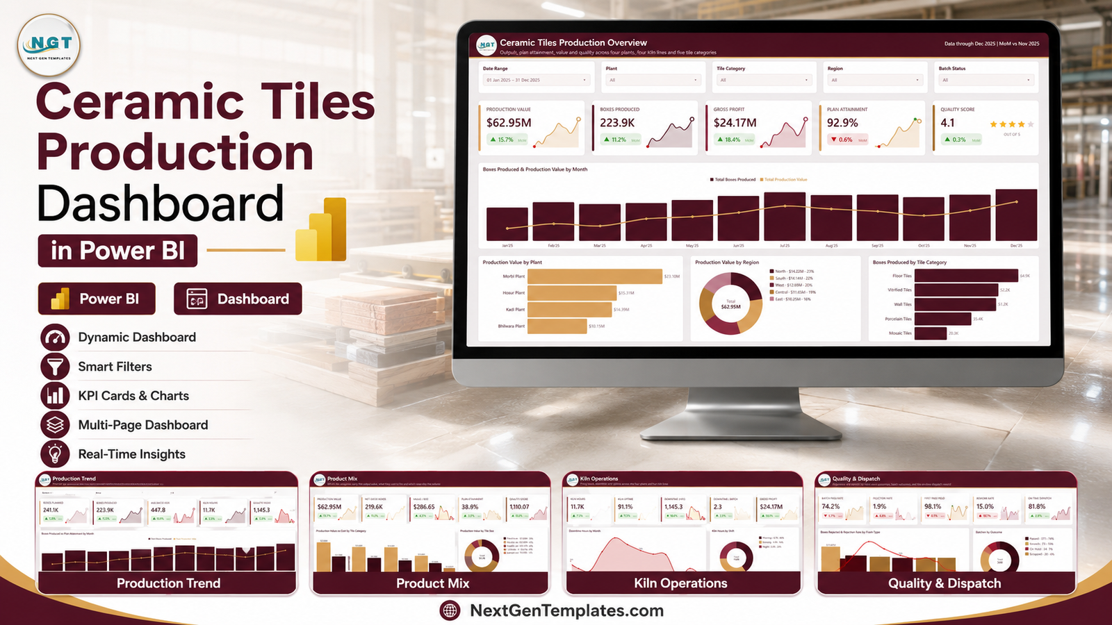
Key Features of the Ceramic Tiles Production Dashboard in Power BI
- Five visible report pages – Overview, Production Trend, Product Mix, Kiln Operations and Quality & Dispatch – each laid out on a 1280×720 canvas with no dead space.
- 106 DAX measures, including 21 month-on-month delta measures. Volume, plan attainment, production value, material and energy cost, gross margin, kiln hours, downtime, uptime, pass and rework rates, first pass yield, dispatch timeliness and export share are all pre-written.
- 25 SVG KPI cards, five per page, each with an inline sparkline and a coloured MoM arrow. The direction logic is inverted where it should be: falling downtime and falling rejection read as good news, not bad.
- Five synced slicers per page – Date Range, Plant, Tile Category and Region on every page, plus a page-specific fifth (Batch Status, Shift, Finish Type, Kiln Line, Dispatch Status). Set a filter once and it follows you across the report.
- A hidden Details drillthrough page. Right-click a bar and you land on the batch rows behind it. See the Microsoft Learn drillthrough documentation if you want to extend it.
- Two 280×360 tooltip pages – Trend Detail and Category Detail – so hovering a visual shows a mini chart instead of a bare number.
- Two scorecard tables with in-cell data bars and star ratings, covering plant utilisation and supervisor quality.
Dashboard Pages Explanation
Page 1 – Overview
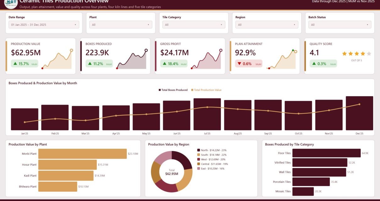
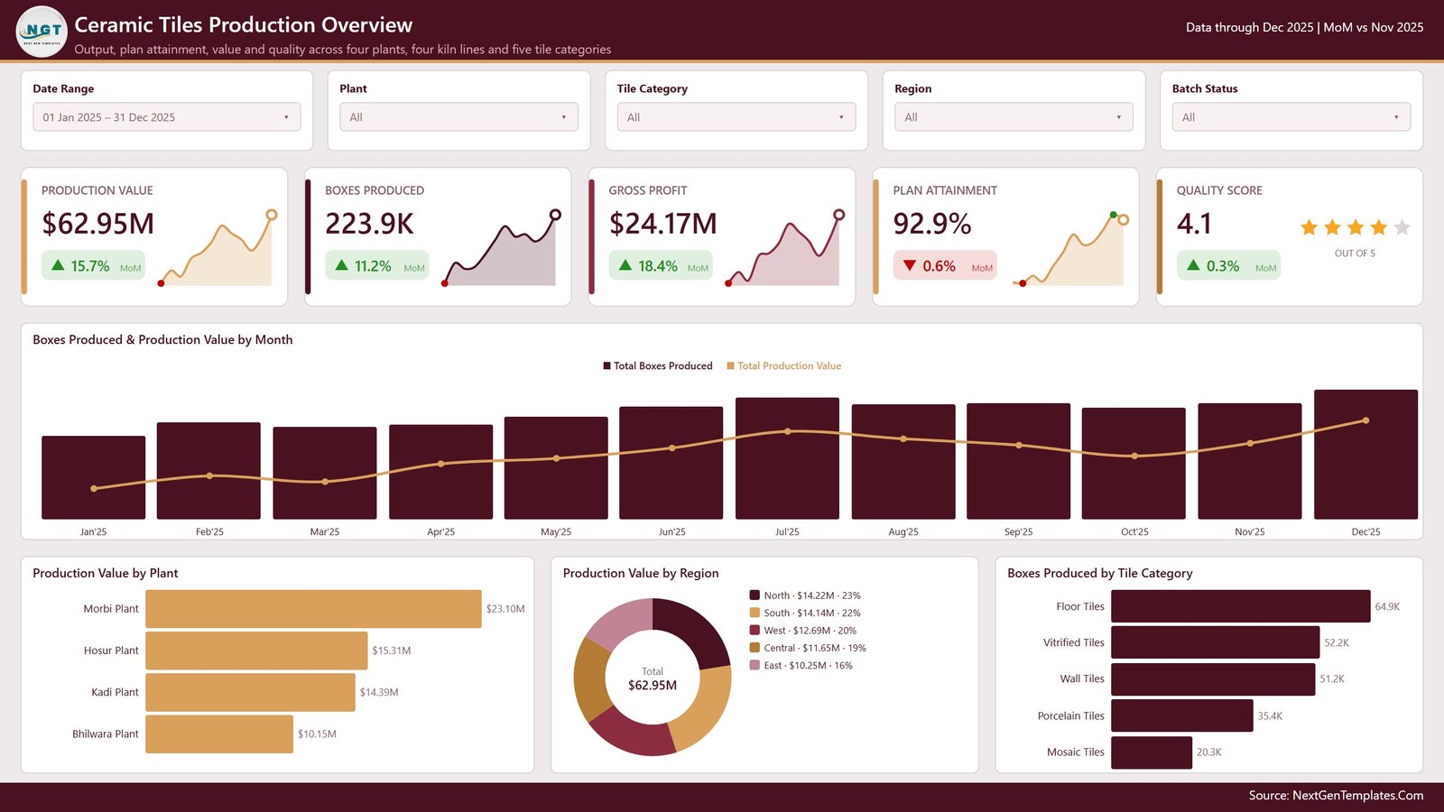
The page you open first. Five cards carry Production Value ($62.95M, up 15.7% MoM), Boxes Produced (223.9K, up 11.2%), Gross Profit ($24.17M, up 18.4%), Plan Attainment (92.9%, down 0.6%) and Quality Score (4.1 out of 5, shown as stars). Below them, Boxes Produced & Production Value by Month is a combo of monthly volume bars and a value line, so you can see when volume rose without value following. The bottom row splits the same total three ways: Production Value by Plant (Morbi $23.10M, Hosur $15.31M, Kadi $14.39M, Bhilwara $10.15M), Production Value by Region as a donut, and Boxes Produced by Tile Category.
Page 2 – Production Trend
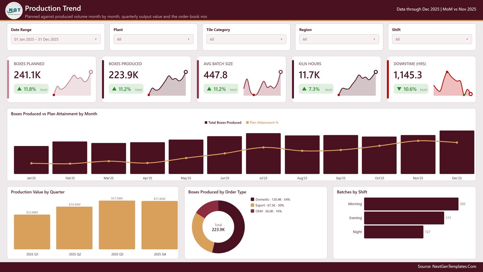
Planned against produced volume, month by month. Boxes Planned (241.1K) sits next to Boxes Produced (223.9K) so the gap is a subtraction, not an investigation. Boxes Produced vs Plan Attainment by Month overlays the attainment line on the volume bars. Underneath, Production Value by Quarter traces the 2025 climb from $12.49M in Q1 to $15.45M in Q2 and $17.59M in Q3, easing slightly to $17.42M in Q4. Boxes Produced by Order Type splits domestic (54%), export (30%) and OEM (16%), and Batches by Shift shows morning carrying 202 of the 500 batches.
Page 3 – Product Mix
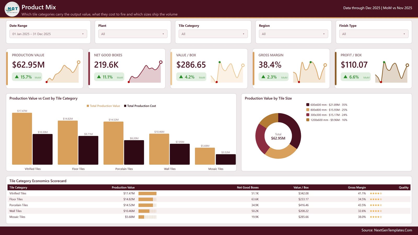
Where the money actually is. Production Value vs Cost by Tile Category pairs a value bar with a cost bar for each of the five categories, and the difference between the pair is the story: Vitrified Tiles generate $17.47M against $10.30M of cost, Mosaic Tiles $5.68M against $3.52M. Production Value by Tile Size shows 600×600 mm carrying 35% of value. The Tile Category Economics Scorecard then lines up production value, net good boxes, value per box, gross margin and a quality star rating – which is where you notice Porcelain at 43.5% margin and $416.46 per box against Wall Tiles at 32.6% and $208.22.
Page 4 – Kiln Operations
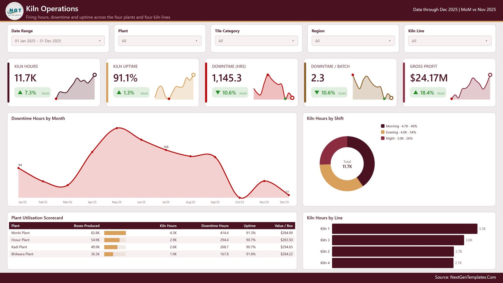
Firing hours and what stopped them. Kiln Hours (11.7K), Kiln Uptime (91.1%), Downtime Hours (1,145.3), Downtime per Batch (2.3) and Gross Profit sit across the top. Downtime Hours by Month traces a May peak down to 77 hours in December – a genuinely useful shape when you are arguing for a maintenance window. Kiln Hours by Shift and Kiln Hours by Line break the same total by when and where, and the Plant Utilisation Scorecard puts boxes produced, kiln hours, downtime hours, uptime and value per box on one row per plant.
Page 5 – Quality & Dispatch
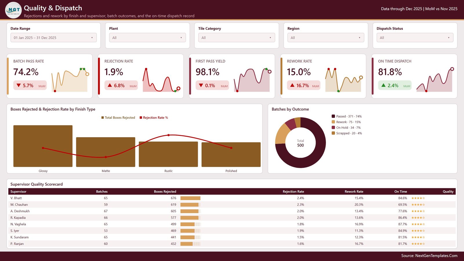
Batch Pass Rate (74.2%), Rejection Rate (1.9%), First Pass Yield (98.1%), Rework Rate (15.0%) and On Time Dispatch (81.8%). Boxes Rejected & Rejection Rate by Finish Type covers glossy, matte, rustic and polished; Batches by Outcome splits the 500 batches into passed (371), rework (75), on hold (34) and scrapped (20); and the Supervisor Quality Scorecard ranks eight supervisors by batches, boxes rejected, rejection rate, rework rate and on-time percentage.
One point worth stating plainly, because it governs how you should read this page: Quality Score and Batch Status are labels you type or export from your own system. They are not measured, tested or certified values, and nothing in this report performs, references or substitutes for product testing, standards conformance or certification.
The file also contains a sixth visible page, Get More Dashboards, which links back to our catalogue, plus the hidden Details drillthrough and the two tooltip pages – nine pages in total.
Ceramic Tiles Production Dashboard in Power BI vs. Excel vs. Paid MES / BI Suites – Feature Comparison
| This Power BI template | Excel dashboard equivalent | Paid MES / BI suite | |
|---|---|---|---|
| Cost | $17.99 one-off | $17.99 one-off | $70-$300 per user / month |
| Platform | Power BI Desktop (free) | Microsoft Excel | Vendor cloud |
| Setup time | Under 30 minutes | Under 30 minutes | 4-12 weeks with consultants |
| Real-time team collaboration | Via Power BI Service (Pro) | OneDrive co-authoring | Built in |
| Mobile access | Power BI mobile app | Excel mobile, limited | Native app |
| Customisable fields | Yes – edit model and DAX | Yes – edit formulas | Config only, or paid change request |
| Share with link | Yes, after publishing | File or OneDrive link | Yes |
| Year-1 cost at 5 users | $17.99 (+ Pro if you publish) | $17.99 | $4,200-$18,000 |
| Drillthrough to individual batches | Yes, hidden Details page | Pivot drill-down | Yes |
| Captures data from kilns directly | No – you supply the export | No | Yes, via PLC integration |
Who Should Use This Template
Production managers running two or more tile plants who already pull batch data into Excel or a database and want it on one screen. Plant controllers who need value, cost and margin sitting next to volume rather than in a separate finance pack. Quality leads who want rejection and rework broken out by finish type and supervisor. And analysts who have been asked for “a Power BI report on production” and would rather start from a working model than a blank canvas.
It is less useful if you have a single line and forty rows a month – a pivot table will do – or if you expect the dashboard to collect data from the plant floor. It reads a table; it does not talk to a PLC or an MES.
Real-World Use Cases
Monthly production review. Set the Date Range slicer to the closing month. Plan attainment, the volume-versus-plan chart and the plant scorecard give you the three slides the review actually needs, without anyone rebuilding a deck.
Mix and margin decisions. The Product Mix page puts value against cost per category. When export orders push volume toward a lower-margin category, you can see the margin move before the month-end close tells you.
Maintenance window argument. Downtime Hours by Month plus Kiln Hours by Line gives you a shape and a location. A May downtime peak concentrated on one line is a far stronger case than “the kilns keep stopping”.
Supervisor coaching. The Supervisor Quality Scorecard spreads rework rate from 11.3% to 20.3% across eight names. Drill through to the batch rows for the outliers and the conversation becomes specific rather than general.
Advantages of the Ceramic Tiles Production Dashboard in Power BI
- Nothing to build. The 106 measures, the date table, the theme, the slicer sync and the drillthrough are done. You paste data and refresh.
- Free to edit. Power BI Desktop costs nothing. A Pro licence is only needed if you publish to the Service for colleagues.
- Honest MoM logic. Cost and downtime cards invert their colours, so the report does not congratulate you for rising energy cost.
- Row-level answers. Every aggregate is one right-click away from the batches that produced it.
- Source-agnostic. Swap the Excel query for SQL Server, SharePoint or an OData feed; as long as the 22 columns come back, every measure keeps working.
- An Excel twin exists for teams that are not on Power BI, so a mixed department can use the same numbers.
Opportunities for Improvement
Where the template stops, stated plainly:
- No data capture. There is no connection to kiln controllers, an MES or an ERP out of the box. You supply the export.
- Quality is a label, not a measurement. Quality Score and Batch Status are values you enter. The report makes no claim about the physical properties of any tile and is not evidence of conformance, testing, certification or product approval.
- The demo rows are fictional. All 500 batch records, plant names, supervisor names and figures are generated sample data for demonstration.
- Unlabelled bars on two charts. The monthly volume bars on pages 1 and 2, and the rejected-boxes bars on page 5, carry no value axis or data labels by design – the shape is the message and the exact number arrives on hover. If you prefer numbers on the bars, switch data labels on in the Format pane; it is a two-click change.
- The Get More Dashboards page ships visible. Delete it before circulating the report internally.
- Fixed 22-column shape. Adding a genuinely new dimension (a customer table, say) means editing the model rather than just pasting rows.
We checked all five pages of this build for rendering faults before publishing and found none – cards, scorecards, star ratings and combo charts all render correctly.
Best Practices
- Keep the headers. Replace rows, not column names. Every measure references the 22 headers by name.
- Load a full year before judging trends. The MoM arrows compare the latest month with the prior one; with three months of data they are noisy.
- Use one Batch ID per batch. Total Batches is a distinct count, so duplicated IDs quietly understate your volume.
- Standardise your label lists. “Vitrified” and “Vitrified Tiles” become two categories. Fix them at source, not in the visual.
- Point the query at a shared path. A OneDrive or SharePoint location means a scheduled refresh works later without rewiring.
- Duplicate a page before redesigning it. Keeping the original makes it easy to compare and to revert.
- Publish, then set a refresh schedule if colleagues need it live rather than as a file.
Explore Relevant Templates
- Ceramic Tiles Production Dashboard in Excel – the same topic, built for Excel
- Cement Mixer Production Dashboard in Power BI
- Flooring and Tiles KPI Dashboard in Power BI – a scorecard rather than an analytics report
- Ceramic Manufacturing KPI Dashboard in Excel
- Railway Equipment Manufacturing Dashboard in Power BI
- Read the Cement Mixer Power BI walkthrough
Frequently Asked Questions
Do I need a paid Power BI licence to use this?
No. Power BI Desktop is free from Microsoft and opens, edits and refreshes the .pbix. A Pro licence is only required if you publish the report to the Power BI Service so colleagues can view it online.
Does this dashboard certify the quality of my tiles?
No. It reports the numbers you give it. It performs no testing, references no product standard, and is not evidence of conformance, certification or product approval. Quality Score and Batch Status are labels you supply.
What is in the download?
A single zip containing the .pbix report, the source Data workbook and a PDF user manual.
Can I add more plants, kiln lines, tile categories or supervisors?
Yes. Add the rows and refresh. Nothing is hard-coded to the demo list, so slicers, charts and scorecards pick up new values automatically.
How do I connect it to our ERP instead of the Excel file?
Replace the source query with any Power BI connector – SQL Server, SharePoint, OData, a data warehouse – as long as it returns the same 22 columns. The measures are unaffected by where the rows come from.
Can I rebrand the colours?
Yes. The report uses a custom theme file, so View > Themes swaps the whole palette in one step, or you can restyle individual visuals.
Are the numbers in the screenshots real?
No. Every figure, plant name and supervisor name shown is demo data generated to populate the visuals.
About the Author
Built by PK – Microsoft Certified Professional with 15+ years of Excel, Google Sheets, and Power BI experience. Founder of NextGenTemplates, reaching 300K+ subscribers across YouTube channels. Every template is hand-built and tested before release.
Conclusion
Most tile plants already have the data. What they lack is a place where volume, plan, cost, margin, kiln time and batch quality sit on the same five screens with the same filters applied. That is exactly what the Ceramic Tiles Production Dashboard in Power BI is: 106 measures and nine pages of report, ready to point at your own export in under half an hour.
Get the Ceramic Tiles Production Dashboard in Power BI for $17.99, or take the Excel version if your team lives in spreadsheets. For step-by-step Power BI and Excel walkthroughs, subscribe at youtube.com/@PKAnExcelExpert.