A coaching network is three businesses stacked on top of each other: a sales business selling tracks, a delivery business scheduling sessions, and a margin business paying coaches. Most coaching reporting only sees the first one. The Coaching Networks Dashboard in Power BI shows all three on five linked pages built from a single 500-row engagement table.
In the demo model that ships with it, the network turns $741.7K of revenue into $331.3K of margin (a 44.7% margin rate) while delivering 2,683 of roughly 3,950 booked sessions – a 67.9% session delivery rate. 14 coaches, 6 coaching tracks, 4 program formats, 3 delivery modes, 4 client segments, 5 regions and 12 months of 2025. Satisfaction averages 4.2 out of 5.
One thing to be clear about up front: this is the analytical Power BI line, not the month-picker KPI scorecard line, and it is not a coaching management system. It reports; it does not book, invoice or store session notes.
Key Features of the Coaching Networks Dashboard in Power BI
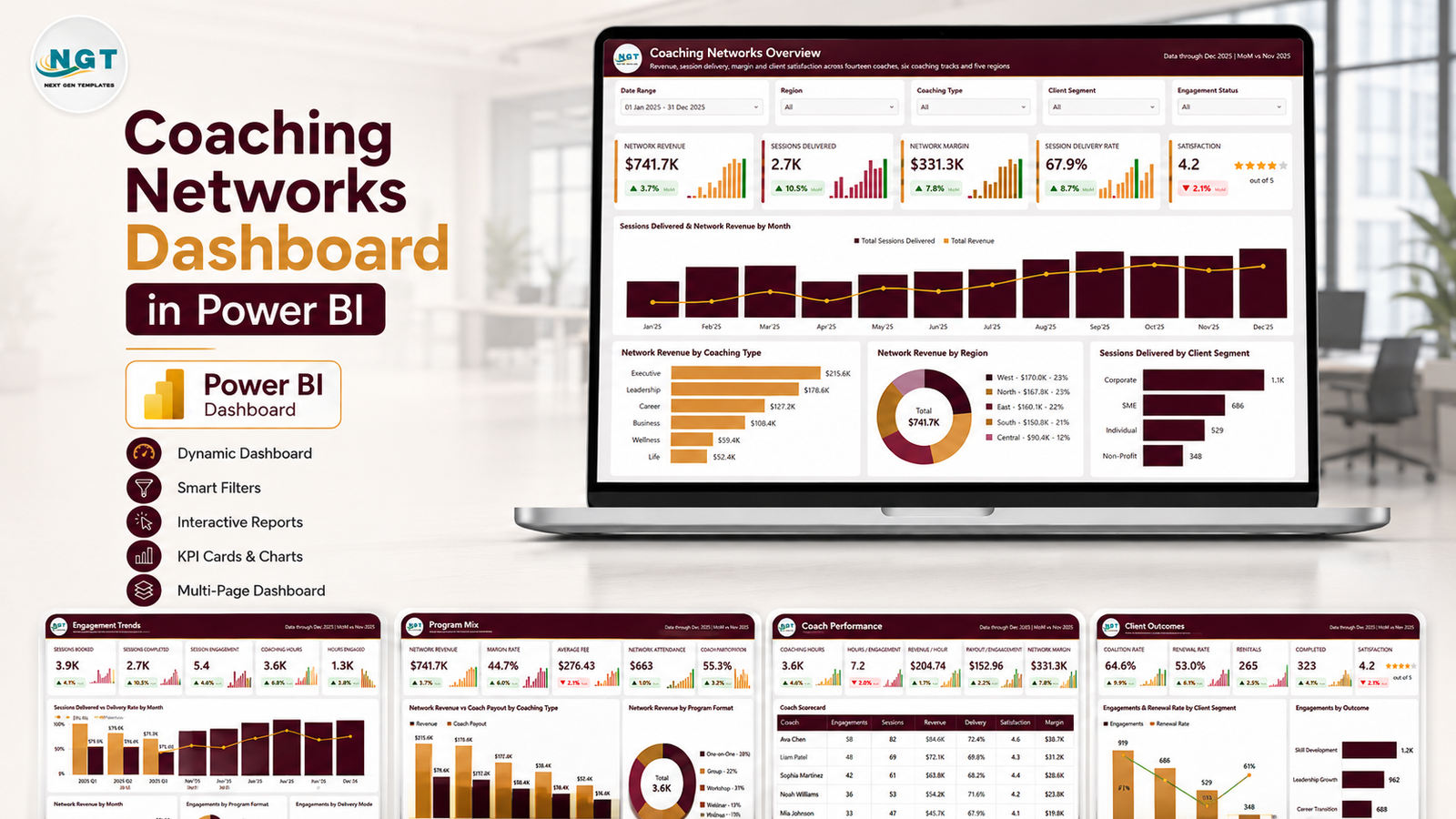
- Five analysis pages – Coaching Networks Overview, Engagement Trends, Program Mix, Coach Performance and Client Outcomes – plus a Get More Dashboards page, all laid out at 1280×720.
- Five slicers on every page. Date Range (defaulted to 01 Jan 2025 – 31 Dec 2025), Region, Coaching Type and Client Segment are constant; the fifth changes with the question – Engagement Status, Delivery Mode, Program Format, Coach Level or Renewed.
- 25 KPI cards. Five per page, each with the value, a month-over-month arrow against November 2025 and a 12-month sparkline.
- Three league tables. A 14-row Coach Scorecard, a six-row Coaching Track Economics Scorecard and a five-row Regional Outcomes Scorecard.
- A Details drillthrough bound on nine fields – Coach, Coach Level, Region, Coaching Type, Delivery Mode, Program Format, Client Segment, Status and Renewed.
- Two 280×360 tooltip pages – Category Detail and Trend Detail – so hovering gives context without another visual on the canvas. Microsoft explains the underlying feature in the Power BI drillthrough documentation.
- 38 measures referenced across the report visuals, covering revenue, coach payout, margin, margin rate, payout ratio, revenue per session, revenue per coaching hour, margin per engagement, delivery rate, completion rate, renewal rate, cancellation rate, sessions per engagement, hours per engagement and satisfaction.
- A 17-column source table with 500 rows of demo data, shipped as Data.xlsx alongside the .pbix.
Dashboard Pages Explanation
Page 1 – Coaching Networks Overview
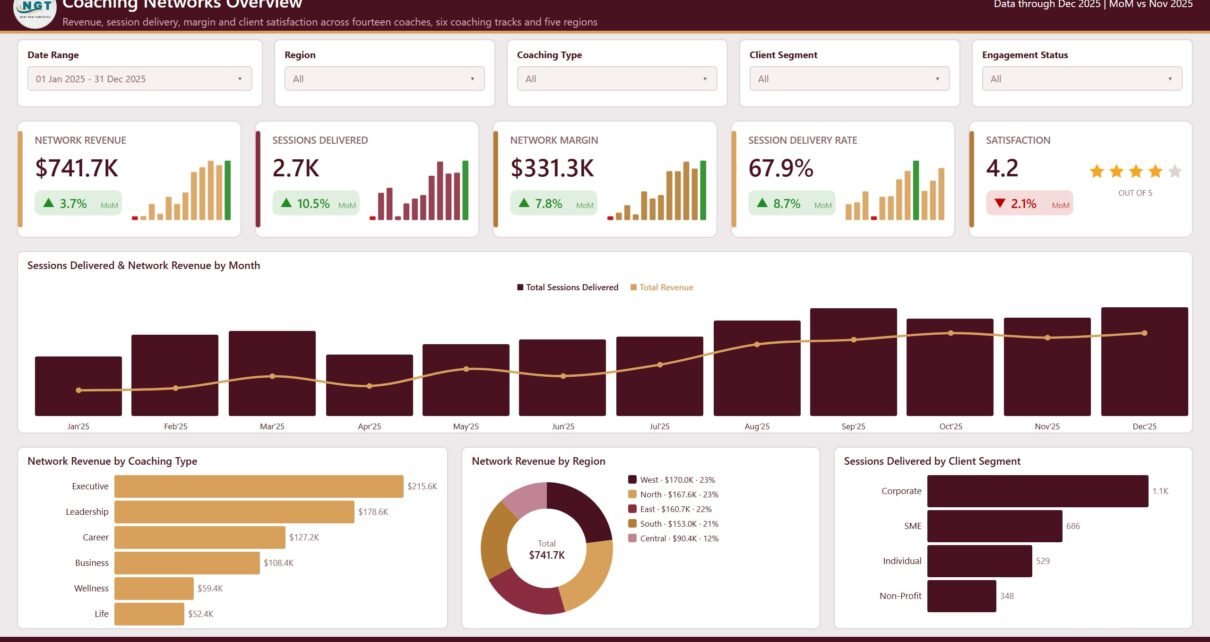
The landing page carries Network Revenue $741.7K (up 3.7% month over month), Sessions Delivered 2.7K (up 10.5%), Network Margin $331.3K (up 7.8%), Session Delivery Rate 67.9% (up 8.7%) and Satisfaction 4.2 out of 5 (down 2.1%) with a star rating.
Below the cards, Sessions Delivered & Network Revenue by Month puts volume as columns and revenue as a line across the twelve months. Then three breakdowns: Network Revenue by Coaching Type (Executive $215.6K, Leadership $178.6K, Career $127.2K, Business $108.4K, Wellness $59.4K, Life $52.4K), Network Revenue by Region as a donut (West $170.0K, North $167.6K, East $160.7K, South $153.0K, Central $90.4K) and Sessions Delivered by Client Segment (Corporate 1.1K, SME 686, Individual 529, Non-Profit 348).
Page 2 – Engagement Trends
This is the delivery-gap page, and it is the one most coaching networks under-report. Sessions Booked 3.9K against Sessions Delivered 2.7K, Sessions / Engagement 5.4, Coaching Hours 3.6K and Sessions Missed 1.3K (down 20.2% month over month – the best-improving number on the report).
Sessions Delivered vs Delivery Rate by Month shows the two moving together, Network Revenue by Quarter climbs $141.9K, $156.5K, $207.6K, $235.6K through 2025, Engagements by Program Format splits the 500 engagements into One-on-One 185, Group 134, Workshop 113 and Intensive 68, and Engagements by Delivery Mode gives Online 234, In-Person 158 and Hybrid 108.
Page 3 – Program Mix
The economics page. Network Revenue $741.7K, Margin Rate 44.7%, Revenue / Session $276.43, Margin / Engagement $663 and Coach Payout Ratio 55.3%.
Network Revenue vs Coach Payout by Coaching Type puts the two bars side by side for all six tracks – Executive $215.6K against $105.1K of payout, Life $52.4K against $35.7K. Network Revenue by Program Format shows One-on-One $253.3K, Group $205.2K, Intensive $171.1K and Workshop $112.1K. The Coaching Track Economics Scorecard then makes the argument explicit: Executive earns $328.65 per session at 51.3% margin; Wellness earns $195.51 at 28.5%. Same network, wildly different unit economics.
Page 4 – Coach Performance
Coaching Hours 3.6K, Hours / Engagement 7.2, Revenue / Hour $204.74, Payout / Session $152.96 and Network Margin $331.3K sit above the Coach Scorecard, which lists every one of the 14 coaches with engagements, sessions, revenue, a revenue bar, delivery rate and satisfaction stars.
It is worth reading that table twice. Amelia Hartwell tops it on revenue at $73.4K with 72.0% delivery. Clara Doyle takes the most engagements (47) but delivers only 54.1% of what she books. Hannah Lindqvist sits last on revenue at $35.0K and first on delivery at 79.0%. Beside the table, Coaching Hours by Coach Level (Certified 1.3K, Senior 962, Associate 782, Master 591) and Coaching Hours by Month, which rises from 232 in January to 372 in December.
Page 5 – Client Outcomes
The retention page: Completion Rate 64.6%, Renewal Rate 53.0%, Renewals 265, Completed 323 and Satisfaction 4.2. Engagements & Renewal Rate by Client Segment pairs volume with renewal, and shows the two moving in opposite directions – Corporate is the biggest book with the highest renewal, Individual the softest.
Engagements by Outcome splits the 500 engagements into Completed 323, In Progress 70, Cancelled 53, Scheduled 40 and On Hold 14. The Regional Outcomes Scorecard closes it out: Central runs the smallest book (63 engagements) with the highest completion rate (74.6%) and the lowest cancellation rate (7.9%), while West carries the most revenue ($170.0K) on 60.9% completion.
The hidden pages
Three pages are hidden in view mode – the nine-field Details drillthrough and the two tooltip pages – so they never appear in the page tabs but do their job when you right-click or hover.
Coaching Networks Dashboard in Power BI vs. Tableau vs. Paid Coaching SaaS – Feature Comparison
| This Power BI template | Tableau / Qlik build | Paid coaching SaaS | |
|---|---|---|---|
| Cost | One payment, no renewal | Licence plus build time | Recurring, usually per coach |
| Platform | Power BI Desktop (free) and Power BI Service | Tableau Desktop or Qlik Sense | Vendor web app |
| Setup time | Swap the source and refresh | Build the model and every view yourself | Onboarding, imports, coach accounts |
| Real-time team collaboration | Yes, once published to the Service | Yes, via Tableau Server or Cloud | Yes, built in |
| Mobile access | Power BI mobile app | Vendor mobile app | Native apps |
| Customisable fields | Yes – model, measures and visuals are all editable | Yes | Limited to vendor fields |
| Share with a link | Yes, through the Power BI Service | Yes, on the server | Yes |
| Year-1 cost at 5 users | The one-off template price | Licences plus consulting days | Recurring per-coach fees |
| Coach league table out of the box | Yes – all 14 coaches ranked | Build it | Varies by plan |
| Books sessions and invoices clients | No – reporting only | No | Yes |
Who Should Use This Template
It earns its place in a coaching network with associates, a coaching franchise, an executive-coaching practice that pays coaches a share of the fee, a leadership-development firm running several tracks, or an internal L&D function that buys coaching by the programme and has to justify the spend.
It is the wrong tool for a solo coach with a dozen clients, and it is not a replacement for a booking or invoicing system. It also makes no claim about coaching efficacy, accreditation or client outcomes – it reports what you record and nothing else.
Real-World Use Cases
Monthly network review. Open Coach Performance, sort the scorecard by delivery rate, and take anyone below 60% into a capacity conversation. In the demo data that is one coach carrying the largest book at the lowest delivery rate – a scheduling problem wearing the costume of a performance problem.
Pricing review. Program Mix answers “which track should we reprice?” without a spreadsheet argument. A track selling 304 sessions at 28.5% margin is a different conversation from one selling 656 at 51.3%.
Regional playbook transfer. Client Outcomes shows which region completes and renews best relative to its size, so the practice that produces 74.6% completion on the smallest book can be copied into the largest one.
Client QBR pack. Filter to one Client Segment and one Region, export the pages, and the quarterly business review is written.
Advantages of the Coaching Networks Dashboard in Power BI
- Delivery is measured, not assumed. Sessions Booked, Sessions Delivered, Sessions Missed and Delivery Rate are first-class citizens rather than a footnote.
- Margin sits next to revenue everywhere. Coach Payout is a modelled column, so payout ratio and margin per engagement fall out of the same table that produces revenue.
- Nothing is hard-coded. Coach names, tracks, formats, modes, segments and regions are all plain text columns; replace them and the visuals relabel themselves.
- The drillthrough saves a dozen bookmarks. Nine bound fields mean almost any visual element can become a filtered detail view on right-click.
- It runs on free software. Power BI Desktop costs nothing; a licence is only needed to publish and share.
- The numbers are internally consistent. Regional engagements sum to 500, track revenue sums to $741.7K and every ratio on the report reconciles to the underlying table – so the demo file is a working reference, not decoration.
Opportunities for Improvement
Honest notes rather than a sales pitch:
- The combination charts carry no value axis. Sessions Delivered & Network Revenue by Month and Sessions Delivered vs Delivery Rate by Month show shape rather than exact readings; if your audience wants numbers, switch data labels on.
- No target or budget column. Everything is actual-versus-prior-month. If you plan against a revenue or utilisation target, add a target column to the source and a variance measure.
- No coach cost beyond payout. Overheads, platform fees and unbillable time are not modelled, so “margin” here means revenue minus coach payout.
- Twelve months only. The demo covers 2025. Year-over-year comparisons need a second year of data and one extra measure.
- No live connector. It reads a file. If you want scheduled refresh from a coaching platform, that is a gateway or dataflow you build on top.
Best Practices
- Keep the 17 column names exactly as shipped the first time you swap data. Rename later, once the refresh is proven.
- Load one full closed month at a time. Part-month data makes the month-over-month arrows lie.
- Decide what Coach Payout includes before anyone quotes the margin rate in a board pack – gross fee share, or fee share after platform costs?
- Treat Satisfaction Score as a survey average, not a rating. Say how many responses sit behind it wherever you publish the 4.2.
- Use the Details drillthrough in reviews instead of building one-off pages for each coach.
- Publish to the Power BI Service when more than two people need it, and give the network a link rather than emailing a file that forks.
Explore Relevant Templates
- Coaching Networks Dashboard in Excel – the same five topics on pivot tables and slicers, for teams that live in Excel.
- Coaching Business Dashboard in Power BI – an earlier, single-practice take on coaching analytics.
- Professional Training & Coaching Dashboard in Power BI – training delivery alongside coaching.
- Career Mentorship Platforms Dashboard in Power BI – mentor matching and programme outcomes.
- Career Counseling Centers Dashboard in Power BI – counsellor caseload and placement reporting.
- Browse every Power BI dashboard template.
Frequently Asked Questions
Do I need a paid Power BI licence to use it?
No. Power BI Desktop is free from Microsoft and will open, refresh and edit the .pbix. A licence is only required to publish to the Power BI Service and share with colleagues.
Does it connect to my coaching platform, calendar or payment provider?
No. It reads a file with the 17 columns described above. Most coaching platforms can export that shape; there is no live connector in the package.
Is this the KPI scorecard dashboard or the analytical one?
The analytical one. The KPI scorecard line is a month-picker scorecard with traffic lights and a KPI definition page. This is five pages of trend, mix and league-table analysis with a drillthrough and hover tooltips.
How does it differ from the Excel version?
The Excel twin covers the same five topics using pivot tables and slicers. The Power BI build adds the nine-field drillthrough, the two hover tooltip pages and Power BI Service sharing. Pick the platform your team already uses.
Can I add my own coaches, tracks and regions?
Yes. All of them are text columns in the source table. No measure refers to a specific coach or track by name, so replacing the values is enough.
Are the figures in the screenshots real?
They come from the 500 rows of demo data in the download. The numbers are realistic and internally consistent but entirely invented – none of them is a benchmark or a target.
What exactly is in the download?
A zip containing the .pbix, Data.xlsx with the 500-row demo source, and a Power BI Dashboard user manual PDF.
About the Author
Built by PK – Microsoft Certified Professional with 15+ years of Excel, Google Sheets, and Power BI experience. Founder of NextGenTemplates, reaching 300K+ subscribers across YouTube channels. Every template is hand-built and tested before release.
Conclusion
Coaching networks fail quietly in the gap between what is booked and what is delivered, and in the gap between what a track bills and what it pays out. The Coaching Networks Dashboard in Power BI puts both gaps on the screen next to the revenue number, then gives you a 14-coach scorecard, a track-economics table, a regional outcomes table and a nine-field drillthrough to work out who and where.
Get the Coaching Networks Dashboard in Power BI – one payment, instant download, unlimited reuse. Prefer spreadsheets? The Excel version covers the same ground.
For walkthroughs of this and other Power BI builds, subscribe at youtube.com/@PKAnExcelExpert.