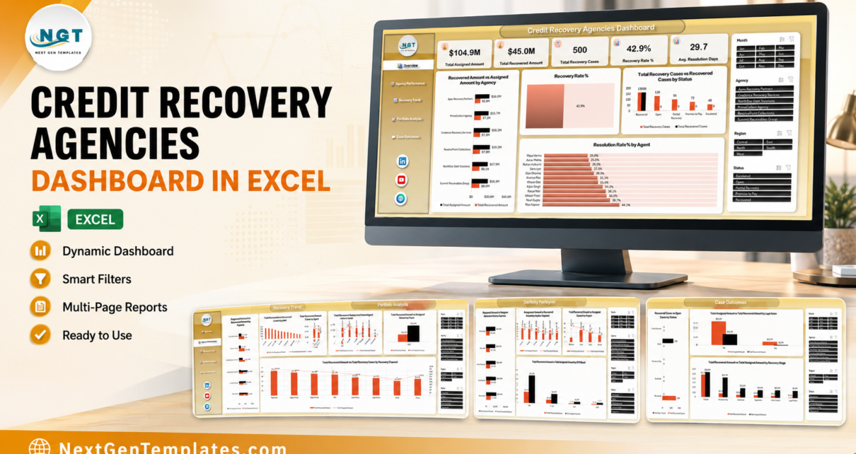
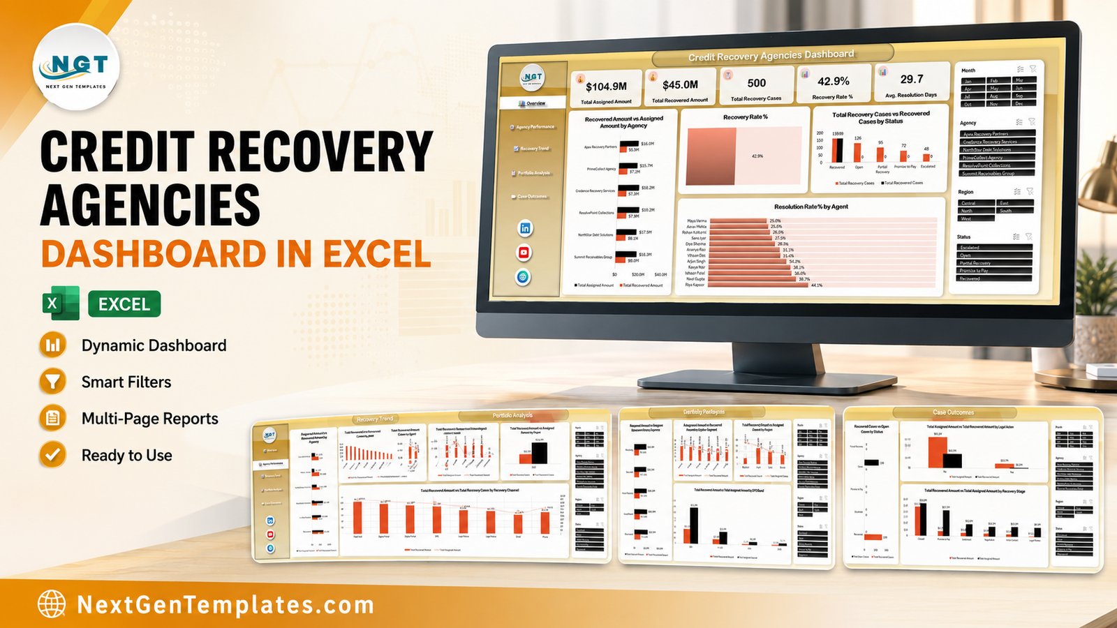
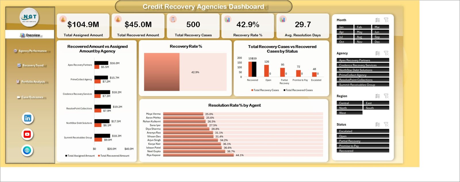
The Credit Recovery Agencies Dashboard in Excel is a five-page analytical workbook built on 19 charts, 25 pivot tables and 4 linked slicers, running over a 500-record sample book of recovery cases described by 25 data columns. In the sample portfolio it reports $104.9M assigned, $45.0M recovered, a 42.9% recovery rate and an average resolution time of 29.7 days across 500 cases and 6 agencies.
If you run or manage a collections operation, the reporting problem is always the same: the case data exists, but nobody can see which agency, which agent, which portfolio and which ageing bucket is actually converting. This Excel dashboard answers all four in one file – no macros, no add-ins, no per-seat platform fee – and it refreshes from your own export in under ten minutes.
Key Features of the Credit Recovery Agencies Dashboard in Excel
- Five headline KPIs on page 1 – Total Assigned Amount, Total Recovered Amount, Total Recovery Cases, Recovery Rate % and Avg. Resolution Days, each recalculating against every slicer selection.
- Four slicers wired to all five pages – Month (Jan-Dec), Agency (6 firms), Region (Central, East, North, South, West) and Status (Escalated, Open, Partial Recovery, Promise to Pay, Recovered). Filter once and the selection carries page to page.
- Agency and agent league tables – all 6 collection firms ranked on assigned versus recovered value, and all 12 agents ranked on resolution rate, from 25.0% at the bottom to 44.1% at the top.
- Ageing and risk views – the book is split across four DPD bands (31-60, 61-90, 91-180, 180+) and four risk bands (Low, Moderate, High, Severe), so the ageing conversation is evidence-based.
- Channel economics – recovered value and case count compared across Field Visit, Digital Portal, SMS, Legal Notice, Email and Phone.
- Legal-action comparison – cases with and without escalation shown side by side on assigned and recovered value.
- A 25-column, 500-row source table – Case ID, Activity Date, Agency, Region, Portfolio, Recovery Channel, Account Type, Debtor Segment, Agent, Original Debt, Assigned Amount, Recovered Amount, Fees Charged, Days Past Due, Contact Attempts, Promise Amount, Resolution Days, Recovery Stage, Status, Risk Band and Legal Action, plus Month, Year, Quarter and DPD Band helpers.
- Plain .xlsx – native Excel tables, pivot tables, pivot charts and slicers only. Nothing to enable, nothing to install.
Dashboard Pages Explanation
The workbook holds seven sheets: five dashboard pages, a Data sheet and a Support sheet. Each page carries the same left-hand navigation rail and the same right-hand slicer panel.
Page 1: Overview
The Overview page opens with the five KPI cards – $104.9M Total Assigned Amount, $45.0M Total Recovered Amount, 500 Total Recovery Cases, 42.9% Recovery Rate and 29.7 Avg. Resolution Days. Below them sit Recovered Amount vs Assigned Amount by Agency, Recovery Rate %, Total Recovery Cases vs Recovered Cases by Status and Resolution Rate % by Agent. In the sample data the status split reads 159 recovered, 126 open, 95 partial recovery, 72 promise to pay and 48 escalated.
Page 2: Agency Performance
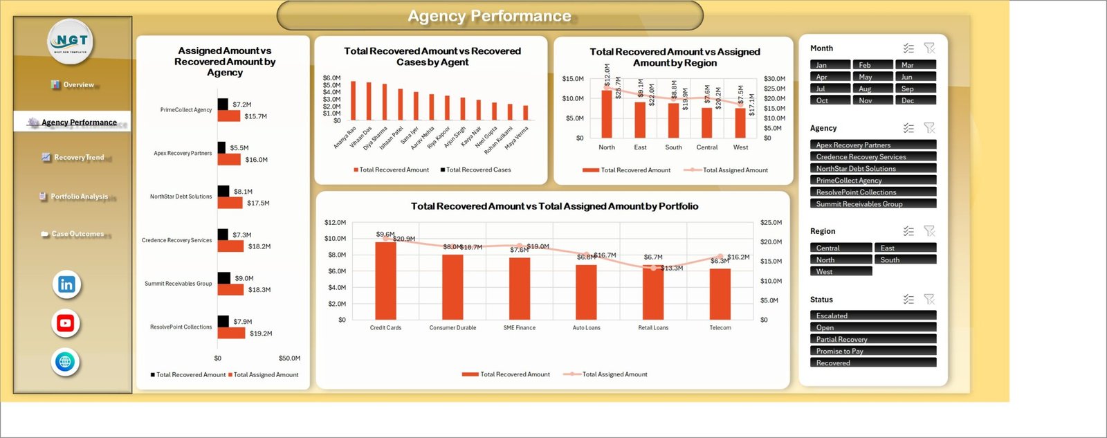
Agency Performance benchmarks the vendors and the people. It carries Assigned Amount vs Recovered Amount by Agency, Total Recovered Amount vs Recovered Cases by Agent, Total Recovered Amount vs Assigned Amount by Region and Total Recovered Amount vs Total Assigned Amount by Portfolio. Summit Receivables Group leads on recovered value at $9.0M from $18.3M assigned, while Apex Recovery Partners converts only $5.5M of $16.0M. North is the strongest region at $12.0M recovered from $25.7M assigned; Credit Cards is the strongest portfolio at $9.6M from $20.9M.
Page 3: Recovery Trend
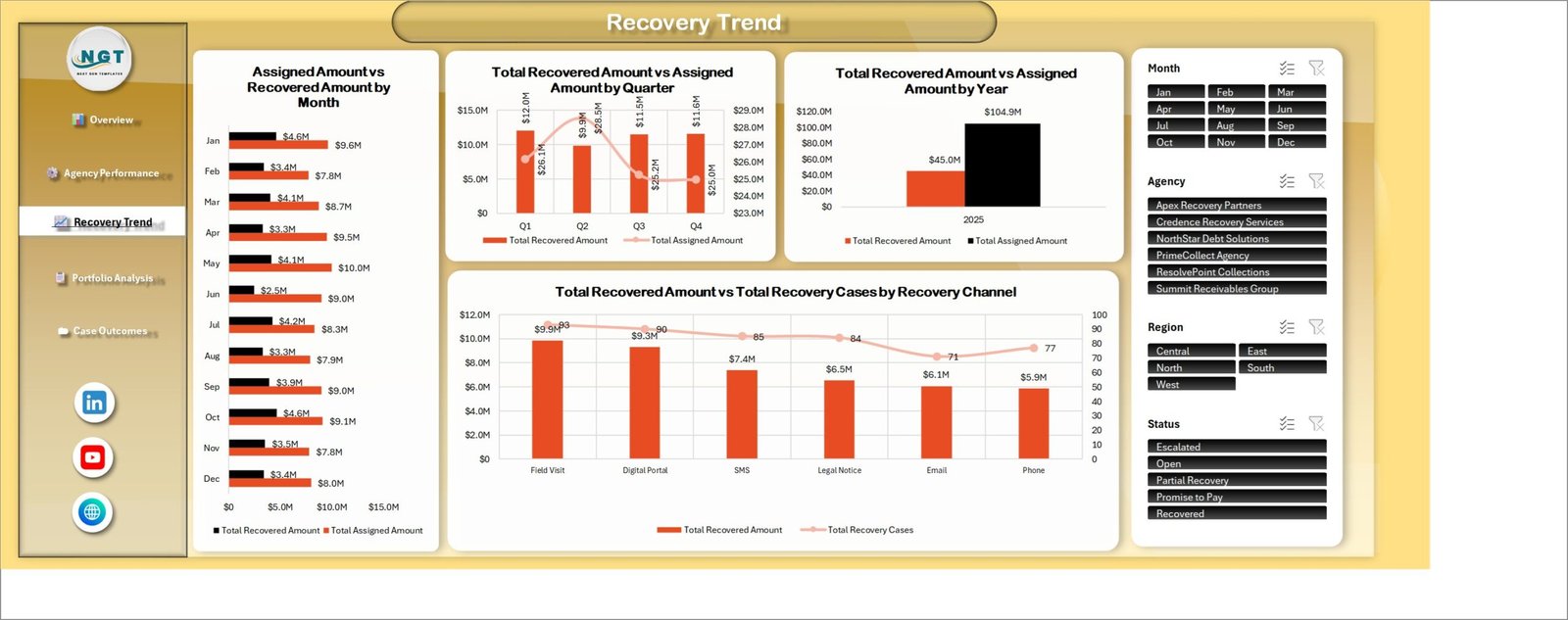
Recovery Trend puts the book on a timeline with Assigned Amount vs Recovered Amount by Month, Total Recovered Amount vs Assigned Amount by Quarter, Total Recovered Amount vs Assigned Amount by Year and Total Recovered Amount vs Total Recovery Cases by Recovery Channel. Q1 is the best quarter at $12.0M recovered against $26.1M assigned, while Q2 dips to $9.9M on the heaviest assignment of the year at $28.5M. On channels, Field Visit returns $9.9M across 83 cases and Phone the least at $5.9M across 77.
Page 4: Portfolio Analysis
Portfolio Analysis slices the exposure with Recovered Amount vs Assigned Amount by Account Type, Assigned Amount vs Recovered Amount by Debtor Segment, Total Recovered Amount vs Recovery Cases by Risk Band and Total Recovered Amount vs Total Assigned Amount by DPD Band. Unsecured accounts carry the biggest assigned balance at $32.2M against $13.0M recovered; Self Employed is the largest debtor segment at $24.8M assigned; and the 180+ DPD bucket dominates the book at $71.0M assigned with $31.3M recovered.

Page 5: Case Outcomes
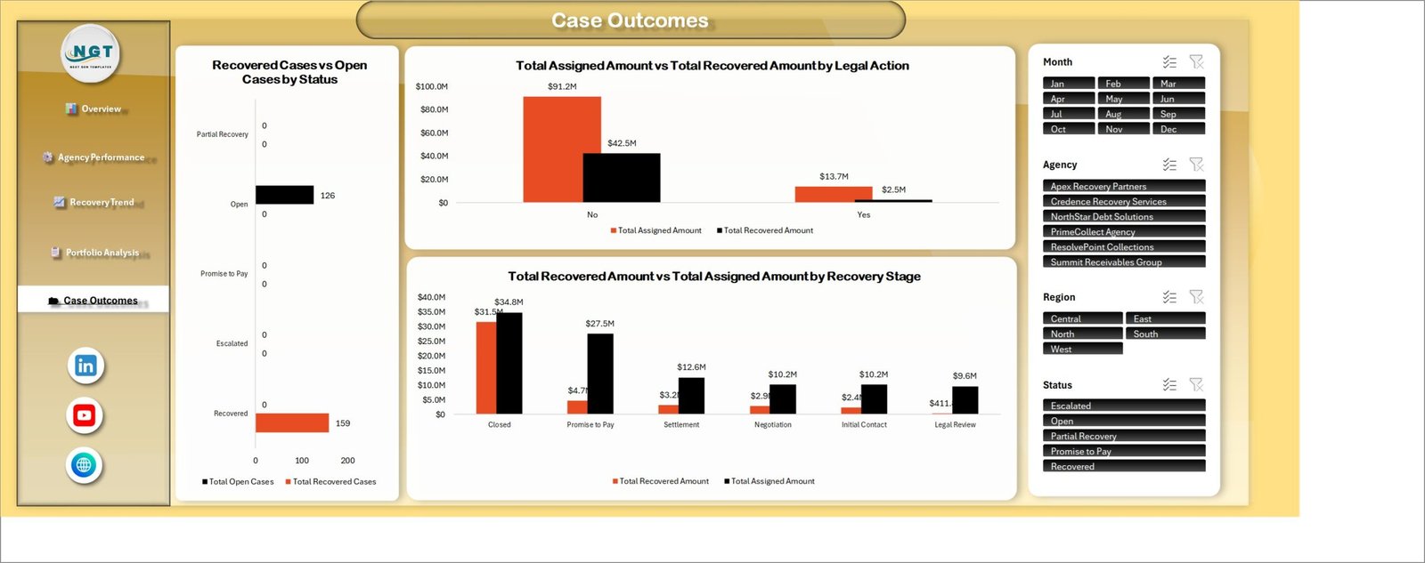
Case Outcomes closes the loop with Recovered Cases vs Open Cases by Status, Total Assigned Amount vs Total Recovered Amount by Legal Action and Total Recovered Amount vs Total Assigned Amount by Recovery Stage. The legal-action chart is the striking one: cases without legal action returned $42.5M of $91.2M assigned, while cases escalated to legal returned $2.5M of $13.7M. By stage, Closed cases account for $31.5M of the $45.0M recovered.
Data Sheet and Support Sheet
The Data sheet holds a formatted Excel table called TblData with 500 sample cases across 25 columns. The Support sheet exposes the helper measures behind the KPI cards – total records, open count, recovered count, escalated count, recovery rate, resolution rate and average recovery per case – so nothing on the dashboard is a black box.
Credit Recovery Agencies Dashboard in Excel vs. a Google Sheets Build vs. Paid Collections SaaS – Feature Comparison
| Feature | Credit Recovery Agencies Dashboard in Excel | Google Sheets equivalent | Katabat / TrueAccord / CollectMax |
|---|---|---|---|
| Cost | $17.99 one-time ✔ | $0-20 one-time | $60-250 / user / month |
| Platform | Excel 2016+, Microsoft 365, Excel for Mac | Browser only | Vendor cloud |
| Setup time | Under 10 minutes ✔ | 15-30 minutes | 4-12 weeks with onboarding |
| Works offline | Yes ✔ | No | No |
| Real-time team collaboration | Via OneDrive / SharePoint co-authoring | Yes ✔ | Yes |
| Customisable fields and charts | 19 charts, 25 pivots, no locked sheets ✔ | Editable | Vendor-controlled |
| Agency and agent league tables | Built in – 6 agencies, 12 agents ✔ | Build it yourself | Yes |
| DPD and risk-band ageing views | Built in – 4 DPD bands, 4 risk bands ✔ | Build it yourself | Yes |
| Year-1 cost at 5 users | $17.99 total ✔ | $0-20 | $3,600 – $15,000 |
For agencies that want board-ready recovery analytics without a per-seat collections platform, the Credit Recovery Agencies Dashboard in Excel sits in the sweet spot.
Who Should Use This Template
Perfect for:
- Collection and credit recovery agency owners with 5-50 agents who report monthly to lender clients
- Bank and NBFC recovery managers comparing several outsourced agencies on one scorecard
- Receivables and credit-control teams presenting DPD ageing and recovery rate to a CFO
- Analysts and consultants who would rather adapt a working Excel model than build one from scratch
Not a fit if:
- You need a dialer, payment capture or an FDCPA-compliant communication log – this is a reporting layer, not a system of record
- You expect automatic sync from a core banking or loan management system; the Data sheet is refreshed by paste or by your own query
- Your organisation requires SOC 2, SSO and row-level security on the reporting layer
- You are on Excel 2010 or earlier, where the slicer and pivot behaviour used here is not supported
Real-World Use Cases
Rahul runs a 40-agent recovery firm working three bank portfolios. Each month he pastes his case export into the Data sheet, refreshes, and sends the Agency Performance page to his clients showing recovered value per portfolio and per agent. The pack used to take his MIS analyst two days of manual pivoting.
Priya manages outsourced collections at a mid-size NBFC. She uses Overview and Portfolio Analysis to compare her six vendor agencies on recovery rate and on how much of the 180+ DPD bucket each one converts – the vendor-scorecard question her platform charges a separate module fee to answer.
Daniel leads credit control at a telecom company. He filters to the Telecom portfolio and the Escalated status before deciding which accounts to hand to legal, and uses the Case Outcomes page as evidence that legal action returned only $2.5M against $13.7M assigned.
Advantages of the Credit Recovery Agencies Dashboard in Excel
- One-time cost. $17.99 once against $3,600-$15,000 a year for five seats on a collections platform’s reporting module.
- No IT approval needed. A plain
.xlsxwith no macros clears most corporate security policies without a conversation. - Every number is traceable. The Support sheet shows the measures behind each KPI card, so a disputed figure can be reconciled in seconds.
- Client-ready output. Each page is laid out for a single printed sheet, so a lender pack is a Save-as-PDF away.
- It scales past the sample. The 500 rows are demo data; pivot tables handle tens of thousands of case rows comfortably.
- Fully editable. No locked sheets or hidden protections – rename an agency, add a portfolio, restyle a chart.
Opportunities for Improvement
A few things are worth knowing before you buy, because a balanced view is more useful than a sales pitch.
- The case-count series on two charts is sparse by design. On the Overview page, Total Recovery Cases vs Recovered Cases by Status shows the “Total Recovered Cases” series at 0 for Open, Partial Recovery, Promise to Pay and Escalated – recovered cases only exist within the Recovered status, so the two bars overlap at 159 there and read zero elsewhere. The same pattern appears in Recovered Cases vs Open Cases by Status on the Case Outcomes page. It is correct arithmetic, but it looks like missing data at first glance; you may want to swap that chart for a single-series count.
- The Recovery Rate % visual is a filled block, not a gauge. It prints 42.9% on a two-tone rectangle rather than a donut or speedometer. Functional, but plainer than the rest of the page.
- A few data labels crowd their bars. On Portfolio Analysis the $31.3M and $10.6M labels sit tight against the DPD bars, and on Case Outcomes the Legal Review label is clipped. Widening the plot area or nudging the label position fixes it in a few seconds.
- Sample data is single-year. The Total Recovered Amount vs Assigned Amount by Year chart shows only 2025, so the year-over-year view only becomes useful once you load your own multi-year history.
- No cost-to-collect metric. Fees Charged is captured in the Data sheet but is not visualised, so a cost-to-collect ratio is an easy addition you may want to build yourself.
Best Practices
- Keep the 25 Data sheet headers exactly as shipped – the pivots reference them by name, so a renamed column silently empties a chart.
- Let the Month, Year, Quarter and DPD Band helper columns be derived from Activity Date and Days Past Due rather than typed by hand, so filters stay consistent.
- Refresh with Ctrl + Alt + F5 after every paste; a single pivot refresh will leave other pages stale.
- Load at least 13 months of history before you present the trend pages – month-on-month movement means little on a partial year.
- Save a snapshot copy at each month-end so you can compare closed periods instead of overwriting them.
- Use the Status slicer to build your own working views: Escalated plus 180+ DPD is your legal shortlist, Promise to Pay is your follow-up list.
- Read the Microsoft guide to slicers if you want to add a fifth filter such as Recovery Channel or Risk Band.
Explore Relevant Templates
- Credit Recovery Agencies KPI Dashboard in Excel – the same business as a month-picker scorecard with MTD/YTD targets and traffic lights. A different template, and a natural companion to this one. There is a full write-up of the KPI version here.
- Loan Recovery Services Dashboard in Excel – the lending-led equivalent, covered in detail in our Loan Recovery Services Dashboard post.
- Loan Recovery Services Dashboard in Power BI – also available as: the Power BI build, for teams already standardised on Power BI Desktop. See the Power BI walkthrough.
- Debt Management KPI Dashboard in Excel – for the borrower side of the same ledger.
- Accounts Receivable KPI Dashboard in Google Sheets – the pre-delinquency view, in Sheets.
Bundle upsell: the CFO’s Financial Command Toolkit packs 10 premium finance templates across Excel, Google Sheets and Power BI, and there is a full breakdown of the toolkit on the blog. Or browse all Excel Dashboard Templates.
Frequently Asked Questions
What KPIs does the Credit Recovery Agencies Dashboard in Excel track?
The Credit Recovery Agencies Dashboard in Excel tracks five headline KPIs – Total Assigned Amount, Total Recovered Amount, Total Recovery Cases, Recovery Rate % and Avg. Resolution Days – plus resolution rate by agent and recovered value by agency, region, portfolio, channel, risk band, DPD band and recovery stage.
How long does setup take?
Under 10 minutes. Unzip the file, open the Data sheet, replace the 500 sample rows with your own case export keeping the 25 headers unchanged, then press Ctrl + Alt + F5. All 19 charts and 25 pivot tables in the Credit Recovery Agencies Dashboard in Excel rebuild from your data.
Do I need macros, Power Query or an add-in?
No. The Credit Recovery Agencies Dashboard in Excel is a plain .xlsx built on native Excel tables, pivot tables, pivot charts and slicers. There is nothing to enable and nothing to install, which is why it clears most corporate security policies without an exception request.
How does this compare to a paid collections platform like Katabat or CollectMax?
A collections platform runs the workflow – dialer, payment capture, compliance logging – at $60-250 per user per month. The Credit Recovery Agencies Dashboard in Excel is the reporting layer only, at $17.99 once, so many agencies run it alongside a platform they already own rather than instead of one.
Is this the same as the Credit Recovery Agencies KPI Dashboard in Excel?
No, they are two different templates. The KPI Dashboard is a month-picker scorecard with MTD/YTD targets and traffic lights. The Credit Recovery Agencies Dashboard in Excel is an analytical, slicer-driven workbook across five pages of charts. They complement each other and many buyers own both.
Can I add my own agencies, agents, portfolios or regions?
Yes. Every dimension in the Credit Recovery Agencies Dashboard in Excel is read from the Data sheet rather than hard-coded. Type new agency, agent, portfolio, region or risk-band values into the table, refresh, and they appear in the charts and slicer lists straight away.
Will it handle more than 500 rows of cases?
Yes. The 500 records are sample data only. Because the Credit Recovery Agencies Dashboard in Excel is built on pivot tables, it handles tens of thousands of case rows comfortably – a larger book simply takes a second longer to refresh.
About the Author
Built by PK – Microsoft Certified Professional with 15+ years of Excel, Google Sheets and Power BI experience. Founder of NextGenTemplates, reaching 300K+ subscribers across YouTube channels. Every template is hand-built and tested before release.
Conclusion
The Credit Recovery Agencies Dashboard in Excel turns a flat case export into five pages of agency, agent, portfolio, ageing and outcome analysis – 5 KPIs, 19 charts, 25 pivot tables and 4 slicers, refreshed from your own data in under ten minutes. For a collections operation that reports monthly to lenders, that is the difference between two days of manual pivoting and one Refresh All.
👉 Click here to Purchase the Credit Recovery Agencies Dashboard in Excel
Instant download · One-time payment · No subscription
🎥 For step-by-step video tutorials, visit Youtube.com/@PK-AnExcelExpert
Last updated: August 2026