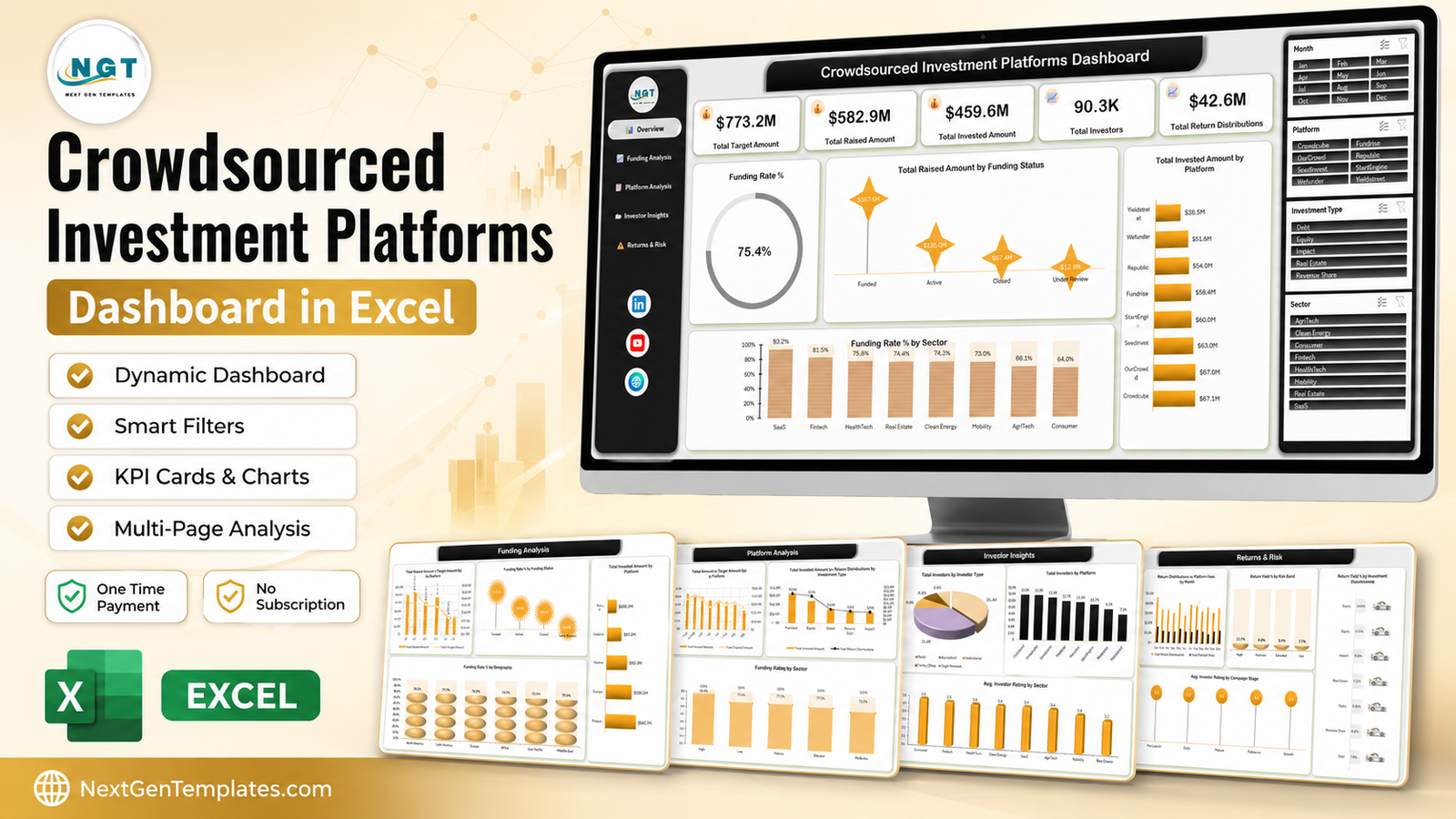
Equity crowdfunding stopped being a novelty a long time ago, and anyone running or backing campaigns now faces the same reporting problem: the money is spread across half a dozen portals, each one exports a different CSV, and none of them tell you how your capital is performing as a whole. The Crowdsourced Investment Platforms Dashboard in Excel is built for exactly that gap. The sample workbook carries 500 investment records covering $773.2M of target capital, $582.9M raised, $459.6M actually invested and 90,300 investors across eight platforms, and it settles on a blended funding rate of 75.4 percent. Five report pages, four slicers, no macros and no monthly fee. Crowdsourced Investment Platforms Dashboard in Excel
This post walks through what is on each page, what the sample numbers actually say, where the template is strong, and where it stops. Crowdsourced Investment Platforms Dashboard in Excel
Key Features of the Crowdsourced Investment Platforms Dashboard in Excel
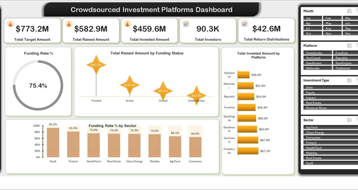
- Five KPI cards on the Overview page: Total Target Amount, Total Raised Amount, Total Invested Amount, Total Investors and Total Return Distributions ($42.6M on the sample data).
- Four slicers wired across all five pages – Month, Platform, Investment Type and Sector. Click “Fintech” once and every chart in the workbook re-cuts.
- Eight named platforms compared head to head: Crowdcube, OurCrowd, SeedInvest, StartEngine, Fundrise, Republic, Wefunder and Yieldstreet.
- A left navigation rail on every sheet, so the workbook reads like an app rather than a stack of tabs.
- 27 columns of source data over 500 rows, held in a real Excel table so pivot ranges extend themselves when you paste more.
- Risk and yield analysis built in – return yield by risk band and by investment type, plus average investor rating by sector and by campaign stage.
- A plain .xlsx file. No add-in, no macro prompt, no subscription, and the data never leaves your machine. Crowdsourced Investment Platforms Dashboard in Excel
Dashboard Pages Explanation
Page 1 – Overview
The five KPI cards sit across the top. Underneath, a Funding Rate % donut reads 75.4 percent, meaning three quarters of the target capital in the sample actually landed. Total Raised Amount by Funding Status splits that into Funded $367.6M, Active $135.0M, Closed $67.4M and Under Review $12.8M. On the right, Total Invested Amount by Platform runs from Crowdcube at $67.1M and OurCrowd at $67.0M down through SeedInvest $63.0M, StartEngine $60.0M, Fundrise $58.4M, Republic $54.0M and Wefunder $51.6M to Yieldstreet at $38.5M. Along the bottom, Funding Rate % by Sector puts SaaS on top at 93.2 percent, then Fintech 81.5, HealthTech 75.8, Real Estate 74.4, Clean Energy 74.3, Mobility 73.0, AgriTech 66.1 and Consumer last at 64.0 percent. Crowdsourced Investment Platforms Dashboard in Excel
Page 2 – Funding Analysis
Total Raised Amount vs Target Amount by Quarter is the combo chart most people screenshot: Q1 $152.0M, Q2 $145.6M, Q3 $148.9M and Q4 $136.4M against a target line that drifts the other way. Funding Rate % by Funding Status is the page’s most interesting chart – campaigns that reach Funded do not stop at 100 percent, they average 115.8 percent, while Active sits at 62.0, Closed at 52.1 and Under Review at 11.8 percent. Total Raised Amount by Campaign Stage shows Growth pulling $187.9M, Early $160.5M, Mature $133.2M, Follow-on $74.3M and Pre-Launch just $27.1M. Funding Rate % by Geography closes the page: North America 78.2, Latin America 77.7, Europe 75.9, Africa 74.7, Asia Pacific 72.5 and Middle East 70.9 percent – a much tighter band than most people expect. Crowdsourced Investment Platforms Dashboard in Excel
Page 3 – Platform Analysis
This is where a platform operator lives. Raised Amount vs Target Amount by Platform puts all eight portals on one axis pair so over- and under-performers are obvious. Total Invested Amount vs Return Distributions by Investment Type shows Real Estate absorbing the most capital at $175.4M, with Equity second, then Debt $61.2M, Revenue Share $50.5M and Impact $41.7M, and a return-distribution line overlaid on a secondary axis. Funding Rate % by Risk Band reads High 82.0, Low 77.1, Elevated 77.1 and Moderate 72.2 percent. Total Invested Amount by Sector ranks Fintech $69.7M, SaaS $68.5M, Clean Energy $62.2M, Real Estate $61.1M, HealthTech $51.7M, Mobility $50.6M, AgriTech $49.0M and Consumer $46.9M. Crowdsourced Investment Platforms Dashboard in Excel
Page 4 – Investor Insights
A pie splits Total Investors by Investor Type: 35.4K retail, 31.4K accredited, 8.9K institutional, 8.0K family office and 6.6K angel network. Total Investors by Platform is a clean column chart – OurCrowd 13.6K, Crowdcube 13.5K, SeedInvest 12.8K, Fundrise 11.7K, Republic 11.5K, StartEngine 10.7K, Wefunder 9.2K, Yieldstreet 7.2K. Avg. Investor Rating by Sector compresses into a narrow 3.2 to 3.5 band, with Consumer and Fintech tied at the top and Real Estate at the bottom. Total Invested Amount by Geography is far less even than the funding-rate view: North America $143.7M, Europe $108.2M, Asia Pacific $92.8M, Middle East $52.7M, Latin America $37.0M and Africa $25.2M. Crowdsourced Investment Platforms Dashboard in Excel
Page 5 – Returns and Risk
Return Distributions vs Platform Fees by Month puts twelve months of distributions against the fees taken, side by side, which is the fastest way to see whether a fee model is proportionate. Return Yield % by Risk Band behaves the way finance theory says it should – High 11.3, Moderate 9.4, Elevated 8.9 and Low 7.7 percent. Return Yield % by Investment Type reads Equity 10.6, Impact 9.9, Real Estate 9.0, Revenue Share 8.0 and Debt 7.8 percent. Finally Avg. Investor Rating by Campaign Stage is quietly the most useful chart in the file: Pre-Launch campaigns rate 3.6, Early 3.5, Mature and Follow-on 3.4, Growth only 3.3. Enthusiasm peaks before the money is committed.
The Data and Support sheets
Behind the reports, the Data sheet holds 500 rows across 27 columns – Investment ID, Investment Date, Platform, Investment Type, Sector, Geography, Investor Type, Campaign Stage, Risk Band, Campaign Name, Funding Status, Investors, Target Amount, Raised Amount, Invested Amount, Fees, Return Distributions, Holding Period Months, Risk Score, Investor Rating, plus Month, Year and Quarter helper columns. The Support sheet holds the lists the slicers read. Return Distributions vs Platform Fees by Month puts twelve months of distributions against the fees taken, side by side, which is the fastest way to see whether a fee model is proportionate. Return Yield % by Risk Band behaves the way finance theory says it should – High 11.3, Moderate 9.4, Elevated 8.9 and Low 7.7 percent. Return Yield % by Investment Type reads Equity 10.6, Impact 9.9, Real Estate 9.0, Revenue Share 8.0 and Debt 7.8 percent. Finally Avg. Investor Rating by Campaign Stage is quietly the most useful chart in the file: Pre-Launch campaigns rate 3.6, Early 3.5, Mature and Follow-on 3.4, Growth only 3.3. Enthusiasm peaks before the money is committed. Return Distributions vs Platform Fees by Month puts twelve months of distributions against the fees taken, side by side, which is the fastest way to see whether a fee model is proportionate. Return Yield % by Risk Band behaves the way finance theory says it should – High 11.3, Moderate 9.4, Elevated 8.9 and Low 7.7 percent. Return Yield % by Investment Type reads Equity 10.6, Impact 9.9, Real Estate 9.0, Revenue Share 8.0 and Debt 7.8 percent. Finally Avg. Investor Rating by Campaign Stage is quietly the most useful chart in the file: Pre-Launch campaigns rate 3.6, Early 3.5, Mature and Follow-on 3.4, Growth only 3.3. Enthusiasm peaks before the money is committed. Crowdsourced Investment Platforms Dashboard in Excel
Crowdsourced Investment Platforms Dashboard in Excel vs. Google Sheets vs. Paid Portfolio SaaS – Feature Comparison
| This Excel Dashboard | Google Sheets Build | Paid Portfolio SaaS | |
|---|---|---|---|
| Cost | One payment, no renewal | Free tool, your build time | Typically $50-$300 per user per month |
| Platform | Excel 2016+, Microsoft 365, Windows or Mac | Browser | Browser, vendor hosted |
| Setup time | About 10 minutes: paste, refresh | Days of chart and formula work | Onboarding plus data mapping |
| Real-time collaboration | Via OneDrive or SharePoint | Yes, native | Yes, native |
| Mobile access | Excel mobile app, view and filter | Yes | Yes |
| Customisable fields | All 27 columns are editable | Yes | Only what the vendor exposes |
| Share with a link | Yes, via OneDrive | Yes | Yes, seat permitting |
| Year-1 cost at 5 users | The purchase price, once | Free plus your hours | $3,000-$18,000 |
| Multi-platform campaign view | Eight portals in one table | Build it yourself | Usually one portal per integration |
| Where your raise data sits | On your machine | Google Drive | Vendor servers |
Who Should Use This Template
Syndicate leads and angel-group managers who back deals through more than one portal and need a single quarterly picture. Crowdfunding platform operations and marketing teams who report funding rate by sector, stage and geography. Fund analysts and IR staff who want a raised-versus-target chart today rather than a BI ticket. Advisors, lecturers and finance students exploring how equity, debt, revenue share, impact and real-estate deals compare on yield and risk.
It is not the right tool if you need a live API connection to a portal, a cap table, a KYC or AML workflow, or per-deal IRR schedules. It is a paste-and-refresh analytical workbook, and it is honest about that. Return Distributions vs Platform Fees by Month puts twelve months of distributions against the fees taken, side by side, which is the fastest way to see whether a fee model is proportionate. Return Yield % by Risk Band behaves the way finance theory says it should – High 11.3, Moderate 9.4, Elevated 8.9 and Low 7.7 percent. Return Yield % by Investment Type reads Equity 10.6, Impact 9.9, Real Estate 9.0, Revenue Share 8.0 and Debt 7.8 percent. Finally Avg. Investor Rating by Campaign Stage is quietly the most useful chart in the file: Pre-Launch campaigns rate 3.6, Early 3.5, Mature and Follow-on 3.4, Growth only 3.3. Enthusiasm peaks before the money is committed.
Real-World Use Cases
A 40-member angel syndicate. Members back deals on four portals. The syndicate lead pastes each export into the Data sheet, sets the Platform slicer to the two portals the group actually uses, and exports the Overview and Returns and Risk pages as a two-page PDF for the quarterly member letter.Crowdsourced Investment Platforms Dashboard in Excel
A mid-size equity crowdfunding portal. The board asks every month which sectors close and which stall. Funding Rate % by Sector answers it in a glance, and the 115.8 percent average on Funded campaigns changed how the team sets campaign targets in the first place.
An alternative-investments teaching module. Students filter to one investment type and explain why Equity yields 10.6 percent while Debt yields 7.8 percent across the same eight platforms. The slicers make it interactive without anyone writing a formula. Return Distributions vs Platform Fees by Month puts twelve months of distributions against the fees taken, side by side, which is the fastest way to see whether a fee model is proportionate. Return Yield % by Risk Band behaves the way finance theory says it should – High 11.3, Moderate 9.4, Elevated 8.9 and Low 7.7 percent. Return Yield % by Investment Type reads Equity 10.6, Impact 9.9, Real Estate 9.0, Revenue Share 8.0 and Debt 7.8 percent. Finally Avg. Investor Rating by Campaign Stage is quietly the most useful chart in the file: Pre-Launch campaigns rate 3.6, Early 3.5, Mature and Follow-on 3.4, Growth only 3.3. Enthusiasm peaks before the money is committed.
Advantages of the Crowdsourced Investment Platforms Dashboard in Excel
- It is finished. Five pages, twenty-odd charts and four slicers already laid out and formatted – the part of a dashboard project that actually costs time.
- Native Excel only. Pivot tables, pivot charts and slicers, documented by Microsoft in the official guide to using slicers to filter data. Nothing proprietary to learn or maintain.
- Portable. One .xlsx you can email, park on OneDrive, or open on a plane. No login, no seat, no vendor.
- Private by default. Capital-raise data stays on your machine, which matters more in this domain than in most.
- Cheap to keep. One payment against three to eighteen thousand dollars a year for a five-seat SaaS equivalent.Return Distributions vs Platform Fees by Month puts twelve months of distributions against the fees taken, side by side, which is the fastest way to see whether a fee model is proportionate. Return Yield % by Risk Band behaves the way finance theory says it should – High 11.3, Moderate 9.4, Elevated 8.9 and Low 7.7 percent. Return Yield % by Investment Type reads Equity 10.6, Impact 9.9, Real Estate 9.0, Revenue Share 8.0 and Debt 7.8 percent. Finally Avg. Investor Rating by Campaign Stage is quietly the most useful chart in the file: Pre-Launch campaigns rate 3.6, Early 3.5, Mature and Follow-on 3.4, Growth only 3.3. Enthusiasm peaks before the money is committed. Return Distributions vs Platform Fees by Month puts twelve months of distributions against the fees taken, side by side, which is the fastest way to see whether a fee model is proportionate. Return Yield % by Risk Band behaves the way finance theory says it should – High 11.3, Moderate 9.4, Elevated 8.9 and Low 7.7 percent. Return Yield % by Investment Type reads Equity 10.6, Impact 9.9, Real Estate 9.0, Revenue Share 8.0 and Debt 7.8 percent. Finally Avg. Investor Rating by Campaign Stage is quietly the most useful chart in the file: Pre-Launch campaigns rate 3.6, Early 3.5, Mature and Follow-on 3.4, Growth only 3.3. Enthusiasm peaks before the money is committed. Return Distributions vs Platform Fees by Month puts twelve months of distributions against the fees taken, side by side, which is the fastest way to see whether a fee model is proportionate. Return Yield % by Risk Band behaves the way finance theory says it should – High 11.3, Moderate 9.4, Elevated 8.9 and Low 7.7 percent. Return Yield % by Investment Type reads Equity 10.6, Impact 9.9, Real Estate 9.0, Revenue Share 8.0 and Debt 7.8 percent. Finally Avg. Investor Rating by Campaign Stage is quietly the most useful chart in the file: Pre-Launch campaigns rate 3.6, Early 3.5, Mature and Follow-on 3.4, Growth only 3.3. Enthusiasm peaks before the money is committed.
Opportunities for Improvement
Being straight about the limits: there is no live portal connector, so every refresh cycle begins with a manual export. There is no XIRR or IRR calculation per deal – the workbook reports yield percentages, not time-weighted returns. The pie chart on Investor Insights is the weakest visual in the file and a bar chart would rank the five investor types more clearly. Currency is single-denomination, so a multi-currency portfolio needs a converted column before pasting. And past roughly 200,000 rows the pivot refresh becomes noticeable – at that scale, move the source into Power Query or Power BI and keep this workbook for reporting. Return Distributions vs Platform Fees by Month puts twelve months of distributions against the fees taken, side by side, which is the fastest way to see whether a fee model is proportionate. Return Yield % by Risk Band behaves the way finance theory says it should – High 11.3, Moderate 9.4, Elevated 8.9 and Low 7.7 percent. Return Yield % by Investment Type reads Equity 10.6, Impact 9.9, Real Estate 9.0, Revenue Share 8.0 and Debt 7.8 percent. Finally Avg. Investor Rating by Campaign Stage is quietly the most useful chart in the file: Pre-Launch campaigns rate 3.6, Early 3.5, Mature and Follow-on 3.4, Growth only 3.3. Enthusiasm peaks before the money is committed. Return Distributions vs Platform Fees by Month puts twelve months of distributions against the fees taken, side by side, which is the fastest way to see whether a fee model is proportionate. Return Yield % by Risk Band behaves the way finance theory says it should – High 11.3, Moderate 9.4, Elevated 8.9 and Low 7.7 percent. Return Yield % by Investment Type reads Equity 10.6, Impact 9.9, Real Estate 9.0, Revenue Share 8.0 and Debt 7.8 percent. Finally Avg. Investor Rating by Campaign Stage is quietly the most useful chart in the file: Pre-Launch campaigns rate 3.6, Early 3.5, Mature and Follow-on 3.4, Growth only 3.3. Enthusiasm peaks before the money is committed. Crowdsourced Investment Platforms Dashboard in Excel
Best Practices
- Never edit the header row on the Data sheet. Every pivot field is bound to those 27 names.
- Fill Month, Year and Quarter on every row you paste – the quarterly and monthly charts group on them, and a blank there silently drops the row from those two views.
- Press Ctrl+Alt+F5 after every paste. Most “the dashboard is wrong” reports are a missing Refresh All.
- Mirror any new platform, sector or investment type onto the Support sheet, then refresh again so the slicer picks it up.
- Keep one workbook per reporting period if you archive, and keep the original file untouched as your template.
- Export to PDF from File > Export rather than screenshotting – the pages are sized to print cleanly. Return Distributions vs Platform Fees by Month puts twelve months of distributions against the fees taken, side by side, which is the fastest way to see whether a fee model is proportionate. Return Yield % by Risk Band behaves the way finance theory says it should – High 11.3, Moderate 9.4, Elevated 8.9 and Low 7.7 percent. Return Yield % by Investment Type reads Equity 10.6, Impact 9.9, Real Estate 9.0, Revenue Share 8.0 and Debt 7.8 percent. Finally Avg. Investor Rating by Campaign Stage is quietly the most useful chart in the file: Pre-Launch campaigns rate 3.6, Early 3.5, Mature and Follow-on 3.4, Growth only 3.3. Enthusiasm peaks before the money is committed. Return Distributions vs Platform Fees by Month puts twelve months of distributions against the fees taken, side by side, which is the fastest way to see whether a fee model is proportionate. Return Yield % by Risk Band behaves the way finance theory says it should – High 11.3, Moderate 9.4, Elevated 8.9 and Low 7.7 percent. Return Yield % by Investment Type reads Equity 10.6, Impact 9.9, Real Estate 9.0, Revenue Share 8.0 and Debt 7.8 percent. Finally Avg. Investor Rating by Campaign Stage is quietly the most useful chart in the file: Pre-Launch campaigns rate 3.6, Early 3.5, Mature and Follow-on 3.4, Growth only 3.3. Enthusiasm peaks before the money is committed. Return Distributions vs Platform Fees by Month puts twelve months of distributions against the fees taken, side by side, which is the fastest way to see whether a fee model is proportionate. Return Yield % by Risk Band behaves the way finance theory says it should – High 11.3, Moderate 9.4, Elevated 8.9 and Low 7.7 percent. Return Yield % by Investment Type reads Equity 10.6, Impact 9.9, Real Estate 9.0, Revenue Share 8.0 and Debt 7.8 percent. Finally Avg. Investor Rating by Campaign Stage is quietly the most useful chart in the file: Pre-Launch campaigns rate 3.6, Early 3.5, Mature and Follow-on 3.4, Growth only 3.3. Enthusiasm peaks before the money is committed.Crowdsourced Investment Platforms Dashboard in Excel
Explore Relevant Templates
- Real Estate Crowdfunding Dashboard in Excel
- VC Portfolio Dashboard in Excel
- Business Angel Networks Dashboard in Excel
- Peer-to-Peer Lending KPI Dashboard in Excel
- Angel Investors KPI Dashboard in Excel
Frequently Asked Questions
Which Excel versions does it work in?
Excel 2016 or later on Windows, Microsoft 365 on Windows or Mac, and Excel for Mac 2019 or later. Everything in the file is a native Excel object. Excel for the web will open it, but slicer behaviour is limited there, so use the desktop app.Crowdsourced Investment Platforms Dashboard in Excel
Does it use macros?
No. It is a plain .xlsx with pivot tables, pivot charts and slicers. There is no macro prompt and nothing to enable.
Can it pull data straight from Crowdcube or Republic?
Not by itself. It is built around the CSV export those portals already give you. If you know Power Query, you can point a query at your export folder and load it into the Data table, and the rest of the workbook keeps working.
How much data can it hold?
The sample is 500 rows. Tens of thousands refresh comfortably. Somewhere past 200,000 rows you will want Power Query or Power BI feeding it instead.
Can I rename the platforms and sectors?
Yes. They are ordinary text columns. Edit the Data sheet, mirror the change on the Support sheet, refresh, and the slicers and charts follow.
Is the sample data real?
No, it is synthetic but realistic – built so every chart, band and rating has something to show. Delete it once your own export is in.
About the Author
Built by PK – Microsoft Certified Professional with 15+ years of Excel, Google Sheets, and Power BI experience. Founder of NextGenTemplates, reaching 300K+ subscribers across YouTube channels. Every template is hand-built and tested before release.Crowdsourced Investment Platforms Dashboard in Excel
Conclusion
Crowdfunding reporting fails for a boring reason: the data is fine, but it is scattered, and nobody has time to rebuild the same five charts every quarter. This workbook is the rebuild, done once. Paste your export, press Refresh All, and you get funding rate by sector and geography, raised against target by quarter, investor mix by type and platform, and yield by risk band and investment type – all filtered by the same four slicers. Return Distributions vs Platform Fees by Month puts twelve months of distributions against the fees taken, side by side, which is the fastest way to see whether a fee model is proportionate. Return Yield % by Risk Band behaves the way finance theory says it should – High 11.3, Moderate 9.4, Elevated 8.9 and Low 7.7 percent. Return Yield % by Investment Type reads Equity 10.6, Impact 9.9, Real Estate 9.0, Revenue Share 8.0 and Debt 7.8 percent. Finally Avg. Investor Rating by Campaign Stage is quietly the most useful chart in the file: Pre-Launch campaigns rate 3.6, Early 3.5, Mature and Follow-on 3.4, Growth only 3.3. Enthusiasm peaks before the money is committed. Crowdsourced Investment Platforms Dashboard in Excel
Get the Crowdsourced Investment Platforms Dashboard in Excel on NextGenTemplates – one payment, instant download, Return Distributions vs Platform Fees by Month puts twelve months of distributions against the fees taken, side by side, which is the fastest way to see whether a fee model is proportionate. Return Yield % by Risk Band behaves the way finance theory says it should – High 11.3, Moderate 9.4, Elevated 8.9 and Low 7.7 percent. Return Yield % by Investment Type reads Equity 10.6, Impact 9.9, Real Estate 9.0, Revenue Share 8.0 and Debt 7.8 percent. Finally Avg. Investor Rating by Campaign Stage is quietly the most useful chart in the file: Pre-Launch campaigns rate 3.6, Early 3.5, Mature and Follow-on 3.4, Growth only 3.3. Enthusiasm peaks before the money is committed. Crowdsourced Investment Platforms Dashboard in Excel
user manual included.
For step-by-step Excel dashboard tutorials, subscribe to youtube.com/@PKAnExcelExpert.