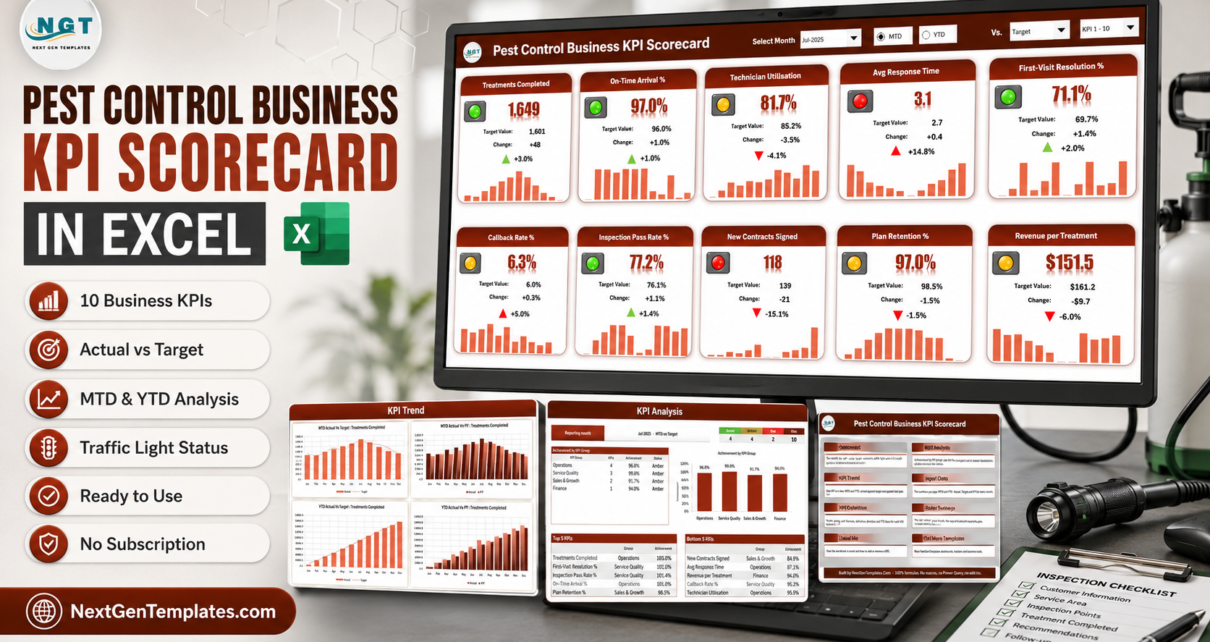
Most pest-control operators already have the numbers. Jobs completed, callbacks, renewals, revenue per treatment – they sit in the field-service app, in the invoicing system, in a spreadsheet somebody keeps. What is usually missing is the one page that turns those numbers into a decision. The Pest Control Business KPI Scorecard in Excel is that page: ten named KPIs, a month picker, a traffic light on every tile and a 12-month sparkline underneath, all driven by formulas with no macros anywhere in the file.
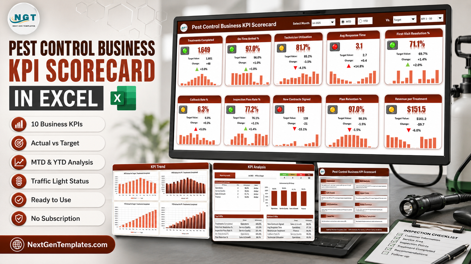
Here is what that looks like in practice. The sample month the workbook ships with is Jul-2025, and it scores 4 Green, 4 Amber and 2 Red across four KPI groups. Treatments Completed sits at 1,649 against a 1,601 target – 103.0% achievement, green. Avg Response Time sits at 3.1 hours against a 2.7-hour target – 14.8% worse than plan, red. New Contracts Signed comes in at 118 against 139 – 84.9%, red. Two of those three facts would take twenty minutes to establish from raw job data. Here they are visible in about five seconds, and that difference is the whole point of a scorecard.
This article walks through what is in the workbook, what it deliberately does not do, and how it differs from the Google Sheets edition and from a paid field-service platform.
Key Features of the Pest Control Business KPI Scorecard in Excel
- Ten pest-control KPIs, already written. Treatments Completed, On-Time Arrival %, Technician Utilisation, Avg Response Time, First-Visit Resolution %, Callback Rate %, Inspection Pass Rate %, New Contracts Signed, Plan Retention % and Revenue per Treatment. Each ships with its own formula description, plain-English definition, unit and direction.
- Four KPI groups. Operations holds four KPIs, Service Quality three, Sales & Growth two and Finance one. That grouping drives the achievement table and chart on the analysis page.
- A month picker tied to the reporting year. The header drop-down reads Jan-2025 through Dec-2025 because the year on the Color Settings sheet feeds it. Change the year and the picker relabels itself.
- MTD or YTD, from a radio button. Every tile, chart and traffic light switches between the month and the year to date.
- Three comparison bases. Vs. Target, Vs. PY (the same month last year) or Vs. Prior Month.
- Direction-aware traffic lights. Eight of the ten KPIs are Upper-the-Better; Avg Response Time and Callback Rate % are Lower-the-Better, so the test inverts and a rising callback rate is correctly red rather than green.
- Twenty KPI slots. Ten are filled. Add your own on the next free row of KPI Definition and use the KPI 1-10 / 11-20 picker to switch which set the scorecard shows.
- Editable RAG bands. Six cells on one sheet set the Green, Amber and Red thresholds for both directions, and every page follows them.
- No macros, no Power Query, no add-ins. Formulas, conditional formatting, camera pictures and sparklines only. Nothing to enable, nothing to trust.
Scorecard Pages Explained
Scorecard
The main page is a wall of ten tiles. Each tile carries the KPI name, a traffic-light indicator, the value in its own unit, the target value, the absolute change, the percentage change with a coloured arrow, and a 12-month sparkline of monthly actuals.

In the shipped sample, Technician Utilisation reads 81.7% against an 85.2% target – amber, with a red down arrow – while Revenue per Treatment reads $151.5 against $161.2, down 6.0%. The unit formatting is per-KPI: counts show as whole numbers, percentages carry one decimal and a percent sign, and the USD KPI gets a dollar sign on both the value and the change.
KPI Analysis
This page answers “where is the month actually going wrong”. It shows achievement by KPI group as both a table and a column chart, a Green / Amber / Red / total count strip, and Top 5 and Bottom 5 KPI tables ranked by achievement.
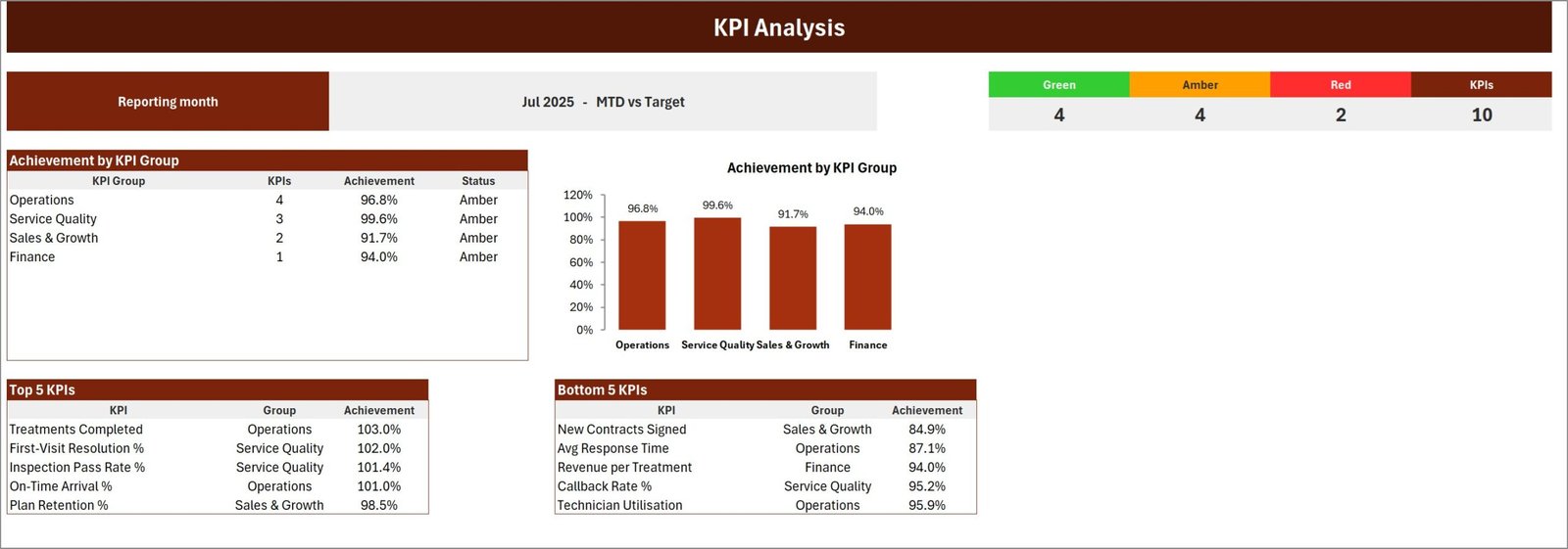
For Jul-2025 MTD vs Target the groups land at Operations 96.8%, Service Quality 99.6%, Sales & Growth 91.7% and Finance 94.0% – all four amber, none green, which tells you this is a broadly on-plan month with two specific failures rather than a collapse. The Bottom 5 names them: New Contracts Signed 84.9%, Avg Response Time 87.1%, Revenue per Treatment 94.0%, Callback Rate % 95.2%, Technician Utilisation 95.9%.
KPI Trend
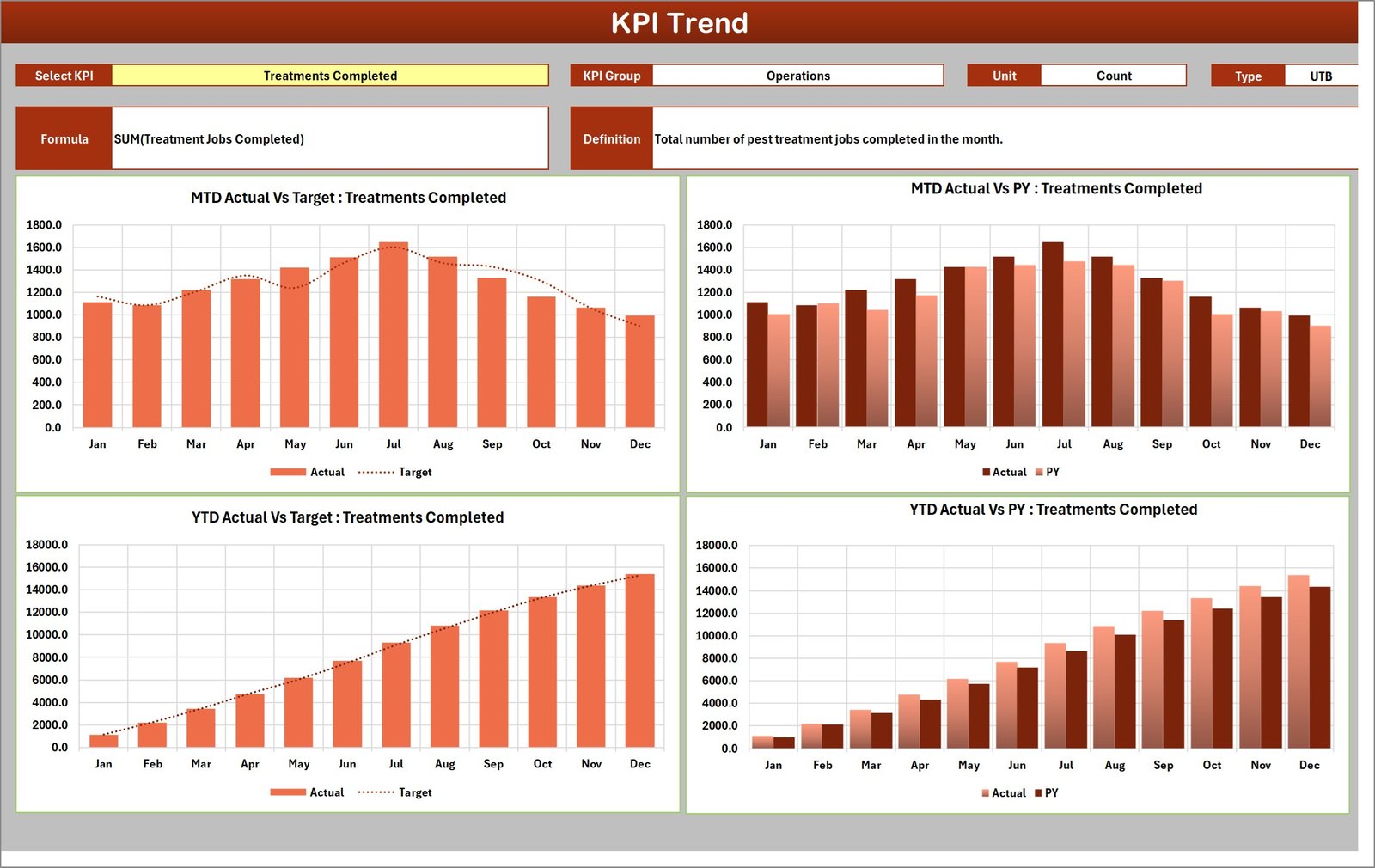
Pick one KPI from a drop-down and the page shows its group, unit, direction, formula and definition, followed by four charts: MTD Actual vs Target, MTD Actual vs PY, YTD Actual vs Target and YTD Actual vs PY. For Treatments Completed the MTD chart makes the summer peak obvious – 1,115 in January climbing to 1,649 in July and falling back to 994 by December – which is exactly the seasonality a pest-control operator plans staffing around.
Input Data, KPI Definition and Color Settings
Input Data holds twenty numbered blocks, one per KPI slot. Each block is twelve monthly rows with six figures: MTD Actual, Target and PY, then YTD Actual, Target and PY. This is the only sheet where you type numbers.
KPI Definition holds the name, group, unit, formula, definition, direction and YTD basis for each KPI, plus a Check column that flags duplicate names – which matters, because every page looks a KPI up by name and two identically named KPIs would be summed together.
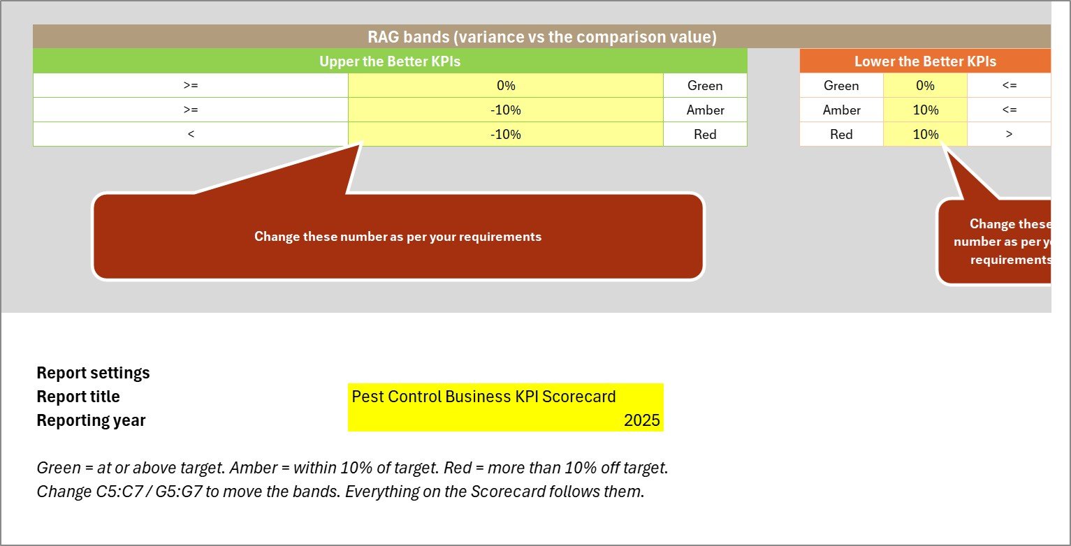
Color Settings holds the RAG bands, the report title and the reporting year. The bands are live, not documentation: the traffic-light formulas on the calculation sheet reference those six cells directly, so changing Amber from -10% to -5% re-colours the whole workbook.
A Home navigation page, a nine-section Read Me and a Get More Templates page complete the nine visible tabs. Two hidden sheets carry the calculations.
Pest Control KPI Scorecard in Excel vs. Google Sheets vs. Paid Field-Service SaaS – Feature Comparison
| This Excel scorecard | Google Sheets edition | Jobber / ServiceTitan reporting | |
|---|---|---|---|
| Cost | 15.99 one-off | One-off, priced separately | ~49-200 per user per month |
| Platform | Excel 2016+, offline | Browser, Google account | Cloud only |
| Setup time | 15-30 minutes | Copy sheet, then type numbers | Days, with onboarding |
| Real-time collaboration | Via OneDrive only | Yes, native | Yes |
| Mobile access | Excel mobile | Yes | Yes |
| Customisable KPI names | Yes – 10 filled, 20 slots | Yes – its own 10 | Vendor-defined fields only |
| Share with a link | No | Yes | Yes |
| Year-1 cost, 5 users | 15.99 total | One-off total | 2,940 – 12,000 |
| Prior-Month comparison | Yes | Target and PY | Varies |
| Works offline | Yes | No | No |
One thing worth being precise about: the Excel and Google Sheets editions of this scorecard are separate builds, not the same file ported between tools. Comparing the two side by side, they share no KPI name at all. The Excel edition measures Treatments Completed, Avg Response Time, Inspection Pass Rate % and New Contracts Signed and groups everything as Operations / Service Quality / Sales & Growth / Finance. The Sheets edition measures Customer Satisfaction (CSAT), Customer Churn Rate, Gross Profit Margin and Pesticide Compliance Incidents and groups them as Service Delivery / Customer Experience / Financial Performance / Operations & Compliance. The Excel build leans operational; the Sheets build leans customer and compliance. Pick by metric list, not by tool preference alone.
Who Should Use This Template
It fits owner-operators, branch managers and service managers at pest-control companies from one technician up to about forty, plus franchisees who report a fixed metric set upward every month. If you already close the month with numbers in hand and simply want them presented as a red/amber/green page, this is built for exactly that.
It does not fit anyone expecting the workbook to pull data automatically. There are no connectors to Jobber, ServiceTitan, PestPac or FieldRoutes, and no Power Query – you type or paste the monthly figures. It is not a scheduling, dispatch or route-planning tool, it does not track individual jobs or customers, and it is not a pesticide-application or regulatory recordkeeping system. If you want job-level analysis with slicers, that is a different product family – see the related templates below.
Real-World Use Cases
A nine-technician residential operator. The owner types his month into six input blocks and looks at one page. Treatments Completed green at 103%, Avg Response Time red at 14.8% over target: more jobs, slower arrivals. That is a dispatch or headcount conversation, surfaced in seconds rather than found by accident in October.
A three-branch commercial operator. Each branch runs the same workbook with the same ten KPIs and the same RAG bands, so group achievement percentages are directly comparable. The service manager flips Vs. to Prior Month for the branch call and to PY for the quarterly pack, with no rebuild in between.
A franchisee reporting to head office. Head office wants Plan Retention % and New Contracts Signed with target and variance every month. Type them once, print the Scorecard page to PDF, send it. The traffic lights carry the commentary.
Advantages of the Pest Control Business KPI Scorecard in Excel
- Nothing to enable or trust. A macro-free .xlsx opens without a security banner, which matters when a franchisee or a client has to open your file.
- Correct handling of Lower-the-Better metrics. Callback rate and response time are the two KPIs most often coloured backwards in a hand-built scorecard. Here the direction comes from a column on KPI Definition and the traffic light respects it.
- The thresholds are yours. The RAG bands are six editable cells that the live formulas read, not a static legend printed on a settings page.
- Three pages that answer three different questions. Scorecard says what happened, KPI Analysis says where, KPI Trend says whether it is a month or a pattern.
- Seasonality is visible. Every tile carries twelve months underneath it, which for a seasonal trade like pest control is often more useful than the headline number.
- One payment. No seats, no renewal, no vendor deciding next year that your reporting tier costs more.
Opportunities for Improvement
An honest listing should say what is not perfect, so here are the things worth knowing before you buy.
- You supply YTD yourself. The workbook does not roll MTD up into YTD, because the correct roll-up differs per KPI – a sum for Treatments Completed, an average for On-Time Arrival %. The YTD Basis column exists to record which rule you used, but the arithmetic is yours. If you want that automated you will add a formula on Input Data.
- The change arrow shows movement, not judgement. On a Lower-the-Better KPI the glyph points up when the number rises even though rising is bad – Avg Response Time in the sample month shows an up arrow at +14.8%. The arrow is coloured red and the traffic light is red, so the message is not ambiguous, but if you want the glyph itself to invert you would edit one formula on the calculation sheet.
- Ten tiles at a time. There are twenty KPI slots but the Scorecard page renders ten, and you switch sets from the header. That is a deliberate layout choice rather than a limit on your data, but it does mean an eighteen-KPI business reads its scorecard in two passes.
- The sample numbers are sample numbers. A few of the shipped series are shaped by a generator rather than by a real branch – First-Visit Resolution %, Inspection Pass Rate % and Plan Retention % each touch the same 97.0 ceiling in several months, which makes those sparklines jumpier than a real one would be. Replace the sample data before you show it to anyone.
- No data connections at all. Worth repeating, because it is the single most common expectation mismatch on a template like this.
Best Practices
- Fix the ten KPIs before you type a single number. Renaming a KPI later is safe, but every page looks it up by name, so decide the list first and keep the names unique – the Check column on KPI Definition will tell you if you slip.
- Write the YTD rule down. Put “Sum” or “Average” in the YTD Basis column for each KPI so the person filling it next month calculates it the same way you did.
- Set targets before the month starts. A traffic light against a target invented after the fact is decoration. The Target columns exist so the comparison is honest.
- Load prior-year figures once. The PY columns feel like extra typing in month one, and then they carry the entire Vs. PY view for the rest of the year.
- Tune the bands to your tolerance. A 10% amber window is generous for On-Time Arrival % and tight for New Contracts Signed. Move the numbers on Color Settings until amber means something in your business.
- Keep one file per year. The reporting year drives the month picker, so a fresh copy each January keeps history clean and comparisons intact.
- Read the month in order. Scorecard for the headline, KPI Analysis for the Bottom 5, KPI Trend for the two KPIs that appeared there. That is a ten-minute monthly review.
If you want to go further with the underlying techniques – sparklines, conditional formatting and the camera tool – Microsoft’s own Excel help and learning hub is the reference worth bookmarking.
Explore Relevant Templates
- Pest Control Business KPI Scorecard in Excel – the template this article covers.
- Pest Control Business KPI Scorecard in Google Sheets – the separate Sheets build, with its own ten KPIs.
- Pest Control Dashboard in Excel – five pages of pivot-driven analysis with slicers, for job-level and technician-level detail.
- Pest Control Dashboard in Power BI – the same analysis as a PBIX project.
- Pest Control Checklist Template in Excel – the job-level checklist that produces the numbers you type in.
- Plumbing Business KPI Scorecard in Excel and Fencing Contractor KPI Scorecard in Excel – the same scorecard engine for adjacent trades.
More on this blog: Pest Control Dashboard in Excel, Pest Control Dashboard in Power BI and Bakery KPI Scorecard in Excel.
Frequently Asked Questions
Do I need macros or an add-in to use this?
No. The workbook is a plain .xlsx built from formulas, conditional formatting, camera pictures and sparklines. It opens on Excel 2016 or later on Windows and Mac and on Excel for Microsoft 365, with no security prompt.
Can I replace the ten pest-control KPIs with my own?
Yes. Rename them on the KPI Definition sheet and fill the matching numbered block on Input Data. There are twenty slots in total and ten are already used. Keep names unique – the Check column flags duplicates.
Will it import from my field-service software?
No. There are no connectors and no Power Query. You type or paste MTD and YTD figures each month. That is what keeps the file offline, portable and free of refresh failures.
How are green, amber and red decided?
By variance against your chosen comparison. Green is at or above it, amber is within 10%, red is more than 10% off. On a Lower-the-Better KPI the test inverts. All six thresholds sit on Color Settings and the live formulas read them, so changing one cell re-colours every page. A KPI with a blank or zero comparison value reads n/a rather than guessing.
Is this the same product as the Pest Control Dashboard?
No. NextGenTemplates ships three related families with similar names. This is the KPI Scorecard – one page, ten named KPIs, a month picker, traffic lights. The Pest Control Dashboard is an analytical dashboard – five pages, pivot tables, slicers and sixteen-plus charts filtered by region, technician and service type. The KPI Dashboard family sits between them. They are complements, not alternatives.
What is in the download?
A single ZIP containing the .xlsx workbook and the Excel KPI Scorecard user manual PDF, available immediately after checkout.
About the Author
Built by PK – Microsoft Certified Professional with 15+ years of Excel, Google Sheets, and Power BI experience. Founder of NextGenTemplates, reaching 300K+ subscribers across YouTube channels. Every template is hand-built and tested before release.
Conclusion
A pest-control business does not usually fail because nobody measured anything. It drifts because the measurements live in five places and nobody assembles them into a page anyone will actually read. The Pest Control Business KPI Scorecard in Excel is a deliberately small answer to that: ten KPIs you can rename, one month picker, honest traffic lights that respect direction, and a trend page for the two metrics that turned red. Type your numbers once a month and the review takes ten minutes.
Get it here: Pest Control Business KPI Scorecard in Excel – 15.99, one-off, .xlsx plus the user manual PDF in one ZIP.
For step-by-step Excel and Power BI tutorials, subscribe on YouTube at youtube.com/@PKAnExcelExpert.