Ask the owner of an auto repair shop how last month went and you usually get a story. The bays were full, one technician was off for a week, two brake jobs came back, and the big fleet customer pushed three appointments. All of it is true, and none of it tells you whether the month was better or worse than the one before.
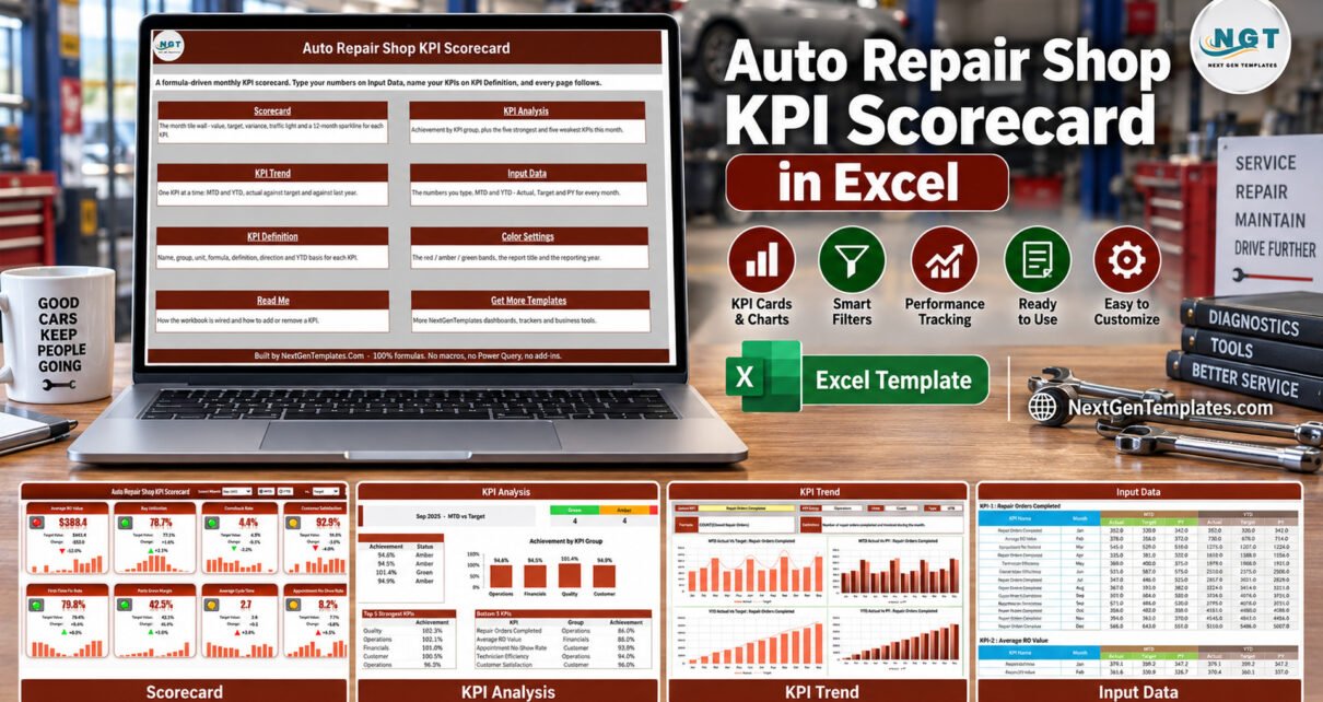
The Auto Repair Shop KPI Scorecard in Excel turns those stories into numbers you can compare: 10 auto repair shop KPIs in 4 groups, laid out as tiles with traffic lights and a 12-month sparkline, across 9 visible sheets. It arrives loaded with a full 2025 sample year, and on Sep-2025 it reads 4 Green, 4 Amber and 2 Red. This article walks through what is on each sheet, how the lights decide, and how to load your own figures – everything you need to judge whether this auto repair KPI template fits your shop.
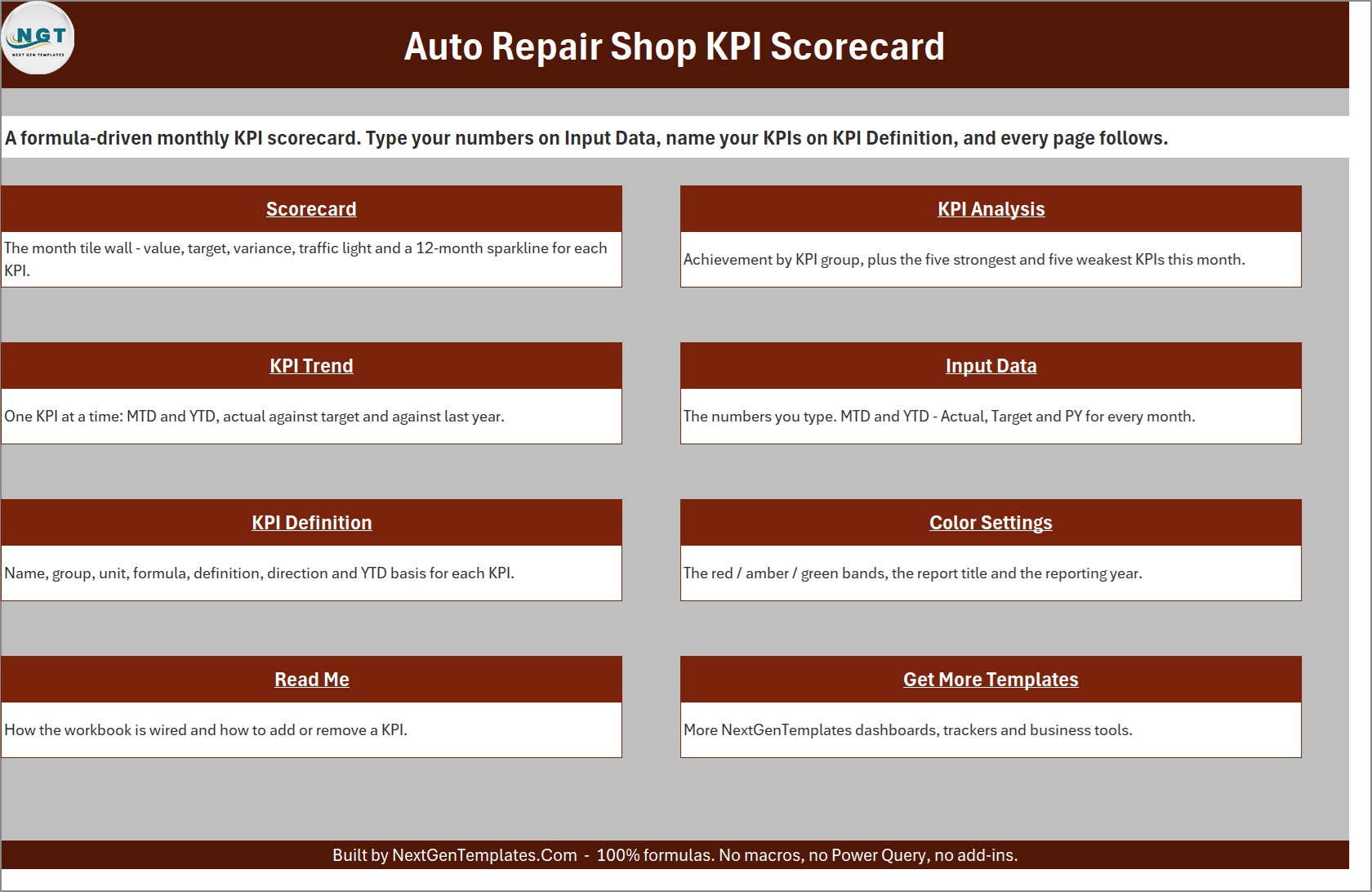
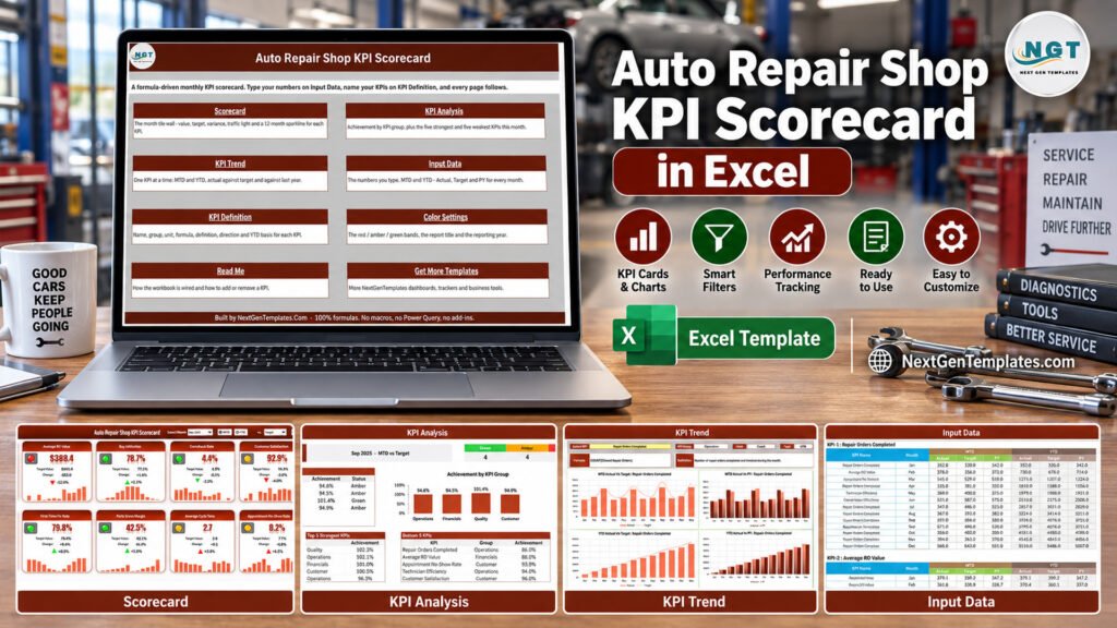
A quick word on naming, because NextGenTemplates sells several products with similar titles. This is the KPI Scorecard family – a tile-based monthly management report driven by numbers you type. It is not a slicer-driven analytics dashboard such as the Auto Repair Dashboard in Excel, which works from transaction-level records, and it is not a template from the separate KPI Dashboard family.
Key Features of the Auto Repair Shop KPI Scorecard in Excel
- Ten auto repair shop KPIs. Repair Orders Completed, Average RO Value, Bay Utilization, Comeback Rate, Customer Satisfaction, Technician Efficiency, First-Time Fix Rate, Parts Gross Margin, Average Cycle Time and Appointment No-Show Rate.
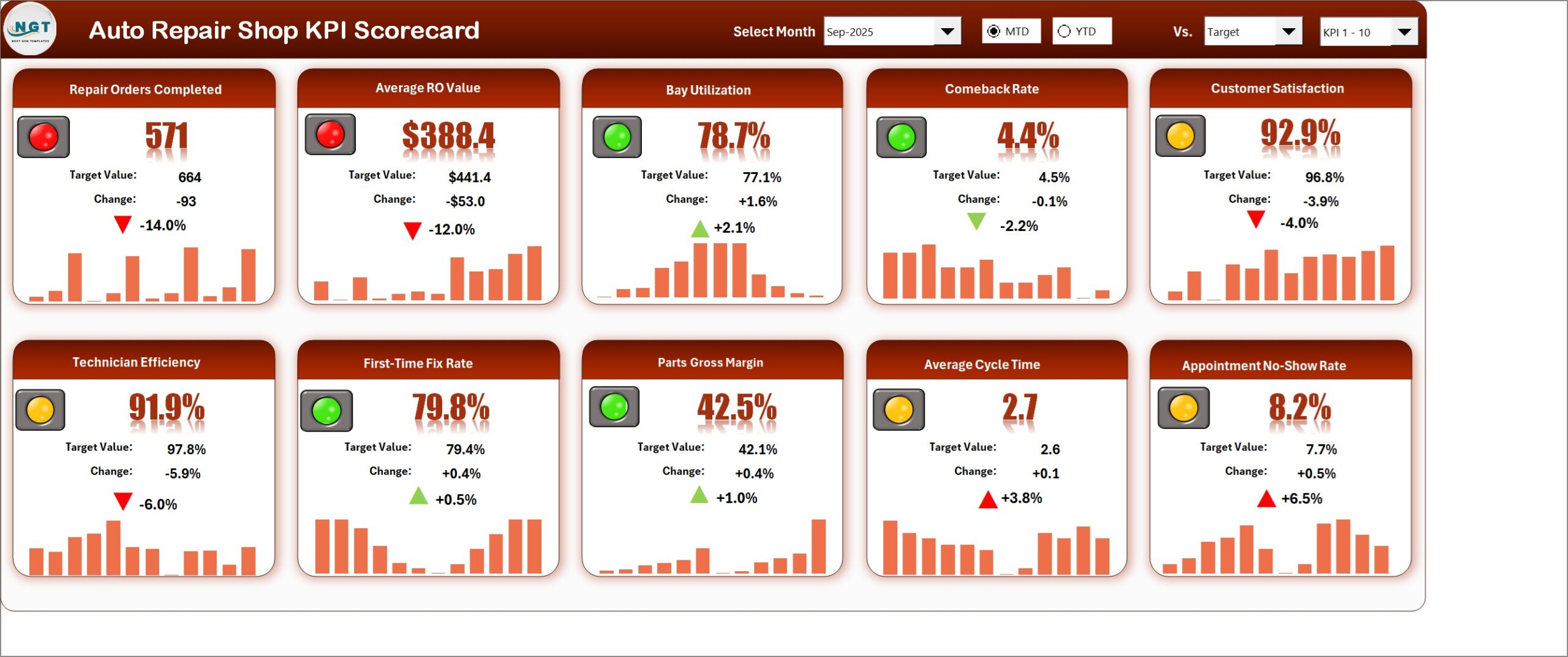
- A header you drive from dropdowns. Select Month, an MTD / YTD switch, a Vs. selector (Target, PY or Prior Month) and a KPI set picker for KPI 1-10 or KPI 11-20.
- Traffic lights that respect direction. Seven KPIs are upper-the-better and three – Comeback Rate, Average Cycle Time and Appointment No-Show Rate – are lower-the-better, so an improving comeback rate turns green.
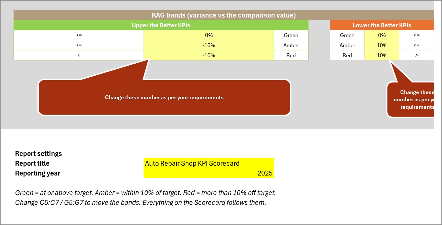
- Editable thresholds. The RAG bands live in ordinary cells on Color Settings. Amber defaults to within 10% of the comparison value.
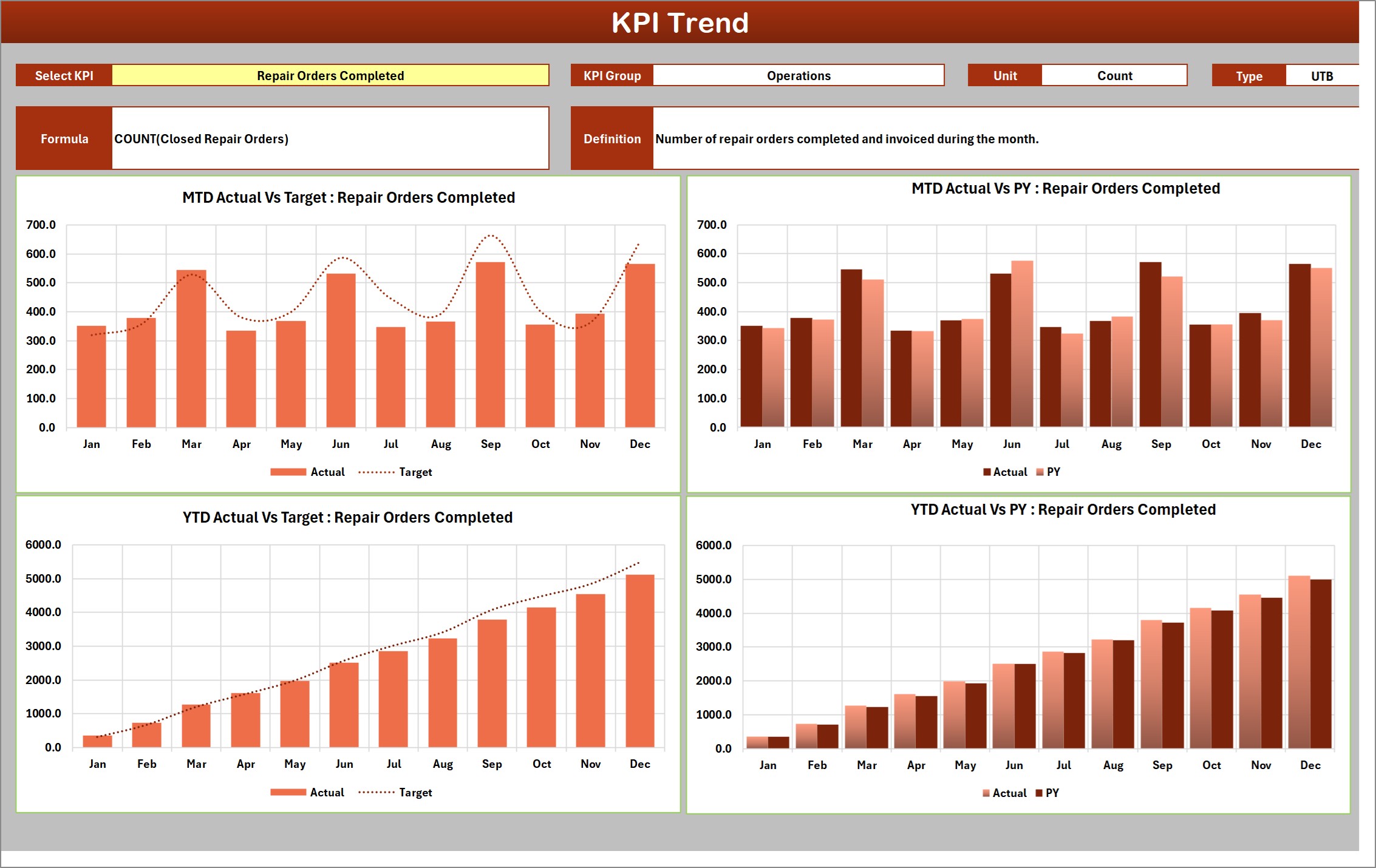
- Analysis and trend pages. KPI Analysis ranks the Top 5 and Bottom 5 KPIs and rolls achievement up by group; KPI Trend charts one KPI by month against target and prior year.
- No macros at all. Formulas, conditional formatting, camera pictures and sparklines only, in a plain .xlsx that opens in Excel 2016 or later.
The Ten Auto Repair Shop KPIs, and Why These Ten
The KPI set covers the four things that decide whether a repair shop makes money: how much work goes through the bays, what each job is worth, whether the work is right first time, and whether customers turn up and come back happy.
| Group | KPI | What it measures | Direction |
|---|---|---|---|
| Operations | Repair Orders Completed | Repair orders completed and invoiced during the month | Higher is better |
| Financials | Average RO Value | Average dollar value of each completed repair order | Higher is better |
| Operations | Bay Utilization | Share of available service-bay hours billed to jobs | Higher is better |
| Quality | Comeback Rate | Share of jobs returning for rework on the same complaint | Lower is better |
| Customer | Customer Satisfaction | Average satisfaction index from post-service surveys | Higher is better |
| Operations | Technician Efficiency | Billed flat-rate hours against hours technicians were clocked in | Higher is better |
| Quality | First-Time Fix Rate | Share of jobs resolved correctly on the first visit | Higher is better |
| Financials | Parts Gross Margin | Gross margin earned on parts sold through repair orders | Higher is better |
| Operations | Average Cycle Time | Average hours a vehicle spends in the shop from drop-off to pickup | Lower is better |
| Customer | Appointment No-Show Rate | Share of booked appointments where the customer did not arrive | Lower is better |
Two pairs are worth reading together. Bay Utilization and Average RO Value tell you whether full bays are also profitable bays. Comeback Rate and First-Time Fix Rate tell you whether quality problems start at diagnosis or at the repair itself. Every name, unit, formula and direction is editable, so if your shop tracks cycle time in days, or wants Effective Labor Rate instead of one of these, you change a row on KPI Definition.
How the Traffic Lights Decide Green, Amber and Red
Each tile compares the actual with the comparison value you chose in the header. For an upper-the-better KPI, green means at or above the comparison, amber means no more than 10% below it, and red means more than 10% below. For a lower-the-better KPI the logic flips: green means at or below, amber up to 10% above, red beyond that. A KPI with a blank or zero comparison value reads n/a instead of guessing.
In the sample, Comeback Rate is 4.4% against a 4.5% target. It is lower, so the light is green and the down-arrow is green too. Average Cycle Time is 2.7 hours against 2.6, a 3.8% overrun, so it sits in amber with a red up-arrow. Both bands are two cells each on Color Settings – move them and every page follows.
Workbook Sheets Explained
Scorecard
Ten tiles, each with a traffic light, value, target, change, percentage change and a 12-month sparkline. On Sep-2025 MTD vs Target, Repair Orders Completed (571 vs 664) and Average RO Value ($388.4 vs $441.4) are red; Bay Utilization, Comeback Rate, First-Time Fix Rate and Parts Gross Margin are green; the other four are amber.
KPI Analysis
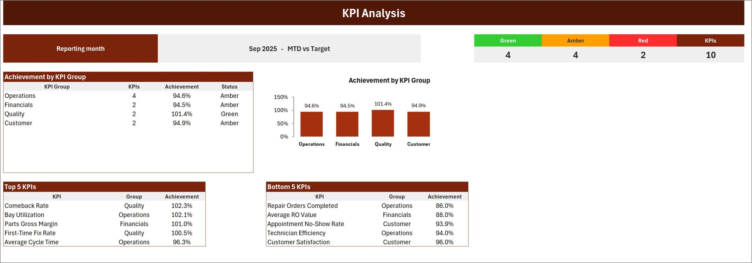
A counter strip (4 Green, 4 Amber, 2 Red, 10 KPIs), Achievement by KPI Group as a table and a column chart – Quality 101.4% Green, Operations 94.6%, Financials 94.5% and Customer 94.9% Amber – and automatic Top 5 and Bottom 5 tables. Comeback Rate leads the Top 5 at 102.3%; Repair Orders Completed leads the Bottom 5 at 86.0%.
KPI Trend
Choose one KPI and the page prints its group, unit, type, formula and definition, then draws four charts: MTD Actual vs Target, MTD Actual vs PY, YTD Actual vs Target and YTD Actual vs PY. For Repair Orders Completed the year closes at 5,110 against a 5,486 target and 5,007 the year before.
Input Data
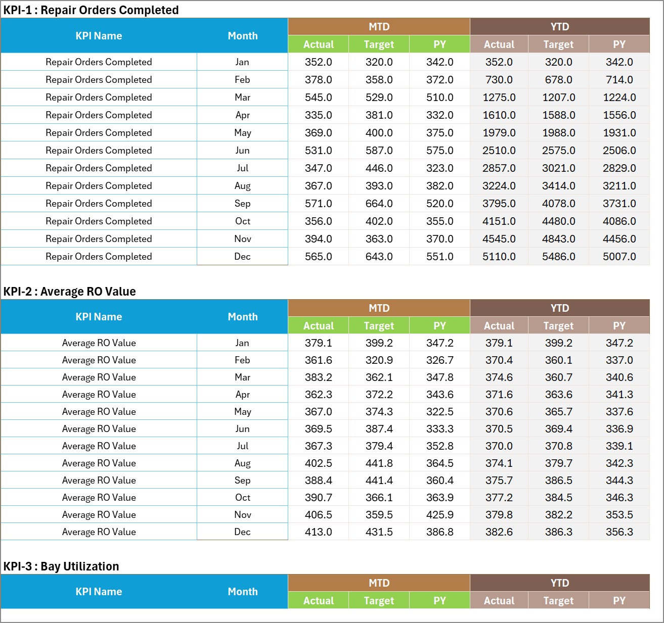
One numbered block per KPI, twelve months deep, with MTD Actual, Target and PY and then YTD Actual, Target and PY. This is the only place numbers live.
KPI Definition
Group, name, unit, formula, definition, UTB / LTB type and YTD basis for each KPI, plus a Check column that turns red on duplicate names.

Color Settings
The RAG bands for both directions, the report title and the reporting year that makes the month picker read Sep-2025.
Read Me
Nine short sections explaining what you type, why YTD is typed rather than calculated, UTB and LTB, the traffic lights, how to add a KPI and why names must be unique.
Get More Templates
Pointers to the other NextGenTemplates product lines and a contact line for customisation.
Reading the Sep-2025 Sample Month
The sample tells a believable story. Throughput is the problem: Repair Orders Completed is 14.0% under target and Average RO Value is 12.0% under, so revenue per month is short on two fronts. Yet Bay Utilization is above target at 78.7%, which means the bays are busy with smaller, lower-value jobs. Technician Efficiency at 91.9% against 97.8% suggests some of that bay time is not being billed at full flat-rate hours.
Quality, on the other hand, is the best group at 101.4%. Comeback Rate is under target and First-Time Fix Rate is just above it. The Customer group sits in amber: satisfaction is 92.9% against 96.8% and no-shows are running at 8.2% against 7.7%. A service manager reading this page would look first at how jobs are written up and priced, not at workmanship.
Excel KPI Scorecard vs. Google Sheets vs. Shop Management Software – Feature Comparison
| Feature | This Excel KPI scorecard | A Google Sheets scorecard | Shop management software |
|---|---|---|---|
| Cost | One-time purchase | One-time template price | Recurring monthly subscription |
| Works offline | Yes | No | No |
| Real-time collaboration | No – share the file | Yes | Yes |
| Pulls numbers automatically | No – you type them monthly | No | Yes, for its own data |
| Change a KPI or threshold | Type over a cell | Type over a cell | Admin settings or vendor support |
| One-page monthly report | Ready on day one | Ready on day one | Often needs a custom report |
If your team works in a browser, the companion Auto Repair Shop KPI Scorecard in Google Sheets is available too. It carries its own KPI list – including Effective Labor Rate and Estimate Approval Rate – so compare the two before choosing rather than assuming they are identical.
Who Should Use This Template
- Independent auto repair shops and general service garages that want one monthly performance page.
- Service managers and foremen who report bay, technician and comeback figures to an owner.
- Bookkeepers and consultants preparing monthly packs for garage clients.
It is not a shop management system. It does not write repair orders, estimates or invoices, track individual technicians or vehicles, or keep warranty, emissions or inspection records, and it makes no compliance or certification claims. For per-visit logging, pair it with the Vehicle Service Log Data Entry System in Excel.
Real-World Use Cases
A six-bay general repair shop. The owner types ten numbers on the first Monday of each month, prints the Scorecard and KPI Analysis pages, and reviews the Bottom 5 table with the service writer.
A brake-and-suspension specialist. The service manager watches Comeback Rate and First-Time Fix Rate side by side to catch diagnosis problems early.
A bookkeeper with several garage clients. One workbook per client, the Vs. control switched to PY for year-end meetings, and the KPI Trend page used to show whether a slow quarter was seasonal.
Advantages of an Excel KPI Scorecard for an Auto Repair Shop
- One page, every month. The same layout makes months comparable at a glance.
- Nothing to connect. Figures come from whatever system you already use, typed once a month.
- Owner-friendly. Traffic lights and arrows need no explanation in a Monday meeting.
- Yours to change. KPI names, targets and bands are plain cells.
Opportunities for Improvement
- YTD figures are typed, not calculated, so you must follow the YTD Basis rule you record for each KPI.
- There is one scorecard per workbook; multi-location groups need a copy per shop.
- In the Color Settings export the right-hand “change these numbers” callout is slightly clipped – cosmetic only, the cells behind it work normally.
Best Practices
- Set realistic targets from last year’s actuals rather than wish-list figures, or everything goes red.
- Fill Input Data on the same day each month from the same source reports.
- Review the Bottom 5 table first; it is where the month’s action items are.
- Keep parts records tidy with the Spare Parts Inventory Data Entry System in Excel so Parts Gross Margin is trustworthy.
Explore Relevant Templates
- Auto Repair Dashboard in Excel – slicer-driven analytics for transaction-level repair data.
- Tyre Shop Stock Data Entry System in Excel – stock records for tyre sales.
- Car Dealership Dashboard in Excel – sales analytics for dealers with a service side.
- Garage Door Service KPI Scorecard in Excel – another scorecard on the same Excel engine.
Frequently Asked Questions
Does it connect to my shop management system?
No. You type the monthly figures on Input Data, which keeps the workbook portable and offline.
Do I need to enable macros?
No. It is a plain .xlsx with formulas, conditional formatting, camera pictures and sparklines. It opens in Excel 2016 or later and Microsoft 365.
How long does setup take?
Usually under half an hour: set the year, rename or keep the ten KPIs, then paste twelve months of MTD and YTD figures.
How many KPIs can it hold?
Twenty. The Scorecard shows ten at a time and the KPI set picker switches between KPI 1-10 and KPI 11-20.
What is in the download?
A ZIP with the .xlsx workbook and a PDF user manual for the Excel KPI Scorecard line.
About the Author
Built by PK – Microsoft Certified Professional with 15+ years of Excel, Google Sheets and Power BI experience, and founder of NextGenTemplates. Video tutorials are on @PKAnExcelExpert.
Conclusion
The Auto Repair Shop KPI Scorecard in Excel gives an independent shop one honest page each month: ten auto repair shop KPIs, direction-aware lights, a group roll-up and a trend view, with nothing to install and nothing to subscribe to. Type your numbers, read the lights, fix the Bottom 5.
Get the Auto Repair Shop KPI Scorecard in Excel