The Garage Door Service KPI Scorecard in Excel is a monthly report card for garage door installation and repair companies: 10 pre-built KPIs in 5 groups, 12 months of MTD and YTD figures, and a traffic light on every tile. The workbook holds 11 sheets (two of them hidden calculation sheets), has zero macros, and its Input Data sheet runs to row 319 – twenty numbered KPI blocks, so you can double the KPI count without writing a formula.
It is worth being precise about which product this is, because the naming in this catalogue runs close. This is the KPI Scorecard line: a month-picker report card that answers “how did we do in September against target?” It is not the KPI Dashboard line, which is a slicer-driven analytical tool with different pages and a different KPI set. A Garage Door Service KPI Dashboard in Google Sheets also exists for the same trade – same words, different product.
Key Features of the Garage Door Service KPI Scorecard in Excel
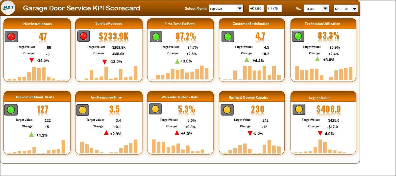
- Ten garage door KPIs written for the trade: New Installations, Service Revenue, First-Time Fix Rate, Customer Satisfaction, Technician Utilization, Preventive Maint. Visits, Avg Response Time, Warranty Callback Rate, Spring & Opener Repairs and Avg Job Value.
- Five KPI groups: Sales, Financial, Service Quality (3), Workforce and Operations (3), each rolled up into a single achievement percentage.
- A month picker driven by an index, not a text match. The header drop-down lists Jan-2025 through Dec-2025 and passes a number to the lookup engine, so picking a month can never blank the cards.
- Direction-aware scoring. Every KPI is typed UTB (upper the better) or LTB (lower the better). Response time rising from 2.9 to 3.5 hours draws a red up-arrow; callback rate falling draws a green down-arrow.
- Editable RAG bands on a single Color Settings sheet: green at or above target, amber within 10%, red beyond.
- A 12-month sparkline in every tile, plus MTD/YTD and Target/PY/Prior-Month toggles in the header.
- Duplicate-name checking on the KPI Definition sheet, because every page looks a KPI up by name.
Workbook Pages Explained
Home
A plain navigation page with eight labelled cards, each describing the sheet it links to. It is the only page you can safely skip.
Scorecard
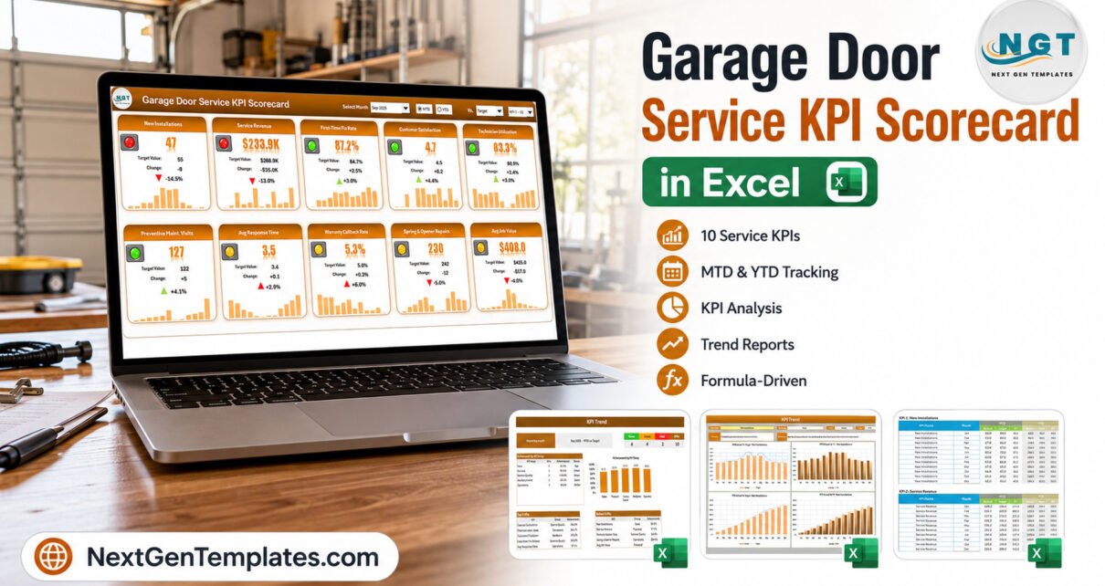
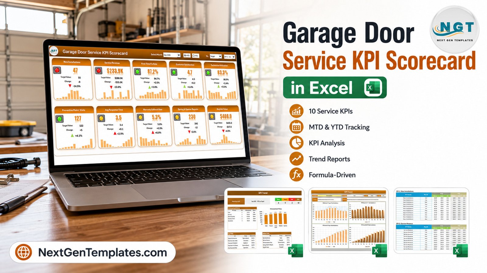
The tile wall, and the page you will actually live on. Ten cards, each showing the month value, the target, the absolute change, the variance percentage, a coloured arrow, a traffic light and a twelve-month sparkline. In the sample data, September 2025 reads 4 green, 4 amber and 2 red: New Installations at 47 against a target of 55 (-14.5%) and Service Revenue at $233.9K against $268.9K (-13.0%) are the two reds.
KPI Analysis
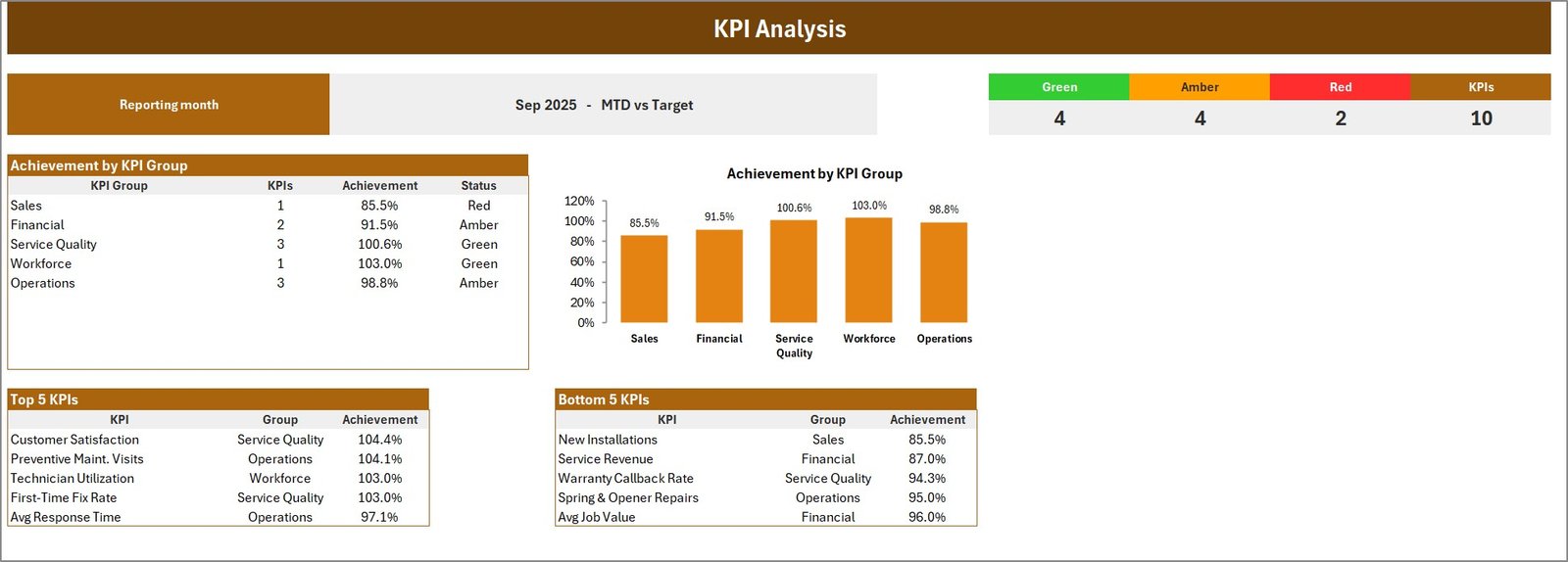
The management summary. A RAG strip across the top (4 / 4 / 2 against 10 KPIs), an Achievement by KPI Group table with a matching bar chart – Sales 85.5% red, Financial 91.5% amber, Service Quality 100.6% green, Workforce 103.0% green, Operations 98.8% amber – and automatically ranked Top 5 and Bottom 5 tables. Customer Satisfaction leads at 104.4%; New Installations sits at the bottom at 85.5%.
KPI Trend
One KPI at a time. Choose it from a validated drop-down and the page pulls its group, unit, direction, formula and definition from KPI Definition, then draws four charts: MTD Actual vs Target, MTD Actual vs PY, YTD Actual vs Target and YTD Actual vs PY.
Input Data, KPI Definition and Color Settings
These three are where you work. Input Data holds twenty numbered blocks of twelve rows each – MTD Actual, Target and PY, then YTD Actual, Target and PY. KPI Definition holds the name, group, unit, formula text, definition, direction and YTD basis for each KPI. Color Settings holds the RAG bands, the report title and the reporting year.
Read Me
Nine short sections covering what you type, why YTD is yours to supply, how UTB and LTB work, how the traffic lights are banded, how to add a KPI, why names must be unique, what the header controls do, and the fact that nothing here needs macros.
Excel Scorecard vs. Google Sheets vs. Paid Field Service Software – Feature Comparison
| This Excel Scorecard | Google Sheets Edition | ServiceTitan / Jobber-class | |
|---|---|---|---|
| Cost | $9.99 once | $8.99 once | $99-$400+ per user / month |
| Platform | Excel 2016+, desktop | Browser, any device | Cloud SaaS |
| Setup time | 15-20 minutes | 10 minutes | 2-8 weeks onboarding |
| Real-time collaboration | Via OneDrive / SharePoint | Native | Native |
| Mobile access | Excel mobile, read-friendly | Yes | Yes, field app |
| Customizable KPIs | All 20 slots are yours | Yes | Vendor-defined |
| Share with a link | File or OneDrive link | Yes | Yes |
| Year-1 cost at 5 users | $9.99 | $8.99 | $6,000-$24,000 |
| Dispatch and invoicing | No | No | Yes |
| Works offline | Yes | No | Partly |
Who Should Use This Template
Owner-operators and multi-crew garage door companies running roughly 3 to 30 technicians get the most from it, along with service managers who already export monthly totals from a job-management system and want one page to review them on, and multi-branch or franchise operators who need every location reporting the same ten KPIs the same way.
Skip it if you want dispatching, invoicing or a technician mobile app – this is a reporting workbook, not an operations platform. It does not connect to your job system, and it deliberately does not recalculate year-to-date for you.
Real-World Use Cases
The monthly owner review. Marcus runs nine technicians. On the first Monday he opens the Scorecard, picks last month, and reads the wall. In September his delivery metrics – first-time fix, satisfaction, utilization, preventive visits – were all green, while installs and revenue were red. That is a demand problem, not a crew problem, and the page said so in ten seconds.
The service-quality watch. Priya tracks Avg Response Time and Warranty Callback Rate, both typed LTB. She uses the KPI Trend page to show a month-by-month picture when either drifts, because a single red tile rarely wins an argument but a twelve-month line does.
The multi-branch roll-up. Dan keeps one copy per branch with an identical KPI Definition sheet, then puts the three KPI Analysis group tables side by side at the quarterly meeting.
Advantages of the Garage Door Service KPI Scorecard in Excel
- Nothing to enable. No macros, no Power Query, no add-ins – just formulas, conditional formatting, sparklines, camera pictures and form controls.
- The direction logic is genuinely correct. Both LTB metrics in the sample – Avg Response Time and Warranty Callback Rate – score and colour the right way round, which is the single most common thing to get wrong in a hand-built scorecard.
- The month picker cannot break. It is index-linked rather than text-matched, so there is no way to select a month that silently blanks every card.
- Real headroom. Twenty KPI slots and a KPI 1-10 / 11-20 set picker, verified at Input Data row 319.
- One place to change the thresholds. Two small band tables drive every light, arrow and status word in the file.
Opportunities for Improvement
Four honest notes, none of which affect a number:
- The two orange callouts on Color Settings read “Change these number as per your requirements” – a small grammar slip – and the right-hand one for LTB KPIs is clipped at the page edge in the print export.
- The Read Me says the month picker reads “Sep-25”; in this build it actually reads “Sep-2025”. The picker is correct, the note is stale.
- The KPI Definition sheet’s header band is purple while the rest of the workbook is orange – a theme inconsistency on one page.
- YTD is typed, not calculated. That is a deliberate design choice, because a sum is right for installs and revenue while an average is right for rates like First-Time Fix Rate, but it does mean twelve more columns of data entry the first time you set the file up.
Best Practices
- Set the reporting year on Color Settings before you touch anything else – the month picker reads from it.
- Rename the KPIs to your own wording on KPI Definition rather than in the tiles. Every page looks a KPI up by name, so the tiles will follow.
- Write the YTD rule you used into the YTD Basis column. It is the only record of why a number is a sum or an average.
- Fill all twelve months even when the year is part-done. The sparklines and the trend charts need the full row.
- Keep one file per branch and one KPI Definition sheet across all of them, so the group percentages are comparable.
- Review MTD and YTD together. A green month inside a red year is a different conversation from a green month inside a green year.
Explore Relevant Templates
The same report card exists for other field-service trades: Plumbing Business KPI Scorecard in Excel, HVAC Contractor KPI Scorecard in Excel, Electrical Contractor KPI Scorecard in Excel and Septic Tank Service KPI Scorecard in Excel.
Prefer to work in a browser? The Garage Door Service KPI Scorecard in Google Sheets is the same ten-KPI report card built natively for Sheets, and the Window and Door Installation KPI Scorecard in Google Sheets covers the adjacent trade. A Window and Door Installation KPI Scorecard in Excel is in preparation alongside this one.
If you want the analytical, slicer-driven product rather than a monthly report card, look at the HVAC Contractor KPI Dashboard in Excel or the Plumbing Business KPI Dashboard in Excel.
Two earlier write-ups on this blog walk through the same scorecard engine page by page, so they are worth reading before you set your own file up: the Septic Tank Service KPI Scorecard in Excel and the Swimming Pool Service KPI Scorecard in Excel. For a look at the slicer-driven alternative built on the same data discipline, see the Concrete Contractor KPI Dashboard in Excel.
Frequently Asked Questions
Is this the same thing as a Garage Door Service KPI Dashboard?
No. This is the KPI Scorecard: a month-picker report card with traffic lights, group achievement and a single-KPI trend page. The KPI Dashboard line is a separate, slicer-driven analytical product with different pages and a different KPI list. They are sold separately and do not overlap.
Are there macros in the file?
None. It is a plain .xlsx, so there is no security prompt and no “enable content” bar.
How many KPIs can I have?
Twenty. Ten are written for you; the Input Data sheet carries twenty numbered blocks and the Scorecard header has a KPI 1-10 / 11-20 picker.
Can I change the traffic-light thresholds?
Yes – the two band tables on Color Settings. Every page reads from them.
Does it calculate YTD automatically?
No, by design. You type the finished YTD figures, because the correct roll-up is a sum for volumes and revenue but an average for rates.
Which Excel versions work?
Excel 2016 or later on Windows or Mac. It opens in Excel for the web too, though the header form controls behave best in the desktop app.
What is in the download?
One ZIP containing the .xlsx workbook and the Excel KPI Scorecard user manual as a PDF.
About the Author
Built by PK – Microsoft Certified Professional with 15+ years of Excel, Google Sheets, and Power BI experience. Founder of NextGenTemplates, reaching 300K+ subscribers across YouTube channels. Every template is hand-built and tested before release.
Conclusion
A garage door business does not need a $300-per-seat platform to know whether September beat target. It needs ten numbers, a target beside each one, a colour that respects which direction is good, and a page that can be read in a minute. That is exactly what the Garage Door Service KPI Scorecard in Excel is – and at 20 KPI slots with editable bands, it will still fit when the business is twice the size.
Get the Garage Door Service KPI Scorecard in Excel – instant download, lifetime access, no macros. For step-by-step Excel tutorials, subscribe to youtube.com/@PKAnExcelExpert.