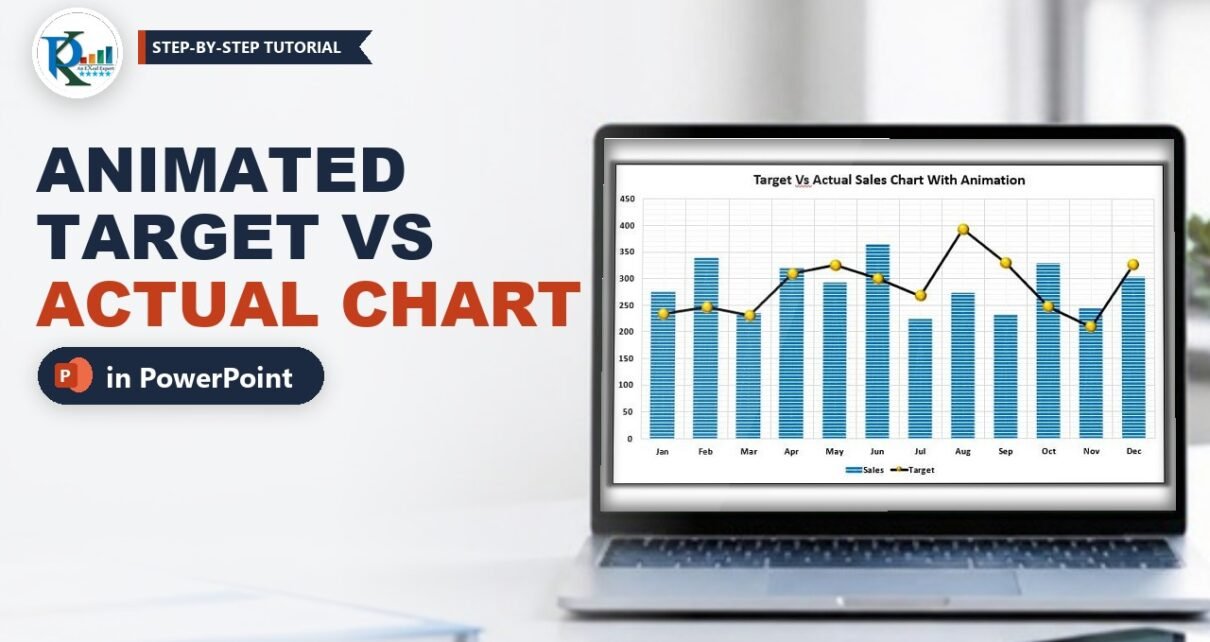
An animated target vs actual sales chart in PowerPoint lets you reveal your results one step at a time in a business review: first the empty chart, then the actual sales columns, then the target line drawing across from left to right. It keeps the room focused on the story instead of a wall of numbers. In this tutorial you will build the chart from scratch with PowerPoint’s own chart tools, so it stays data-driven and updates when you edit the numbers. Then you will add a Wipe animation by series and tune its direction and timing exactly as PK does in the video.
⬇️ Download the PowerPoint File
One slide with the animated, data-driven chart · .pptx · PowerPoint 2013 and later
Watch the Video Tutorial
PK inserts a column chart, turns Target into a line with markers, styles both series, and animates the chart by series so it builds in three clicks.
What You Will Build
- A data-driven combo chart: Sales as columns and Target as a line, Jan to Dec.
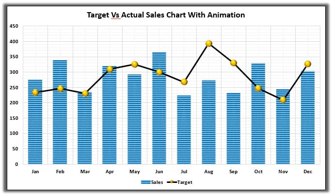
- A clean design: patterned blue columns, a dark target line, gold 3-D circle markers, gridlines and a shadowed frame.
- A three-click animation: chart background, then Sales, then Target.
- Direction and timing control: columns wipe up from the bottom and the line wipes in from the left.
- A slide you can reuse every month by editing the chart data.
Why Animate a Target vs Actual Chart?
- Clear comparison: the gap between each column and the target line shows over- and under-performance at a glance.
- Controlled story: you reveal actual sales first, discuss them, then bring in the target.
- Professional finish: a short, purposeful animation looks polished without distracting from the numbers.
Step 1: Prepare the Slide
- Add a new slide: right-click in the slide list and choose New Slide, use Home → New Slide, or press Ctrl+M.
- PK deletes the placeholder title and builds his own title bar: draw a rectangle across the top, apply a Shape Style from the Format tab, then insert WordArt on top of it in white with your slide title.
Step 2: Insert the Chart and Enter the Data
- Go to Insert → Chart. You can start from Combo, but PK simply picks Column (clustered) and changes one series to a line later. Click OK.
- PowerPoint opens a small Excel sheet with sample data. Delete the third series so you keep two: Sales and Target.
- Put the month names in the category column and type or paste your figures. Close the data window when the range is correct.
The numbers used in the practice file:
Month  Sales  Target
Jan    274    233
Feb    339    246
Mar    234    230
Apr    319    309
May    292    325
Jun    363    300
Jul    224    267
Aug    272    393
Sep    231    329
Oct    328    247
Nov    245    209
Dec    303    327
Because the chart reads from this embedded data, you can come back to Chart Design → Edit Data at any time, change a value and the chart updates.
Step 3: Format the Chart Elements
- Click the Chart Elements (+) button, open Gridlines and tick all four: primary major horizontal, primary major vertical, and the two minor gridlines. The light grid gives the chart its graph-paper look.
- Select the vertical axis and, on the Home tab, set the font to black and bold. Do the same for the horizontal axis and the legend.
- Type a chart title, for example Target Vs Actual Sales by Month, and make it bold and black.
Step 4: Turn Target into a Line with Markers
Right-click any column and choose Change Series Chart Type. In the dialog, set the Target series to Line with Markers and leave Sales as Clustered Column. Click OK. This is the same combo-chart technique you use in Excel.
Step 5: Style the Sales Columns
- Right-click a Sales column and choose Format Data Series.
- Under Series Options, set Gap Width to about 80% so the columns are wider.
- Under Fill & Line → Fill, choose Pattern fill. Use white and blue as the two colours and pick a horizontal-line pattern. The practice file uses the Light horizontal pattern in blue and white, which gives the striped columns you see in the screenshot.
Step 6: Style the Target Line and Markers
- Right-click the line and choose Format Data Series → Fill & Line.
- Line: Solid line, a dark colour and a width of about 2.5 pt. (The practice file uses black at 3 pt.)
- Marker → Marker Options: Built-in, type circle, size 15.
- Marker Fill: Solid fill in Accent 4, the gold colour of the default Office theme. Marker Border: No line.
- Effects → 3-D Format: choose the Circle top bevel. This turns the flat dots into shiny gold buttons.
Step 7: Frame the Chart
Select the chart area, then on the Format tab set Shape Outline to black and add Shape Effects → Shadow → Outer → Offset: Center. The chart now stands out from the slide like a card.
Step 8: Make It an Animated Target vs Actual Sales Chart in PowerPoint
This is where the chart comes alive.
Apply a Wipe entrance by series
- Select the chart and open the Animations tab.
- Choose the Wipe entrance effect. On its own it would reveal the whole chart in one go.
- Click Effect Options and, under Sequence, choose By Series.
PowerPoint now splits the chart into three animation steps: the chart background (axes, gridlines and legend), the Sales series and the Target series. By Category is the other option: it would reveal the chart month by month instead.
Fix the direction and timing
With By Series, every step wipes from the same direction. Columns look right growing from the bottom, but a line should draw from left to right. Open Animation Pane, click the small expand arrow under the chart animation to show all three steps, then double-click each one:
- Step 1, chart background: on the Timing tab set Duration to 2 seconds (Medium).
- Step 2, Sales columns: Direction From Bottom, Duration 2 seconds.
- Step 3, Target line: on the Effect tab change Direction to From Left, then set Duration to 2 seconds.
All three steps start On Click, so you control the pace while you talk.
Step 9: Present It
Start the slideshow from the current slide (Shift+F5 or the Slide Show button in the status bar). Click once and the empty chart with its legend appears. Click again and the Sales columns rise from the bottom. Click a third time and the Target line draws across from January to December.
Updating the Chart Every Month
Right-click the chart and choose Edit Data, update the Sales and Target figures and close the data window. The formatting and the animation stay in place, so next month’s review takes a minute.
Important for the downloaded file: the chart’s embedded data sheet has two columns the wrong way round. Column B is headed Target but the chart draws it as the blue columns, and column C is headed Sales but the chart draws it as the line. The slide looks right until you open Edit Data. Then the chart refreshes from the sheet and Target appears as the columns and Sales as the line.
Fix it once before you use the file: right-click the chart, choose Edit Data, and swap columns B and C so that column B is Sales (274, 339, 234 and so on) and column C is Target (233, 246, 230 and so on), exactly as in the table in Step 2. Close the data window and save. Swap the data rather than the chart types: the column styling and the first animation step belong to the series in column B, and the line styling and the From Left step belong to column C, so this keeps the Sales columns rising first and the Target line drawing in last.
Modern Alternative: the Morph Transition
Addition, not from the video: in PowerPoint for Microsoft 365, the Morph transition can animate between two versions of a chart on consecutive slides, for example last month’s figures on one slide and this month’s on the next. It suits before-and-after comparisons, while the by-series Wipe in this tutorial is better for building one chart up step by step. Test it in your version before a live presentation.
Common Errors and Fixes
The whole chart appears in one click
The sequence is still As One Object. Select the chart, open Effect Options and choose By Series.
The target line wipes up from the bottom
By Series applies one direction to every step. Expand the chart animation in the Animation Pane, double-click the Target step and set Direction to From Left.
Target shows as columns, not a line
Right-click the chart, choose Change Series Chart Type and set Target to Line with Markers. If this happens in the practice file right after you open Edit Data, the data columns are swapped instead: follow the fix in Updating the Chart Every Month.
The markers look flat
The bevel is on the marker, not the line. Select the series, go to the marker settings in Format Data Series, then Effects → 3-D Format and pick a top bevel.
Tips
- Keep animations short (around 2 seconds) and On Click so you stay in control of the story.
- Reveal actual sales before the target so the discussion starts with what happened.
- Use one strong colour for actuals and a dark neutral for the target so the line reads clearly over the columns.
- Reuse the slide as a template: duplicate it and edit the data for each region or product.
- Microsoft’s guide to animating text or objects in PowerPoint covers effect options and the Animation Pane.
Want It Ready-Made?
For more data-driven PowerPoint visuals, the Data Driven 3D Container Chart in PowerPoint and the Data-Driven Gantt Chart in PowerPoint on NextGenTemplates.com are ready to edit with your own numbers. You can browse all PowerPoint templates there.
Related Tutorials
- Target vs Actual Sales Dynamic Chart in Excel
- Data-Driven 3D Battery Chart in PowerPoint
- Animated Filled Spheres in PowerPoint
- Data-Driven Gantt Chart in PowerPoint with Conditional Formatting
- Automatic Data Transfer from Excel to PowerPoint
Frequently Asked Questions
How do I animate a chart series by series in PowerPoint?
Select the chart, apply an entrance effect such as Wipe on the Animations tab, then open Effect Options and choose By Series. Each series then appears on its own click.
Can I make the line draw from left to right?
Yes. In the Animation Pane, expand the chart animation, double-click the line series step and set its Direction to From Left on the Effect tab.
Is the chart still data-driven after adding the animation?
Yes. It is a native PowerPoint chart, so Edit Data updates the columns and line and the animation stays in place.
What is the difference between By Series and By Category?
By Series reveals each data series in turn, here Sales and then Target. By Category reveals one category at a time, here one month after another.
Can I reuse this chart in my own presentation?
Yes. Copy the whole slide into your deck so the animation comes with it, then use Edit Data to replace the numbers with your own.
About the Author
PK is a Microsoft Excel expert and trainer and the founder of PK: An Excel Expert and NextGenTemplates.com. He has been teaching Excel, PowerPoint visuals, Power Query and Power BI since 2016 on his YouTube channel.
Conclusion
An animated target vs actual sales chart in PowerPoint takes about ten minutes to build and makes every sales review clearer. Insert a column chart, switch Target to a line with markers, style the columns and markers, then add a Wipe animation by series with the columns rising from the bottom and the target line drawing in from the left. Download the PowerPoint file, swap in your own numbers, and you have a reusable slide for every monthly review.