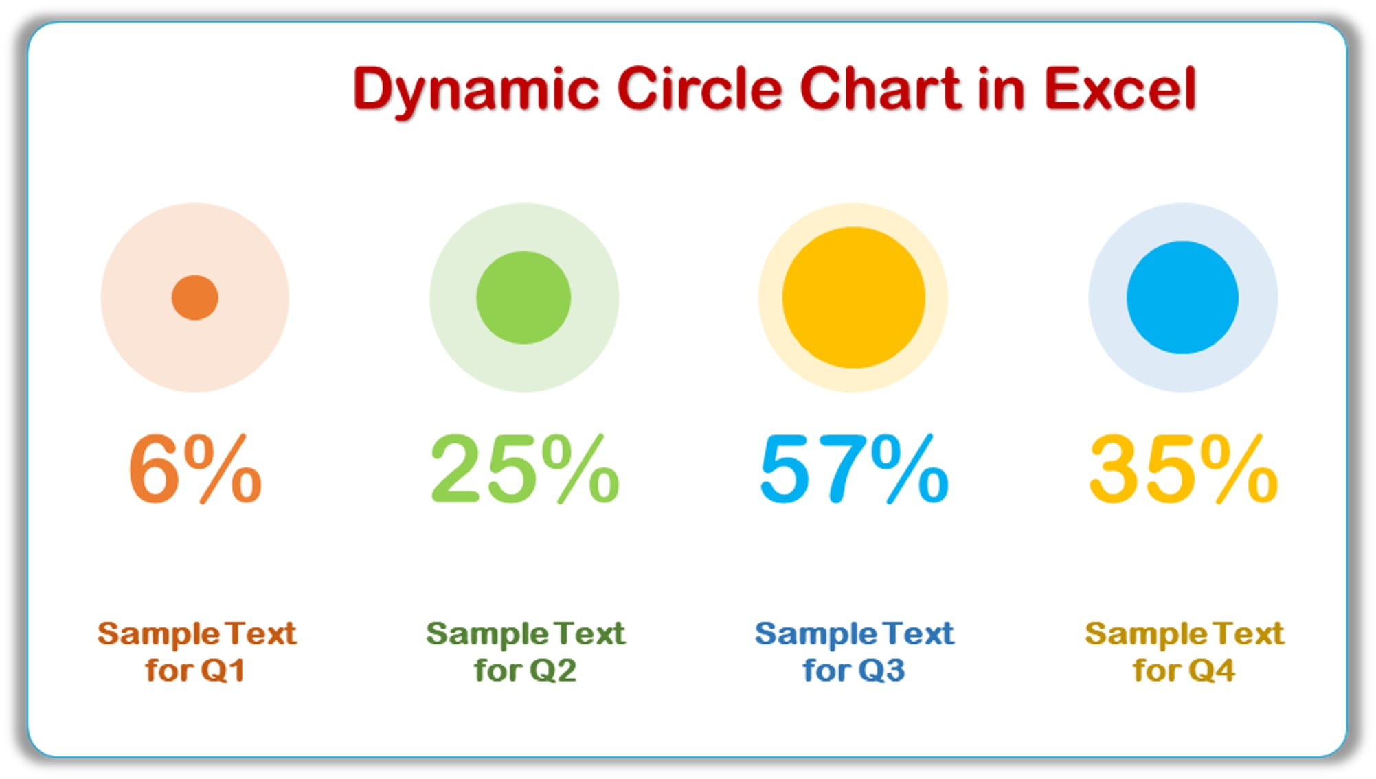
Dynamic Circle Chart in Excel
06
Feb 2022
51Comments Off on Dynamic Circle Chart in Excel
PK
Meet PK, the founder of PK-AnExcelExpert.com! With over 15 years of experience in Data Visualization, Excel Automation, and dashboard creation. PK is a Microsoft Certified Professional who has a passion for all things in Excel. PK loves to explore new and innovative ways to use Excel and is always eager to share his knowledge with others. With an eye for detail and a commitment to excellence, PK has become a go-to expert in the world of Excel. Whether you're looking to create stunning visualizations or streamline your workflow with automation, PK has the skills and expertise to help you succeed. Join the many satisfied clients who have benefited from PK's services and see how he can take your Excel skills to the next level!
https://www.pk-anexcelexpert.com
Related Articles
Data Analytics KPI Dashboard in Excel
In the era of data-driven decision-making, mastering the art of effective dashboard creation is crucial. A well-designed Data Analytics Key
An Innovative chart for team level performance
This innovative and eye-catching chart, we have created a chart for team level performance using Line with Marker chart. In
Server Uptime KPI Dashboard in Power BI
Modern businesses run on servers, and every second of downtime can impact revenue, customer trust, and productivity. Because of this,