These are the charts people screenshot and ask “how did you do that in Excel?” Six projects build KPI visuals from ordinary Excel charts and shapes, with no add-ins and no VBA.
Course projects
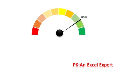
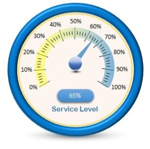
1. Speedometer (Gauge) Chart
The classic KPI gauge built from a doughnut and a pie chart. Ideal for service level or target achievement.
Learn more →
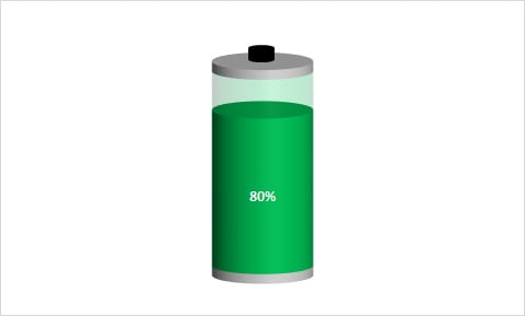
2. Battery Chart
A progress bar shaped like a battery that changes colour as the value rises.
Learn more →
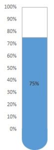
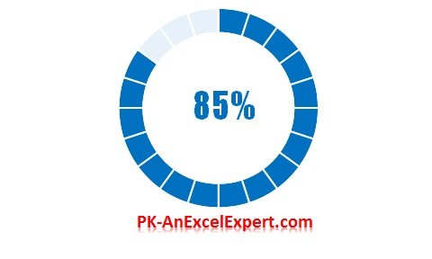
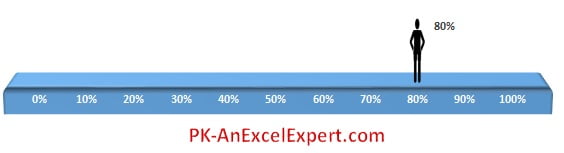
5. Moving Man Chart
An infographic that combines a chart with shapes that move with the value.
Learn more →
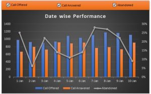
6. Dynamic Chart with Check Boxes
Show or hide series with form-control check boxes. No VBA.
Learn more →
7. Waterfall Chart in Excel
Build a waterfall chart in Excel two ways: the built-in Waterfall type with Set as total, and a stacked column bridge with helper formulas that works in every version.
Learn more →
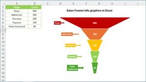
8. Funnel Chart in Excel
Build a funnel chart in Excel two ways: the built-in Funnel type in 365 and 2019, or a centred stacked bar with a spacer column for any version.
Learn more →
Ready-made animated and infographic charts
Gantt variants, 3D gauges, container charts, progress bars and timelines are available as finished templates on NextGenTemplates.
Frequently asked questions
Do these charts need macros?
No. All six are built with standard charts, shapes and formulas. They work in any desktop Excel from 2013.
Will they update automatically?
Yes. Each chart reads its value from a cell, so linking that cell to your data makes the visual live.
Can I reuse one chart for many KPIs?
Yes, copy the chart and point the source cells at another KPI. The dashboard module shows this in a full layout.