In times of crisis, effective management of key performance indicators (KPIs) is crucial for tracking performance, identifying areas for improvement, and making quick decisions. The Crisis Management KPI Dashboard in Power BI is a comprehensive tool designed to monitor and analyze KPIs related to crisis situations. This ready-to-use dashboard leverages data from Excel and allows users to visualize real-time performance, track targets, and compare metrics across different time periods. In this article, we will dive into the features and functionalities of the dashboard, how it helps in crisis management, and how to use it efficiently.
What is a Crisis Management KPI Dashboard?
A Crisis Management KPI Dashboard is a tool that helps track and evaluate key performance indicators during crisis situations. The dashboard focuses on important metrics like response time, recovery efforts, operational efficiency, and financial performance. By visualizing these metrics, organizations can quickly assess the effectiveness of their crisis management strategies and make informed decisions to mitigate risks.
The Power BI template is built to provide insights in real time, using data entered in an Excel file. The dashboard is divided into three key pages: Summary Page, KPI Trend Page, and KPI Definition Page, each designed to display and analyze different aspects of crisis management performance.
Key Features of the Crisis Management KPI Dashboard
The Crisis Management KPI Dashboard is composed of three pages, each focusing on different aspects of KPI tracking and analysis. Let’s look at each page and its key features.
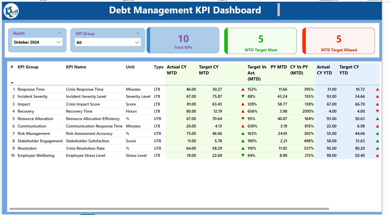
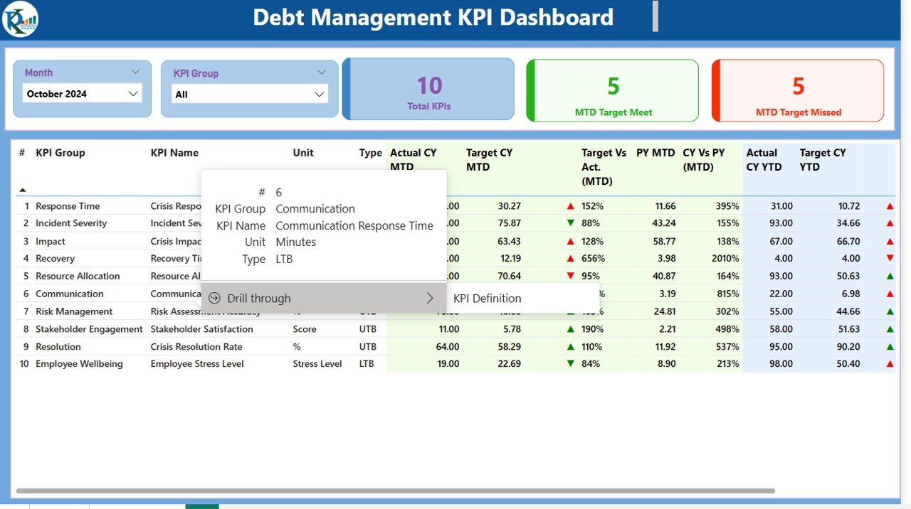
1. Summary Page
The Summary Page is the central hub of the dashboard, offering an overview of all KPIs and their performance in real time.
Slicers:
- Month Slicer: Select a specific month to view the data for that month.
- KPI Group Slicer: Filter the KPIs by their respective groups or categories.
Cards:
- Total KPIs Count: Displays the total number of KPIs being tracked.
- MTD Target Met Count: Shows the number of KPIs meeting the target for the month-to-date (MTD).
- MTD Target Missed Count: Displays the number of KPIs that have missed the target for the MTD.
Detailed KPI Table:
Click to buy Crisis Management KPI Dashboard in Power BI
The table includes the following columns:
- KPI Number: Sequence number for each KPI.
- KPI Group: The group or category to which the KPI belongs.
- KPI Name: The name of the KPI.
- Unit: The unit of measurement for the KPI.
- Type: Indicates whether the KPI is LTB (Lower the Better) or UTB (Upper the Better).
- Actual CY MTD: Current year’s MTD value.
- Target CY MTD: Target value for the current year’s MTD.
- MTD Icon: Green and red arrows showing whether the KPI met or missed its target.
- Target Vs Actual (MTD): The percentage comparison of target vs actual for MTD.
- PY MTD: Previous year’s MTD value for comparison.
- CY Vs PY (MTD): Percentage comparison of current year’s MTD and previous year’s MTD.
- Actual CY YTD: Current year’s YTD value.
- Target CY YTD: Target value for the current year’s YTD.
- YTD Icon: Green and red arrows showing whether the KPI met or missed its target for YTD.
- Target Vs Actual (YTD): The percentage comparison of target vs actual for YTD.
- PY YTD: Previous year’s YTD value for comparison.
- CY Vs PY (YTD): Percentage comparison of current year’s YTD and previous year’s YTD.
Click to buy Crisis Management KPI Dashboard in Power BI
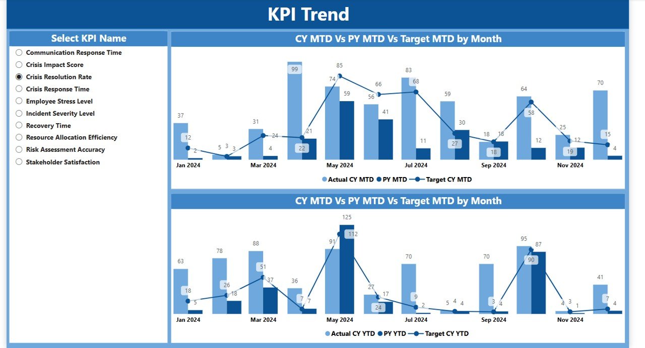
2. KPI Trend Page
The KPI Trend Page displays a trend analysis of key KPIs over time, helping you identify performance patterns and trends.
Combo Charts:
- Display actual numbers for both the Current Year and Previous Year for MTD and YTD.
- A visual comparison between the current year’s actual performance, previous year’s performance, and the set targets.
KPI Slicer: You can select a specific KPI from the dropdown to view its trends over time.
3. KPI Definition Page
The KPI Definition Page allows you to drill down into the details of each KPI, including its formula and definition.
Drill-Through: From the Summary Page, you can click on any KPI to access this page and view more detailed information.
Click to buy Crisis Management KPI Dashboard in Power BI
KPI Details: Each KPI will have the following information:
- Formula: The calculation formula used for the KPI.
- Definition: A detailed explanation of what the KPI measures.
- KPI Group, Name, Unit, Type: The same information available on the Summary Page for better clarity.
-
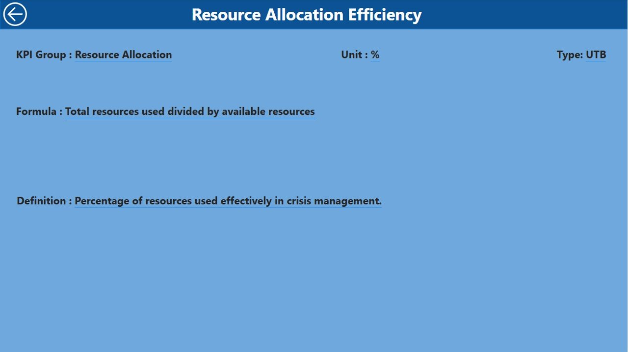
KPI Definition Page
Advantages of Using the Crisis Management KPI Dashboard
The Crisis Management KPI Dashboard provides numerous advantages to organizations in times of crisis:
-
Real-Time Monitoring: The dashboard gives a real-time overview of KPI performance, allowing decision-makers to act quickly.
-
Performance Comparison: The ability to compare current data with previous year’s data helps identify improvements or areas needing attention.
-
Visual Insights: The use of charts and slicers makes it easy to analyze and interpret data, even for non-technical users.
-
Efficiency in Reporting: The dashboard streamlines KPI tracking, reporting, and performance evaluation in one place.
-
Customizable: The dashboard can be customized to suit your organization’s specific KPIs, crisis management needs, and targets.
Opportunity for Improvement in Crisis Management with the Dashboard
Click to buy Crisis Management KPI Dashboard in Power BI
While the Crisis Management KPI Dashboard is an excellent tool, there are opportunities for improvement:
-
Automated Data Updates: Automating the data entry process (e.g., integrating with external databases) would improve efficiency and reduce errors.
-
Scenario Planning: Including a feature for scenario analysis could help predict future performance during a crisis and plan accordingly.
-
Mobile Accessibility: Developing a mobile version of the dashboard would allow crisis managers to access important data on the go.
-
Enhanced Alerts: Integrating automated alerts or notifications based on KPI thresholds would enable quicker responses to emerging issues.
Best Practices for Using the Crisis Management KPI Dashboard
To make the most of the Crisis Management KPI Dashboard, follow these best practices:
- Update Data Regularly: Ensure that the data in the Excel sheets is updated regularly so that the Power BI dashboard reflects accurate, real-time information.
- Focus on Critical KPIs: Prioritize tracking KPIs that directly impact crisis resolution, such as response time, resolution time, and customer satisfaction.
- Review Trends: Use the KPI Trend Page to identify patterns and trends over time, helping to assess whether your crisis management strategies are working.
- Collaborate with Teams: Share the dashboard with key stakeholders and teams involved in crisis management to ensure everyone is aligned.
- Use Drill-Through for Deep Analysis: Utilize the drill-through feature to dive deeper into KPI details and better understand performance drivers.
Conclusion
Click to buy Crisis Management KPI Dashboard in Power BI
The Crisis Management KPI Dashboard in Power BI is an essential tool for organizations to track and monitor performance during a crisis. By providing real-time insights into critical KPIs, comparing current performance with previous data, and visualizing trends, this dashboard enables organizations to make data-driven decisions and respond effectively. With its customizability, ease of use, and comprehensive reporting capabilities, the dashboard is a powerful asset for any crisis management team.
Frequently Asked Questions (FAQs)
1. What KPIs does the Crisis Management KPI Dashboard track?
The dashboard tracks KPIs like response time, resolution time, customer satisfaction, and performance against targets.
2. Can I customize the KPIs in the dashboard?
Yes, the dashboard is fully customizable, and you can add or modify KPIs to suit your organization’s crisis management needs.
3. How is the data entered into the dashboard?
The data is entered through an Excel file with three sheets: Input_Actual, Input_Target, and KPI Definition, which feed data into Power BI.
4. Can I access the dashboard on mobile devices?
Currently, the dashboard is optimized for Power BI desktop, but you can access it via Power BI’s mobile app for viewing.
5. How often should I update the data in the Crisis Management KPI Dashboard?
It’s recommended to update the data regularly (e.g., weekly or monthly) to ensure that the dashboard reflects the most current performance.
Visit our YouTube channel to learn step-by-step video tutorials
Watch the step-by-step video Demo:
Click to buy Crisis Management KPI Dashboard in Power BI