In today’s competitive job market, organizations must do more than just offer competitive salaries. They need to ensure employee satisfaction and retention by offering valuable benefits—and tracking those benefits efficiently. That’s where an Employee Benefits Dashboard in Excel becomes a game-changer.
This powerful Excel-based tool gives HR professionals and leadership teams a clear, data-driven view of all benefits-related metrics, from company and employee contributions to department-level engagement and monthly trends.
In this guide, we will explore everything about the Employee Benefits Dashboard in Excel—what it is, how it works, its key features, advantages, best practices, and more.
Click to Purchases Employee Benefits Dashboard in Excel
What Is an Employee Benefits Dashboard in Excel?
An Employee Benefits Dashboard in Excel is a visual reporting tool that summarizes and analyzes all benefit-related data for an organization. Designed using Microsoft Excel, this dashboard allows you to monitor benefit costs, employee participation, provider information, and coverage trends—all in one place.
The best part? You don’t need specialized software or coding knowledge to use it. If you’re familiar with Excel, this dashboard becomes your ready-to-use companion for strategic HR planning.
Key Features of the Employee Benefits Dashboard
This Excel dashboard is built for functionality, ease of use, and visual impact. It contains five primary analysis pages, along with a data sheet and a support sheet to manage and customize inputs.
Let’s explore each page:
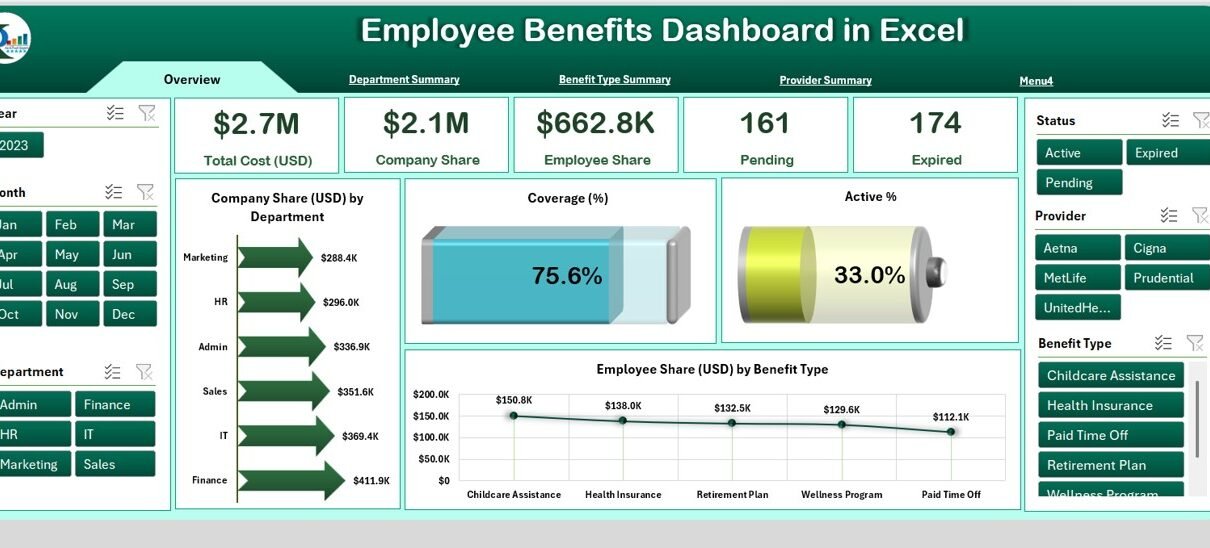
Overview Page
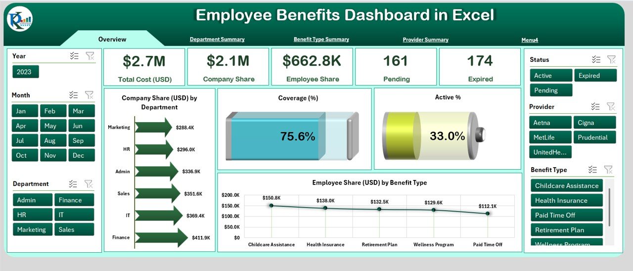
This is the main page of the dashboard and acts as the control center. It includes:
-
Page Navigator on the left side for quick access to all tabs
-
Slicers on both left and right for filtering by department, benefit type, and time period
5 KPI Cards showing:
- Total Cost (USD)
- Company Share (USD)
- Employee Share (USD)
- Active % of employees enrolled
- Coverage (%)
4 Insightful Charts:
- Company Share (USD) by Department
- Coverage (%)
- Active %
- Employee Share (USD) by Benefit Type
This page helps HR teams get a bird’s-eye view of benefit utilization and financial allocation.
Department Summary

This tab provides department-wise analysis, helping you compare how different teams engage with benefits.
-
Slicers on the left and right
3 Charts:
- Employee Share (USD) by Department
- Active % by Department
- Total Cost (USD) by Department
This information allows HR professionals to identify disparities or patterns across departments and plan targeted interventions.
Benefit Type Summary
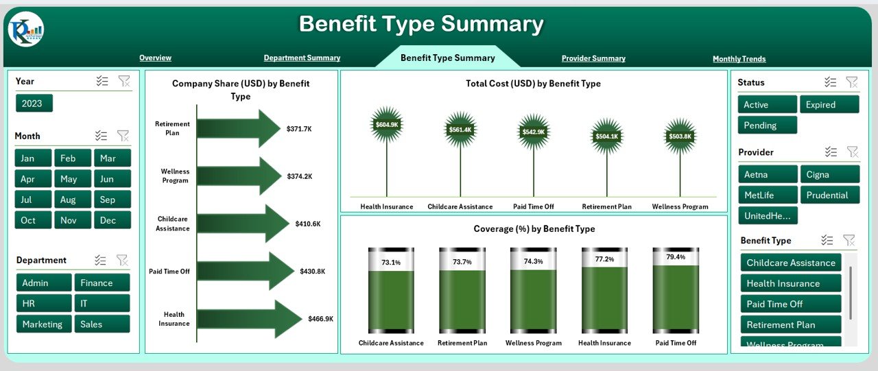
On this sheet, you can analyze how each type of benefit performs in terms of cost and participation.
-
Slicers for filtering
3 Charts:
- Company Share (USD) by Benefit Type
- Total Cost (USD) by Benefit Type
- Coverage (%) by Benefit Type
Whether it’s health insurance, retirement plans, or education assistance, you can instantly see which benefits are most valued by employees.
Provider Summary
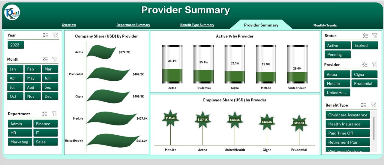
Here, the focus shifts to benefit providers—insurance companies, wellness vendors, retirement fund managers, etc.
-
Slicers for provider filtering
3 Charts:
- Company Share (USD) by Provider
- Active % by Provider
- Employee Share (USD) by Provider
This page helps organizations evaluate which providers deliver high value and engagement, and which may need review.
Click to Purchases Employee Benefits Dashboard in Excel
Monthly Trends
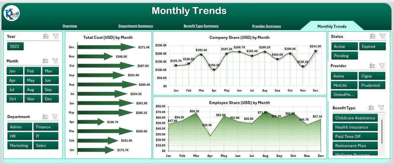
Track benefit trends month-by-month to identify seasonal spikes or reductions in costs and participation.
-
Slicers for time range selection
3 Time-Series Charts:
- Total Cost (USD) by Month
- Company Share (USD) by Month
- Employee Share (USD) by Month
This analysis aids budget forecasting and helps HR teams measure the impact of any benefit policy changes over time.
Data Sheet and Support Sheet
-
Data Sheet: This is the backbone of the dashboard. You enter all records here—employee details, departments, benefit types, providers, and monthly cost breakdowns.
-
Support Sheet: This holds your master lists and dropdown references—like benefit categories, department names, and provider names.
Both sheets are fully editable, giving you control and flexibility.
Why Should You Use an Employee Benefits Dashboard?
Still wondering if you need this tool? Here are some compelling reasons:
✅ Transparent Reporting
It offers visual clarity into where your money goes and how employees use benefits.
✅ Data-Driven HR
You no longer have to guess what’s working. The dashboard shows real-time numbers.
✅ Cost Control
By analyzing trends and provider costs, you can make better financial decisions.
✅ Improved Engagement
Understanding employee preferences helps you align benefits with what truly matters to them.
✅ Easy Customization
Since it’s built in Excel, you can adjust formulas, labels, and layouts without needing any programming skills.
Advantages of Using the Employee Benefits Dashboard in Excel
-
No Learning Curve: If you know Excel, you can use this dashboard immediately.
-
Interactive Filters: Drill down by department, benefit type, or provider.
-
Visual KPIs: Get instant performance indicators through cards and graphs.
-
Centralized Data: Keep all benefit-related information in one secure file.
-
Professional Presentation: Use it for board meetings, HR reviews, and audit presentations.
Best Practices for the Employee Benefits Dashboard
Follow these tips to get the most out of your dashboard:
1. Update Monthly
Feed in fresh data every month to keep your visuals accurate and actionable.
2. Use Drop-down Lists
Maintain consistency using dropdowns for benefit types, departments, and providers.
3. Validate Your Data
Avoid errors by double-checking entries—especially date formats and cost columns.
4. Set Access Levels
If multiple people are using the file, set editing permissions to protect data.
5. Analyze Before Deciding
Don’t rely on assumptions—use trend analysis before changing benefit offerings.
6. Backup Regularly
Always keep a backup file before making major updates.
How Can HR Teams Use This Dashboard?
Here are a few use cases:
-
Compare Costs: Identify departments with high benefit spend and investigate further.
-
Provider Negotiation: Use historical data to negotiate better rates with vendors.
-
Measure Satisfaction: Check active % and coverage as indirect indicators of employee satisfaction.
-
Forecast Budgets: Use monthly trends to allocate future HR budgets effectively.
-
Plan Policy Changes: Analyze the impact of new benefits or modified ones.
Who Can Benefit from This Dashboard?
This tool is ideal for:
-
HR Managers
-
Compensation & Benefits Specialists
-
Finance Teams
-
Department Heads
-
Small Business Owners
-
Consultants & Auditors
If you manage or report on employee benefits, this dashboard makes your job easier.
What Metrics Can You Track?
The dashboard is built to track important KPIs such as:
-
Total Benefits Cost (USD)
-
Company Contribution (USD)
-
Employee Contribution (USD)
-
Coverage %
-
Active %
-
Cost by Department / Benefit Type / Provider
-
Monthly Trend Lines
You can always add more KPIs based on your business requirements.
Can You Customize the Dashboard?
Absolutely. You can:
-
Add or remove benefit types
-
Change department names
-
Edit formulas for KPIs
-
Apply custom color themes
-
Embed pivot tables or charts
That’s the beauty of Excel—it gives you complete control without needing a developer.
How to Get Started?
-
Download the Template: Use the ready-to-use Employee Benefits Dashboard file.
-
Input Your Data: Use the Data Sheet to add employee benefits information.
-
Check Support Sheet: Make sure dropdown lists are accurate.
-
Explore Dashboard Pages: Click through each page to see different views.
-
Apply Filters: Use slicers to refine the visuals.
-
Analyze & Act: Use insights to guide HR decisions.
Conclusion
Tracking employee benefits doesn’t have to be overwhelming. With the Employee Benefits Dashboard in Excel, you get a clear, visual, and interactive solution to monitor every aspect of benefits distribution, cost, and engagement. Whether you’re managing 50 employees or 5000, this dashboard brings structure, insight, and agility to your HR operations.
It’s time to stop juggling spreadsheets and start making smarter, data-driven decisions—right from your Excel file.
Frequently Asked Questions (FAQs)
Q1. Can I use this dashboard with Excel Online or Google Sheets?
Answer: This dashboard is built for the Excel desktop version, especially for PivotCharts and slicers. Some features may not work in Excel Online or Google Sheets.
Q2. Is any VBA or macro used in this dashboard?
Answer: No. The dashboard works entirely with Excel formulas, slicers, and pivot charts. No coding or macros are required.
Q3. Can I add new benefit types or departments?
Answer: Yes. You can update the support sheet to add new benefit types, departments, or providers. Make sure to keep the data consistent for filters to work properly.
Q4. What version of Excel do I need?
Answer: Excel 2016 or later is recommended for full compatibility with slicers and modern chart types.
Q5. Is it safe to share this dashboard with my team?
Answer: Yes. You can protect specific sheets and share a read-only version if needed. Just remember to remove or hide sensitive salary information before sharing.
Q6. Can I track year-over-year benefit trends?
Answer: Yes, you can add columns in the data sheet for previous year comparisons and create additional charts for year-over-year analysis.
Visit our YouTube channel to learn step-by-step video tutorials