In today’s data-driven world, businesses must stay on top of their financial performance to remain competitive. Revenue is one of the most critical metrics for any organization. It reflects business growth, operational efficiency, and market demand. To track and analyze revenue effectively, many professionals turn to Excel. A Revenue Analysis Report in Excel is a powerful tool that provides deep insights, helping decision-makers make informed choices.
This article explores everything you need to know about creating and using a Revenue Analysis Report in Excel. Whether you’re a finance analyst, business owner, or operations manager, this guide will walk you through the key components, benefits, and best practices of revenue reporting.
Click to Purchases Revenue Analysis Report in Excel
What Is a Revenue Analysis Report in Excel?
A Revenue Analysis Report in Excel is a detailed financial tool used to monitor, assess, and present revenue-related data in an organized manner. It allows users to compare actual revenue against targets, evaluate performance across regions and channels, and identify trends over time.
Using Excel for revenue reporting combines the flexibility of spreadsheets with the power of data visualization. Excel’s built-in features like formulas, pivot tables, slicers, and charts make it ideal for creating interactive and customizable reports.
Key Components of the Revenue Analysis Report in Excel
The ready-to-use template for this Revenue Analysis Report in Excel includes the following 3 main sheets:
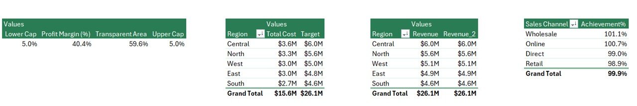
Summary Page
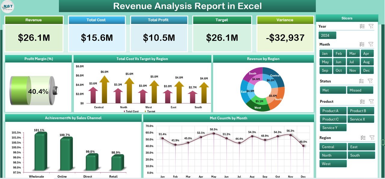
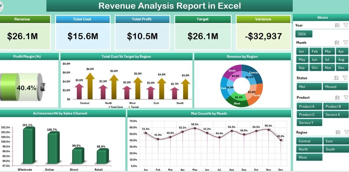
The Summary Page is the heart of the dashboard. It gives a bird’s-eye view of overall performance. It features:
-
Top 5 Cards: These highlight key figures such as Total Revenue, Total Cost, Profit Margin (%), Target Revenue, and Variance.
-
Right-side Slicers: These allow you to filter data by Region, Sales Channel, and Month for dynamic analysis.
Five Insightful Charts:
- Profit Margin (%)
- Total Cost vs Target Revenue by Region
- Revenue by Region
- Achievement % by Sales Channel
- Met Count % by Month
Click to Purchases Revenue Analysis Report in Excel
These visuals provide quick and clear insights, helping managers focus on areas that need attention.
Report Page
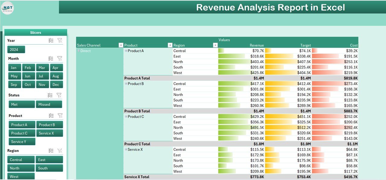
The Report Page is more detailed and includes:
-
Left-side Slicer Panel: Filter data by multiple categories.
-
Information Table: This displays raw or calculated revenue figures, cost, target values, and performance metrics. You can sort and filter this table for granular analysis.
Data Sheet
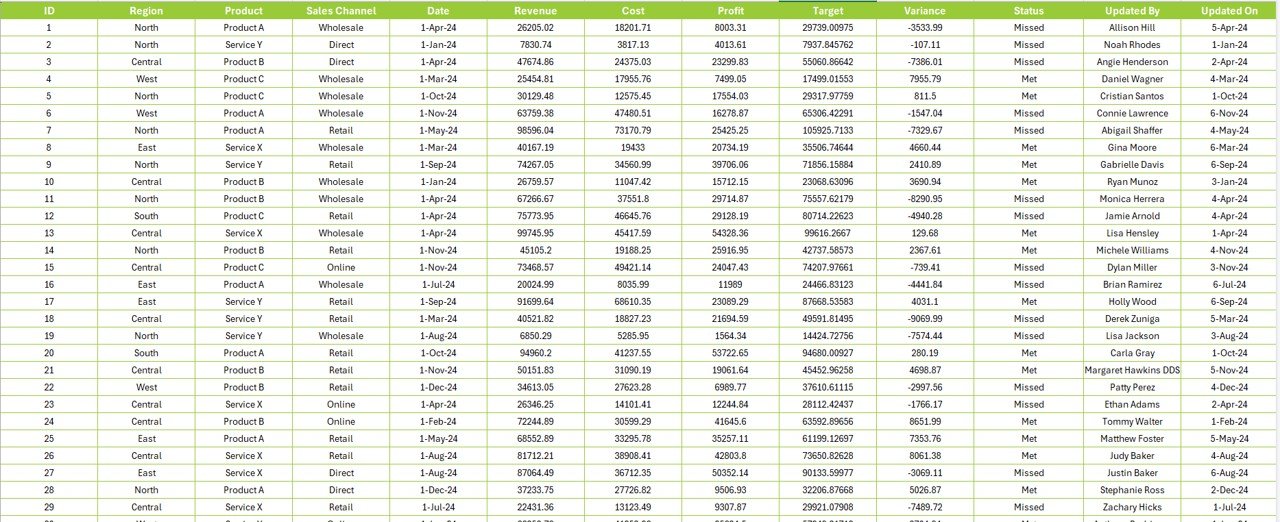
This is the backbone of the report. It holds all raw transactional data, including:
-
Sales Date
-
Region
-
Sales Channel
-
Revenue
-
Cost
-
Target
Well-structured data ensures accurate charts, KPIs, and analysis across the report.
Support Sheet
This sheet includes reference data, dropdown values for slicers, and lookup tables. It helps maintain consistency in data validation and improves automation across the workbook.
Why Use Excel for Revenue Analysis?
While tools like Power BI and Tableau are popular, Excel remains a favorite for many reasons:
🧩 Ease of Use: No steep learning curve. Anyone familiar with Excel can work on the report.
🎯 Customizable: You can tailor the report to your business needs without coding.
💡 Quick Analysis: With pivot tables, slicers, and formulas, you can explore multiple perspectives within minutes.
📤 Easy Sharing: Share reports via email, cloud, or print. No special software required for viewing.
Advantages of Using a Revenue Analysis Report in Excel
Let’s explore the key benefits of using this type of reporting tool:
📌 1. Real-Time Decision Making
-
Interactive elements like slicers allow decision-makers to filter and analyze data on the go.
-
Quickly assess which region or channel is underperforming.
📌 2. Simplifies Complex Data
-
Charts and cards transform raw data into understandable visuals.
-
You don’t need to scroll through thousands of rows to find insights.
📌 3. Boosts Productivity
-
Automating the report saves time spent on repetitive tasks.
-
Weekly and monthly revenue analysis becomes faster and more accurate.
📌 4. Cost-Effective
-
No need to purchase expensive software.
-
You can manage all reporting needs with Excel and some creativity.
📌 5. Improves Collaboration
-
Share the workbook with finance, sales, and operations teams.
-
Everyone sees the same data but can filter based on their needs.
How to Use the Revenue Analysis Report Effectively?
To get the most out of your report, follow these simple steps:
-
Update the Data Sheet regularly with actual sales, costs, and targets.
-
Use Slicers to narrow down insights by region, month, or sales channel.
-
Monitor Cards to instantly understand how you’re performing against targets.
-
Review Charts for trend analysis and strategic planning.
-
Drill down into the Report Page to investigate anomalies or variances.
Best Practices for the Revenue Analysis Report in Excel
To ensure accuracy, usability, and scalability, consider these best practices:
✔️ 1. Keep Data Clean
-
Remove duplicates and blanks.
-
Standardize formats (dates, currency, etc.).
✔️ 2. Use Named Ranges and Tables
-
This helps with dynamic charts and makes formulas easier to understand.
✔️ 3. Automate with Formulas
-
Use Excel functions like
IF,SUMIFS,AVERAGEIFS,INDEX/MATCH, andVLOOKUPfor smart calculations.
✔️ 4. Avoid Hardcoding
-
Always reference cells or tables. Hardcoding limits flexibility and introduces errors.
✔️ 5. Protect Sensitive Data
-
Use Excel’s built-in protection and password features to lock sheets or workbooks.
✔️ 6. Test Before Sharing
-
Validate charts and KPIs after each update to ensure accuracy.
What Metrics Can You Track with This Report?
Here are some common revenue KPIs you can include:
-
Total Revenue
-
Target Revenue
-
Variance
-
Cost of Sales
-
Profit Margin (%)
-
Revenue by Region
-
Achievement % by Sales Channel
-
Met Count % by Month
These KPIs give you a well-rounded picture of your revenue landscape.
Opportunities for Improvement
Even though Excel is powerful, there are always ways to improve:
🔄 Integrate Power Query for easier data import from external sources.
🧩 Add Trendlines or Forecasts for predictive analysis.
🌐 Link to External Systems like CRM or ERP for live data updates.
📬 Create Alerts using conditional formatting to highlight critical insights.
🧠 Use Macros or VBA for automating repetitive updates.
Conclusion
A well-designed Revenue Analysis Report in Excel can transform how businesses view their financial health. With clear visuals, real-time filtering, and accurate metrics, it empowers decision-makers to act quickly and strategically. Excel’s flexibility makes it the perfect tool for small to mid-sized businesses seeking powerful reporting without the high cost of enterprise tools.
If you want to stay ahead in today’s competitive market, adopt a smart revenue analysis strategy—starting with this Excel-based report.
Frequently Asked Questions (FAQs)
1. What is a Revenue Analysis Report used for?
It is used to monitor, evaluate, and compare actual revenue against targets. It helps identify trends, performance gaps, and growth opportunities.
2. Why choose Excel for revenue reporting?
Excel is user-friendly, highly customizable, and cost-effective. It provides powerful data visualization and analysis without needing third-party tools.
3. Can I automate the report updates?
Yes, you can use Excel formulas, pivot tables, Power Query, or even VBA macros to automate updates and reduce manual effort.
4. How often should I update the data sheet?
Ideally, update it weekly or monthly depending on your business operations. Regular updates ensure you’re analyzing the latest performance data.
5. What if my revenue data comes from different sources?
Use Power Query in Excel to combine data from multiple sources like CSV, Excel, databases, or web APIs into one clean dataset.
6. Is this report suitable for non-finance users?
Yes. The visual dashboards and slicers make it easy to understand, even for people without financial backgrounds.
7. Can I add more charts and KPIs?
Absolutely! The report is fully customizable. You can add more metrics based on your business needs.
8. How do I handle large datasets in Excel?
Use Excel Tables, Power Pivot, and limit the use of volatile formulas. Also, keep unnecessary formatting minimal to enhance performance.
Visit our YouTube channel to learn step-by-step video tutorials