In today’s fast-changing business world, disruptions are inevitable. From cyberattacks to natural disasters and from power outages to supply chain delays, organizations must stay prepared. A single incident can impact productivity, revenue, and even reputation. This is why Business Continuity Management (BCM) has become a vital function in every organization.
One of the most effective ways to monitor and manage continuity plans is by using a Business Continuity Dashboard in Excel. This ready-to-use dashboard helps companies track recovery times, costs, incidents, and test results in one place. It turns raw data into insights so leaders can make quick, informed decisions when disruptions occur.
In this article, we will explore everything about the Business Continuity Dashboard in Excel, including its features, advantages, use cases, best practices, and FAQs.
Click to Purchases Business Continuity Dashboard in Excel
What is a Business Continuity Dashboard in Excel?
A Business Continuity Dashboard in Excel is a structured tool that allows organizations to:
-
Track incidents across departments.
-
Measure Recovery Point Objectives (RPO) and Recovery Time Objectives (RTO).
-
Monitor downtime costs.
-
Review the success of continuity tests.
-
Visualize monthly performance trends.
Instead of relying on scattered spreadsheets or manual reports, the dashboard consolidates all the continuity data in one place. It displays performance with cards, charts, and KPIs so decision-makers can act quickly during and after incidents.
Key Features of the Business Continuity Dashboard
The prebuilt dashboard comes with five main analytical pages, supported by data and reference sheets. A page navigator on the left side ensures easy navigation.
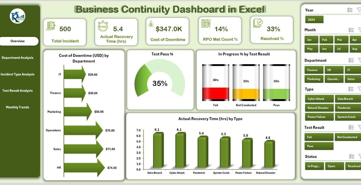
Overview Page
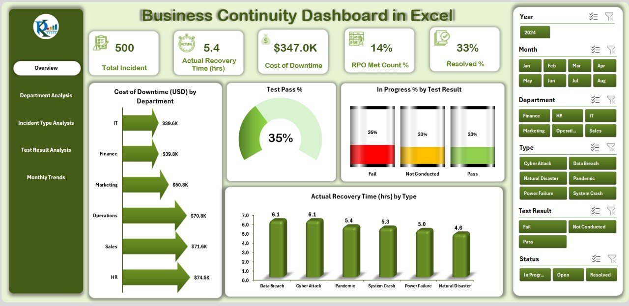
The Overview Page acts as the control center. It provides high-level insights through summary cards and visual charts.
Cards Included:
- Cost of Downtime (USD)
- Test Pass %
- In Progress % (by test result)
- Actual Recovery Time (hours)
Charts Displayed:
- Cost of Downtime by Department
- Test Pass % trend
- In Progress % by Test Result
- Actual Recovery Time by Type
This page ensures that executives and managers can instantly see the health of continuity operations.
Department Analysis
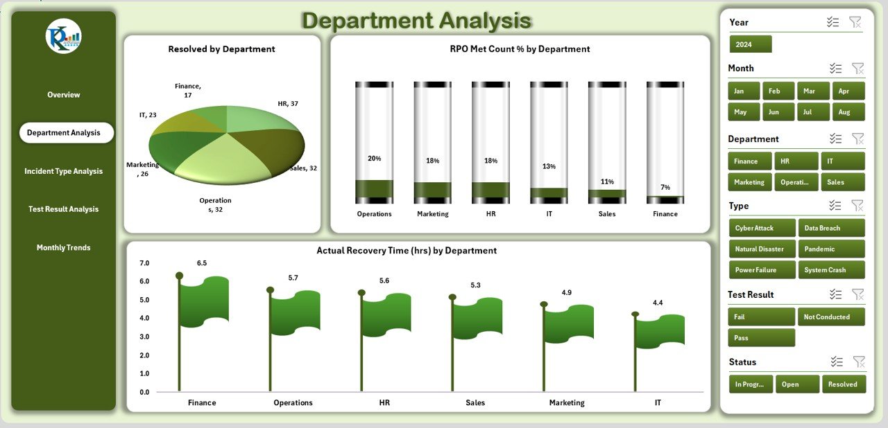
The Department Analysis Page focuses on performance across business units.
Charts Included:
- Resolved Incidents by Department
- RPO Met Count % by Department
- Actual Recovery Time (hours) by Department
This view helps identify which departments perform well during disruptions and which require additional resources or training.
Incident Type Analysis
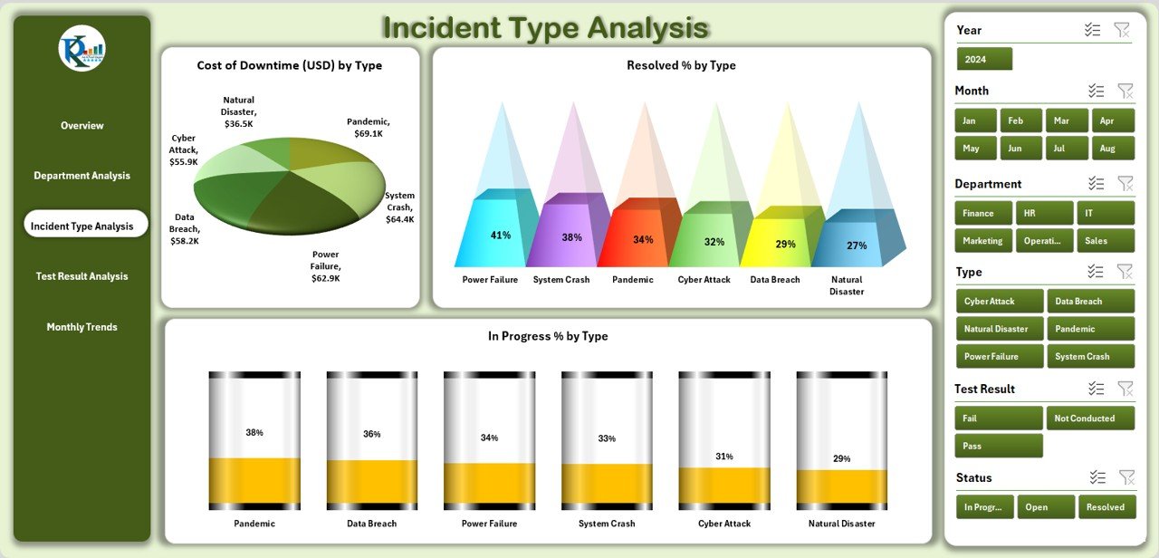
The Incident Type Analysis Page breaks down incidents by category.
Click to Purchases Business Continuity Dashboard in Excel
Charts Included:
- Cost of Downtime by Type
- Resolved % by Type
- In Progress % by Type
This analysis highlights the most expensive or frequent incident types. It supports proactive planning by showing where the organization is most vulnerable.
Test Result Analysis
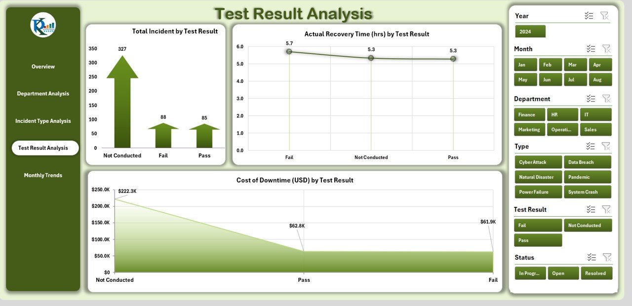
Testing ensures that continuity plans actually work. This page captures and analyzes the results of such tests.
Charts Included:
- Total Incidents by Test Result
- Actual Recovery Time by Test Result
- Cost of Downtime by Test Result
By reviewing test results, organizations can identify gaps in procedures and improve resilience before real incidents occur.
Monthly Trends
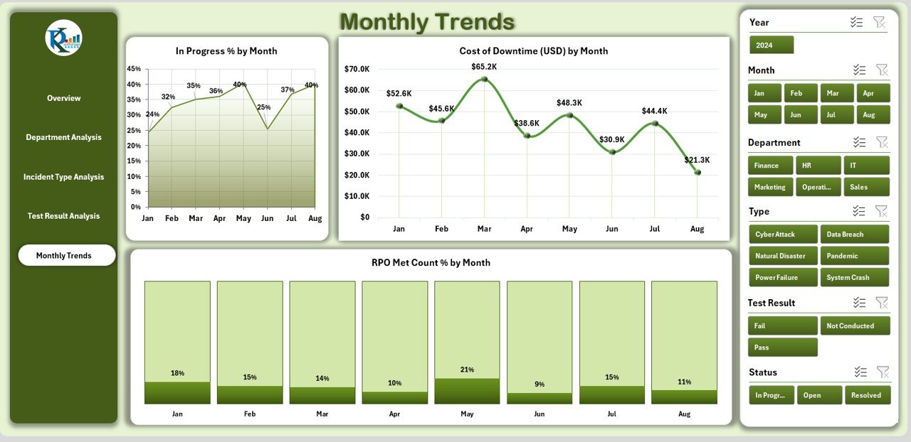
The Monthly Trends Page tracks how continuity performance evolves over time.
Charts Included:
- In Progress % by Month
- Cost of Downtime (USD) by Month
- RPO Met Count % by Month
This helps leaders evaluate whether their strategies improve performance or if further adjustments are needed.
Supporting Sheets
-
Data Sheet – Stores raw input data.
-
Support Sheet – Manages reference values such as department names, incident types, or test categories.
Why Use a Business Continuity Dashboard in Excel?
Many organizations invest in high-cost business continuity software. However, Excel remains one of the most flexible, cost-effective, and widely used tools. With the right dashboard, Excel can deliver enterprise-grade insights without requiring complex systems.
Key reasons to use Excel:
-
Universally available in organizations.
-
Easy to customize.
-
Supports automation through formulas and pivot tables.
-
Visual insights through charts and conditional formatting.
Advantages of a Business Continuity Dashboard in Excel
Implementing this dashboard comes with several advantages:
✅ Centralized Monitoring – One dashboard provides a complete picture of continuity performance.
✅ Faster Decision-Making – Visual KPIs enable quicker responses during disruptions.
✅ Cost Savings – Avoids expensive third-party tools while delivering similar insights.
✅ Improved Preparedness – Continuity tests can be tracked and improved over time.
✅ Departmental Accountability – Each department’s performance is transparent.
✅ Customizable – The dashboard can be modified to fit industry or company needs.
Opportunities for Improvement in Business Continuity
Even with a strong dashboard, organizations can improve their continuity planning. Some opportunities include:
🔹 Integrating real-time data sources for automatic updates.
🔹 Expanding analysis to include supplier and vendor risks.
🔹 Using scenario simulations for high-impact events.
🔹 Adding financial modeling for cost-benefit analysis of continuity measures.
🔹 Linking the dashboard with incident reporting tools for automation.
Best Practices for Using a Business Continuity Dashboard
To maximize the value of the dashboard, follow these best practices:
📊 Keep Data Updated – Regularly input and validate incident and test data.
🧩 Use Clear KPIs – Choose measurable KPIs such as RTO, RPO, and cost of downtime.
🔄 Automate Where Possible – Use formulas, pivot tables, and conditional formatting for efficiency.
🏢 Engage Departments – Involve department heads in reviewing performance.
📈 Review Trends – Compare monthly results to ensure strategies are improving resilience.
🎯 Test Continuity Plans Often – Frequent testing ensures that recovery strategies remain relevant.
How Can Organizations Benefit from the Dashboard?
Organizations that implement a Business Continuity Dashboard in Excel gain several benefits:
-
Clear visibility into risks and costs.
-
Data-driven decisions during emergencies.
-
Improved compliance with regulatory standards.
-
Greater stakeholder confidence.
-
A culture of resilience within the organization.
Conclusion
A Business Continuity Dashboard in Excel is more than just a reporting tool. It acts as the backbone of an organization’s resilience strategy. By consolidating data into meaningful KPIs and charts, it empowers leaders to prepare, respond, and recover effectively from disruptions.
Whether you are a small business or a large enterprise, adopting this dashboard ensures better preparedness, improved accountability, and stronger decision-making during critical times.
Frequently Asked Questions (FAQs)
1. What is a Business Continuity Dashboard?
A Business Continuity Dashboard is a tool that tracks and visualizes key continuity metrics such as downtime cost, recovery time, and incident resolution.
2. Why use Excel for a Business Continuity Dashboard?
Excel is flexible, cost-effective, and widely used. It allows organizations to build dashboards without expensive software.
3. What KPIs should be included in the dashboard?
Common KPIs include Cost of Downtime, RPO Met %, Recovery Time, Test Pass %, and Incident Resolution %.
4. How often should continuity tests be done?
Tests should be performed at least quarterly, but more frequent testing improves preparedness.
5. Can the dashboard be customized?
Yes. Organizations can add new KPIs, change charts, or integrate external data to match their specific needs.
6. Who should use this dashboard?
Business continuity managers, IT teams, compliance officers, and senior leadership teams can all benefit.
7. How does this dashboard support compliance?
It provides documented evidence of continuity planning, testing, and results, which regulators often require.
Visit our YouTube channel to learn step-by-step video tutorials