Managing IT operations efficiently has become one of the most important priorities for modern organizations. As technology becomes the backbone of business, IT teams handle a wide range of responsibilities—from resolving support tickets to ensuring systems run without interruption. However, without proper tracking and reporting, IT departments often struggle with bottlenecks, delays, and poor visibility.
This is where an IT Dashboard in Excel comes into play. It acts as a one-stop solution for tracking performance, monitoring metrics, and analyzing trends. Unlike expensive IT management software, this ready-to-use Excel template helps businesses organize, analyze, and visualize their IT data in a simple yet powerful way.
Click to Purchases IT Dashboard in Excel
In this guide, we will explore everything you need to know about the IT Dashboard in Excel—its structure, features, benefits, best practices, and frequently asked questions. By the end, you will understand why this tool is essential for any IT team looking to improve efficiency and transparency.
What Is an IT Dashboard in Excel?
An IT Dashboard in Excel is a structured reporting tool that consolidates IT-related data into visual charts, cards, and tables. It gives managers and team leaders a real-time view of performance indicators such as:
-
Ticket resolution time
-
SLA (Service Level Agreement) compliance
-
Customer satisfaction rating
-
Open and resolved ticket trends
-
Departmental and agent-level performance
This Excel-based dashboard comes with interactive features like page navigators and slicers, allowing users to filter and analyze data instantly. It transforms raw IT records into actionable insights without requiring coding or complex tools.
Key Features of the IT Dashboard in Excel
The template has been designed for maximum usability. It includes five main pages along with a support sheet to capture reference data. Let’s break down each section.
Overview Page

The Overview Page acts as the main control center of the dashboard. On the right side, a slicer allows users to filter data by time period or other attributes. The page includes five summary cards that display key performance metrics at a glance.
It also includes four powerful charts:
-
Resolved % – percentage of tickets resolved successfully.
-
Open % by Ticket Type – distribution of open tickets by type.
-
Customer Rating by Department – satisfaction scores by department.
-
Resolution Time (Days) by Assigned Agent – how long each agent takes to resolve issues.
Department Analysis Page

This page focuses on departmental-level performance. With slicers for easy navigation, managers can instantly see which teams are excelling and which need improvement.
It includes four departmental charts:
-
SLA Met % by Department – measures compliance with service agreements.
-
Resolution Time (Days) by Department – average resolution duration.
-
High Priority Ticket by Department – highlights workload of critical tickets.
-
Resolved % by Department – resolution efficiency by team.
Click to Purchases IT Dashboard in Excel
Ticket Analysis Page

This page helps understand ticket-level performance across different categories.
Charts included:
-
Customer Rating by Ticket Type – satisfaction levels based on issue type.
-
High Priority Ticket Type – distribution of urgent tickets.
-
Resolution Time (Days) by Ticket Type – speed of handling various issues.
-
Resolved % by Ticket Type – completion success across categories.
Assigned Agent Analysis Page
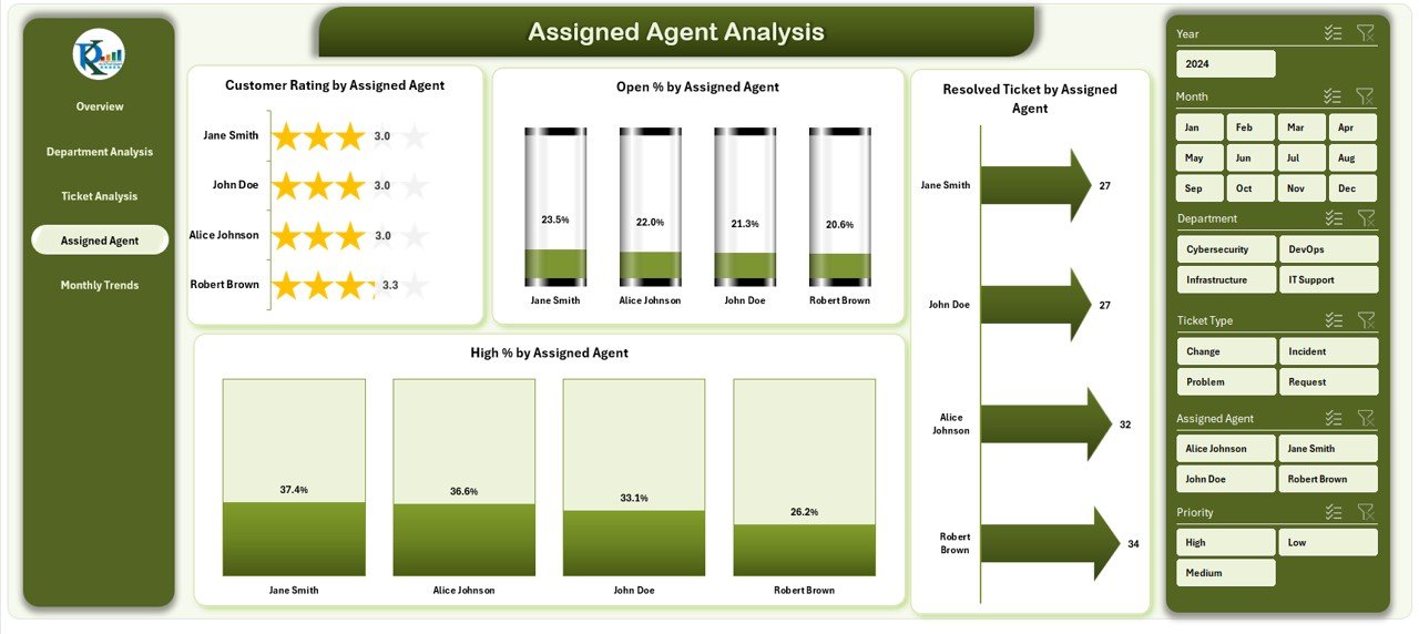
Individual agent performance can make or break IT operations. This page provides agent-specific insights with four charts:
-
Customer Rating by Assigned Agent – feedback scores for each agent.
-
High % by Assigned Agent – percentage of high-priority tickets handled.
-
Open % by Assigned Agent – current workload distribution.
-
Resolved Ticket by Assigned Agent – number of issues successfully resolved.
Monthly Trends Page
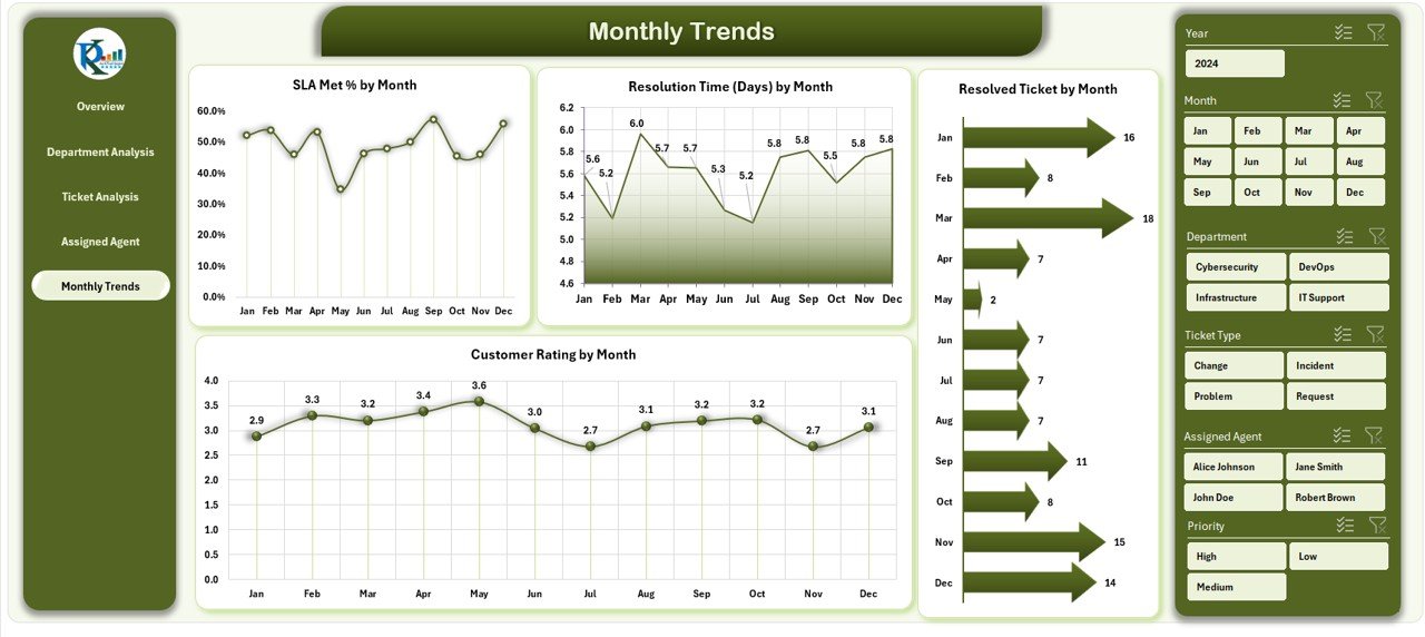
Tracking performance over time is essential for identifying improvement opportunities. This page provides monthly trends through charts such as:
-
SLA Met % by Month
-
Resolution Time (Days) by Month
-
Resolved Ticket by Month
-
Customer Rating by Month
Support Sheet
The support sheet acts as the backbone of the dashboard, storing reference lists such as:
-
Department names
-
Ticket types
-
Agent names
-
SLA targets
It ensures data accuracy and smooth functioning of dropdowns and slicers.
Why Do You Need an IT Dashboard in Excel?
Many organizations rely on scattered spreadsheets, manual reports, or outdated tools. This leads to:
-
Lack of visibility
-
Difficulty tracking KPIs
-
Poor decision-making due to delayed insights
By using an IT Dashboard in Excel, you can:
-
Get real-time insights without expensive software
-
Ensure accountability at department and agent levels
-
Track trends and plan resources effectively
-
Improve customer satisfaction with faster response times
Advantages of IT Dashboard in Excel
Using this dashboard provides several benefits:
✅ Cost-Effective – No need for costly IT management tools.
✅ User-Friendly – Built in Excel, which most employees already know.
✅ Customizable – Adapt charts, metrics, and filters to your needs.
✅ Real-Time Tracking – Monitor SLA compliance and resolution times instantly.
✅ Improved Decision-Making – Visual data helps managers act faster.
✅ Performance Transparency – Clear visibility of agent and department performance.
Opportunities for Improvement in IT Dashboard
Even though the IT Dashboard in Excel is powerful, there are areas where you can improve:
🔹 Data Automation – Connect the dashboard to live databases instead of manual entry.
🔹 Advanced Visuals – Use Excel add-ins like Power Query and Power Pivot for deeper analysis.
🔹 Mobile Access – Optimize the template for mobile-friendly viewing.
🔹 Predictive Insights – Add forecasting functions to anticipate workload spikes.
Best Practices for the IT Dashboard in Excel
To make the most of your dashboard, follow these best practices:
-
Keep Data Clean: Ensure all records are updated and free from errors.
-
Use Slicers Wisely: Do not overload with filters; keep them intuitive.
-
Review KPIs Regularly: Revisit your chosen metrics every quarter.
-
Train Your Team: Teach users how to interpret charts and use filters.
-
Automate Reports: Use Excel formulas and macros to reduce manual work.
-
Back Up Data: Always maintain a secure backup of IT records.
Conclusion
An IT Dashboard in Excel is not just a reporting tool—it is a performance management solution that drives efficiency, accountability, and customer satisfaction. With its structured design and interactive charts, IT teams can monitor KPIs, analyze trends, and take informed decisions without investing in costly platforms.
By implementing this dashboard, organizations can move away from scattered reports and embrace a data-driven IT culture that improves service delivery and enhances business outcomes.
Frequently Asked Questions (FAQs)
1. What is an IT Dashboard in Excel used for?
It is used to monitor IT operations, track KPIs, analyze ticket trends, and evaluate agent and department performance in one place.
2. Can small businesses use this dashboard?
Yes. The template is designed to be cost-effective and works perfectly for small, medium, and large businesses.
3. Do I need advanced Excel skills to use this?
Not at all. Basic Excel knowledge is enough since the dashboard comes with built-in formulas, charts, and slicers.
4. Can I customize the metrics?
Yes. You can easily add or remove KPIs, change chart types, and modify filters based on your requirements.
5. How does this improve customer satisfaction?
By reducing resolution times, improving SLA compliance, and providing visibility into agent performance, it helps IT teams deliver faster and better service.
Visit our YouTube channel to learn step-by-step video tutorials
Click to Purchases IT Dashboard in Excel
Watch the step-by-step video tutorial: