Emergencies can strike at any time — from natural disasters to workplace incidents. Quick, informed, and coordinated responses are essential to minimize risks, protect lives, and reduce damage. However, managing data from multiple sources during crises can be chaotic. That’s where an Emergency Management Dashboard in Excel comes in.
This powerful, ready-to-use Excel template transforms raw emergency data into meaningful insights through charts, summaries, and key performance indicators (KPIs). It provides emergency management teams, departments, and leaders with a unified view of incidents, resources, and response performance — all in one interactive dashboard.
In this article, you’ll explore everything about the Emergency Management Dashboard in Excel, including its structure, features, advantages, best practices, and frequently asked questions.
Click to Purchases Emergency Management Dashboard in Excel
What Is an Emergency Management Dashboard in Excel?
An Emergency Management Dashboard in Excel is a comprehensive tool designed to help organizations track, analyze, and visualize key emergency data. It offers a single platform to monitor multiple parameters like incidents, response times, severity levels, and recovery progress.
Instead of maintaining multiple reports or spreadsheets, this dashboard consolidates everything into a visually interactive format. The dashboard helps you monitor emergency events by department, response team, location, and time period, providing insights that improve decision-making and preparedness.
Whether you manage a hospital, a corporate site, a municipality, or a school system — this dashboard ensures you stay prepared, responsive, and informed during emergencies.
Structure of the Emergency Management Dashboard
This Excel-based Emergency Management Dashboard includes five major pages and one support sheet. Each page has slicers for quick filtering and charts that display performance trends and incident analysis. Here’s what each page offers:
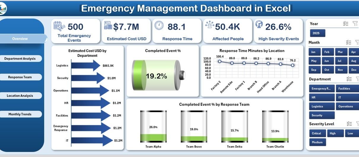
Overview Page
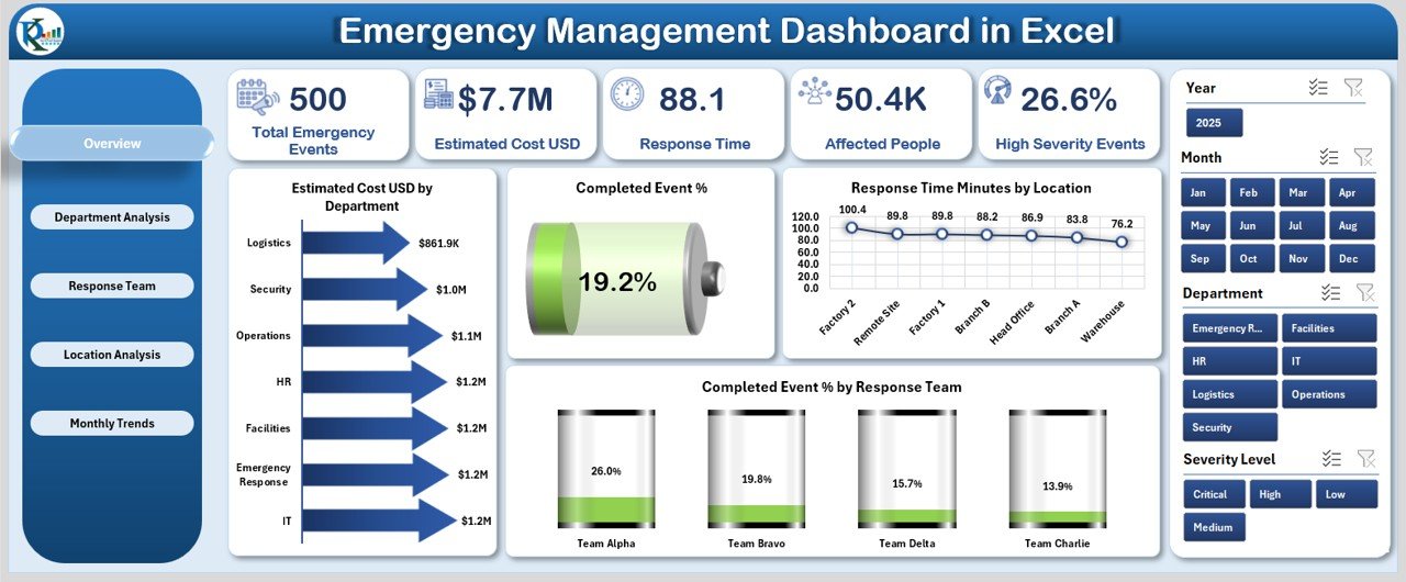
The Overview Page is the heart of the dashboard. It gives a snapshot of key metrics across all departments and locations.
Key Elements on this Page:
-
Navigation Panel (Left Side): Allows users to move between pages effortlessly.
-
Top 5 KPI Cards: These cards summarize vital statistics like Total Emergencies, Completed Events %, Average Response Time, Estimated Cost (USD), and High Severity %.
-
Right-Side Slicers: Enable dynamic filtering by department, location, or response team.
Charts Included:
- Estimated Cost (USD) by Department
- Completed Event %
- Response Time (Minutes) by Location
- Completed Event % by Response Team
This page acts as the control center where decision-makers can instantly understand the situation and make informed choices.
Department Analysis Page
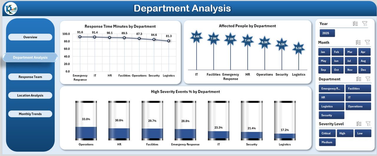
The Department Analysis page offers an in-depth view of how each department performs during emergencies. It allows leaders to compare departments and identify areas needing improvement.
Key Highlights:
-
Slicers for Filtering: Quickly analyze by date, severity, or event type.
Charts Included:
- Response Time (Minutes) by Department
- Affected People by Department
- High Severity Event % by Department
This section helps identify departments with high response times or recurring high-severity events, ensuring better preparedness and resource allocation.
Response Team Analysis Page
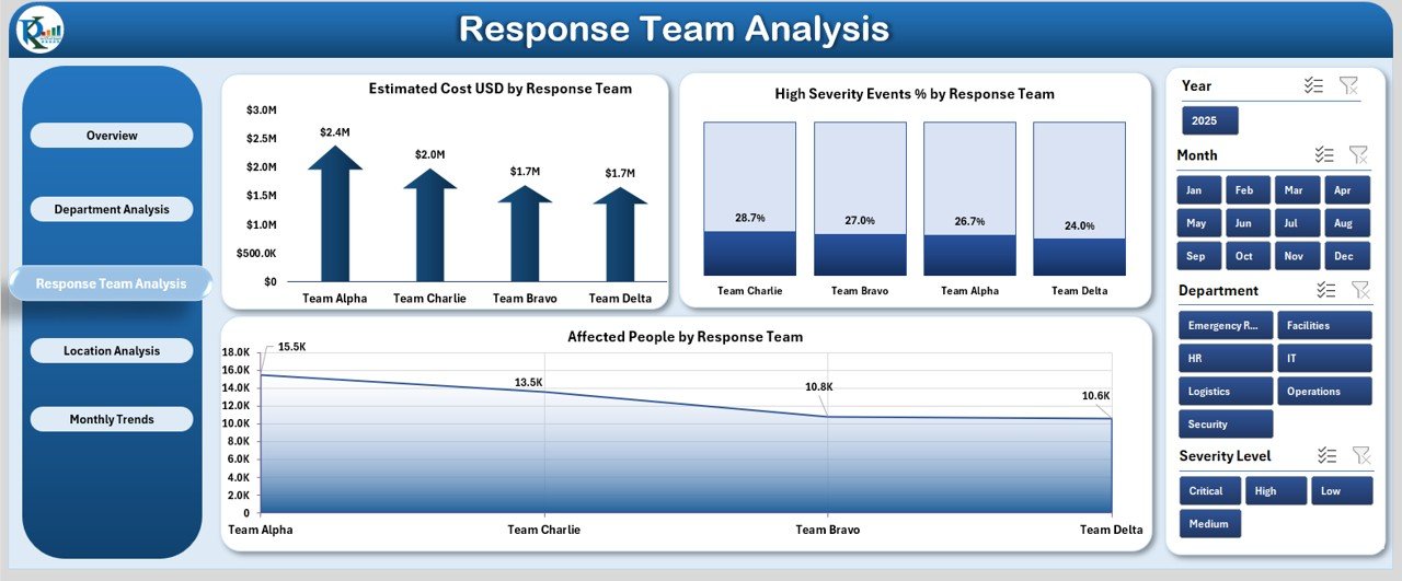
Response teams play a crucial role during emergencies, and this page evaluates their performance metrics in detail.
Main Charts:
- Estimated Cost (USD) by Response Team
- High Severity Event % by Response Team
- Affected People by Response Team
By analyzing these insights, organizations can pinpoint top-performing teams, identify those needing additional training, and ensure resource balance across all units.
Click to Purchases Emergency Management Dashboard in Excel
Location Analysis Page
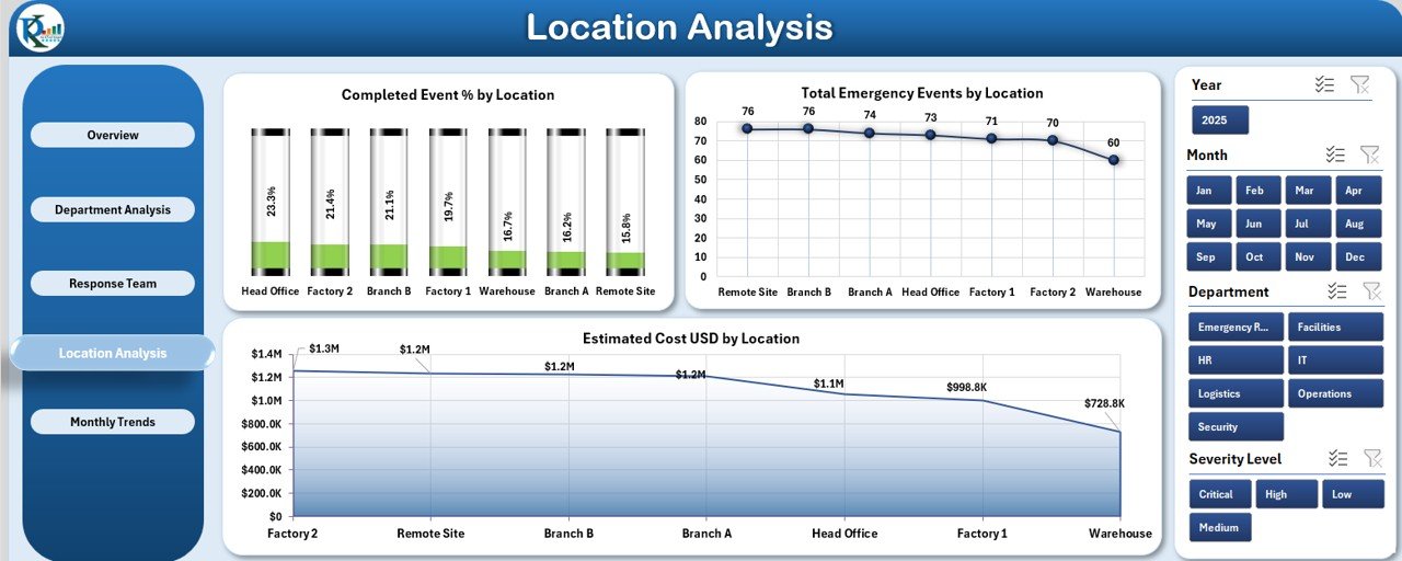
Different locations may face varied risks and challenges during emergencies. The Location Analysis page provides detailed insights into geographical performance.
Charts on this Page:
- Completed Event % by Location
- Total Emergency Events by Location
- Estimated Cost (USD) by Location
This page helps track how well each location manages emergencies and which sites face recurring or costly incidents.
Monthly Trends Page
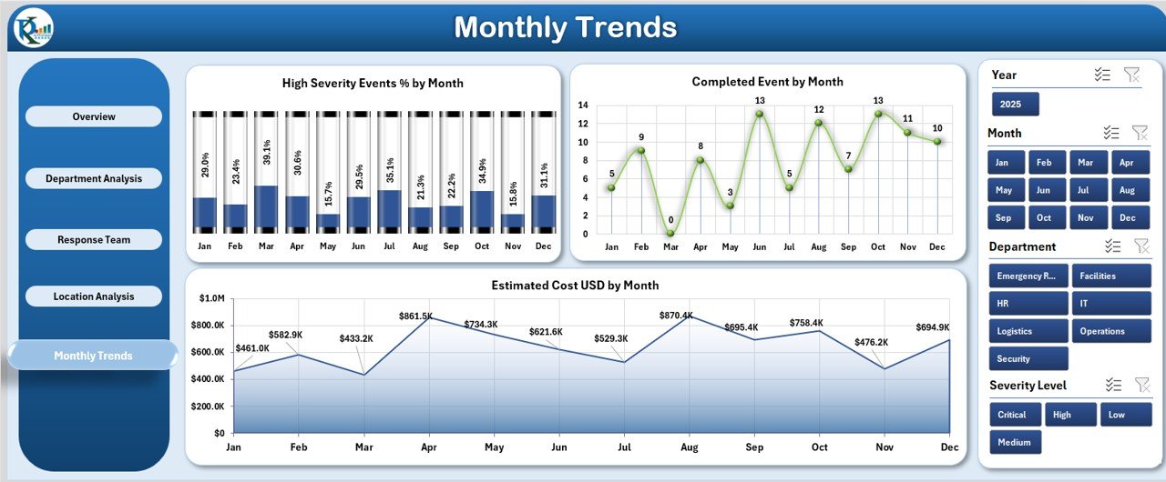
Understanding trends over time is essential for strategic planning. The Monthly Trends Page displays the timeline of emergencies, severity, and completion status month by month.
Charts Included:
- High Severity Event % by Month
- Completed Events by Month
- Estimated Cost (USD) by Month
This historical view helps forecast future emergency patterns and allocate resources accordingly.
Support Sheet
The Support Sheet acts as the backend of the dashboard. It holds reference data such as department names, locations, response teams, and dropdown lists. This ensures all dashboard elements remain dynamic and error-free.
Why Use an Emergency Management Dashboard in Excel?
Excel is one of the most accessible and flexible tools for building analytical dashboards. Here’s why it’s ideal for emergency management:
-
No Extra Software Required: Works directly in Microsoft Excel.
-
Easy Customization: Modify charts, data, or KPIs according to your organization’s structure.
-
Instant Insights: Provides real-time visualization through slicers and pivot charts.
-
Universal Compatibility: Excel dashboards can be shared easily via email or OneDrive.
-
Cost-Effective Solution: Eliminates the need for expensive software subscriptions.
How to Use the Emergency Management Dashboard
Follow these steps to make the most of your Emergency Management Dashboard in Excel:
-
Enter Data: Update the main data table with event details such as department, location, date, response team, severity, and cost.
-
Refresh the Pivot Tables: Use the “Refresh All” button to update charts automatically.
-
Use Slicers for Filtering: Apply slicers to analyze data by month, location, or team.
-
Review KPIs: Monitor cards and charts on the Overview page for overall insights.
-
Compare Performance: Use department and team analysis pages to find patterns and improvement areas.
-
Track Monthly Progress: Study the Monthly Trends page to observe changes over time.
Key Metrics Tracked in the Dashboard
The Emergency Management Dashboard provides a holistic view of emergency response operations. Key performance indicators (KPIs) include:
-
Total Number of Emergency Events
-
Completed Event %
-
High Severity Event %
-
Average Response Time (Minutes)
-
Estimated Cost (USD)
-
Affected People Count
-
Events by Department, Team, and Location
These metrics ensure your organization maintains visibility over operational efficiency and safety performance.
Advantages of the Emergency Management Dashboard in Excel
Using this dashboard brings numerous benefits that go beyond traditional reporting.
1. Centralized Data View
It consolidates emergency data from multiple departments and locations into a single visual platform.
2. Real-Time Monitoring
Decision-makers can monitor emergencies in real-time, identify delays, and allocate resources efficiently.
3. Improved Coordination
Departments and response teams can collaborate better with shared, accurate insights.
4. Data-Driven Decision Making
Visual insights help leaders plan training, improve readiness, and allocate budgets effectively.
5. Easy Customization
Users can easily modify KPIs, visuals, and slicers to match their specific requirements.
6. Enhanced Preparedness
By analyzing trends, organizations can forecast potential risks and improve readiness for future emergencies.
Opportunities for Improvement
Even though Excel dashboards are powerful, there are always ways to enhance them:
-
Automate Data Entry: Use Power Query or VBA macros for seamless updates.
-
Integrate Alerts: Add conditional formatting for high-severity incidents.
-
Add Drill-Down Features: Enable interactive filtering for deeper insights.
-
Include Predictive Analytics: Apply forecasting formulas to anticipate event trends.
-
Use Power BI Integration: Extend visualization power with Microsoft Power BI connection.
These improvements can transform your Excel dashboard into a semi-automated emergency management system.
Best Practices for the Emergency Management Dashboard in Excel
To maximize efficiency and accuracy, follow these proven best practices:
🔹 1. Keep Data Clean and Structured
Maintain consistent formats for departments, locations, and response teams. Use dropdowns from the support sheet to prevent typing errors.
🔹 2. Refresh Regularly
Ensure all charts and KPIs reflect the latest information by refreshing pivot tables frequently.
🔹 3. Track Key Metrics Only
Avoid overloading the dashboard. Focus on metrics that impact response efficiency, such as response time, severity, and completion rate.
🔹 4. Apply Conditional Formatting
Highlight overdue or high-severity cases with color codes to draw attention.
🔹 5. Review Monthly Trends
Use the monthly charts to analyze performance and plan improvement initiatives.
🔹 6. Protect Sensitive Information
Lock certain sheets or cells with passwords to safeguard confidential emergency data.
🔹 7. Train Users
Provide quick training to ensure all team members can use the dashboard effectively.
Real-World Applications
The Emergency Management Dashboard in Excel is ideal for multiple industries and sectors.
🏥 Healthcare Organizations
Track hospital emergency events, patient volume, and response time.
🏢 Corporate Offices
Monitor facility incidents, safety issues, and evacuation drills.
🏫 Educational Institutions
Oversee student safety drills, health emergencies, and risk response.
🏛️ Government Agencies
Coordinate between departments during natural disasters or public crises.
🏭 Manufacturing Units
Track safety incidents, equipment malfunctions, and chemical spills.
Each sector benefits from improved visibility, preparedness, and quick decision-making.
Example Insights You Can Gain
Here’s what you can discover using this dashboard:
-
Which departments handle emergencies the fastest.
-
Which response teams manage high-severity events efficiently.
-
Which locations incur the highest estimated costs.
-
How overall completion rates change month by month.
-
How many people are affected in specific incident categories.
Such actionable insights help organizations minimize downtime, reduce risk, and optimize emergency response efforts.
Conclusion
The Emergency Management Dashboard in Excel is a powerful, user-friendly solution for tracking and improving your organization’s emergency response efforts. It simplifies data management, improves communication, and enhances strategic planning.
From analyzing departmental efficiency to tracking monthly trends, this dashboard offers a complete picture of emergency operations — helping organizations stay prepared and proactive.
Whether you’re in healthcare, education, manufacturing, or corporate operations, implementing this dashboard will make your emergency management process more transparent, efficient, and data-driven.
Frequently Asked Questions (FAQs)
1. What is an Emergency Management Dashboard in Excel?
It’s a ready-to-use Excel tool that tracks emergency incidents, response times, severity levels, and costs across departments and locations.
2. Who can use this dashboard?
Any organization that manages emergencies — such as hospitals, schools, companies, or government agencies — can benefit from it.
3. Can I customize the KPIs in the dashboard?
Yes, all KPIs and charts can be customized to match your organization’s specific reporting needs.
4. Does the dashboard work in all Excel versions?
Yes, it’s compatible with most versions of Microsoft Excel (Excel 2016 or later is recommended for full compatibility).
5. Can I connect this dashboard with other tools?
You can link it to external data sources using Power Query or even integrate it with Power BI for advanced visualization.
6. How do I update the data in the dashboard?
Simply enter new event records in the data sheet and click “Refresh All.” The charts and KPIs will update automatically.
7. Is this dashboard suitable for small businesses?
Absolutely! Small organizations can use it to improve preparedness and response efficiency without needing costly software.
Visit our YouTube channel to learn step-by-step video tutorials