In today’s fast-growing urban mobility market, bike and scooter sharing services have become a vital part of modern transportation. With thousands of users, multiple docking stations, and daily rental transactions, tracking performance manually can be a huge challenge.
That’s where the Bike and Scooter Sharing KPI Dashboard in Excel steps in. This intelligent Excel-based dashboard helps operators, city planners, and business managers monitor key metrics, analyze performance, and make quick data-driven decisions — all in one place.
In this article, we’ll explore how this dashboard works, its structure, key features, benefits, best practices, and frequently asked questions to help you make the most of this powerful tool.
Click to Purchases Bike and Scooter Sharing KPI Dashboard in Excel
🚀 What Is a Bike and Scooter Sharing KPI Dashboard in Excel?
A Bike and Scooter Sharing KPI Dashboard is a smart analytical tool built in Microsoft Excel to monitor, visualize, and evaluate performance indicators (KPIs) related to shared mobility services.
It consolidates complex data — such as trips, utilization rate, maintenance costs, downtime, and user satisfaction — into interactive visuals. With this dashboard, managers can compare Actual vs Target vs Previous Year performance across multiple KPIs and easily spot trends or problem areas.
Unlike software that requires coding, this Excel dashboard is user-friendly and ready to use. It allows anyone with basic Excel knowledge to analyze detailed metrics without external tools or complex integrations.
Click to Purchases Bike and Scooter Sharing KPI Dashboard in Excel
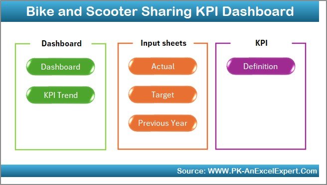
📊 Structure of the Dashboard
The Bike and Scooter Sharing KPI Dashboard in Excel contains seven worksheet tabs, each designed for a specific purpose. Together, they provide a complete analytical framework from data entry to visualization.
1️⃣ Home Sheet
The Home sheet acts as the control panel or navigation hub.
-
It contains buttons to jump to each analytical sheet quickly.
-
The layout is clean and intuitive, making it easy for new users to explore different sections of the dashboard.
-
You can customize it with your company logo or color scheme to make it more professional.
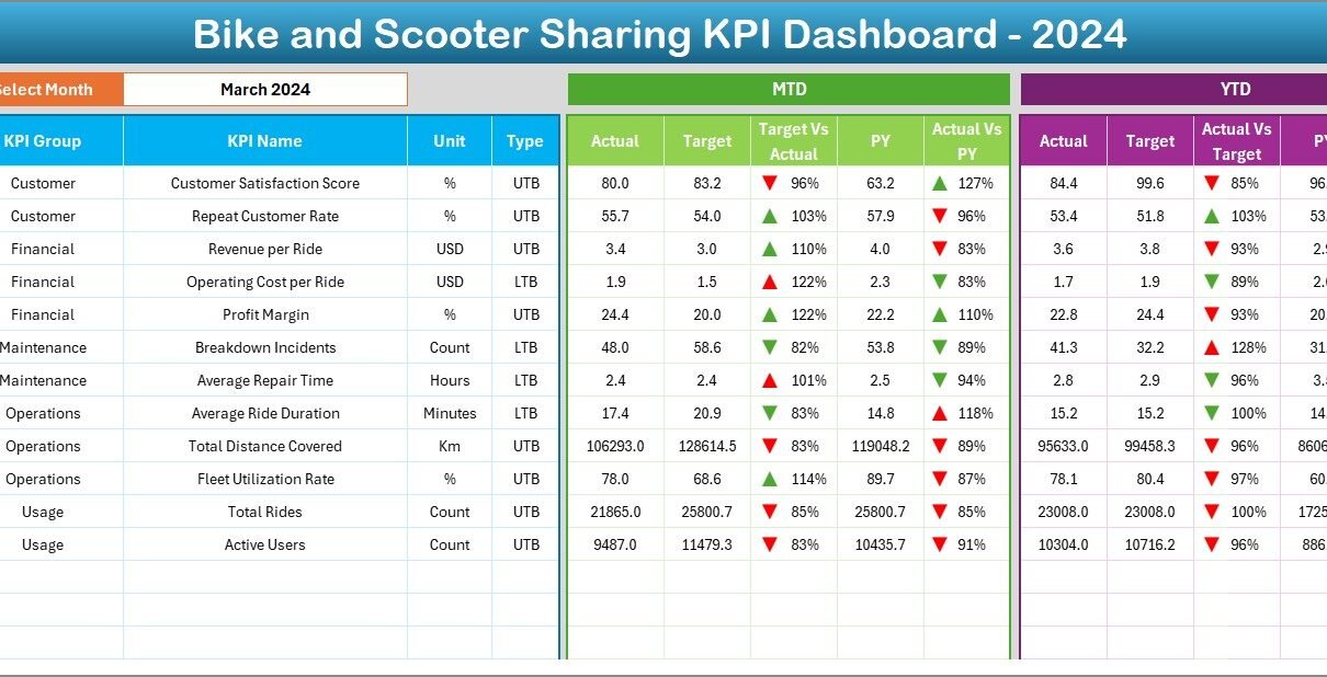
2️⃣ Dashboard Sheet
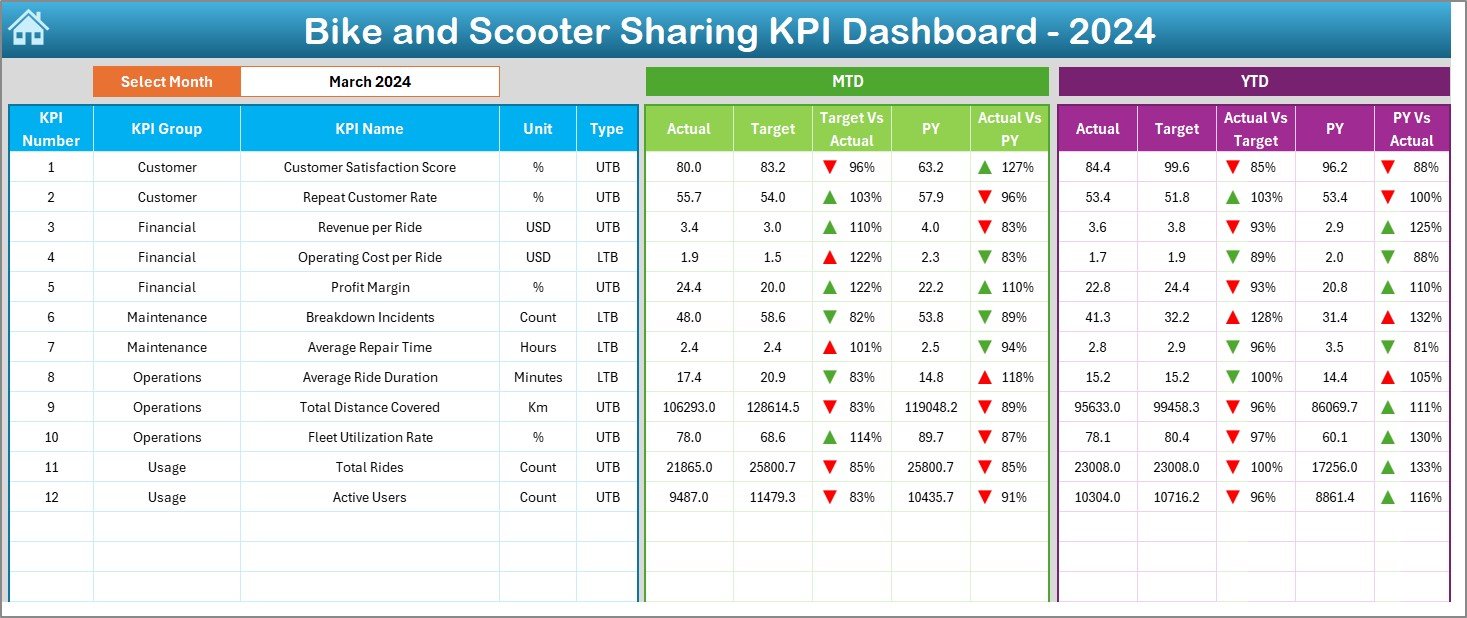
The Dashboard sheet tab is the main page where all key visuals and KPI summaries appear.
-
A Month selector (cell D3) allows you to view monthly performance dynamically.
-
The sheet displays MTD (Month-to-Date) and YTD (Year-to-Date) data for each KPI.
-
You can instantly compare Actual, Target, and Previous Year values with conditional formatting that highlights growth or decline using up/down arrows.
-
This visual setup gives a real-time overview of performance trends.
It’s ideal for presentations, management reviews, and quick decision-making — all without switching between multiple reports.
3️⃣ KPI Trend Sheet
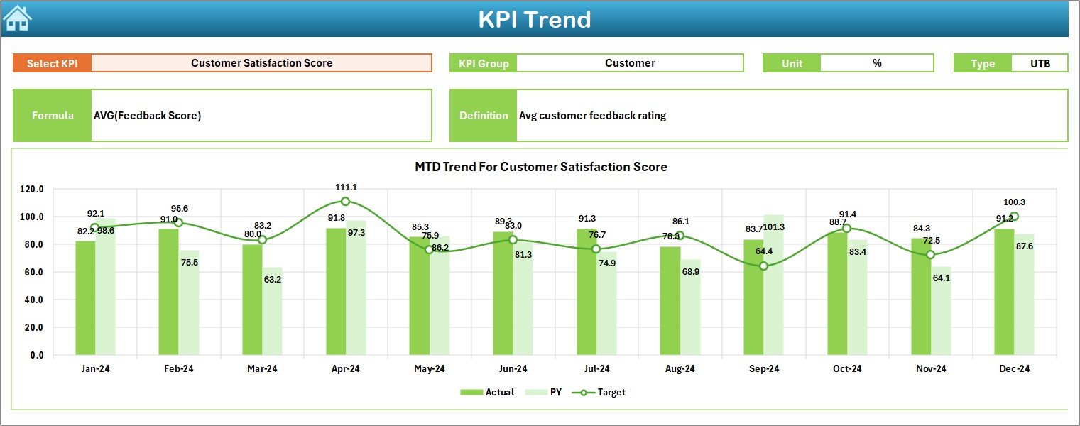
The KPI Trend sheet provides a deeper view into performance over time.
-
You can select a specific KPI from cell C3 using a dropdown list.
-
The dashboard then displays that KPI’s Group, Unit, Type (LTB/UTB), Formula, and Definition.
-
Below, you’ll find trend charts showing MTD and YTD movement for Actual, Target, and Previous Year values.
This feature is perfect for identifying seasonal patterns, growth trajectories, and areas needing attention.
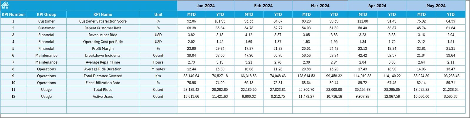
4️⃣ Actual Numbers Input Sheet
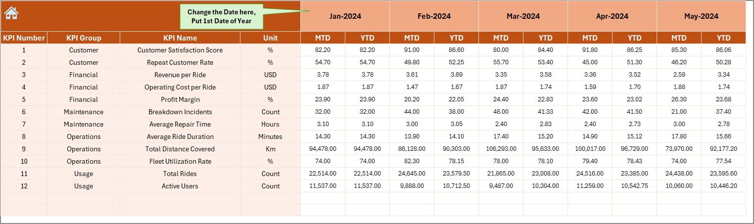
This is the data entry sheet where you record monthly MTD and YTD actual numbers.
-
You can adjust the start month in cell E1, and the dashboard updates accordingly.
-
Simple and well-organized tables ensure data accuracy.
-
Each record directly feeds into the Dashboard and Trend pages, ensuring real-time visualization without manual intervention.
This sheet ensures your analysis always stays current and aligned with your reporting cycles.
5️⃣ Target Sheet Tab
The Target sheet tab is where performance goals are entered.
-
It includes MTD and YTD targets for every KPI.
-
This makes it easy to evaluate whether the business is on track or lagging behind.
-
The dashboard automatically calculates variance between Actual and Target for quick performance assessment.
It supports proactive management — not just reporting on what happened, but predicting what should happen next.
6️⃣ Previous Year Number Sheet
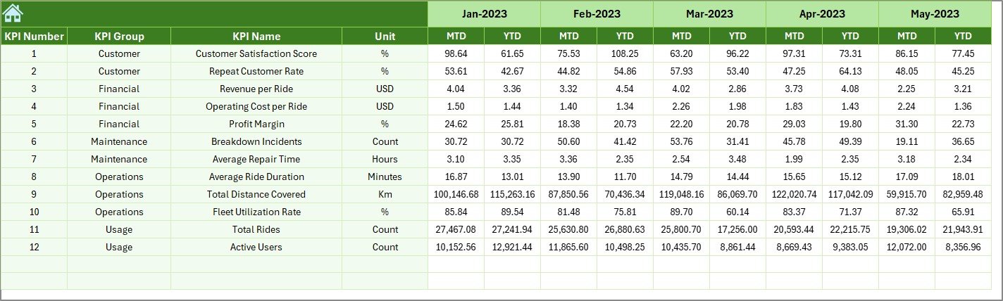
Historical data provides critical context.
-
The Previous Year Numbers sheet allows you to enter last year’s performance figures.
-
This sheet mirrors the structure of the current-year data for consistency.
-
With these figures, you can analyze growth trends, compare annual improvements, and evaluate long-term business health.
By maintaining historical data, you create a valuable performance archive that strengthens planning and forecasting.
7️⃣ KPI Definition Sheet
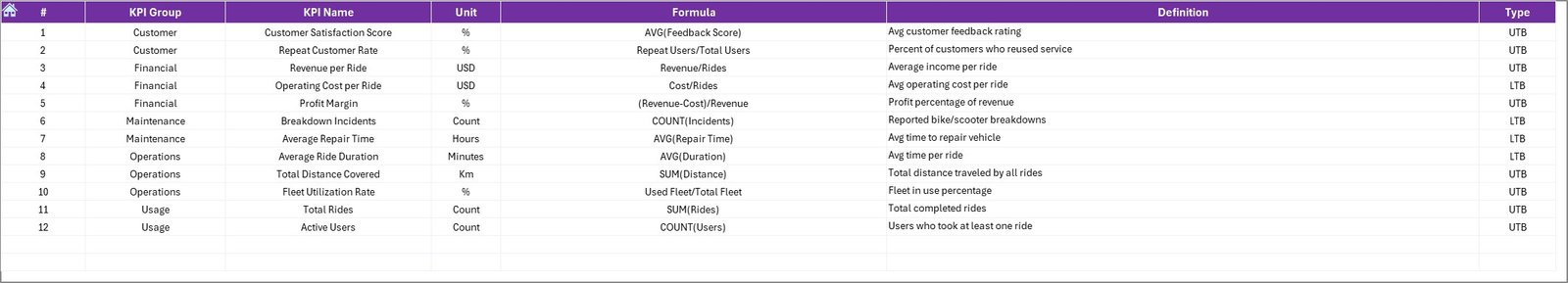
The KPI Definition sheet documents every performance indicator used in the dashboard.
-
It includes KPI Name, KPI Group, Unit, Formula, and Definition.
-
It also specifies the KPI Type — whether UTB (Upper the Better) or LTB (Lower the Better).
This ensures everyone in your team understands how each KPI is calculated and interpreted, promoting data transparency and consistency.
Click to Purchases Bike and Scooter Sharing KPI Dashboard in Excel
💡 Key Features of the Dashboard
Let’s look at the most important features that make this dashboard so effective:
-
✅ Ready-to-use Excel template — no coding or setup required.
-
📅 Dynamic Month Selector — instantly switch between months.
-
📈 MTD & YTD Analysis — track short-term and annual trends.
-
🎯 Target vs Actual Comparison — visualize performance gaps.
-
📉 Previous Year Comparison — benchmark against past performance.
-
⚙️ KPI Trend Visualization — monitor how each KPI evolves.
-
🧭 Interactive Navigation Buttons — move between sheets easily.
-
🧾 Detailed KPI Definitions — ensure clarity and standardization.
-
💬 Conditional Formatting — red and green arrows highlight trends.
Together, these features create a highly efficient reporting system that saves hours of manual work.
🧭 How the Dashboard Supports Decision-Making
The Bike and Scooter Sharing KPI Dashboard helps decision-makers at multiple levels:
-
Operations Managers can monitor utilization, downtime, and maintenance turnaround time.
-
Finance Teams can evaluate revenue, cost per ride, and profit margins.
-
Marketing Teams can analyze user growth, retention, and satisfaction rates.
-
Executives can visualize strategic KPIs in one view to assess company performance.
Because all information stays in Excel, you can integrate it with other reports, share snapshots with stakeholders, and even automate updates using Power Query or VBA.
Click to Purchases Bike and Scooter Sharing KPI Dashboard in Excel
🌟 Advantages of Using the Bike and Scooter Sharing KPI Dashboard in Excel
Implementing this dashboard offers several practical advantages:
1. Centralized Data Management
Instead of juggling multiple spreadsheets, you get all your metrics in one consolidated file.
2. Real-Time Performance Visibility
Managers can track live progress, identify bottlenecks, and take corrective actions before issues escalate.
3. Enhanced Decision-Making
The visual representation of KPIs simplifies complex data and supports strategic planning.
4. Customizable and Scalable
You can easily add new KPIs, modify layouts, or adjust visuals to fit your organization’s needs.
5. Cost-Effective Solution
Unlike expensive BI tools, this Excel dashboard provides professional-level analysis at zero additional cost.
6. Easy to Use
Even non-technical users can manage and interpret the dashboard without training.
7. Increased Accountability
By defining ownership and tracking KPI progress, teams stay aligned with organizational goals.
🔍 Opportunities for Improvement
Even though the dashboard is powerful, there’s always room for enhancement. Here are some ideas:
-
Automate Data Entry: Use Excel Power Query or VBA to import actuals automatically.
-
Add Region or Branch Filters: Enable city-level or station-level filtering for deeper analysis.
-
Integrate User Feedback Metrics: Include satisfaction ratings and issue reports to capture service quality.
-
Expand to Power BI: Connect the Excel file to Power BI for advanced visualization and real-time dashboards.
-
Use Macros for Reports: Automate monthly report generation and PDF exports with a single click.
These improvements can make the dashboard even more robust, efficient, and time-saving.
🧠 Best Practices for the Bike and Scooter Sharing KPI Dashboard in Excel
Follow these best practices to maximize accuracy and efficiency:
1. Maintain Clean Data
Ensure all records are up to date, formatted consistently, and free of duplicates.
2. Standardize KPI Definitions
Use the KPI Definition sheet as your single source of truth so everyone interprets metrics correctly.
3. Validate Monthly Updates
Before each reporting cycle, verify the accuracy of Actual, Target, and Previous Year data.
4. Protect Sensitive Information
Lock or password-protect sheets that contain formulas and targets to prevent accidental edits.
5. Leverage Conditional Formatting
Use visual cues like arrows or traffic-light icons to instantly highlight trends.
6. Schedule Data Refreshes
Regularly update the dashboard to keep your analysis timely and relevant.
7. Document All Changes
If you modify KPIs or formulas, document them to maintain historical context and transparency.
8. Encourage Cross-Department Usage
Share the dashboard across departments — operations, finance, marketing — to encourage collaboration.
By following these practices, you’ll ensure your dashboard stays reliable, insightful, and easy to use.
🔧 How to Customize the Dashboard
You can tailor the dashboard to fit your organization’s needs:
-
Add your company logo and branding to the Home sheet.
-
Adjust formulas to reflect your local currency or time frame.
-
Include more KPIs relevant to your business model.
-
Use Excel slicers or pivot tables for additional analysis.
-
Combine this dashboard with other datasets like weather, traffic, or demand forecasts.
With just a few tweaks, the dashboard becomes a personalized analytics hub.
🏁 Conclusion
The Bike and Scooter Sharing KPI Dashboard in Excel is a comprehensive, easy-to-use, and cost-effective solution for tracking key business metrics.
It provides everything you need — from performance tracking to trend analysis and goal comparison — all within Excel’s familiar environment. Whether you manage a small fleet or a large-scale urban mobility network, this dashboard brings structure, clarity, and speed to your reporting process.
With its seven organized sheets, interactive visuals, and powerful formulas, it transforms complex mobility data into actionable insights. By adopting it, your team can save time, reduce reporting errors, and make decisions that drive sustainable growth.
Click to Purchases Bike and Scooter Sharing KPI Dashboard in Excel
❓ Frequently Asked Questions (FAQs)
1. What is a KPI Dashboard in Excel?
A KPI Dashboard in Excel is a tool that visually tracks performance metrics using charts, tables, and dynamic formulas — helping users evaluate goals and results in real time.
2. Can I add my own KPIs?
Yes. You can easily add new KPIs by updating the KPI Definition, Target, and Actual sheets. The dashboard will automatically reflect the changes.
3. Do I need advanced Excel skills to use this?
No. The dashboard is designed for all skill levels. Basic Excel knowledge is enough to navigate, input data, and analyze results.
4. Can this dashboard handle data for multiple cities or branches?
Yes. You can extend the file by adding filters or pivot tables for multi-location analysis.
5. Is it compatible with Mac and Windows?
Yes. It works seamlessly across both platforms as long as you’re using a modern version of Microsoft Excel.
6. Can I export charts or data?
Absolutely. You can export visuals as images or generate PDF reports directly from Excel.
7. How often should I update the data?
Ideally, you should update it monthly or weekly — depending on your reporting frequency — to maintain accurate and relevant analysis.
Click to Purchases Bike and Scooter Sharing KPI Dashboard in Excel
Visit our YouTube channel to learn step-by-step video tutorials