In today’s technology-driven world, data transparency and performance visibility are critical for any IT department. Whether you manage service requests, resolve incidents, or track customer satisfaction, having a centralized view of all IT metrics is essential for making smart decisions.
That’s exactly where the IT Dashboard Report in Excel comes in.
This all-in-one reporting solution helps IT managers, analysts, and business leaders track, visualize, and analyze key IT performance indicators (KPIs) using a simple yet powerful Excel template.
In this article, we’ll explore everything you need to know about this Excel-based IT dashboard — from how it works to its advantages, best practices, and practical usage tips.
Click to Purchases IT Dashboard Report in Excel
What Is an IT Dashboard Report in Excel?
An IT Dashboard Report in Excel is a visual performance management tool that organizes and presents IT metrics in one easy-to-understand layout. It helps teams monitor KPIs such as incident resolution rate, SLA compliance, customer satisfaction, and system uptime — all within a dynamic Excel file.
The dashboard provides interactive charts, summary cards, and slicers that make data analysis fast and intuitive.
Instead of going through lengthy reports, you can now visualize trends and identify performance gaps with just a few clicks.
📊 Key Features of the IT Dashboard Report in Excel
This report is designed to be both functional and visually engaging, ensuring that every IT professional — from helpdesk analysts to CIOs — can gain valuable insights.
Here’s what’s inside:
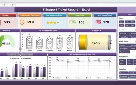
1. Summary Page

This is the main dashboard page, giving you an instant overview of all critical IT metrics.
-
🧭 Top 5 KPI Cards: These cards highlight essential performance metrics like Resolved %, Open %, Customer Rating, Resolution Time, and SLA Met %.
Interactive Charts:
- Resolved %
- Open % by Ticket Type
- Customer Rating by Department
- Resolution Time (Days) by Assigned Agent
- SLA Met % by Month
Click to Purchases IT Dashboard Report in Excel
-
Right-Side Slicer: Enables quick filtering by month, department, or agent, so you can focus on specific data segments effortlessly.
2. Report Page

This page provides a detailed table view of the underlying data, enabling granular analysis and drill-downs.
-
📋 Left-Side Slicer: Easily filter reports by ticket type, agent, priority, or date.
-
🧾 Information Table: Displays ticket ID, request details, assigned agent, resolution time, and SLA status — all in a structured format.
3. Data Sheet

This sheet stores the raw data, forming the foundation of all analytics and visualizations.
Each record includes fields such as ticket number, issue type, department, date logged, resolution date, and feedback rating.
4. Support Sheet

The support sheet contains dropdown values, lookup lists, and formulas used for data validation.
This ensures consistent data entry and prevents human errors during reporting.
Click to Purchases IT Dashboard Report in Excel
Why Use an IT Dashboard Report in Excel?
Managing IT operations manually can be overwhelming. Tracking multiple KPIs through separate spreadsheets or reports often leads to confusion and inefficiency.
An Excel-based IT Dashboard Report changes that. It centralizes all your data and offers real-time, interactive insights without requiring expensive BI tools.
Let’s look at the key benefits.
Advantages of Using an IT Dashboard Report in Excel
✅ 1. Centralized Data Management
All your IT metrics — tickets, agents, SLAs, and feedback — are stored in one Excel file.
This eliminates the need to toggle between multiple systems or documents.
✅ 2. Quick and Clear Insights
With visual charts and KPI cards, you can instantly see performance trends.
Whether it’s an increase in open tickets or a drop in SLA compliance, the dashboard makes it easy to spot issues early.
✅ 3. Enhanced Decision-Making
The dashboard provides actionable data that helps IT managers identify problem areas, allocate resources efficiently, and improve customer satisfaction.
✅ 4. Customizable and Scalable
You can easily modify the dashboard to fit your organization’s structure.
Add new KPIs, departments, or ticket types without any coding — everything works through Excel formulas and pivot tables.
✅ 5. Cost-Effective and Accessible
Unlike complex analytics software, this Excel solution requires no subscription or installation.
Every team member can open it, analyze data, and collaborate seamlessly.
How Does the IT Dashboard Report Work?
The IT Dashboard Report in Excel operates through three interconnected layers:
-
Data Layer (Data Sheet):
All IT ticket details are stored here. Each row represents an incident or service request. -
Analysis Layer (Pivot Tables):
Pivot tables summarize and categorize data automatically based on metrics like resolution time, department, and agent performance. -
Visualization Layer (Dashboard Page):
Dynamic charts and KPI cards pull summarized data to create interactive visuals for better understanding.
The beauty of this system lies in Excel’s built-in automation — when you update your data sheet, all dashboards update instantly.
🧩 Use Cases of the IT Dashboard Report
🕐 1. Service Desk Monitoring
Track daily ticket inflow, categorize by type, and identify agents with the highest resolution rates.
🧰 2. Incident Management
Analyze recurring issues, average downtime, and resolution delays to improve system stability.
📞 3. Customer Support Analysis
Monitor customer feedback trends to ensure consistent satisfaction levels across departments.
🧑💻 4. SLA Performance Tracking
Visualize SLA compliance by agent, department, or issue type, ensuring service commitments are met.
💡 5. IT Resource Optimization
Identify which departments face frequent issues or need better resource allocation for smoother operations.
Who Can Benefit from the IT Dashboard Report in Excel?
This dashboard is ideal for:
-
IT Managers and Directors
-
Service Desk Teams
-
IT Analysts and Support Engineers
-
CIOs and Business Intelligence Professionals
-
Managed Service Providers (MSPs)
Whether you’re a small business or a large enterprise, this tool scales perfectly to your needs.
How to Use the IT Dashboard Report Step by Step
-
Open the Dashboard File in Excel.
-
Go to the “Data Sheet” and enter or paste your ticket records.
-
Refresh the Pivot Tables (Alt + F5 or Data > Refresh All).
Navigate to the “Summary Page.”
- Use slicers to select your preferred month, department, or agent.
- Instantly view performance charts and KPI cards.
-
Check the “Report Page” for detailed ticket information.
-
Use the “Support Sheet” to edit lists like departments or agents if needed.
Within minutes, you’ll have a fully updated report ready for presentation or management review.
Advantages of Using Excel for IT Reporting
While modern BI tools like Power BI and Tableau are popular, Excel still holds a special place in IT reporting because:
-
It’s widely available and easy to use.
-
It requires no additional cost.
-
It allows for custom formulas and flexibility.
-
It integrates smoothly with existing systems like Outlook, Access, and SharePoint.
Excel’s familiarity means anyone in your organization can quickly adapt and start using the dashboard effectively.
Best Practices for the IT Dashboard Report in Excel
To make the most of your dashboard, follow these simple yet effective practices:
✔️ 1. Maintain Data Consistency
Ensure ticket types, departments, and agent names follow the same spelling and format to avoid pivot table mismatches.
✔️ 2. Refresh Data Regularly
Always refresh pivot tables and charts after updating the data sheet to display the latest results.
✔️ 3. Use Conditional Formatting
Highlight high or low performance metrics with visual cues such as color scales or icons for faster interpretation.
✔️ 4. Define Clear KPIs
Avoid cluttering your dashboard with too many metrics. Focus on KPIs that truly impact IT performance and business outcomes.
✔️ 5. Protect Your Sheets
Lock your dashboard and formulas to prevent accidental edits by other users.
✔️ 6. Automate Data Imports
If possible, connect Excel with your ticketing system (e.g., ServiceNow, Jira) to pull data automatically.
✔️ 7. Backup Regularly
Keep versioned backups of your dashboard to track performance over time.
How Can This Dashboard Improve IT Service Quality?
When teams have transparent performance data, they make better decisions.
The IT Dashboard Report bridges the gap between data collection and action, ensuring every stakeholder knows what’s happening in real time.
For instance:
-
IT Managers can identify bottlenecks in resolution time.
-
Agents can track their SLA compliance rates.
-
Executives can see overall trends and allocate budgets more effectively.
The result? Improved efficiency, happier customers, and a more responsive IT environment.
Pro Tips to Make Your Dashboard More Powerful
-
Add trend lines to your charts to show performance direction.
-
Use dynamic slicers to filter by month, agent, or priority.
-
Include traffic-light icons (red/yellow/green) for SLA performance.
-
Add a date filter in cell D3 for month selection and automate chart updates.
-
Create a “KPI Definition” sheet describing each metric and its formula.
These enhancements make your dashboard more interactive and user-friendly.
Conclusion
The IT Dashboard Report in Excel is an invaluable tool for every IT department aiming to streamline operations, monitor key metrics, and enhance service delivery.
It brings clarity, accountability, and data-driven decision-making into everyday IT management — all within the familiar environment of Microsoft Excel.
By using this dashboard, you can move from reactive to proactive IT operations.
Track every ticket, measure every SLA, and celebrate every milestone — because with the right data, you can drive continuous improvement across your IT ecosystem.
Frequently Asked Questions (FAQs)
1. What Is an IT Dashboard Report in Excel?
It’s an Excel-based tool that visualizes IT performance metrics such as ticket resolution, SLA compliance, and customer satisfaction in one interactive report.
2. Can I Customize This Dashboard for My Organization?
Yes, you can easily add or remove KPIs, departments, or agents. All charts and slicers automatically adjust to new data.
3. Do I Need Advanced Excel Skills to Use It?
Not at all. The dashboard uses simple formulas and pivot tables. Anyone with basic Excel knowledge can operate it smoothly.
4. How Often Should I Update the Data Sheet?
Ideally, update it daily or weekly, depending on your ticket volume. Refresh the dashboard afterward to keep results current.
5. Is This Dashboard Suitable for Small Businesses?
Absolutely. Whether you manage 50 tickets a month or 5,000, the dashboard scales easily without additional software costs.
6. Can This Dashboard Replace My Helpdesk Software?
No, it complements your helpdesk system. Use it as a performance analytics layer to visualize and analyze your helpdesk data more effectively.
7. Can I Export Reports for Management Reviews?
Yes. You can export charts or pages as PDF or PowerPoint slides for monthly performance meetings.
Visit our YouTube channel to learn step-by-step video tutorials