In today’s fast-moving world, efficient shipping management plays a vital role in every business that deals with logistics, transportation, or product delivery. Keeping track of freight costs, shipment timelines, carrier performance, and regional trends can become complex without proper visualization tools.
That’s where the Shipping Dashboard in Excel comes in — a ready-to-use and interactive solution that simplifies shipping data analysis and decision-making. This dashboard helps logistics managers, supply chain professionals, and business owners monitor performance across different departments, regions, and modes of transport — all from one centralized Excel file.
Click to Purchases Shipping Dashboard in Excel
What Is a Shipping Dashboard in Excel?
A Shipping Dashboard in Excel is an analytical tool that helps track, visualize, and manage shipping-related data efficiently. Built entirely in Microsoft Excel, it uses structured datasets and dynamic charts to display important performance metrics such as freight cost, transit performance, profitability, and customer satisfaction.
Instead of analyzing large spreadsheets manually, this dashboard summarizes all data into meaningful visuals. It helps you quickly see where your shipping operations are performing well and where improvement is needed.
With built-in slicers, pivot charts, and navigation features, the Shipping Dashboard transforms static shipping records into an interactive reporting tool — perfect for daily monitoring or monthly business reviews.
Structure of the Shipping Dashboard in Excel
This dashboard consists of five main analytical pages and one data sheet. Each page offers a unique perspective of your shipping performance. Let’s explore each section in detail.
Overview Page — Your Central Control Panel
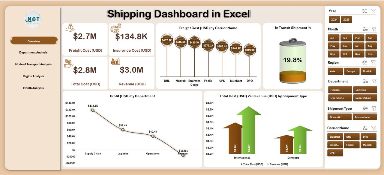
The Overview Page is the main page of the dashboard and serves as the central summary of all shipping KPIs.
Key elements of this page include:
-
📊 Slicer on the right side — allows you to filter data by department, region, or shipping mode.
-
🧮 5 KPI Cards — these display major metrics such as total freight cost, total shipments, profit, and shipment transit percentage.
📈 4 Interactive Charts:
- Freight Cost (USD) by Carrier Name
- In Transit Shipment %
- Profit (USD) by Department
- Total Cost (USD) Vs Revenue (USD) by Shipment Type
This page helps management quickly evaluate performance and understand cost-to-revenue relationships across different shipping types.
2️⃣ Department Analysis — Measuring Cost & Efficiency Across Teams
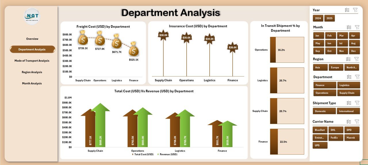
The Department Analysis Page gives you a detailed breakdown of how different departments are performing in terms of cost, insurance, and efficiency.
This page includes:
-
🎛️ Slicer on the right side to choose specific departments.
📊 Charts Included:
- Freight Cost (USD) by Department
- Insurance Cost (USD) by Department
- In Transit Shipment % by Department
- Total Cost (USD) Vs Revenue (USD) by Department
This page is highly useful for finance and operations managers who need to control shipping expenses and analyze profitability by department.
Click to Purchases Shipping Dashboard in Excel
3️⃣ Mode of Transport Analysis — Understanding Cost Efficiency by Mode
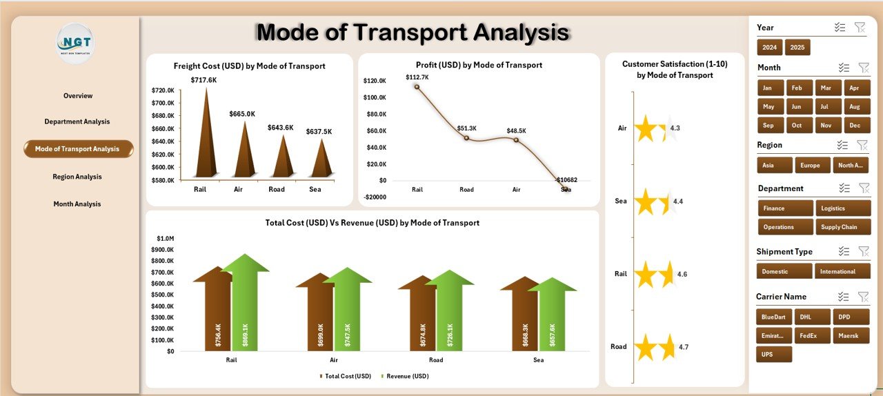
Shipping can happen through multiple modes — air, sea, road, or rail. Each mode has unique cost implications and performance factors.
The Mode of Transport Analysis Page provides visual comparisons to understand which mode delivers the best balance between cost, speed, and satisfaction.
This page includes:
-
🚚 Freight Cost (USD) by Mode of Transport
-
💰 Profit (USD) by Mode of Transport
-
😊 Customer Satisfaction (1–10) by Mode of Transport
-
⚖️ Total Cost (USD) Vs Revenue (USD) by Mode of Transport
This analysis helps decision-makers identify the most cost-effective mode and improve operational strategy.
4️⃣ Region Analysis — Geographical Performance at a Glance
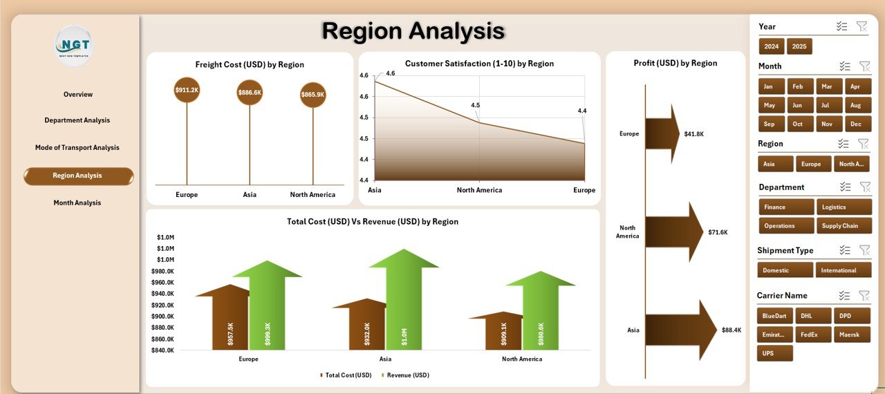
Different regions often perform differently due to factors like distance, carrier efficiency, and local logistics infrastructure.
The Region Analysis Page provides insights into how various geographical areas are contributing to costs, profits, and satisfaction.
Charts included in this section:
-
Freight Cost (USD) by Region
-
Profit (USD) by Region
-
Customer Satisfaction (1–10) by Region
-
Total Cost (USD) Vs Revenue (USD) by Region
By using these visuals, businesses can optimize their regional shipping strategies and identify high-performing areas versus those needing improvement.
5️⃣ Month Analysis — Tracking Monthly Trends and Seasonality
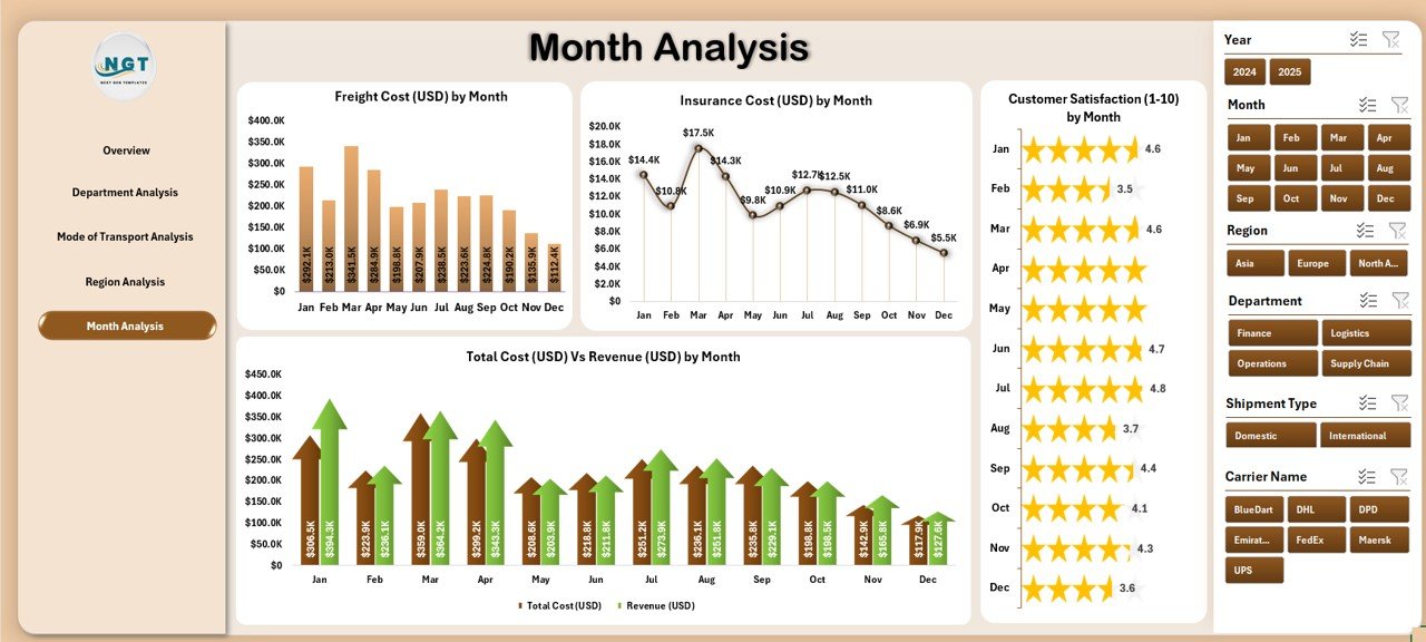
The Month Analysis Page focuses on understanding monthly performance trends and seasonal fluctuations.
Charts available:
-
Freight Cost (USD) by Month
-
Insurance Cost (USD) by Month
-
Customer Satisfaction (1–10) by Month
-
Total Cost (USD) Vs Revenue (USD) by Month
These insights allow you to identify peak seasons, cost spikes, and satisfaction patterns across months — enabling better forecasting and budget planning.
🧾 Data Sheet — The Core Behind the Dashboard
Every dashboard needs accurate and structured data. The Data Sheet stores all raw shipment details, such as shipment type, carrier, region, cost, profit, and satisfaction score.
This sheet acts as the engine that powers all visuals and KPIs throughout the dashboard. Users can regularly update it with new data to refresh the analysis automatically.
Click to Purchases Shipping Dashboard in Excel
🚀 Key Features of the Shipping Dashboard in Excel
Here are some of the most important features that make this dashboard stand out:
🧭 Page Navigator: Located on the left side, it allows quick movement across all analytical pages.
🎛️ Dynamic Slicers: Instantly filter data by department, mode, or region.
💡 KPI Cards: Present important performance indicators in a simple visual format.
📈 Interactive Charts: Compare trends and metrics across multiple dimensions.
💾 Data Integration: Works with structured Excel data, easy to update or expand.
🔍 Departmental Insights: Identify which departments perform best in terms of cost efficiency.
🌎 Regional Tracking: Understand profitability and customer satisfaction across different regions.
📅 Monthly Overview: Spot seasonal trends and plan logistics more effectively.
💼 Why Do Businesses Need a Shipping Dashboard in Excel?
Managing shipping operations without a dashboard can lead to inefficiencies, missed opportunities, and higher costs. A well-designed dashboard turns complex data into clear insights.
Key reasons businesses need it:
-
It brings all critical shipping metrics into one place.
-
It saves time by automating data calculations and visual updates.
-
It improves visibility into costs, revenue, and performance metrics.
-
It allows data-driven decisions instead of guesswork.
When managers can see all important shipping KPIs at a glance, they can make faster and more informed decisions — leading to better profitability and customer satisfaction.
Advantages of the Shipping Dashboard in Excel
Here are the top benefits of using this dashboard for your organization:
1. Better Decision-Making
Visual data presentation helps managers identify performance gaps quickly. They can compare costs, revenues, and satisfaction scores across multiple parameters.
2. Real-Time Insights
Since the dashboard updates automatically when new data is entered, it provides near real-time analysis. This enables proactive decisions.
3. Cost Optimization
By tracking freight, insurance, and total costs across departments and modes, businesses can identify areas of overspending and take corrective actions.
4. Improved Customer Experience
Customer satisfaction scores by region or mode of transport help managers understand service quality and implement improvements.
5. Increased Efficiency
The built-in navigation, slicers, and auto-calculations save hours of manual work, allowing teams to focus on strategy and operations.
6. High Flexibility
Being Excel-based, it’s easily customizable — users can modify charts, add data fields, or apply additional filters as per their needs.
Best Practices for Using the Shipping Dashboard in Excel
To get the most out of your dashboard, follow these best practices:
1. Keep Data Clean and Updated
Regularly update your data sheet and avoid duplicates or missing values. Clean data ensures accurate visualization.
2. Use Consistent Units
Always use the same currency, measurement units, and time frames to maintain consistency across analyses.
3. Review KPIs Monthly
Hold monthly performance reviews using the dashboard to track progress and identify trends early.
4. Customize for Your Business
Modify the charts and KPIs to reflect what matters most to your organization — for instance, delivery time, transit damage rate, or returns.
5. Back Up Data Regularly
Since Excel dashboards depend on data files, maintain backups to prevent accidental data loss.
6. Train Users
Ensure your team understands how to use slicers, filters, and refresh data. This helps them interact with the dashboard effectively.
How to Use the Shipping Dashboard Effectively
Here’s a step-by-step process to make the most of your Excel Shipping Dashboard:
-
Enter Data in the Data Sheet — Fill in all shipment details such as cost, mode, carrier, and satisfaction scores.
-
Refresh Pivot Tables — Go to “Data” > “Refresh All” to update the visuals automatically.
-
Navigate Through Pages — Use the page navigator on the left side to switch between Overview, Department, Mode, Region, and Month analysis.
-
Filter Using Slicers — Select specific departments or transport modes to analyze targeted data.
-
Interpret Charts and KPIs — Review visual trends and take action based on performance outcomes.
Following these steps will help you gain a complete picture of your logistics performance.
Example Insights You Can Draw
-
Identify the most profitable department or region.
-
Compare freight costs between carriers or transport modes.
-
Analyze customer satisfaction trends by region.
-
Evaluate insurance and total cost distribution.
-
Spot months with higher or lower profitability.
These insights allow strategic decision-making, performance optimization, and cost reduction.
How the Dashboard Supports Decision-Making
This Excel-based tool bridges the gap between raw data and actionable insights. It provides a foundation for strategic business planning, allowing you to:
-
Set performance benchmarks for carriers and departments.
-
Plan annual budgets based on accurate shipping cost analysis.
-
Evaluate shipping mode efficiency to reduce transit delays.
-
Improve customer satisfaction through data-backed decisions.
Example KPIs You Can Track
-
Freight Cost per Shipment
-
Profit Margin (%)
-
In Transit Shipment %
-
Customer Satisfaction Score
-
Total Cost Vs Revenue Ratio
-
Insurance Cost by Department
-
Shipment Count by Mode of Transport
By tracking these KPIs, organizations gain a deeper understanding of their logistics performance and operational efficiency.
Who Can Benefit from This Dashboard?
This Shipping Dashboard in Excel is ideal for:
📦 Logistics and Supply Chain Teams — To monitor operational efficiency.
💰 Finance Departments — To analyze costs and profitability.
🧑💼 Operations Managers — To optimize resource utilization.
🏭 Manufacturing Units — To track product shipping performance.
🏬 Retailers and E-commerce Businesses — To manage deliveries effectively.
🏁 Conclusion
The Shipping Dashboard in Excel is more than just a reporting tool — it’s a powerful, data-driven system that gives you a complete view of your shipping operations. By combining cost analysis, performance tracking, and customer feedback, it turns ordinary Excel data into actionable insights.
Whether you manage logistics for a manufacturing unit, retail business, or international shipping company, this dashboard helps you achieve better control, efficiency, and profitability. Its structured layout, analytical pages, and interactive charts make it an indispensable tool for modern supply chain management.
❓ Frequently Asked Questions (FAQs)
1. What is the purpose of a Shipping Dashboard in Excel?
The dashboard helps monitor, analyze, and visualize shipping data — including cost, revenue, profit, and satisfaction metrics — for better decision-making.
2. Can I customize the dashboard for my company’s needs?
Yes. The dashboard is fully customizable in Excel. You can change charts, add fields, or modify KPI definitions based on your business model.
3. How often should I update the data?
It’s best to update the data sheet weekly or monthly depending on your shipping frequency. The visuals refresh automatically once new data is entered.
4. Do I need advanced Excel skills to use it?
No. The dashboard is user-friendly and designed for professionals with basic Excel knowledge. Instructions are simple, and navigation is intuitive.
5. Can I track multiple carriers or regions?
Absolutely. The dashboard includes slicers for filtering by carrier, region, or transport mode — enabling multi-dimensional analysis with ease.
6. What kind of insights can I get from this dashboard?
You can analyze freight cost distribution, shipment performance, regional trends, and satisfaction levels to improve operational efficiency.
7. Is it suitable for small businesses?
Yes. The dashboard’s simplicity and Excel-based design make it ideal for small to mid-sized businesses looking to manage logistics smartly without expensive software.
Visit our YouTube channel to learn step-by-step video tutorials