Part of the free Module 9: Advanced Charts and Infographics · Lesson 6 of 8 · Full Excel course
Updated on 5 September 2026 · Works in Excel 365, 2021, 2019 and 2016 unless noted.
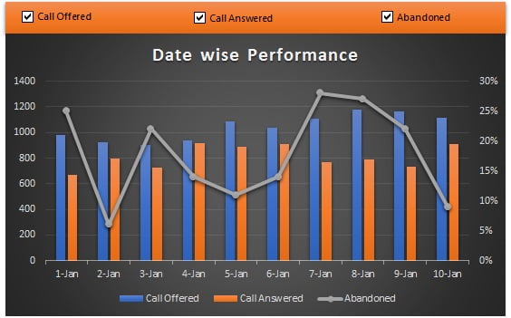
A dynamic chart with checkboxes in Excel lets the viewer show or hide individual series by ticking or unticking a box next to the chart. Each checkbox writes TRUE or FALSE to a linked cell, and helper formulas feed the chart either the real values or #N/A, which Excel does not plot. In this lesson you build a column and line combo chart of calls offered, answered and abandoned with three checkboxes and no VBA.
What the dynamic chart does and when to use it
Excel charts ignore #N/A errors, so a series whose helper column returns NA() simply disappears from the plot. Linking each checkbox to a cell and wrapping the data in IF(link, value, NA()) gives the reader an on and off switch per series without touching the chart itself. This is the standard interactivity technique for dashboards where several measures share one chart: the reader can isolate calls offered, compare answered against abandoned, or view all three at once.
The Form Control method below works in Excel 2013 through Microsoft 365. Microsoft 365 also offers native cell checkboxes on the Insert tab that return TRUE and FALSE directly, and the table later in this lesson compares the two.
The data
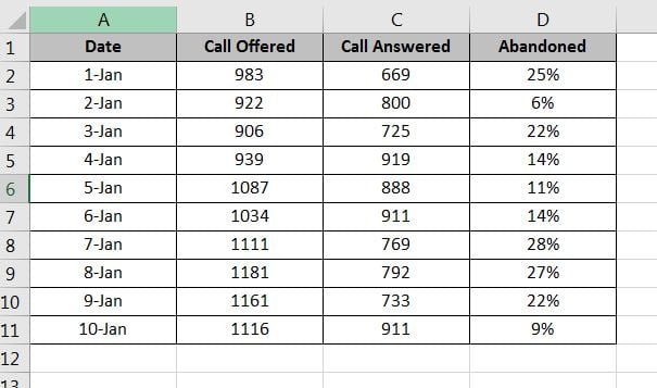
The Data sheet holds ten dates in column A with Call Offered, Call Answered and Abandoned percent in columns B to D. Column F will hold the three linked cells and columns G to J will hold the chart-ready helper table.
| Date | Call Offered | Call Answered | Abandoned % |
|---|---|---|---|
| 01-Jan | 520 | 498 | 4.2% |
| 02-Jan | 610 | 571 | 6.4% |
| 03-Jan | 480 | 469 | 2.3% |
| 04-Jan | 655 | 602 | 8.1% |
| 05-Jan | 590 | 566 | 4.1% |
The screenshots use ten rows; five are shown here so you can type a smaller version and follow along.
Step 1: prepare the helper table
- Copy A1:A11 (the dates) and paste at G1.
- Copy the headers B1:D1 and paste at H1. Columns H to J will hold the chart-ready values.
Step 2: add the checkboxes
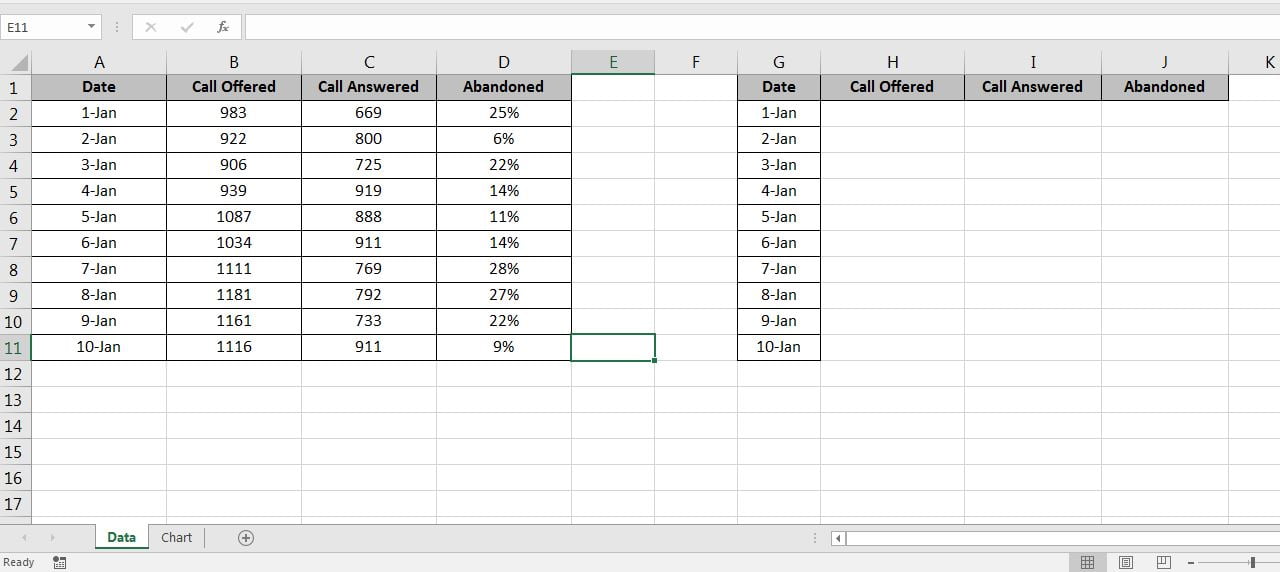
- Go to the Chart sheet. On the Developer tab choose Insert > Form Controls > Check Box. If the Developer tab is hidden, enable it under File > Options > Customize Ribbon.
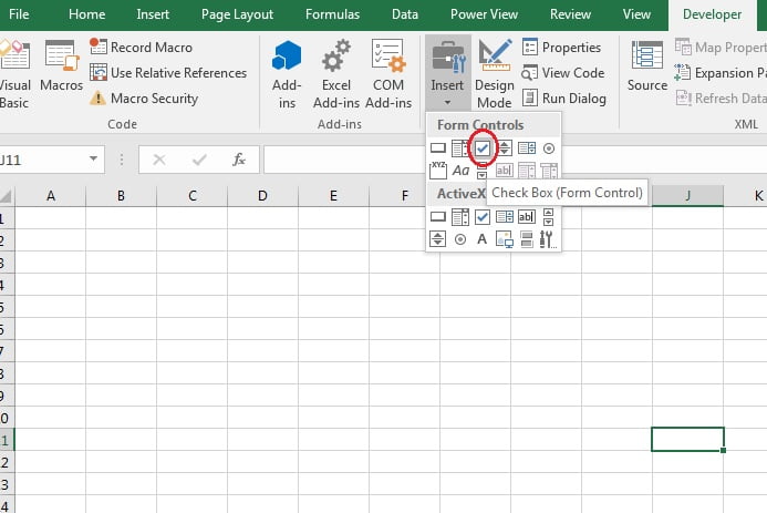
- Draw three checkboxes and rename them Call Offered, Call Answered and Abandoned. Right-click each and choose Format Control.
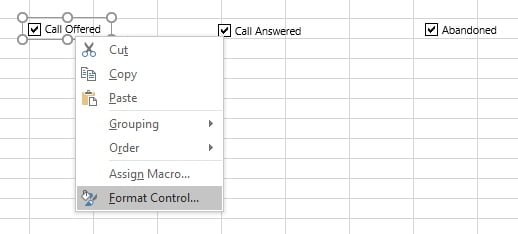
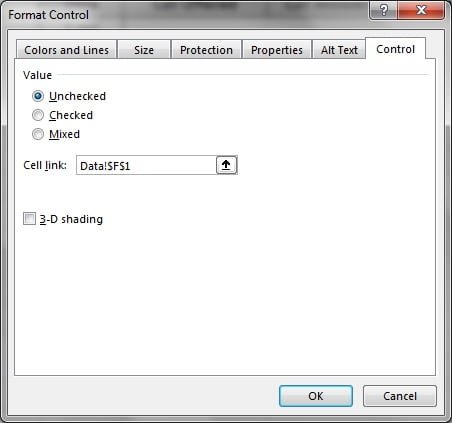
- Set the Cell link to
Data!$F$1for Call Offered,Data!$F$2for Call Answered andData!$F$3for Abandoned. Each cell now shows TRUE or FALSE as the box is toggled.
Step 3: write the helper formulas
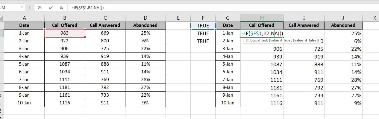
- On the Data sheet enter
=IF($F$1,B2,NA())in H2,=IF($F$2,C2,NA())in I2 and=IF($F$3,D2,NA())in J2. - Fill the formulas down to row 11 and format column J as percentage.
| Cell | Formula | What it does |
|---|---|---|
| H2 | =IF($F$1,B2,NA()) |
Shows calls offered when the first box is ticked, otherwise #N/A |
| I2 | =IF($F$2,C2,NA()) |
Shows calls answered when the second box is ticked |
| J2 | =IF($F$3,D2,NA()) |
Shows abandoned percent when the third box is ticked |
Step 4: build the combo chart from the helper table
- Select G1:J11 and go to Insert > Charts > Insert Column or Bar Chart > 2-D Column > Clustered Column.
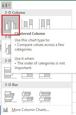
- Right-click any column and choose Change Chart Type.
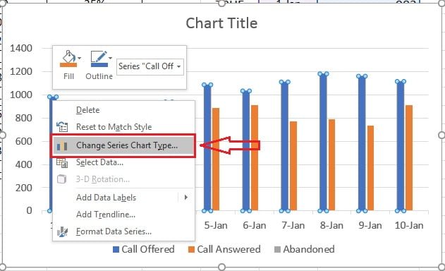
- In the Combo section set Abandoned to Line with Markers and tick Secondary Axis so the percentage is readable next to the call counts. Click OK.
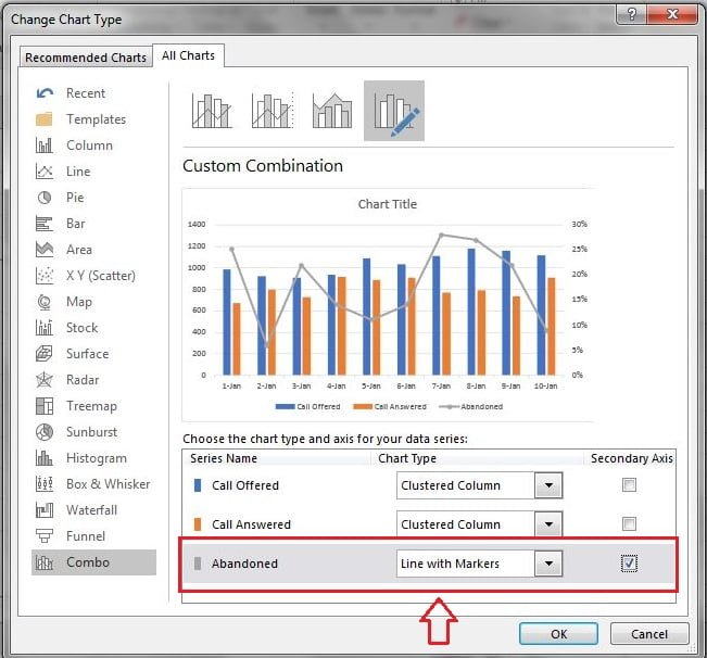
- On the Chart Design tab (Design under Chart Tools in Excel 2016 and 2019) choose Style 6 or another preset.

- Change the title to Date wise Performance, cut the chart (Ctrl+X) and paste it on the Chart sheet next to the checkboxes.
- Insert a rectangle from Insert > Shapes, match its width to the chart and send it behind the checkboxes to act as a control panel. Untick a box and its series disappears from the chart.
Form Control, cell checkbox or ActiveX: which to use
Excel has three kinds of checkbox. All three can drive the helper formulas; they differ in where they work and how much setup they need.
| Checkbox type | Where to insert | Versions | How the value reaches a cell | Best for |
|---|---|---|---|---|
| Form Control check box | Developer > Insert > Form Controls | Excel 2007 to 365, Windows and Mac | Set a Cell link in Format Control | Dashboards shared with any desktop version |
| Cell checkbox | Insert > Checkbox | Microsoft 365 only | The cell itself holds TRUE or FALSE | New workbooks that will stay on Microsoft 365 |
| ActiveX check box | Developer > Insert > ActiveX Controls | Excel for Windows only | LinkedCell property, usually with VBA | Macro-driven forms, not plain charts |
For a chart that must open correctly on colleagues’ machines, the Form Control option is the safest choice. If everyone is on Microsoft 365, the cell checkbox is quicker: place it in F1, and the IF($F$1, ...) formulas work unchanged.
Worked example
Suppose F1 is TRUE, F2 is TRUE and F3 is FALSE because the reader has unticked Abandoned. The helper table for 01-Jan becomes 520 in H2, 498 in I2 and #N/A in J2. The chart still draws two columns for that date, the secondary axis remains, but the abandoned line vanishes because every point in column J is #N/A. Tick Abandoned again and the line returns instantly; nothing in the chart definition changed, only the values it reads.
If the reader unticks all three boxes, the plot area goes blank while the axes and legend stay in place, which is a useful cue that the chart is waiting for a selection.
Download the practice file
Download the Dynamic Chart Excel file with the checkboxes and formulas already in place, or click the chart below.
Watch the video
When to use this chart
- Dashboards where several measures share one time axis and the reader should choose what to compare.
- Presentations where you reveal series one at a time.
- Reports with measures of different scale, combined with a secondary axis as shown here.
Formatting tips
- Fix the secondary axis bounds (for example 0 to 20 percent) so the line does not rescale when other series are hidden.
- Give each checkbox the same colour as its series so the link is obvious.
- Format the linked cells in white font or hide column F so TRUE and FALSE do not distract.
- Keep the legend; when a series is hidden its legend entry stays, which reminds the reader it can be switched back on.
Tips and common mistakes
- Use NA(), not an empty string or 0. An empty string plots as zero and a zero draws a flat line along the axis.
- Chart the helper table, never the raw data. If the chart reads B1:D11 the checkboxes have no effect.
- Set Hidden and Empty Cells to Gaps (Select Data > Hidden and Empty Cells) if #N/A points still show as connected line segments.
- Lock the linked cells with absolute references.
$F$1survives filling down;F1does not. - Group the checkboxes with the chart. Select both, right-click and choose Group so they move together when you lay out the dashboard.
- Do not mix cell checkboxes and Form Controls on one sheet unless you have to; readers on Excel 2019 will see the 365 checkbox as plain TRUE or FALSE text.
Errors and how to fix them
| Symptom | Cause | Fix |
|---|---|---|
| Ticking a box does nothing | No cell link, or the chart reads the raw data | Set the Cell link in Format Control and point the chart at G1:J11 |
| Hidden series shows as zero | Helper formula returns 0 or an empty string | Return NA() in the FALSE branch |
| #N/A appears in the data labels | Labels read the helper cells | Turn labels off for that series or use a number format such as 0;-0;; |
| Line breaks into segments | Hidden and Empty Cells set to Zero | Choose Gaps or Connect data points with line |
| Checkbox moves when columns resize | Object properties set to move with cells | Format Control > Properties > Do not move or size with cells |
Practice exercise
- Type the five-row table above, add the helper columns and build the combo chart with three checkboxes.
- Add a fourth measure, Average Handle Time, with its own checkbox and plot it as a second line on the secondary axis.
- Replace the Form Controls with Microsoft 365 cell checkboxes in F1:F3 if you have Microsoft 365 and confirm the formulas still work.
- Fix the secondary axis to 0 to 10 percent and note what changes when you hide Call Offered.
Key takeaways
- A checkbox writes TRUE or FALSE to a linked cell; that cell drives the chart through IF formulas.
- Excel skips #N/A, so
NA()is the only reliable way to hide a series without deleting it. - Always chart the helper table, not the source data.
- Form Controls work everywhere; Microsoft 365 cell checkboxes need no Developer tab.
- Fixed axis bounds keep the chart stable while series come and go.
Related lessons
- Advanced Charts and Infographics course hub
- Speedometer chart in Excel
- Progress circle chart in Excel
- Waterfall chart in Excel (next lesson)
- Combo chart with a secondary axis
- IF function
- See also: Dynamic variance arrows chart with check boxes (with download and video)
- Microsoft Support: Add a check box or option button (Form controls)
Frequently asked questions
Why does the hidden series still show as zero?
The helper formula returns an empty string or 0 instead of NA(). Excel plots both as values, so a column of zeros appears along the axis. Only the #N/A error is skipped by charts. Change the FALSE branch of every IF formula to NA() and the series disappears cleanly.
Can I do this without the Developer tab?
Yes, in Microsoft 365. Use Insert > Checkbox to place a cell checkbox in F1, F2 and F3; each cell holds TRUE or FALSE, so the IF formulas work as written. Excel 2016, 2019 and 2021 need the Form Control checkbox from the Developer tab, which takes one minute to enable under File > Options > Customize Ribbon.
Does this work with a line or pie chart too?
It works with any chart type that reads a range. For a pie or doughnut chart, hiding a slice with NA() removes it and the remaining slices rescale to 100 percent. For a line chart, set Hidden and Empty Cells to Gaps so the hidden series does not leave a broken segment.
Can one checkbox control several series at once?
Yes. Point more than one helper column at the same linked cell, for example =IF($F$1,B2,NA()) and =IF($F$1,C2,NA()). Ticking that box then shows both series together, which is handy for a Target and Actual pair.
Will the checkboxes survive when I copy the chart to PowerPoint?
No. Pasting into PowerPoint copies the chart, not the Form Controls. Paste as a linked Excel object if you want to toggle series from the presentation, or make the selection in Excel first and paste the chart as a picture.
Want the finished version? Ready-made Excel dashboards, trackers and chart templates are available at NextGenTemplates.com.