In the modern world, healthcare and technology go hand in hand. Hospitals, clinics, and healthcare startups generate enormous amounts of data daily—from patient appointments and doctor interactions to satisfaction scores and billing records. Without proper analytics, this data remains underutilized.
That’s where the Health Tech Dashboard in Power BI comes in — a powerful and ready-to-use analytical tool that turns complex healthcare data into visual insights. Whether you’re tracking patient satisfaction, appointment efficiency, or doctor performance, this dashboard helps decision-makers identify trends and optimize outcomes in real time.
Click to Purchases Health Tech Dashboard in Power BI
What Is a Health Tech Dashboard in Power BI?
A Health Tech Dashboard in Power BI is an advanced analytical reporting solution designed to monitor, visualize, and analyze healthcare data interactively. Built using Microsoft Power BI and powered by Excel datasets, it transforms raw health data into actionable insights that enhance patient care, operational efficiency, and overall healthcare management.
This dashboard consolidates key metrics from multiple sources—appointments, transactions, feedback, and departmental data—into a single digital interface. Users can explore healthcare performance from various perspectives, such as department, location, doctor, or time trend, with just a few clicks.
With its intuitive interface, built-in filters, and rich visuals, this dashboard becomes an indispensable tool for healthcare administrators, finance teams, and hospital managers who need a data-driven approach to decision-making.
Why Healthcare Organizations Need Power BI Dashboards
Healthcare organizations deal with enormous data volumes every day. Appointments, patient feedback, doctor schedules, and billing all generate records that can provide invaluable insights if used correctly. Unfortunately, many institutions still rely on manual reporting or Excel sheets that limit visibility and increase errors.
A Power BI Health Tech Dashboard bridges this gap by offering:
-
Real-time data visibility: Access up-to-date appointment, satisfaction, and performance metrics.
-
Interactive filtering: Analyze data by department, location, or doctor in seconds.
-
Automation and accuracy: Reduce manual errors and time spent on data preparation.
-
Visual storytelling: Transform tables into engaging charts and KPIs for better understanding.
Structure of the Health Tech Dashboard in Power BI
The Health Tech Dashboard in Power BI is thoughtfully structured into five analytical pages, each offering unique perspectives on healthcare data.
Let’s explore each one in detail.
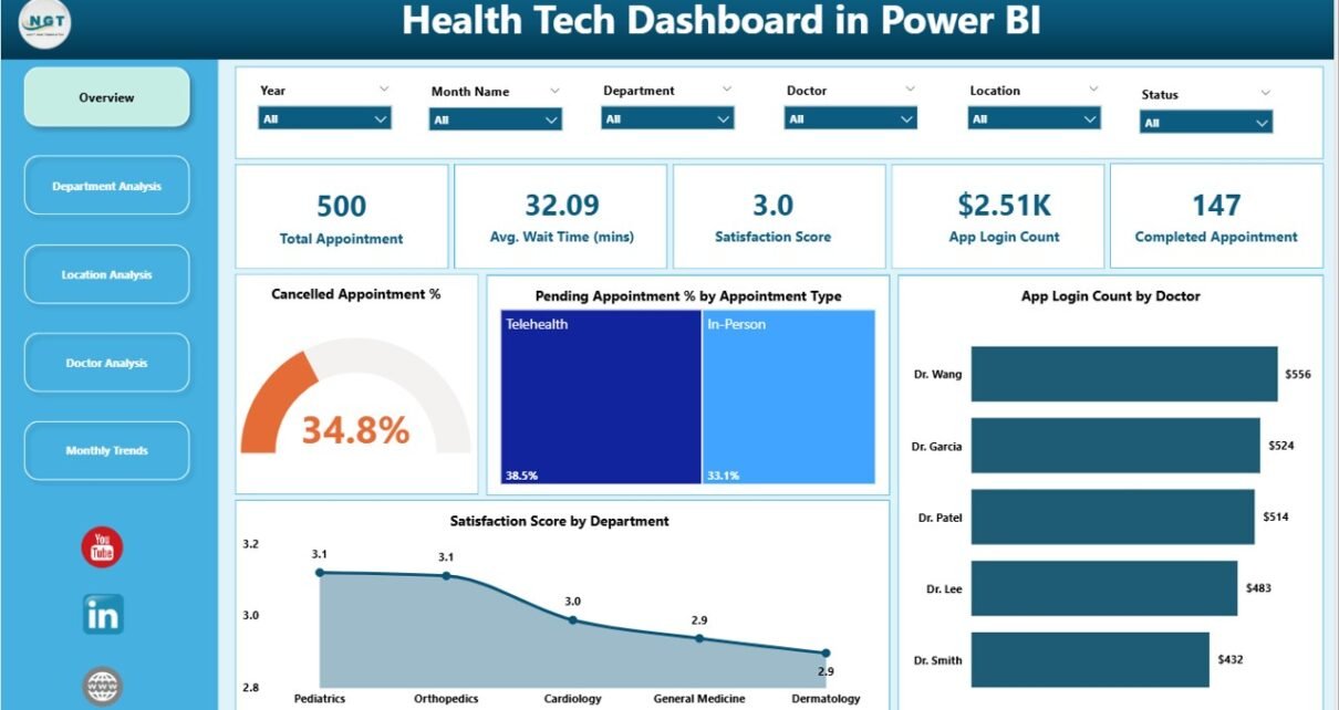
1. Overview Page
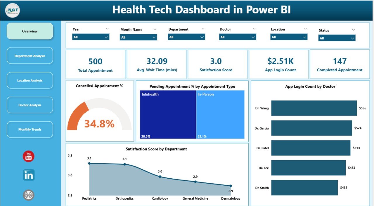
The Overview Page acts as the main hub of the dashboard, displaying a snapshot of the most critical metrics. It helps users quickly assess the overall performance of the healthcare organization.
Cards Displayed:
-
Total Appointments
-
Cancelled Appointment %
-
Pending Appointment %
-
App Login Count by Doctor
-
Satisfaction Score by Department
Charts Included:
-
📊 Cancelled Appointment %
-
⏳ Pending Appointment % by Appointment Type
-
👨⚕️ App Login Count by Doctor
-
💬 Satisfaction Score by Department
This page helps management instantly spot performance gaps, such as departments with lower satisfaction or higher appointment cancellations, ensuring timely corrective actions.
2. Department Analysis Page
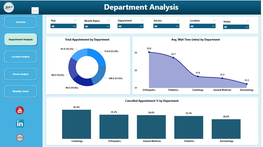
The Department Analysis Page provides an in-depth view of performance across different departments such as Cardiology, Pediatrics, Radiology, and General Medicine.
Charts Displayed:
-
🏥 Total Appointments by Department
-
⏱ Average Wait Time (mins) by Department
-
❌ Cancelled Appointment % by Department
This page helps identify operational inefficiencies, patient flow bottlenecks, and departments needing additional support. By visualizing these KPIs, hospital leaders can make targeted improvements in service delivery.
Click to Purchases Health Tech Dashboard in Power BI
3. Location Analysis Page
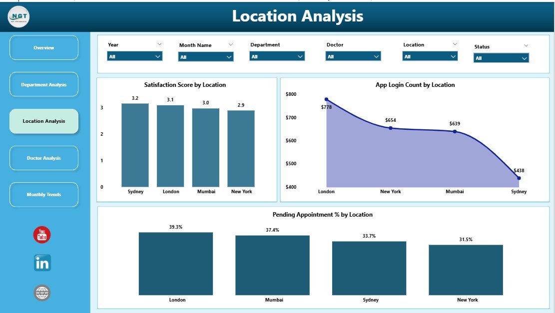
Large healthcare networks often operate across multiple branches or cities. The Location Analysis Page brings clarity to performance differences by region or facility.
Charts Displayed:
-
🌍 Satisfaction Score by Location
-
⏱ Average Wait Time (mins) by Location
-
🔄 Pending Appointment % by Location
With this analysis, administrators can easily detect high-performing and underperforming locations. For instance, if one branch shows a lower satisfaction score, it becomes a signal for management to investigate patient feedback or staff allocation.
4. Doctor Analysis Page
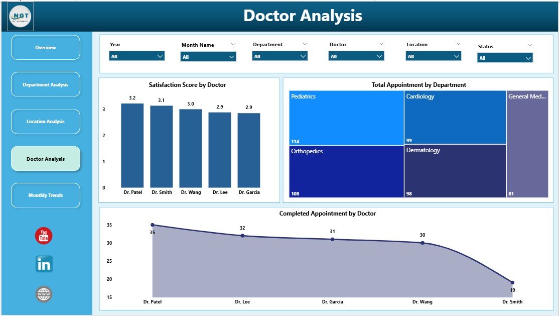
Doctors are the heart of any healthcare system, and their performance directly influences patient satisfaction and operational success.
Charts Displayed:
-
💰 Amount (USD) by Transaction Channel
-
⚠️ Failed Transactions by Transaction Channel
-
⏱ Transaction Duration (Sec) by Transaction Channel
-
👩⚕️ Satisfaction Score by Doctor
-
📅 Total Appointments by Doctor
-
✅ Completed Appointments by Doctor
This section empowers administrators to evaluate each doctor’s efficiency, monitor transaction activity, and understand how doctors engage with patients. Such insights can improve patient trust and operational transparency.
5. Monthly Trends Page
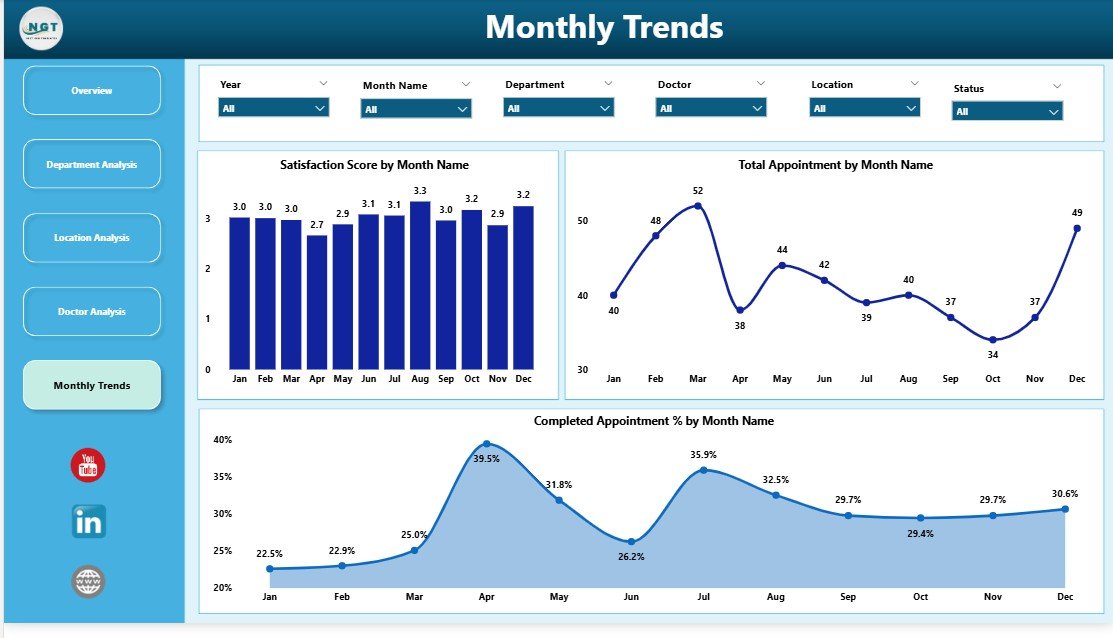
Healthcare trends change over time, and monitoring them monthly provides a big-picture view. The Monthly Trends Page highlights how the organization is evolving over the months.
Charts Displayed:
-
📈 Satisfaction Score by Month
-
🗓 Total Appointments by Month
-
✅ Completed Appointments by Month
This page helps track seasonal fluctuations, campaign impacts, or overall performance growth. By comparing trends month-to-month, hospitals can plan resource allocation and patient outreach strategies more effectively.
Advantages of the Health Tech Dashboard in Power BI
The Health Tech Dashboard in Power BI offers several benefits that enhance the quality, efficiency, and financial health of healthcare organizations.
1. Centralized Healthcare Insights
All data points—appointments, departments, doctors, and patients—are connected in one place, ensuring quick access to accurate insights.
2. Real-Time Monitoring
Power BI connects directly with live data sources, allowing healthcare professionals to monitor appointments, patient flow, and satisfaction in real time.
3. Improved Decision-Making
Interactive visuals make it easier to compare performance across departments and locations, enabling faster and data-backed decisions.
4. Enhanced Patient Satisfaction
By tracking satisfaction scores and wait times, organizations can pinpoint areas of improvement, leading to better patient experiences.
5. Performance Tracking of Doctors and Departments
Each doctor’s contribution and department’s efficiency can be monitored to ensure balanced workloads and optimal service levels.
6. Cost and Time Efficiency
Automating data collection and visualization reduces manual reporting time and operational costs.
7. Secure and Scalable
Built in Microsoft Power BI, the dashboard is both secure and scalable for organizations of any size.
Use Cases of the Health Tech Dashboard
This Power BI dashboard can be implemented in various healthcare settings:
-
🏥 Hospitals & Clinics: Track patient satisfaction, department performance, and appointment efficiency.
-
💊 Pharmaceutical Companies: Monitor doctor engagement, sales performance, and transaction analytics.
-
🩺 Telemedicine Platforms: Analyze virtual appointments, app logins, and patient feedback.
-
🧪 Diagnostic Centers: Manage test volumes, wait times, and customer satisfaction.
-
🩹 Healthcare Startups: Evaluate service delivery and optimize operational workflows.
How Power BI Enhances Healthcare Analytics
Power BI is a leading business intelligence tool from Microsoft. Its features perfectly suit the healthcare industry’s analytical demands.
-
Interactive Visuals: Easy-to-understand charts, graphs, and KPIs bring data to life.
-
Drill-Down Capability: Users can move from high-level overviews to specific details in seconds.
-
Integration with Excel and Databases: Healthcare data from Excel sheets or hospital management systems can be seamlessly imported.
-
Customizable Reports: Each page can be customized for specific audiences like doctors, HR teams, or finance departments.
-
Mobile Access: Power BI dashboards can be viewed on tablets and smartphones, ensuring accessibility anywhere.
Best Practices for the Health Tech Dashboard in Power BI
Implementing the Health Tech Dashboard in Power BI effectively requires following a few best practices:
1. Define Clear KPIs
Identify metrics that align with your healthcare goals—like wait time, satisfaction score, or appointment completion rate.
2. Maintain Data Quality
Ensure all data entered into Excel or hospital systems is clean, updated, and validated to avoid misleading visuals.
3. Use Role-Based Access
Control who can view or edit data. For example, doctors may view their department’s data but not financial records.
4. Automate Data Refresh
Schedule automatic updates in Power BI so your dashboard always reflects the latest data.
5. Keep Visuals Simple and Meaningful
Avoid clutter. Use only relevant charts and KPIs that add value to decision-making.
6. Leverage Filters and Slicers
Empower users to explore data interactively—by doctor, department, or month—using Power BI slicers.
7. Review and Update Regularly
As healthcare operations evolve, periodically review KPIs and dashboard design for continuous improvement.
How to Use the Health Tech Dashboard
Click to Purchases Health Tech Dashboard in Power BI
Using the Health Tech Dashboard in Power BI is straightforward even for non-technical users:
-
Import your data: Load appointment, doctor, and satisfaction data from Excel.
-
Refresh connections: Enable data refresh for up-to-date visuals.
-
Navigate pages: Use the left-side navigator to switch between Overview, Department, Location, Doctor, and Monthly Trend pages.
-
Use slicers: Filter data by department, month, or doctor for detailed insights.
-
Export reports: Download visuals or summaries for management reviews.
Future of Health Tech Dashboards
As healthcare continues to digitize, dashboards like this will become central to managing quality and efficiency. AI-powered insights, predictive analytics, and automated alerts will take these dashboards to the next level — helping hospitals not just react to problems, but anticipate and prevent them.
Power BI’s integration capabilities with tools like Microsoft Teams, Azure, and Dataverse will further enhance collaboration, ensuring seamless communication between teams.
Conclusion
The Health Tech Dashboard in Power BI bridges the gap between raw healthcare data and actionable insights. It empowers hospitals, clinics, and health organizations to visualize their performance in real time and take smarter decisions.
By focusing on departments, doctors, locations, and patient satisfaction, this tool ensures no aspect of healthcare performance goes unnoticed. It saves time, reduces errors, and enhances overall operational excellence.
In short, it’s more than a dashboard—it’s the heartbeat of modern healthcare analytics.
Frequently Asked Questions (FAQs)
1. What is a Health Tech Dashboard in Power BI?
It’s a visual reporting solution built in Microsoft Power BI to analyze healthcare data such as appointments, satisfaction scores, and doctor performance.
2. Who can use this dashboard?
Hospitals, clinics, healthcare startups, and administrators who want to monitor patient and operational performance effectively.
3. Does it require coding knowledge?
No. It’s a plug-and-play Power BI solution that uses Excel as its data source. Users can navigate and filter data easily.
4. Can I customize the KPIs or visuals?
Yes, Power BI allows complete customization. You can add or remove visuals, adjust slicers, or modify colors to fit your branding.
5. Is the dashboard compatible with mobile devices?
Absolutely! Power BI dashboards can be accessed through mobile and tablet devices using the Power BI app.
6. How often can the dashboard data be updated?
You can set automatic refresh schedules—daily, weekly, or monthly—depending on your organization’s data update frequency.
7. What kind of insights can I get?
You can analyze appointment efficiency, doctor performance, satisfaction scores, and wait times to enhance patient experience and operational decisions.
8. Why should healthcare organizations adopt Power BI dashboards?
Because Power BI provides automation, real-time visibility, and secure data management—helping healthcare institutions become truly data-driven.
Visit our YouTube channel to learn step-by-step video tutorials