In today’s fast-paced healthcare landscape, dental service providers rely on data-driven insights to improve patient outcomes, streamline operations, and enhance profitability. The Dental Services KPI Dashboard in Power BI is a ready-to-use analytical tool that empowers dental clinics, hospitals, and multi-location dental chains to monitor performance effectively.
By transforming raw Excel data into clear, interactive visualizations, this dashboard helps dental professionals track critical Key Performance Indicators (KPIs)—from patient satisfaction and treatment success rates to revenue and resource utilization. Let’s explore how this Power BI dashboard revolutionizes dental service management.
Click to Purchases Dental Services KPI Dashboard in Power BI
What Is a Dental Services KPI Dashboard in Power BI?
A Dental Services KPI Dashboard is a performance-tracking tool built in Power BI that consolidates operational, financial, and clinical KPIs into one interactive report. It gives a real-time snapshot of your dental practice’s health and helps you make informed decisions.
Power BI transforms Excel-based datasets into dynamic visuals and KPIs that dental administrators, clinic managers, and owners can use to:
-
Track patient flow and appointments
-
Monitor doctor and staff productivity
-
Measure treatment outcomes and efficiency
-
Compare actual vs target performance
-
Identify trends and areas needing improvement
By centralizing all performance indicators in one view, this dashboard becomes a powerful decision-support system for dental organizations.
Click to Purchases Dental Services KPI Dashboard in Power BI
Key Features of the Dental Services KPI Dashboard in Power BI
The Dental Services KPI Dashboard includes three well-structured pages that provide both high-level and detailed insights into dental operations. Each page plays a vital role in monitoring clinic performance.
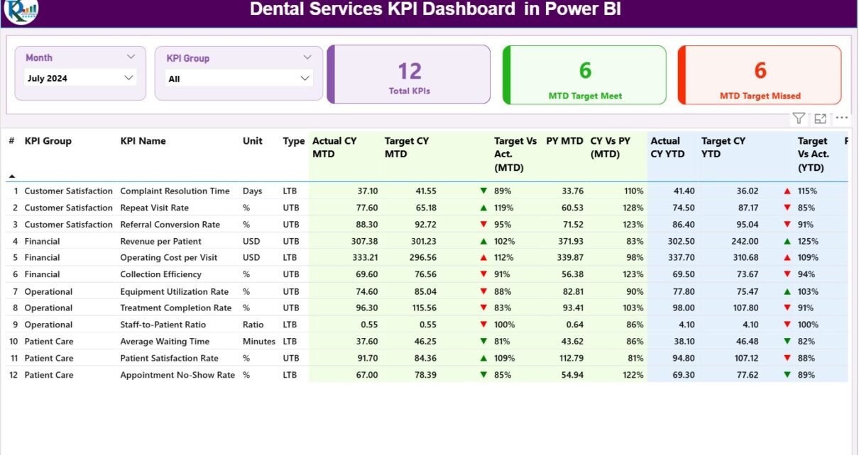
1. Summary Page: The Central Performance View
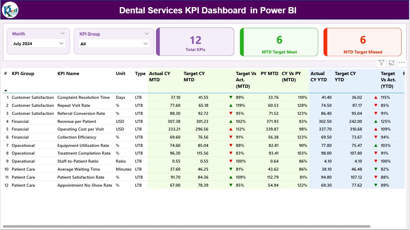
The Summary Page is the main page of the dashboard—your command center for monitoring KPIs.
Key Features:
-
🗓️ Month and KPI Group Slicers:
Easily filter data by month and KPI group to focus your analysis on a specific period or performance category. -
💡 KPI Overview Cards:
Three cards show at a glance:-
Total KPI Count
-
Month-to-Date (MTD) Target Met
-
MTD Target Missed
-
-
📋 Detailed KPI Table:
The table lists all KPIs with columns such as:-
KPI Number
-
KPI Group (e.g., Patient Care, Finance, Operations)
-
KPI Name
-
Unit of Measurement
-
Type (LTB – Lower the Better, UTB – Upper the Better)
-
Actual CY MTD
-
Target CY MTD
-
MTD Icon (▲/▼ with color coding for performance status)
-
Target vs Actual (MTD %)
-
PY MTD (Previous Year)
-
CY vs PY (MTD %)
-
Actual CY YTD and Target CY YTD
-
YTD Icon for quick performance comparison
-
Target vs Actual (YTD %)
-
PY YTD and CY vs PY (YTD %)
-
These elements allow users to evaluate performance at both monthly (MTD) and yearly (YTD) levels, making it easy to spot improvement or decline.
Visual Indicators:
Red and green arrows make interpretation intuitive—green (▲) means performance meets or exceeds target, while red (▼) indicates underperformance.
2. KPI Trend Page: Visualize Monthly and Yearly Changes
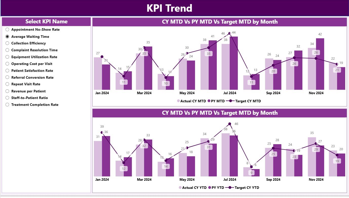
The KPI Trend Page focuses on visual storytelling. It uses combo charts to display Actual, Target, and Previous Year (PY) data side-by-side for deeper trend analysis.
Page Highlights:
-
📈 Two Combo Charts:
Compare MTD and YTD trends of current performance against targets and previous years. -
🔍 KPI Slicer:
Select any KPI name from the slicer on the left to view specific trends over time. -
🧭 Interactive Analytics:
Drill down to specific months or KPIs to analyze performance fluctuations.
This page helps you understand progress patterns, identify peak or off-peak periods, and uncover data-driven insights that lead to continuous improvement.
3. KPI Definition Page: The Foundation of Consistency
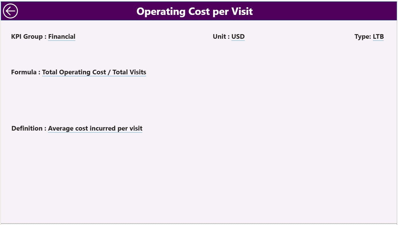
The KPI Definition Page is a drill-through page (hidden by default) that ensures each KPI has a clearly defined meaning. You can access it from the Summary Page to view detailed KPI information such as:
-
KPI Formula
-
KPI Definition
-
Unit of Measurement
-
Type (UTB/LTB)
A back button on the top-left corner makes it easy to return to the main dashboard page.
This ensures every user interprets KPIs correctly—reducing confusion and enhancing transparency across teams.
Excel Data Source Structure
The data powering this Power BI dashboard comes from a connected Excel file. The structure ensures flexibility and easy updates.
1. Input_Actual Sheet
Record the actual performance numbers for each KPI:
-
Columns include KPI Name, Month (use first day of month), MTD values, and YTD values.
2. Input_Target Sheet
Record the target performance numbers for each KPI:
-
Same structure as the actuals sheet for easy comparison.
3. KPI Definition Sheet
Enter KPI metadata such as:
-
KPI Number
-
KPI Group
-
KPI Name
-
Unit
-
Formula
-
Definition
-
Type (LTB/UTB)
This structure ensures your Power BI file remains clean, standardized, and easy to refresh.
Click to Purchases Dental Services KPI Dashboard in Power BI
Advantages of Using the Dental Services KPI Dashboard in Power BI
1. Real-Time Decision Support
Power BI automatically updates visuals when new data is entered in Excel, giving decision-makers instant access to the latest performance insights.
2. Clear Visualization
Color-coded charts and icons make performance comparisons easy, reducing reporting time and improving communication between departments.
3. Enhanced Efficiency
By centralizing metrics in one dashboard, teams save hours of manual reporting and can focus more on patient care and operational improvement.
4. Data-Driven Patient Care
Analyze patient visit trends, appointment no-shows, and treatment success rates to improve service quality and patient satisfaction.
5. Easy Integration
Since the data source is Excel, anyone familiar with spreadsheets can easily maintain and update the dashboard.
6. Multi-Department Insights
Dentists, finance teams, and administrators can view their respective KPIs simultaneously—promoting transparency and collaboration.
Click to Purchases Dental Services KPI Dashboard in Power BI
Best Practices for Using the Dental KPI Dashboard
To ensure accuracy and effectiveness, follow these best practices:
-
Regular Data Updates:
Refresh Excel data monthly or weekly to ensure the dashboard reflects current realities. -
Consistent KPI Definitions:
Standardize KPI formulas across all clinics to maintain data consistency. -
Use Conditional Formatting Wisely:
Highlight variances greater than ±10% for quick visibility. -
Integrate Departmental Data:
Combine patient, finance, and HR data to get holistic insights. -
Encourage Staff Participation:
Share results with your team to create ownership and motivation. -
Monitor Trends, Not Just Numbers:
Focus on long-term improvements rather than one-off results. -
Leverage Power BI Features:
Use slicers, bookmarks, and tooltips to create interactive user experiences. -
Ensure Data Security:
Protect sensitive patient data using Power BI’s access control and row-level security.
Following these practices turns the dashboard into a continuous improvement system rather than a static report.
How the Dashboard Supports Dental Business Growth
A data-driven dental organization can make better strategic decisions. Here’s how:
-
Optimize Resource Allocation:
Identify underperforming areas or idle resources. -
Enhance Marketing ROI:
Track new patient acquisition sources and campaigns. -
Improve Patient Retention:
Analyze feedback and satisfaction scores. -
Strengthen Financial Control:
Monitor revenue, expenses, and profitability by clinic or department. -
Ensure Compliance:
Maintain hygiene and regulatory standards effortlessly.
Ultimately, this dashboard helps create a high-performance, patient-focused, and profitable dental practice.
How to Implement the Dashboard
Step 1: Prepare Your Data
Ensure your Excel sheets (Actuals, Targets, and KPI Definition) are formatted correctly.
Step 2: Connect Excel to Power BI
Use the “Get Data” option to import the three sheets.
Step 3: Build Relationships
Link tables using KPI Name or KPI Number as the common field.
Step 4: Add Visuals and Cards
Use Power BI visuals such as Cards, Tables, Combo Charts, and Slicers for interactivity.
Step 5: Apply Conditional Formatting
Use red/green icons to represent performance statuses.
Step 6: Refresh and Share
Publish the report to Power BI Service to share with stakeholders securely.
Click to Purchases Dental Services KPI Dashboard in Power BI
Advantages of Building It in Power BI
Building the Dental KPI Dashboard in Power BI offers key benefits:
-
Automation: No more manual report creation.
-
Visualization: Powerful visuals help spot trends instantly.
-
Accessibility: Accessible on desktop, mobile, or web.
-
Scalability: Works for single clinics or large dental chains.
-
Cost Efficiency: Uses Excel as a backend—no expensive systems required.
Conclusion
The Dental Services KPI Dashboard in Power BI is more than just a reporting tool—it’s a strategic performance management system.
It transforms raw Excel data into actionable intelligence, empowering decision-makers to monitor, analyze, and enhance every aspect of dental service operations.
From patient satisfaction and hygiene compliance to financial efficiency and treatment outcomes, this Power BI dashboard provides a unified view of your practice’s success.
As dentistry continues to evolve, adopting tools like this ensures your organization remains agile, efficient, and patient-focused.
Frequently Asked Questions (FAQ)
1. What is a Dental Services KPI Dashboard?
It’s a Power BI dashboard that tracks dental performance metrics such as patient visits, revenue, and treatment efficiency.
2. Why use Power BI for dental services?
Power BI offers automation, interactivity, and visualization, making it perfect for healthcare data analysis.
3. How often should I update the dashboard?
Update monthly for MTD and YTD tracking, ensuring data accuracy.
4. Can I customize the KPIs?
Yes, you can add, remove, or modify KPIs through the KPI Definition sheet.
5. Is Excel mandatory for this dashboard?
Yes, Excel serves as the backend data source for easy updates.
6. What types of KPIs are most important?
Key metrics include Patient Visits, Treatment Success Rate, Revenue per Dentist, and Appointment No-Show Rate.
7. Can I share the dashboard online?
Yes, you can publish it to Power BI Service and share with authorized users.
8. Is it suitable for multi-branch dental chains?
Absolutely—it can consolidate data across multiple clinics for a unified view.
9. How do I track MTD and YTD performance?
Use the Summary Page to compare MTD/YTD Actuals vs Targets and Previous Year data.
10. What makes this dashboard different?
It combines flexibility (Excel) with analytical power (Power BI), offering real-time, visual insights for better decision-making.
Click to Purchases Dental Services KPI Dashboard in Power BI
Visit our YouTube channel to learn step-by-step video tutorials