Managing Accounts Payable KPI Dashboard efficiently plays a critical role in cash flow control, vendor relationships, and overall financial health. However, many finance teams still rely on disconnected spreadsheets and emails. As a result, they lose visibility into payment performance, overdue invoices, and KPI trends.
That is exactly where an Accounts Payable KPI Dashboard in Power BI adds massive value.
An Accounts Payable KPI Dashboard in Power BI transforms raw AP data into clear, interactive, and actionable insights. It helps finance managers, CFOs, auditors, and accounting teams track performance in real time. Moreover, it highlights risks early, improves compliance, and strengthens decision-making.
In this detailed guide, you will learn what an Accounts Payable KPI Dashboard in Power BI is, how it works, what pages it includes, its advantages, best practices, and frequently asked questions. Additionally, you will understand why this dashboard has become essential for modern finance operations.
Click to Purchases Accounts Payable KPI Dashboard in Power BI
What Is an Accounts Payable KPI Dashboard in Power BI?
An Accounts Payable KPI Dashboard in Power BI is a ready-to-use analytical dashboard designed to monitor accounts payable performance using KPIs, charts, tables, and slicers. It connects Excel-based AP data with Power BI visuals to provide a centralized performance view.
Instead of reviewing large Excel files, finance teams can quickly analyze:
-
KPI-wise performance
-
Target vs actual variance
-
Month-to-date (MTD) trends
-
Year-to-date (YTD) progress
-
Current year vs previous year comparisons
As a result, teams save time, reduce manual work, and improve financial accuracy.
Why Do Finance Teams Need an Accounts Payable KPI Dashboard?
Accounts payable operations involve multiple KPIs, strict timelines, and compliance checks. Unfortunately, manual tracking often creates gaps. Therefore, a Power BI dashboard becomes critical.
Key Reasons Why AP Teams Need This Dashboard
-
It centralizes all AP KPIs in one place
-
It highlights missed and met targets instantly
-
It improves visibility for MTD and YTD results
-
It reduces dependency on manual reporting
-
It strengthens vendor trust and compliance
Moreover, the dashboard allows leaders to identify trends and take corrective actions faster.
What Are the Core Features of the Accounts Payable KPI Dashboard in Power BI?
This Accounts Payable KPI Dashboard in Power BI is a ready-to-use and structured solution. It uses Excel as a data source and Power BI for visualization.
Let’s explore its key features in detail.
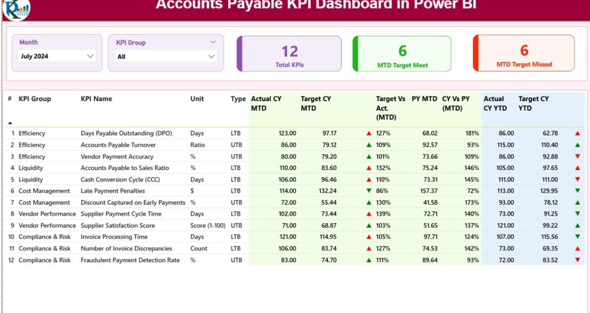
How Does the Summary Page Work in the Accounts Payable KPI Dashboard?
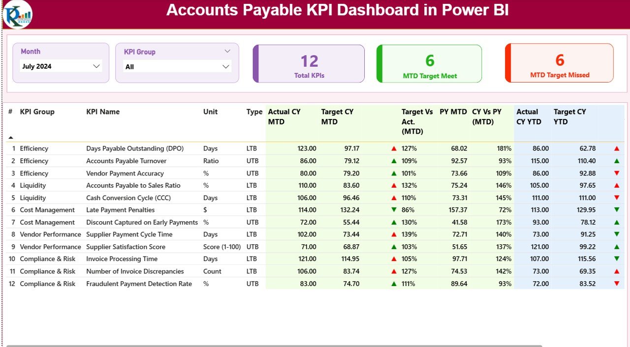
The Summary Page acts as the main landing page of the dashboard. It provides a snapshot view of all KPI performance at once.
What Slicers Are Available on the Summary Page?
At the top of the page, you will find two powerful slicers:
-
Month slicer – Select a specific month to analyze
-
KPI Group slicer – Filter KPIs by category
Because of these slicers, users can analyze data instantly without changing reports.
What KPI Cards Are Displayed on the Summary Page?
Right below the slicers, the dashboard shows three high-impact KPI cards:
-
Total KPIs Count – Total number of AP KPIs tracked
-
MTD Target Met Count – KPIs that achieved the target for MTD
-
MTD Target Missed Count – KPIs that failed to meet the target for MTD
These cards give instant clarity and help managers focus on problem areas quickly.
What Information Does the Detailed KPI Table Show?
Below the KPI cards, the Summary Page displays a highly detailed KPI performance table. This table provides in-depth KPI-wise analysis.
Columns Included in the KPI Performance Table
Each row represents one KPI. Here is what each column means:
-
KPI Number
-
Sequence number of the KPI
-
-
KPI Group
-
Category or group of the KPI
-
-
KPI Name
-
Name of the performance metric
-
-
Unit
-
Unit of measurement (Days, %, Count, USD, etc.)
-
-
Type
-
KPI nature
-
LTB (Lower the Better)
-
UTB (Upper the Better)
-
How Are MTD Values Shown in the Dashboard?
The dashboard shows month-to-date performance with strong visual clarity.
-
Actual CY MTD
-
Actual KPI value for current year, MTD
-
-
Target CY MTD
-
Target KPI value for current year, MTD
-
-
MTD Icon
-
Green ▲ for target achieved
-
Red ▼ for target missed
-
-
Target vs Actual (MTD)
-
Percentage comparison
-
Formula: Actual / Target
-
-
PY MTD
-
Previous year MTD value
-
-
CY vs PY (MTD)
-
Growth or decline comparison
-
Formula: CY MTD / PY MTD
-
How Are YTD Values Shown in the Dashboard?
Click to Purchases Accounts Payable KPI Dashboard in Power BI
In addition to MTD, the dashboard tracks yearly performance.
-
Actual CY YTD
-
Current year YTD actual value
-
-
Target CY YTD
-
Current year YTD target
-
-
YTD Icon
-
Green ▲ for target achieved
-
Red ▼ for target missed
-
-
Target vs Actual (YTD)
-
Percentage comparison
-
Formula: Actual / Target
-
-
PY YTD
-
Previous year YTD value
-
-
CY vs PY (YTD)
-
Year-on-year comparison
-
Formula: CY YTD / PY YTD
-
Because of this layout, users can evaluate short-term and long-term KPIs together.
What Does the KPI Trend Page Show?
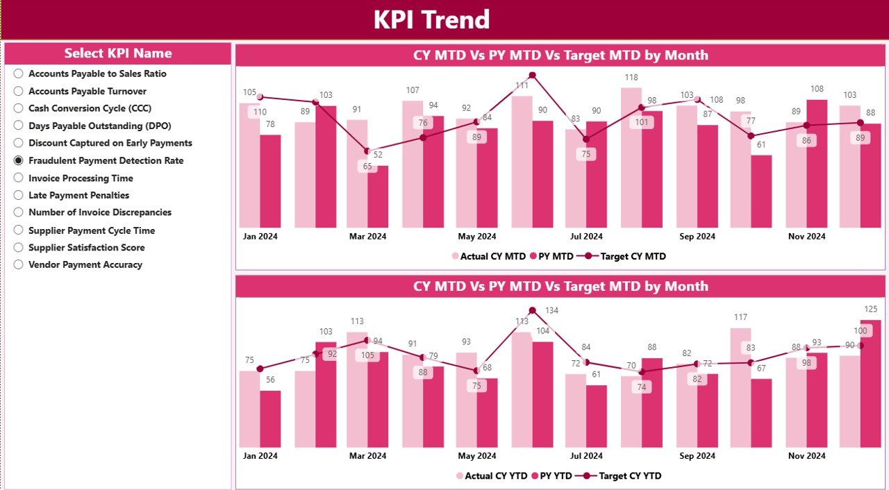
The KPI Trend Page focuses on performance movement over time. It helps users analyze trends rather than just values.
Key Visuals on the KPI Trend Page
-
MTD Combo Chart
-
Current Year Actual
-
Previous Year Actual
-
Target
-
-
YTD Combo Chart
-
Current Year Actual
-
Previous Year Actual
-
Target
-
These combo charts clearly show gaps and improvements month by month.
How Does the KPI Slicer Work on This Page?
A slicer on the left allows users to select a specific KPI. Once selected, both charts update instantly.
As a result, finance teams can deep dive into individual KPIs without creating multiple reports.
Why Is the KPI Definition Page Important?
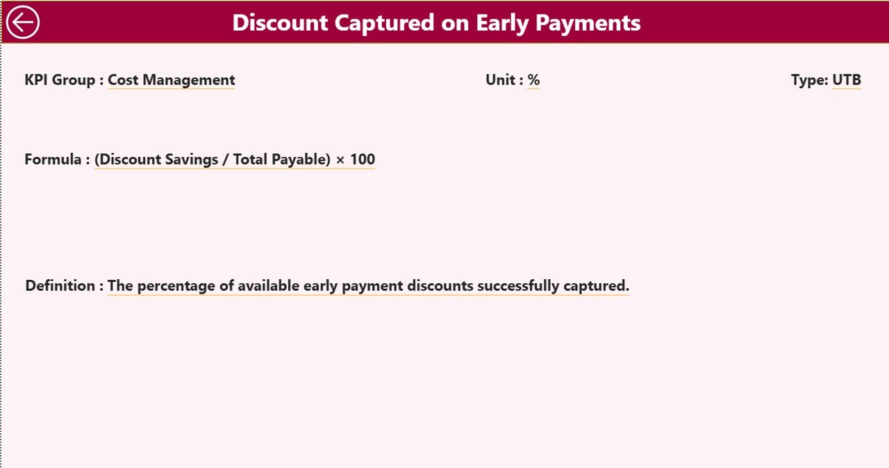
The KPI Definition Page removes confusion and improves KPI understanding across teams.
Key Characteristics of the KPI Definition Page
-
This page stays hidden by default
-
It works as a drill-through page
-
Users can access it from the Summary Page
What Information Does This Page Show?
-
KPI Formula
-
KPI Definition
-
Unit of measurement
-
KPI Type (LTB or UTB)
Because of this design, users see clear KPI logic without cluttering the main dashboard.
To return to the Summary Page, users simply click the Back button on the top-left corner.
How Does Excel Work as the Data Source for This Dashboard?
Click to Purchases Accounts Payable KPI Dashboard in Power BI
The dashboard uses Excel as its data source, which makes data entry simple and flexible.
Excel File Structure Used in the Dashboard
The Excel file contains three worksheets:
What Is the Input_Actual Sheet Used For?
This sheet captures all actual performance data.
You need to enter:
-
KPI Name
-
Month (use first date of the month)
-
MTD value
-
YTD value
Because of this structure, Power BI calculates trends and comparisons automatically.
What Is the Input_Target Sheet Used For?
This sheet stores target KPIs.
You need to enter:
-
KPI Name
-
Month (use first date of the month)
-
MTD target
-
YTD target
With this data, the dashboard compares targets against actuals accurately.
What Is the KPI Definition Sheet Used For?
This sheet defines the foundation of the entire dashboard.
You need to fill:
-
KPI Number
-
KPI Group
-
KPI Name
-
Unit
-
Formula
-
Definition
-
Type (LTB or UTB)
Because of this setup, the dashboard remains scalable and easy to maintain.
Advantages of Accounts Payable KPI Dashboard in Power BI
Using an Accounts Payable KPI Dashboard in Power BI delivers significant benefits.
Key Advantages
-
✅ Improves visibility of AP performance
-
✅ Reduces manual reporting effort
-
✅ Highlights risks early
-
✅ Improves target tracking
-
✅ Enhances decision-making speed
-
✅ Builds strong financial discipline
Moreover, this dashboard supports strategic and operational finance teams alike.
Best Practices for the Accounts Payable KPI Dashboard in Power BI
Following best practices ensures maximum value from the dashboard.
Recommended Best Practices
-
Keep KPI definitions clear and standardized
-
Update Excel data regularly
-
Use consistent month formats
-
Review MTD KPIs weekly
-
Monitor YTD KPIs monthly
-
Train users on drill-through usage
-
Validate target values periodically
By following these practices, teams maintain dashboard accuracy and credibility.
Conclusion: Why Should You Use an Accounts Payable KPI Dashboard in Power BI?
An Accounts Payable KPI Dashboard in Power BI simplifies AP performance management. It brings clarity, transparency, and control into finance operations.
Instead of chasing reports, finance teams can focus on insights. Moreover, leaders can identify risks early, optimize cash flow, and improve vendor relationships.
If you want better control over accounts payable KPIs, this dashboard becomes a must-have analytical tool.
Frequently Asked Questions (FAQs)
What is the main purpose of an Accounts Payable KPI Dashboard in Power BI?
The main purpose is to track, analyze, and improve accounts payable performance using KPIs, targets, and trends.
Who should use an Accounts Payable KPI Dashboard?
Finance managers, AP executives, CFOs, auditors, and accounting teams should use it.
Can we update data without Power BI expertise?
Yes. You only need to update the Excel file. Power BI refreshes visuals automatically.
Does the dashboard support MTD and YTD analysis?
Yes. The dashboard tracks both MTD and YTD performance in detail.
Can we customize KPIs in this dashboard?
Yes. You can add or modify KPIs using the KPI Definition sheet.
Is this dashboard suitable for audit and compliance reviews?
Yes. The structured KPI tracking improves documentation and audit readiness.
Visit our YouTube channel to learn step-by-step video tutorials