In today’s competitive business world, after-sales service plays a crucial role in shaping customer loyalty and brand reputation. A satisfied customer doesn’t just come back — they recommend your brand to others. However, managing after-sales service efficiently requires real-time insights into performance metrics.
That’s where the After-Sales Service KPI Dashboard in Power BI becomes a game-changer.
This ready-to-use solution helps businesses monitor key performance indicators (KPIs) that define service quality, customer experience, and operational excellence.
In this article, we’ll explore what this dashboard is, how it works, its features, benefits, and the best practices to make the most out of it.
Click to Purchases After-Sales Service KPI Dashboard in Power BI
What Is an After-Sales Service KPI Dashboard in Power BI?
An After-Sales Service KPI Dashboard in Power BI is a dynamic data visualization tool that tracks, analyzes, and displays key performance metrics related to post-purchase services.
It connects to an Excel data source containing actual, target, and definition data for each KPI. Power BI then transforms this raw data into insightful visuals — allowing managers to measure month-to-date (MTD) and year-to-date (YTD) performance instantly.
Instead of scrolling through multiple spreadsheets, you can now view service performance, customer support efficiency, and target achievements on one interactive screen.
This dashboard empowers service teams to make informed decisions, identify areas for improvement, and enhance overall customer satisfaction.
Key Components of the After-Sales Service KPI Dashboard
The Power BI file contains three powerful pages designed for a seamless analytical experience. Each page provides specific insights that help track the performance of your after-sales operations.
Summary Page – The Central Control Panel
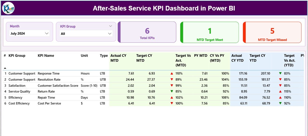
The Summary Page serves as the main interface of the dashboard. It provides a comprehensive view of all KPIs and their performance status.
Here’s what you can find:
-
Slicers for Month and KPI Group:
You can filter results by month or KPI group to analyze specific periods or departments.
Key Metric Cards:
Three summary cards display:
- Total KPI Count
- MTD Target Met Count
- MTD Target Missed Count
Detailed KPI Table:
Below the cards lies a data-rich table showcasing every KPI’s details, including:
- KPI Number & Name
- KPI Group (e.g., Customer Support, Service Quality, Complaint Resolution)
- Unit of Measurement
- Type (UTB or LTB)
- MTD & YTD Actual vs Target Values
- Performance Icons (▲ / ▼) showing if the target was achieved
- Comparisons with Previous Year (PY) for both MTD and YTD
This page allows managers to instantly assess which KPIs are meeting expectations and which ones need attention.
KPI Trend Page – Visualizing Progress Over Time
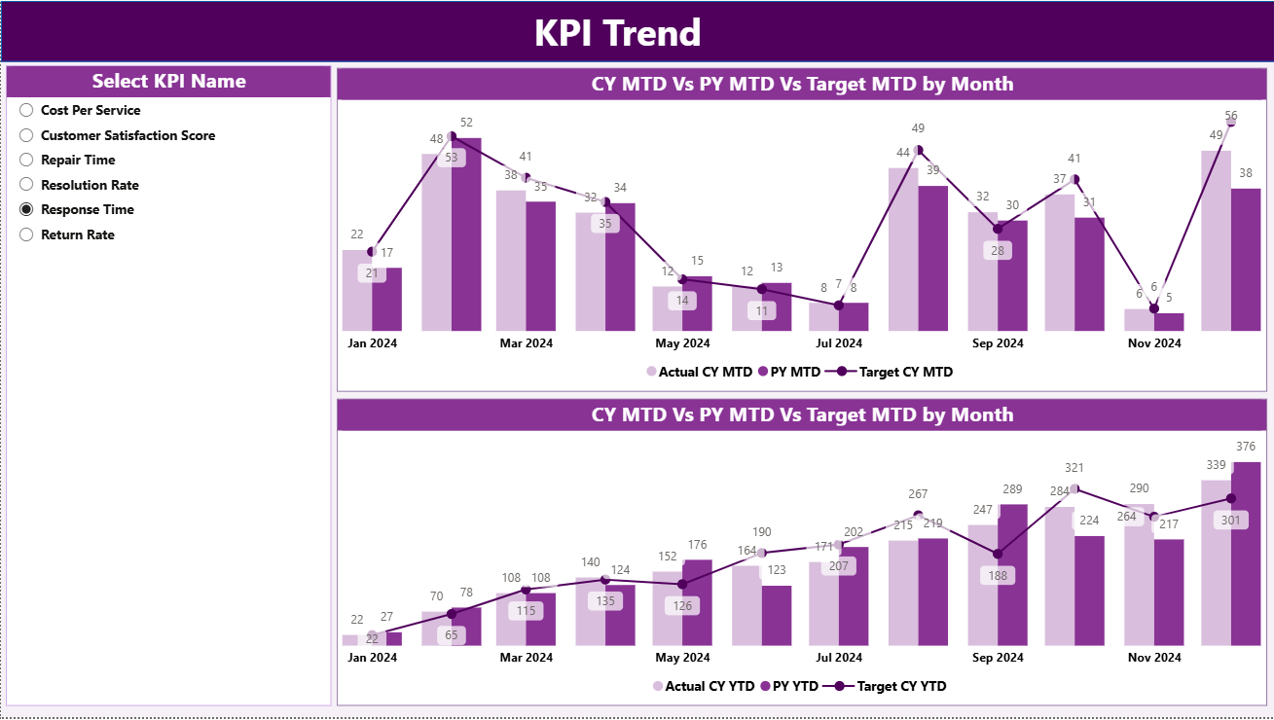
The KPI Trend Page is where you can visualize how performance has evolved.
It includes:
Two Combo Charts:
- One for MTD Performance
- Another for YTD Performance
Both display Actual, Target, and Previous Year values side by side. -
Dynamic KPI Slicer:
Users can select a KPI name from the slicer to view its trend individually.
Click to Purchases After-Sales Service KPI Dashboard in Power BI
This page is particularly useful for spotting trends, seasonality effects, and the impact of service improvement initiatives.
KPI Definition Page – Understanding the Metrics
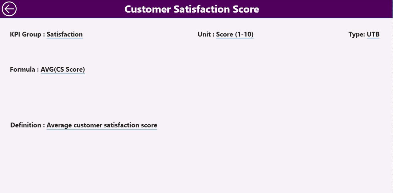
The KPI Definition Page acts as a reference guide. It’s designed as a drill-through page, hidden from direct navigation but accessible when you click on a KPI in the summary view.
Here, you can view:
-
KPI Number
-
KPI Group
-
KPI Name
-
Unit
-
Formula
-
Definition
-
Type (LTB / UTB)
This ensures transparency and consistency across your organization — everyone knows exactly how each KPI is calculated.
A Back Button at the top left helps users return to the Summary Page easily.
Data Source Structure in Excel
The dashboard draws data from an Excel file that contains three structured worksheets:
-
Input_Actual Sheet Tab:
Enter actual KPI numbers for each month.
Columns include:-
KPI Name
-
Month (use first date of each month)
-
MTD Number
-
YTD Number
-
-
Input_Target Sheet Tab:
Enter target values for the same KPIs.
Columns include:-
KPI Name
-
Month (first date of each month)
-
MTD Target
-
YTD Target
-
-
KPI Definition Sheet Tab:
Define each KPI in detail, including:-
KPI Number
-
KPI Group
-
KPI Name
-
Unit
-
Formula
-
Definition
-
Type (UTB / LTB)
-
This structured format allows seamless integration and automatic data refresh in Power BI.
🚀 Why Businesses Need an After-Sales Service KPI Dashboard
Every business aims to deliver excellent service after a sale, but without proper metrics, improvement becomes guesswork.
An After-Sales Service KPI Dashboard ensures:
-
Data-driven decisions instead of intuition.
-
Instant visibility into team performance.
-
Comparisons between actual and target performance.
-
Continuous improvement in service efficiency.
When implemented correctly, it becomes the foundation for maintaining long-term customer relationships.
💡 How to Use the Dashboard Effectively
Follow these steps to get the most out of your Power BI dashboard:
-
Load Your Data:
Fill out the three Excel sheets and connect the Power BI file to it. -
Set Up Refresh Schedule:
Automate data updates weekly or monthly using Power BI Service. -
Filter Insights:
Use slicers to analyze specific months, departments, or KPI groups. -
Drill Down for Details:
Use the drill-through feature to see KPI definitions or formulas. -
Share Dashboards Securely:
Publish the dashboard on Power BI Service and share access with your team. -
Review Trends Regularly:
Compare current performance with targets and previous year numbers.
Advantages of Using an After-Sales Service KPI Dashboard in Power BI
Using this dashboard brings several tangible benefits:
✅ 1. Improved Visibility
Get a complete view of your after-sales performance across all departments in one place.
✅ 2. Faster Decision-Making
Identify issues quickly and take corrective action before they escalate.
✅ 3. Enhanced Customer Experience
Monitor service quality and reduce response times to increase satisfaction.
✅ 4. Efficient Resource Allocation
Know which areas need more manpower, training, or investment.
✅ 5. Trend and Pattern Recognition
Spot recurring problems and take proactive steps to prevent them.
✅ 6. Real-Time Performance Tracking
Use Power BI’s refresh and live dashboard capabilities to stay up-to-date.
✅ 7. Cross-Team Collaboration
Enable managers, technicians, and executives to work with the same set of metrics.
Click to Purchases After-Sales Service KPI Dashboard in Power BI
Best Practices for the After-Sales Service KPI Dashboard
To ensure your dashboard provides meaningful insights, follow these best practices:
🔹 1. Define Clear KPIs
Avoid ambiguous metrics. Each KPI should have a clear purpose and formula.
🔹 2. Use Consistent Units and Data Formats
Maintain standard units (e.g., minutes, hours, %) to simplify comparisons.
🔹 3. Highlight Critical KPIs
Use colors, icons, or conditional formatting to draw attention to important metrics.
🔹 4. Keep Visuals Simple
Avoid overcrowding charts. Focus on clarity and readability.
🔹 5. Automate Data Refresh
Schedule regular refreshes to ensure that your dashboard always shows current data.
🔹 6. Review and Refine Regularly
Adjust your KPIs as business goals evolve or new priorities emerge.
🔹 7. Train Users
Ensure your team knows how to navigate and interpret the dashboard effectively.
🔍 Real-World Applications
This Power BI dashboard suits a variety of industries and functions, including:
-
Automotive Service Centers: Tracking warranty claims, turnaround times, and customer feedback.
-
Consumer Electronics: Monitoring installation quality, complaint resolution speed, and parts availability.
-
Industrial Equipment Manufacturers: Managing field technician efficiency and repair costs.
-
Retail Chains: Measuring return handling times and customer satisfaction scores.
No matter the industry, the principles of after-sales tracking remain the same — speed, quality, and customer trust.
💬 Common Mistakes to Avoid
Even the best dashboards fail if not used properly. Avoid these pitfalls:
-
Using too many KPIs at once — focus on what truly matters.
-
Neglecting data validation in Excel before connecting to Power BI.
-
Ignoring previous year comparisons.
-
Not updating targets periodically.
-
Using overly complex visuals that confuse rather than clarify.
🧩 Integration with Other Systems
You can integrate the After-Sales Service KPI Dashboard with other business tools such as:
-
CRM Systems (e.g., Salesforce, HubSpot): For capturing customer interactions.
-
ERP Platforms (SAP, Oracle): For warranty and spare part tracking.
-
Service Desk Tools (Zendesk, Freshdesk): For complaint and ticket management.
This integration ensures all teams work with unified, accurate data.
🔚 Conclusion
An After-Sales Service KPI Dashboard in Power BI is more than a reporting tool — it’s a strategic asset.
By tracking service KPIs, comparing actuals against targets, and identifying improvement areas, businesses can deliver exceptional customer experiences while optimizing operational efficiency.
With Power BI’s interactive visuals, drill-through options, and real-time data updates, this dashboard helps organizations transform customer service from a cost center into a value-creating powerhouse.
❓ Frequently Asked Questions (FAQs)
1. What is the main purpose of an After-Sales Service KPI Dashboard?
Its main purpose is to track and visualize performance indicators related to after-sales service such as response time, resolution rate, and customer satisfaction.
2. How often should I update the data?
You should update the Excel data at least monthly, though weekly updates are ideal for high-volume service teams.
3. Can I customize the KPIs?
Yes, you can easily add, modify, or remove KPIs in the Excel definition sheet and refresh the Power BI file.
4. Is this dashboard suitable for small businesses?
Absolutely. It’s scalable and adaptable for both small and large organizations.
5. What makes Power BI a better platform for such dashboards?
Power BI offers powerful visualization tools, drill-through features, and integration with Excel — making it ideal for dynamic performance reporting.
6. Can this dashboard be shared online?
Yes, by publishing it to Power BI Service, you can securely share it with your team and management.
7. Does it require coding knowledge?
No. Once the Excel data is ready, you can manage everything using Power BI’s drag-and-drop interface.
Visit our YouTube channel to learn step-by-step video tutorials