Agri Insurance Dashboard in Excel is a ready-to-use reporting template for crop insurance teams that need to monitor premiums, paid claims, sum insured, policy count, insured area, settlement performance, loss ratio, region, crop type, subsidy, and farmer category trends in one workbook. Crop insurance data can become difficult quickly: one season may include thousands of policies across districts, crops, claim reasons, channels, subsidy types, and policy statuses. This Excel dashboard gives those records a clear structure with 5 dashboard pages, high-level cards, interactive slicers, and chart-based analysis.
The template is built for users who already work in Microsoft Excel and want a faster way to review agri insurance performance without building a dashboard from scratch. You can replace the sample data, refresh the workbook, and use slicers to create focused views for management reviews, claim meetings, underwriting discussions, and subsidy reporting. For purchase details, visit the Agri Insurance Dashboard in Excel product page.
Key Features of Agri Insurance Dashboard in Excel
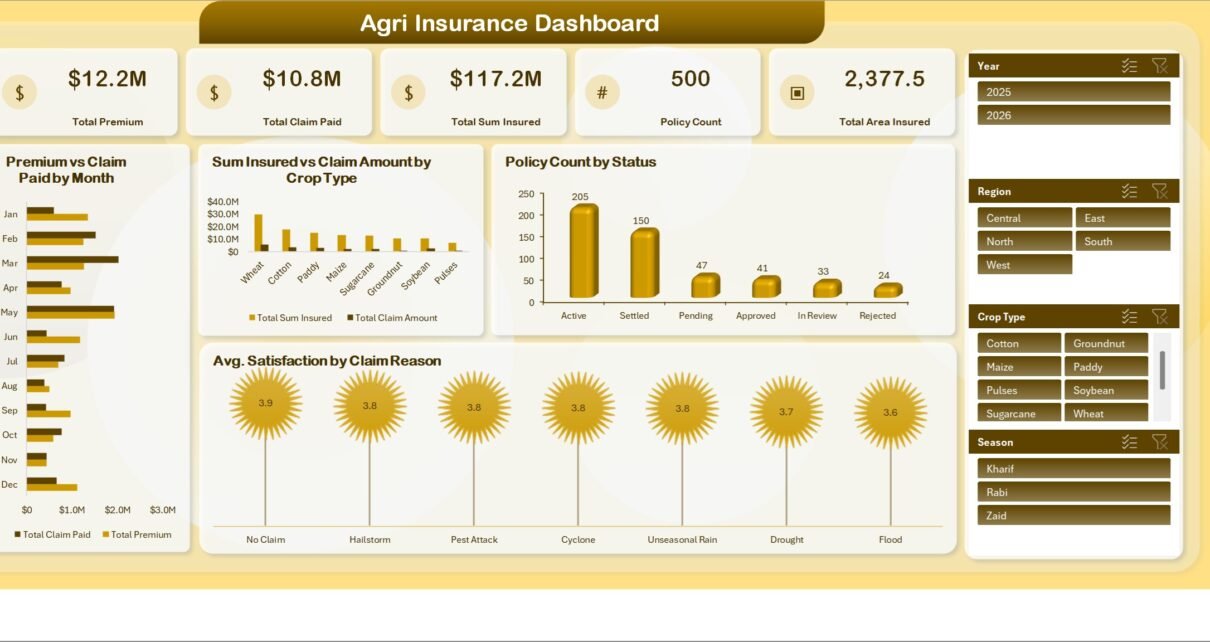
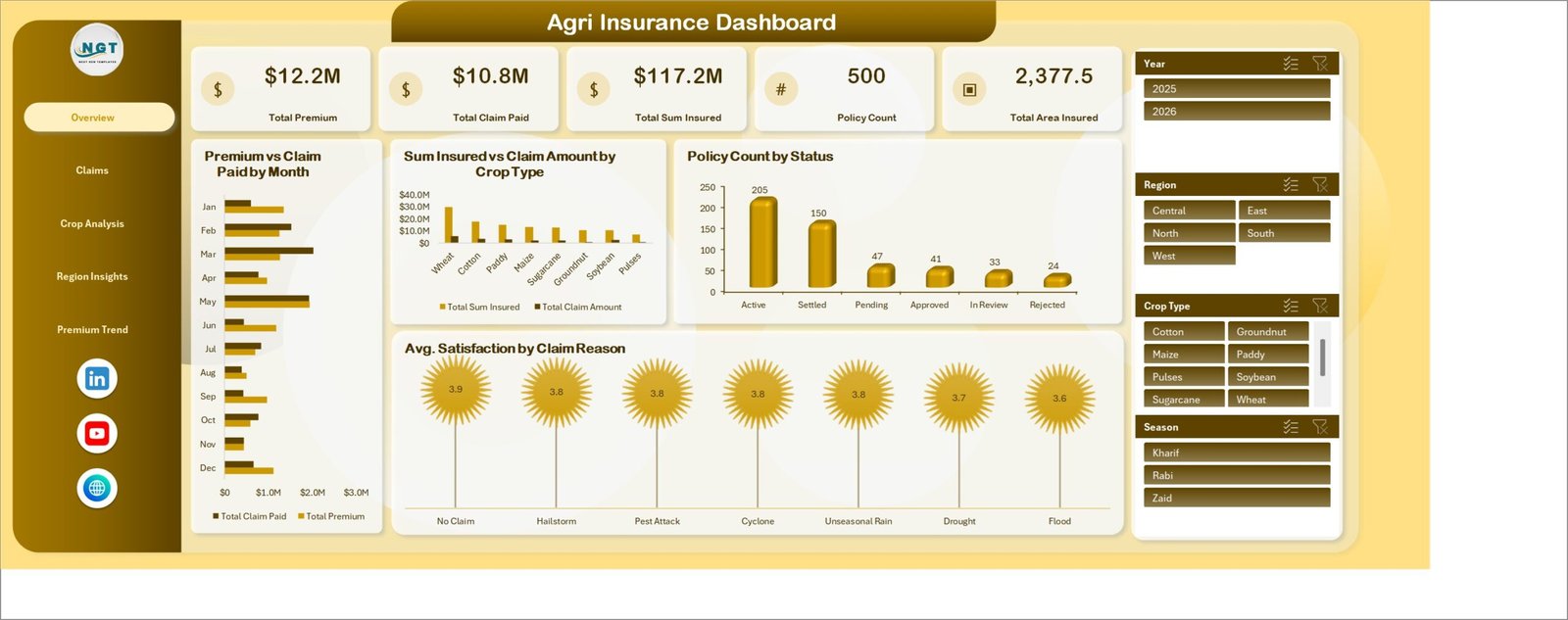
This Excel dashboard includes 5 reporting pages: Overview, Claims, Crop Analysis, Region Insights, and Premium Trend. The Overview page contains 5 high-level cards for Total Premium, Total Claim Paid, Total Sum Insured, Policy Count, and Total Area Insured. These cards help managers understand portfolio size, insured exposure, claim outflow, and insured acreage without reading raw data rows.
The dashboard uses slicers for quick filtering and pivot-based charts for repeatable analysis. Microsoft explains that PivotTables are designed to summarize, analyze, explore, and present worksheet data, which is exactly why this format works well for insurance portfolios with multiple dimensions. You can learn more from Microsoft Support here: Create a PivotTable to analyze worksheet data.
Dashboard Pages Explanation
1. Overview Page
The Overview page gives a high-level view of agri insurance performance. At the top, the cards show Total Premium, Total Claim Paid, Total Sum Insured, Policy Count, and Total Area Insured so users can quickly understand total portfolio value, claim payout, policy volume, and exposure.
Premium vs Claim Paid by Month: This chart compares monthly premium against claim paid. It helps users identify months where claim payouts are rising faster than premium collection.
Sum Insured vs Claim Amount by Crop Type: This chart compares insured exposure with claim amount by crop type. It helps underwriting and risk teams spot crops that may need closer review.
Policy Count by Status: This visual shows how many policies sit in each status. It helps operations teams review active, expired, pending, closed, or similar policy groups.
Average Satisfaction by Claim Reason: This chart connects customer or farmer satisfaction with claim reason. It helps service teams identify where claim communication or settlement experience may need improvement.
2. Claims
The Claims page is focused on claim volume, paid amount, settlement percentage, and settlement timing. It includes Claim Amount vs Claim Paid by Claim Reason, Total Claim Amount by Status, Claim Settlement Percentage by Month, and Average Settlement Days by Region.
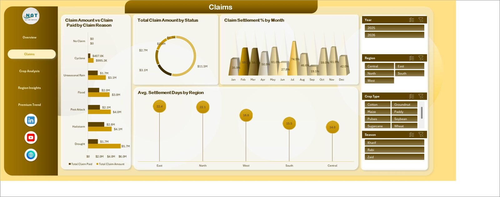
Claims managers can use this page to compare claim reasons, review unpaid or partially paid exposure, and identify settlement delays by region. It is especially useful when a team needs to explain whether claim pressure is caused by specific reasons, specific regions, or month-level seasonality.
3. Crop Analysis
The Crop Analysis page reviews risk and performance from a crop perspective. It includes Premium vs Claim Paid by Crop Type, Sum Insured vs Area Insured by Season, Total Area Insured by Crop Type, and Loss Ratio Percentage by Season.
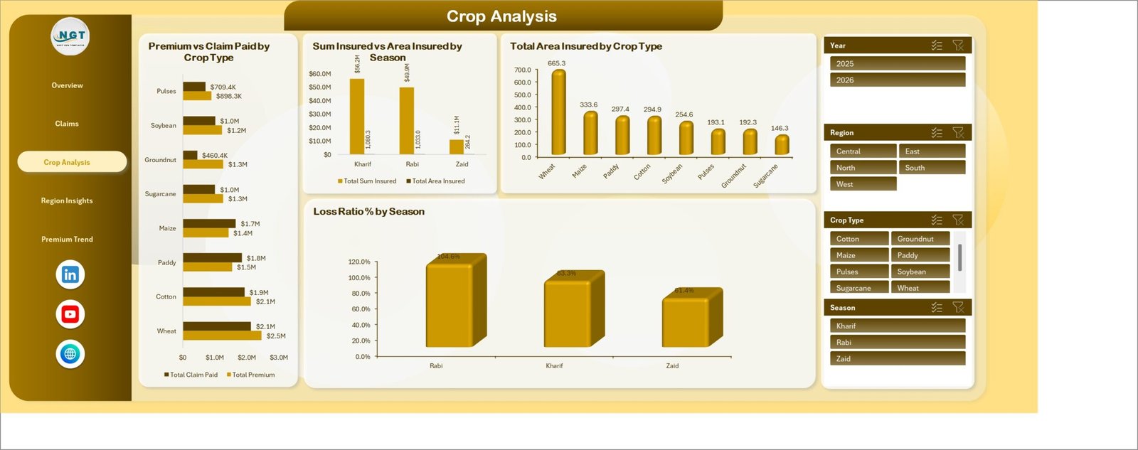
This page helps users compare premium against claim paid for each crop type and understand how insured area changes by season. The loss ratio view is especially useful for identifying seasons where claims are high compared with collected premium.
4. Region Insights
The Region Insights page compares geographic insurance performance. It includes Sum Insured vs Premium by Region, Top 10 Policy Count by District, Total Claim Paid vs Total Claim Amount by Region, and Top 10 Loss Ratio Percentage by District.
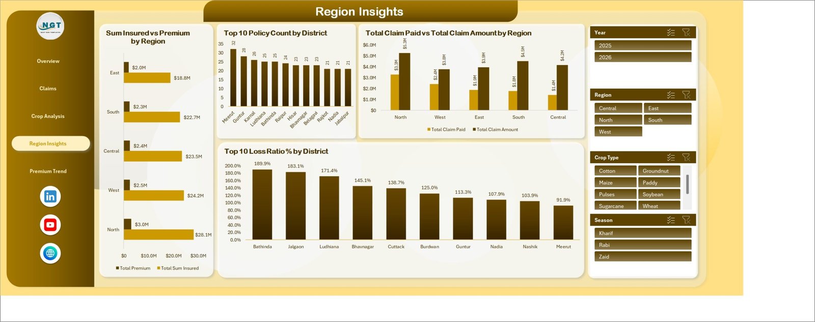
Regional managers can use this page to compare insured exposure and premium by region, identify districts with the highest policy count, and review where loss ratio is elevated. This is helpful for territory reviews, district-level planning, and claim-response prioritization.
5. Premium Trend
The Premium Trend page is designed for premium, subsidy, and retained premium analysis. It includes Total Premium vs Subsidy by Month, Net Retained Premium by Quarter, Total Premium vs Total Subsidy by Channel, and Total Subsidy by Farmer Category.
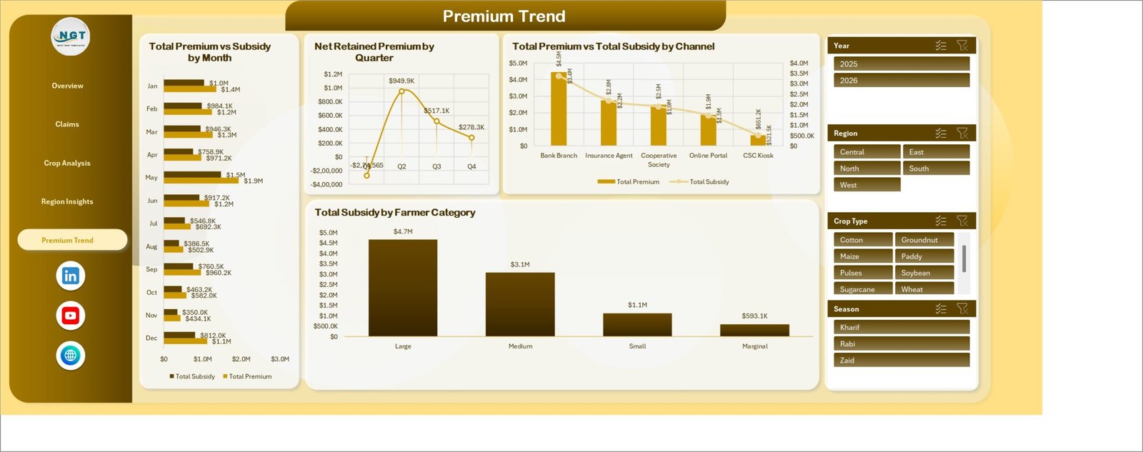
Finance teams can use this page to review how total premium and subsidy move over time, how retained premium changes by quarter, and which channels or farmer categories contribute the most subsidy-related activity.
Agri Insurance Dashboard in Excel vs. Google Sheets vs. Paid CRM/SaaS – Feature Comparison
| Feature | This Excel dashboard | Google Sheets alternative | Paid insurance SaaS |
|---|---|---|---|
| Cost | One-time template purchase | Low tool cost but manual dashboard build | Recurring subscription |
| Platform | Microsoft Excel | Browser spreadsheet | Vendor-hosted application |
| Setup time | Replace data and refresh | Build charts, formulas, and filters manually | Requires onboarding and setup |
| Collaboration | Possible through OneDrive or SharePoint | Native collaboration | Usually included |
| Custom fields | Editable workbook structure | Editable but manual | Depends on vendor permissions |
| Year-1 cost at 5 users | Low one-time template cost plus Excel access | Workspace cost plus build time | Often much higher due to subscription pricing |
| Agri insurance reporting | Premium, claims, policy status, crop, region, subsidy, settlement, and loss ratio | Must be designed manually | Depends on module purchased |
Who Should Use This Template
This template is useful for agricultural insurers, rural insurance branches, farm cooperatives, crop insurance analysts, claims managers, underwriting support teams, agri finance teams, and consultants who prepare insurance performance reports in Excel. It is also useful for training and demonstration when teams need to understand how crop insurance KPIs can be organized into dashboard pages.
It is not a replacement for a full policy administration system. It does not issue policies, process payments, calculate legal claim entitlement, connect to live APIs, or automate settlement workflows. It works best as a reporting layer for prepared Excel data.
Real-World Use Cases
Anika, crop insurance manager: uses the Overview page to review premium, claim paid, policy count, sum insured, and insured area before a weekly portfolio meeting.
Rohan, claims operations lead: uses the Claims and Region Insights pages to compare settlement percentage, settlement days, claim amount, claim paid, and district-level loss ratio.
Meera, agri finance analyst: uses the Premium Trend page to track subsidy by farmer category, retained premium by quarter, and premium vs subsidy by channel.
Advantages of Agri Insurance Dashboard in Excel
The main advantage is speed. Instead of building slicers, pivot tables, cards, and charts from scratch, users start from a ready workbook and adapt the sample data structure to their own records. The dashboard also keeps related analysis pages together, so portfolio review, claim analysis, crop review, regional review, and subsidy review are not scattered across different files.
Because the template is built in Excel, teams can customize labels, add rows, change chart styles, or extend the data model using familiar Excel tools. It is also easier to share filtered outputs as screenshots or PDFs for review meetings.
Opportunities for Improvement
Large insurance teams with live policy systems may need automated data connections, user permissions, audit logs, and live refresh. Those workflows are better handled by a database, BI tool, or insurance SaaS platform. This workbook is strongest when the team can export or prepare data in Excel format and refresh the dashboard manually.
Best Practices
Keep crop type, region, district, season, claim reason, status, channel, and farmer category names consistent. Avoid mixing spellings such as North Region and North. Refresh all pivots after adding data. Review loss ratio by season and district regularly, because these views can highlight areas that deserve underwriting or claim process attention.
Explore Relevant Templates
For related reporting, explore Insurance Agency Dashboard in Excel, Agriculture and Farm Dashboard in Excel, Remote Crop Monitoring Dashboard in Excel, and Insurance Policy and Premium Tracker in Google Sheets.
Frequently Asked Questions
What KPIs are included in the Agri Insurance Dashboard in Excel?
The Overview page includes Total Premium, Total Claim Paid, Total Sum Insured, Policy Count, and Total Area Insured. Other pages add claim amount, settlement percentage, settlement days, loss ratio, subsidy, retained premium, and district-level metrics.
Can I use my own agri insurance data?
Yes. Replace the sample records with your own data in the same structure, then refresh the workbook so charts and cards update.
Does this dashboard require VBA macros?
No. It is designed around Excel tables, pivot tables, charts, and slicers.
Can I filter the dashboard by crop, region, or season?
Yes. The dashboard includes slicers for quick filtering so users can focus on specific crops, regions, seasons, statuses, channels, claim reasons, and farmer categories.
Is this a full insurance management system?
No. It is a reporting dashboard for prepared data. It does not replace policy issuance, underwriting systems, payment tools, or claims processing software.
Where can I buy the template?
You can purchase it from the Agri Insurance Dashboard in Excel product page.
About the Author
Built by PK – Microsoft Certified Professional with 15+ years of Excel, Google Sheets, and Power BI experience. Founder of NextGenTemplates, reaching 300K+ subscribers across YouTube channels. Every template is hand-built and tested before release.
Conclusion
The Agri Insurance Dashboard in Excel gives crop insurance and agriculture finance teams a practical way to review premium, claims, sum insured, policy count, insured area, settlement performance, regional exposure, crop risk, loss ratio, and subsidy trends from one workbook. If your team uses Excel for recurring reporting, this template can save setup time and bring the most important agri insurance questions into one dashboard experience.
Click here to purchase Agri Insurance Dashboard in Excel