Agriculture and Farm Dashboard in Excel is a powerful, ready-to-use Excel template that helps farmers, agronomists, and agricultural business owners track farm revenue, crop yield, operating costs, and profitability across multiple dimensions. Whether you manage a small family farm or a large-scale agricultural enterprise, this dashboard brings all your critical farming data into one place.
In this detailed guide, you will learn everything about this dashboard — its structure, features, pages, advantages, best practices, and how it can transform your farm management workflow. This template is designed to work with standard Excel pivot tables and slicers, so you do not need any VBA or macro knowledge to get started.
Click here to Purchase Agriculture and Farm Dashboard in Excel
Key Features of Agriculture and Farm Dashboard in Excel
The Agriculture and Farm Dashboard in Excel includes 5 interactive dashboard pages, a data sheet, and a support sheet — giving you a complete farm analytics solution in a single Excel file. It tracks 5 critical KPIs: Total Revenue, Net Farm Profit, Total Area, Total Yield, and Total Records.
Every page includes interactive slicers that allow you to filter data by region, crop, season, irrigation type, soil type, and buyer type. The dashboard is fully data-driven — just replace the sample data with your own and click Refresh All to update everything instantly.
This template is ideal for anyone who needs to analyze agricultural performance without the complexity of specialized software. It provides 15+ professional charts across all pages, covering revenue analysis, cost comparisons, crop profitability, regional performance, seasonal trends, and operational efficiency.
If you are looking for more Excel templates for farming and agriculture, explore our collection of Excel Dashboard Templates at NextGenTemplates.
Dashboard Pages Explained
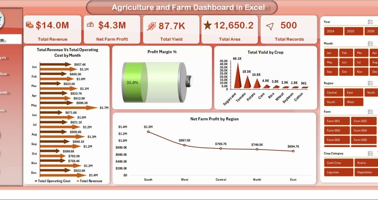
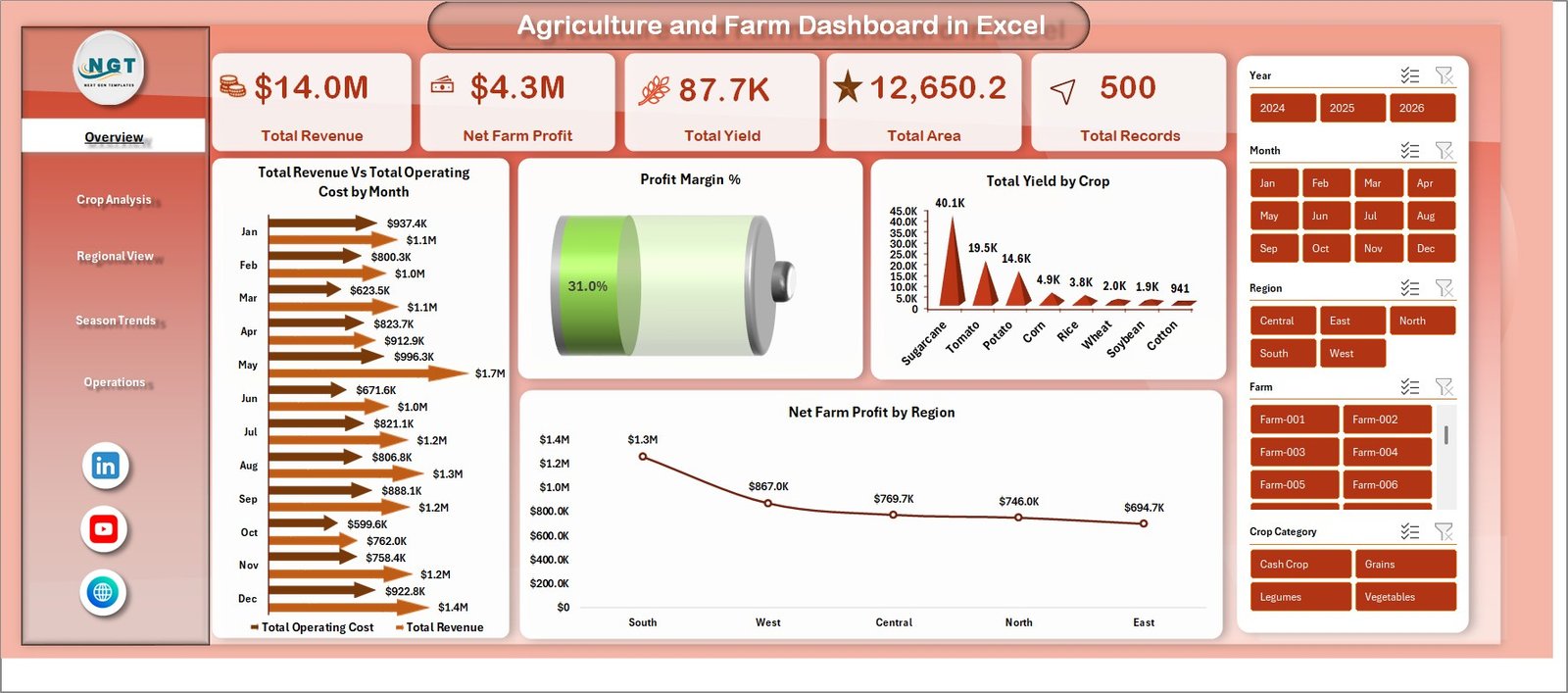
1 – Overview Page
The Overview Page serves as the central command center of the dashboard. At the top, you will find 5 KPI cards displaying high-level information: Total Revenue, Net Farm Profit, Total Area, Total Yield, and Total Records. These cards give you an instant snapshot of your overall farm performance.
Below the cards, the page features several analytical charts. The Total Revenue vs Total Operating Cost by Region chart helps you compare income against expenses across different geographic areas. The Profit Margin % chart provides a quick view of your overall profitability. Total Yield by Crop shows which crops are producing the most output, while Net Farm Profit by Region highlights the most profitable farming regions.
Multiple interactive slicers are available on this page, allowing you to filter the entire dashboard by various dimensions and see your customized view in seconds.
 Agriculture and Farm Dashboard in Excel
Click here to Purchase Agriculture and Farm Dashboard in Excel
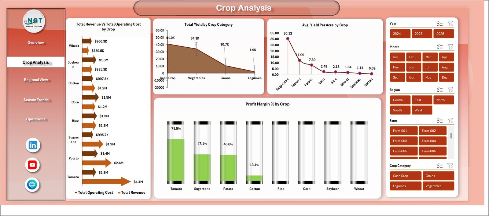
2 – Crop Analysis
The Crop Analysis page provides a deep dive into crop-level performance. This page helps you identify which crops are generating the most revenue, which have the highest yield, and which deliver the best profit margins.
Charts on this page include Total Revenue vs Total Operating Cost by Crop, which compares income and expenses at the crop level. Total Yield by Crop Category groups crops into broader categories for macro-level analysis. Avg Yield Per Acre by Crop helps you understand productivity efficiency for each crop type. Finally, Profit Margin % by Crop reveals which crops deliver the highest returns relative to their costs.
This analysis is especially valuable for farm managers who need to make planting decisions based on historical profitability data.
 Crop Analysis
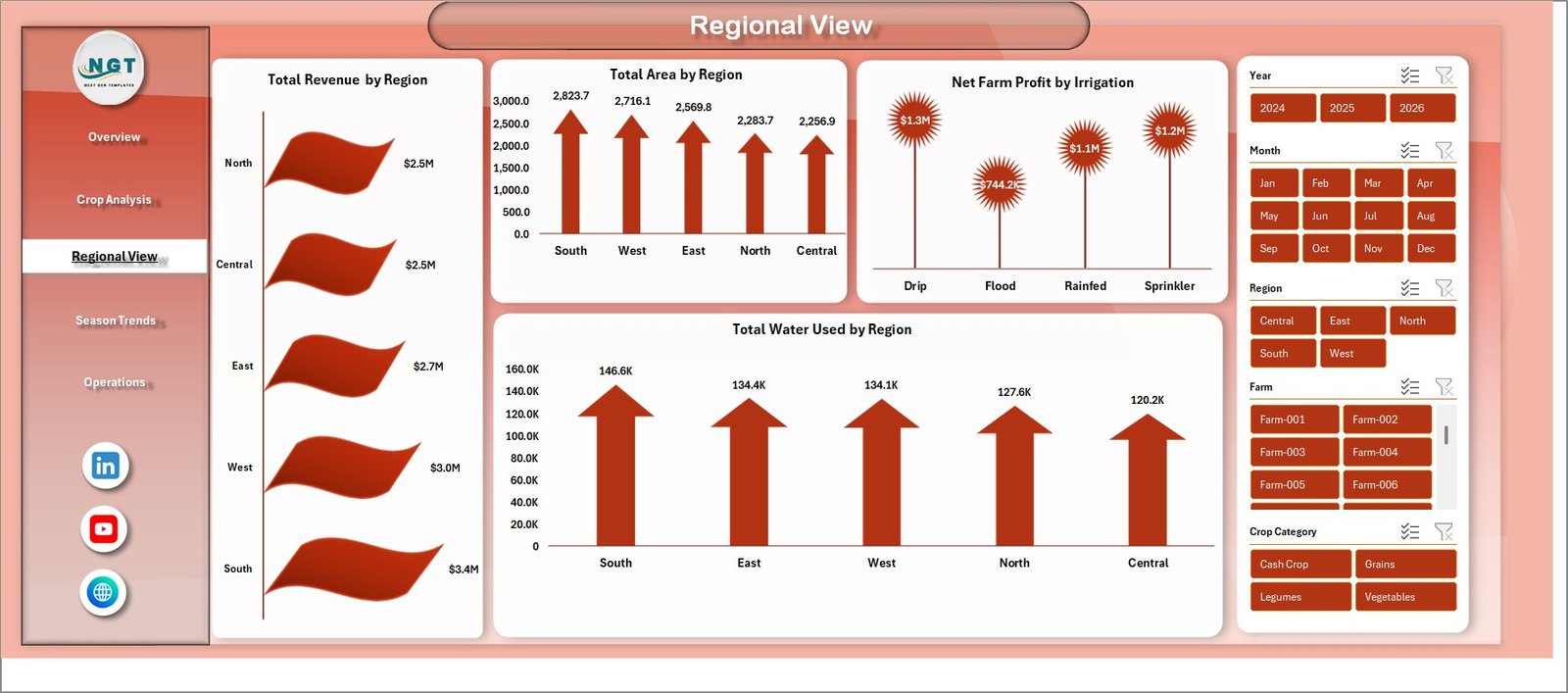
3 – Regional View
The Regional View page focuses on geographic performance analysis. Understanding how different regions contribute to your farming operations is essential for resource allocation and strategic planning.
This page includes charts for Total Revenue by Region, Total Area by Region, Net Farm Profit by Irrigation, and Total Water Used by Region. Together, these visuals help you understand which regions are most productive, which irrigation methods yield the best profits, and where water resources are being consumed the most.
If you manage farms across multiple locations, this page becomes your go-to view for comparing regional efficiency and identifying areas for improvement.
 Regional View
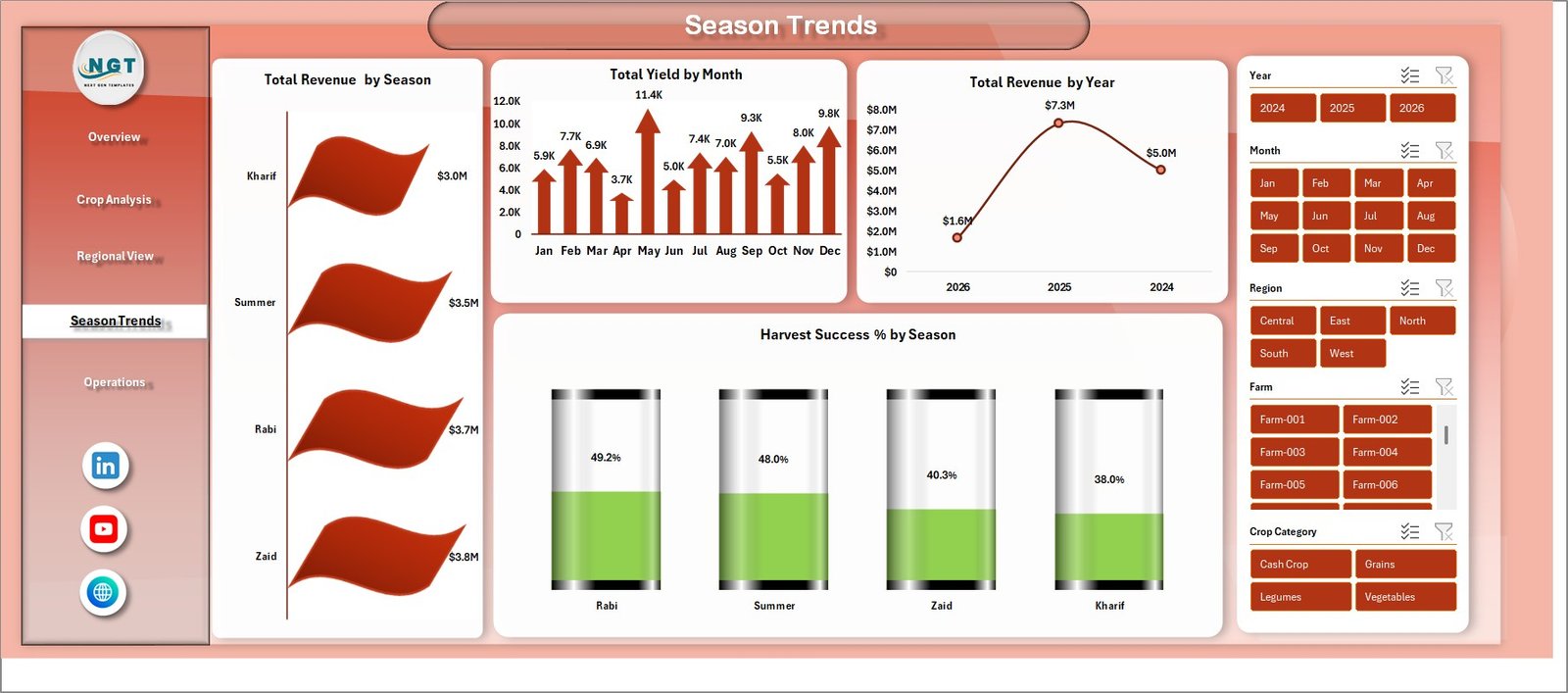
4 – Season Trends
Agriculture is inherently seasonal, and the Season Trends page helps you track performance across different time periods. This page is critical for planning your planting, harvesting, and resource allocation cycles.
The charts include Total Revenue by Season, which shows how income varies across spring, summer, autumn, and winter. Total Yield by Month tracks monthly production output. Total Revenue by Year provides year-over-year comparisons. Harvest Success % by Season measures how effectively harvests are completed across different seasons.
By analyzing these seasonal patterns, you can optimize your farming calendar and make smarter decisions about crop selection and timing. Similar seasonal analysis is also available in the Agriculture and Farm Dashboard in HTML.
 Season Trends
5 – Operations
The Operations page helps you monitor the operational side of your farming business. Understanding resource usage and buyer dynamics is essential for maximizing efficiency and profitability.
This page features charts for Total Water Used by Irrigation, which analyzes water consumption across different irrigation methods. Avg Yield Per Acre by Soil Type reveals how different soil conditions affect crop productivity. Total Revenue by Buyer Type shows how income is distributed across different buyer segments such as wholesale, retail, and direct-to-consumer.
These operational insights help you fine-tune your farming practices, optimize water usage, and target the most profitable buyer channels.
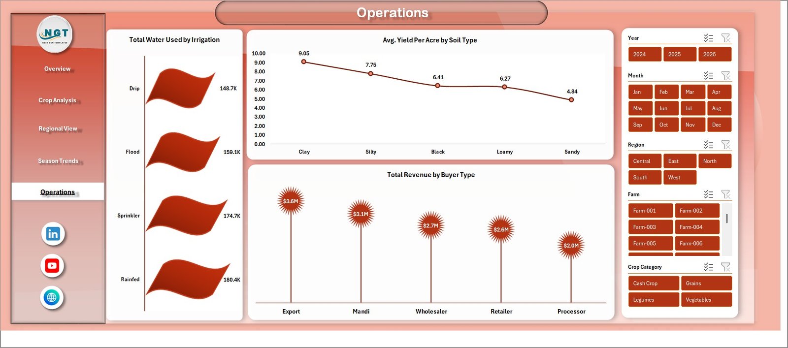 Operations
6 – Data Sheet
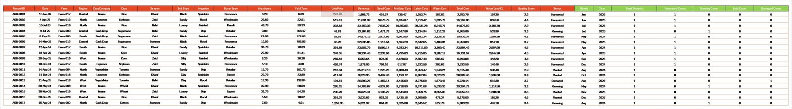
The Data Sheet is where you enter all your farming records. The sample data provided in the template shows the exact format you need to follow. Simply replace the sample records with your own data — including crop names, regions, seasons, yields, revenues, costs, irrigation types, soil types, and buyer types.
After updating the data, navigate to the Data tab in the Excel ribbon and click Refresh All. All pivot tables and charts across the entire dashboard will update automatically with your new data.
 Data Sheet tab
7 – Support Sheet
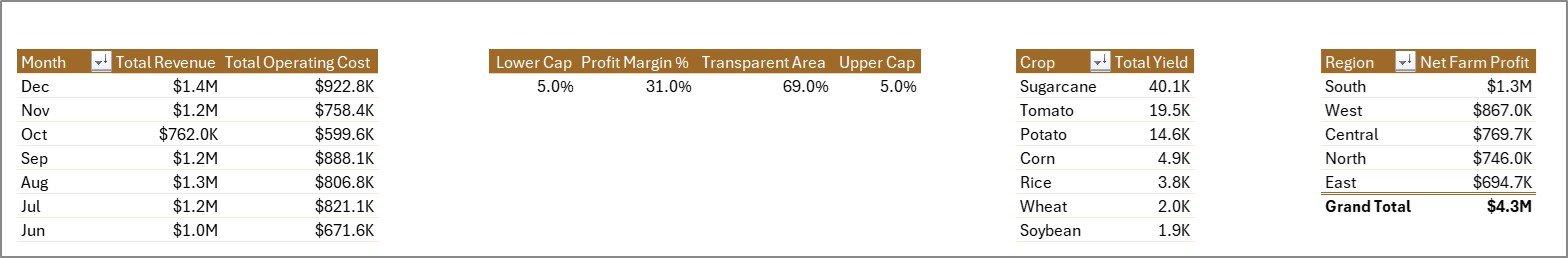
The Support Sheet contains all the pivot tables that power the entire dashboard. These pivots are connected to the Data Sheet and feed data to every chart and KPI card across all 5 dashboard pages.
After updating data in the Data Sheet, go to the Data tab in the Excel ribbon and click Refresh All. All pivot tables will refresh and every chart will update automatically. You can keep this sheet hidden during regular use — it works silently in the background.
 Support sheet tab
Advantages of Agriculture and Farm Dashboard in Excel
This dashboard offers several practical advantages for agricultural professionals. First, it provides centralized data management by consolidating all farm metrics into a single Excel file. You no longer need to maintain separate spreadsheets for revenue, yield, costs, and regional performance.
Second, the interactive slicers make data exploration effortless. You can filter by crop, region, season, irrigation type, or any other dimension with a single click. This saves significant time compared to manual data filtering.
Third, the dashboard requires no technical expertise. Since it uses standard Excel pivot tables and charts without any macros or VBA, anyone familiar with basic Excel operations can use it immediately. The data-driven design means the dashboard adapts automatically to whatever data you enter.
Fourth, it supports strategic decision-making by providing clear visual insights into crop profitability, regional performance, seasonal trends, and operational efficiency. Farm owners can use these insights to optimize planting decisions, reduce costs, and increase profitability. For similar agriculture dashboards in Excel, check out our other templates.
Opportunities for Improvement
While this dashboard is a comprehensive solution, there are opportunities to enhance it further based on your specific needs. You could integrate weather data to correlate climate conditions with crop performance. Adding predictive analytics using Excel trend functions or Power BI could help forecast future yields and revenue.
For farms with IoT sensors, connecting real-time field data to the Excel model could enable near-real-time monitoring. Additionally, you could expand the dashboard with more granular cost breakdowns such as labor, fertilizer, and equipment maintenance costs for deeper financial analysis.
If you need more advanced visualization capabilities, consider exploring the Vertical Farming Dashboard in Power BI for interactive Power BI visuals.
Best Practices for Using This Dashboard
To get the most out of the Agriculture and Farm Dashboard in Excel, follow these best practices. Always maintain clean, consistent data in the Data Sheet. Use the same format for crop names, regions, and other fields to ensure accurate pivot table aggregation.
Update your data regularly — ideally after each harvest or at the end of each month. The more current your data, the more actionable your insights will be. Use the slicers on each page to explore different combinations of filters and discover hidden patterns in your farming data.
Back up your Excel file regularly, especially before making large data updates. If you manage multiple farms, consider maintaining separate copies of the dashboard for each location and a consolidated version for overall analysis.
Focus on the KPIs that matter most to your operation. For example, if water costs are a major expense, pay close attention to the Operations page. If you are evaluating which crops to plant next season, spend more time on the Crop Analysis and Season Trends pages.
Explore Relevant Templates
If you found the Agriculture and Farm Dashboard in Excel useful, you might also be interested in these related templates from NextGenTemplates:
- Agriculture and Farm Dashboard in HTML – The same agricultural analytics in a browser-based HTML format with interactive charts.
- Farm Production and Profitability Dashboard in Google Sheets – A Google Sheets version for cloud-based farm analytics.
- Vertical Farming Dashboard in Power BI – Advanced farming analytics with Power BI visualizations.
- Aquaculture Dashboard in Excel – Track aquaculture production, sustainability, and profitability in Excel.
Frequently Asked Questions
What is the best Excel dashboard for tracking agriculture and farm performance?
The Agriculture and Farm Dashboard in Excel by NextGenTemplates is one of the best options available. It includes 5 interactive pages covering overview metrics, crop analysis, regional performance, seasonal trends, and operations tracking. It tracks Total Revenue, Net Farm Profit, Total Area, Total Yield, and Total Records as key performance indicators.
How do I use the Agriculture and Farm Dashboard in Excel?
Simply download the Excel file, open the Data Sheet tab, and replace the sample data with your own farming records. Then go to the Data tab in the Excel ribbon and click Refresh All. All 5 dashboard pages, charts, KPI cards, and pivot tables will update automatically with your data.
Do I need VBA or macros to use this farm dashboard?
No. The Agriculture and Farm Dashboard in Excel uses standard pivot tables, charts, and slicers. No macros, VBA, or additional software is required. It is designed to be beginner-friendly and works in any modern version of Microsoft Excel.
Can I track crop yield and revenue by season in Excel?
Yes. The Season Trends page in this dashboard provides charts for Total Revenue by Season, Total Yield by Month, Total Revenue by Year, and Harvest Success % by Season. These help you understand seasonal patterns and plan your farming calendar accordingly.
What data do I need to use this agriculture dashboard?
You need farming records that include fields such as crop name, region, season, area, yield, revenue, operating cost, irrigation type, soil type, buyer type, and water usage. The Data Sheet in the template shows the exact format and sample data to follow.
Is there a Google Sheets version of this farm dashboard?
Yes. NextGenTemplates offers a Farm Production and Profitability Dashboard in Google Sheets for users who prefer cloud-based spreadsheets over desktop Excel.
Conclusion
The Agriculture and Farm Dashboard in Excel is a practical, powerful, and easy-to-use tool for anyone involved in agricultural management. With 5 interactive pages, 15+ professional charts, 5 KPI cards, and interactive slicers, it provides comprehensive visibility into farm revenue, crop performance, regional analysis, seasonal trends, and operational efficiency.
Whether you are a farmer tracking your own fields, an agronomist advising clients, or an agricultural business managing multiple farms, this dashboard gives you the data-driven insights you need to make smarter decisions and improve profitability.
Click here to Purchase Agriculture and Farm Dashboard in Excel
Visit our YouTube channel to learn step-by-step video tutorials