Airline catering is one of the most important parts of the passenger experience. While travelers often focus on flight schedules, seat comfort, and customer service, meal quality also shapes how they remember an airline. Therefore, airlines and catering service providers must track catering operations carefully. They need to monitor meal costs, service quality, revenue, delivery performance, and team efficiency in one place.
However, many airline catering businesses still depend on manual reports, scattered worksheets, and disconnected files. As a result, it becomes hard to track performance clearly. Teams often struggle to compare costs, measure service quality, and identify which meal type, airport, or catering team performs best. Because of this, decision-makers may miss chances to improve quality and control costs.
That is why an Airline Catering Dashboard in Excel becomes a valuable solution. It helps airlines, airport food service teams, and catering managers analyze the most important data from one interactive dashboard. Instead of checking multiple spreadsheets, users can review key metrics, compare performance, and make better decisions faster.
Click to Purchases Airline Catering Dashboard in Excel
In this article, you will learn what an Airline Catering Dashboard in Excel is, why it matters, what features it includes, what benefits it offers, and how to use it effectively. In addition, you will also discover best practices and frequently asked questions to help you get the most from this dashboard.
What Is an Airline Catering Dashboard in Excel?
An Airline Catering Dashboard in Excel is a ready-to-use analytical tool that helps users monitor and manage airline food service operations through charts, KPI cards, slicers, and structured data views. It brings all important catering metrics into one visual and interactive file.
Instead of working with raw data only, this dashboard converts catering records into clear insights. For example, users can quickly review:
-
Service rating by airline
-
On-time delivery percentage
-
Total cost by meal category
-
Cost per meal by airport
-
Revenue by meal type
-
Revenue per meal by team
-
Monthly cost and revenue trends
Because Excel supports slicers, pivot charts, formulas, and structured data models, it becomes a practical platform for building a catering dashboard. Moreover, many businesses already use Excel daily, so teams can adopt the dashboard without a steep learning curve.
Why Do Airlines Need a Catering Dashboard in Excel?
Airline catering involves many moving parts. Meals must reach the right aircraft, at the right airport, at the right time, and within budget. At the same time, the quality must meet passenger expectations. Therefore, even a small issue in planning, cost control, or service delivery can affect customer satisfaction and profitability.
Common challenges in airline catering
Without a dashboard, airline catering teams often face problems such as:
-
Tracking costs across multiple meal categories
-
Comparing revenue against catering expenses
-
Measuring delivery performance by airport
-
Reviewing service quality across airlines or teams
-
Identifying high-performing and low-performing meal types
-
Monitoring monthly trends for planning and forecasting
Because of these challenges, managers need a dashboard that offers both summary-level and detailed insights. Excel makes this possible in a familiar and flexible format.
What Are the Key Features of the Airline Catering Dashboard in Excel?
This ready-to-use dashboard includes a page navigator on the left side, which allows users to move easily across different analytical pages. In addition, slicers placed on the right side help users filter data and review performance from different angles.
The dashboard contains 5 main pages, along with a support sheet and a data sheet.
Let us understand each page in detail.
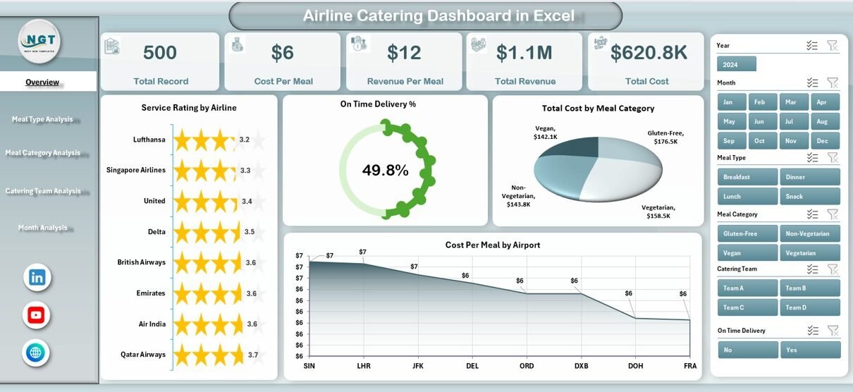
1) What Does the Overview Page Show?
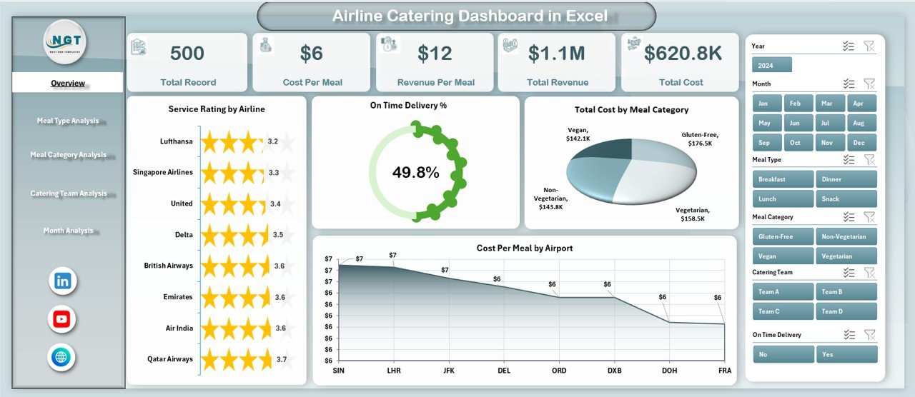
The Overview Page is the main page of the dashboard. It provides a quick summary of overall airline catering performance. Since this page gives a high-level view, it helps users understand the current situation immediately.
Main elements of the Overview Page
-
Right-side slicer for quick filtering
-
4 KPI cards for summary tracking
-
4 analytical charts
Charts included on the Overview Page
-
Service Rating by Airline
-
On-Time Delivery %
-
Total Cost by Meal Category
-
Cost Per Meal by Airport
Why is this page useful?
This page works as the control center of the dashboard. For example, if management wants to know which airline receives the best service rating or which airport has the highest meal cost, they can find the answer quickly. In the same way, they can track whether on-time catering delivery meets operational expectations.
Because everything appears in one place, users can review performance fast and move deeper into detailed pages when needed.
Click to Purchases Airline Catering Dashboard in Excel
2) What Can You Learn from the Meal Type Analysis Page?
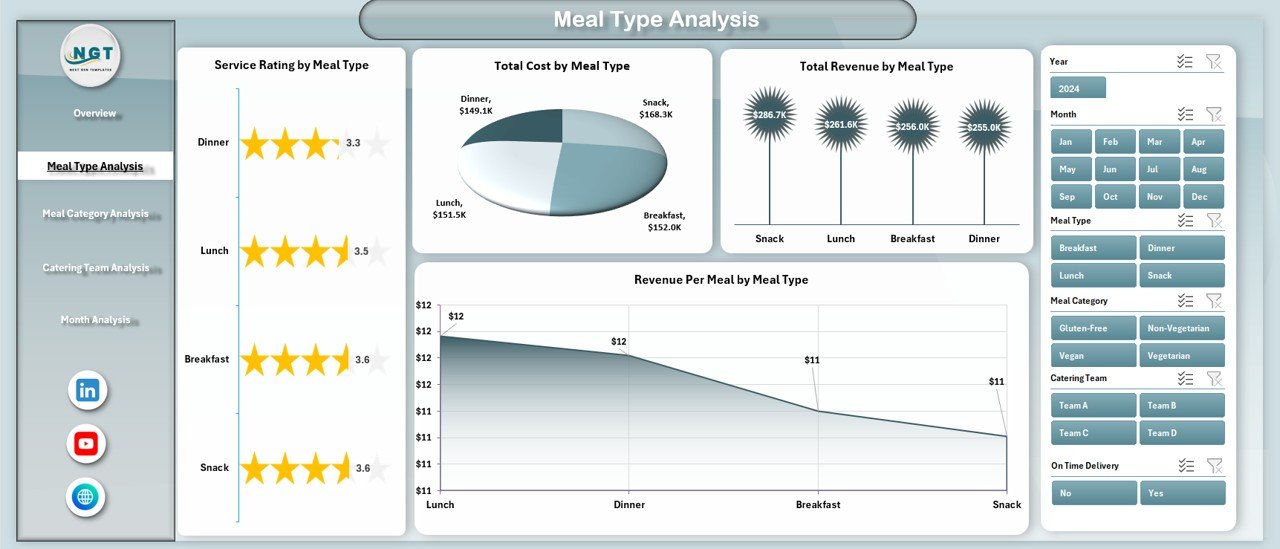
The Meal Type Analysis page focuses on performance by meal type. This helps users understand how different meals contribute to quality, cost, and revenue.
Charts included on this page
-
Service Rating by Meal Type
-
Total Cost by Meal Type
-
Total Revenue by Meal Type
-
Revenue Per Meal by Meal Type
Why does meal type analysis matter?
Different meal types often have different cost structures, preparation needs, and passenger demand. For example:
-
Vegetarian meals may have lower production costs
-
Premium meals may generate better revenue
-
Special meals may require more planning and quality control
Therefore, analyzing meal type performance helps businesses balance customer satisfaction and profitability. In addition, this page makes it easier to identify which meal types deliver strong returns and which ones need review.
3) Why Is Meal Category Analysis Important?
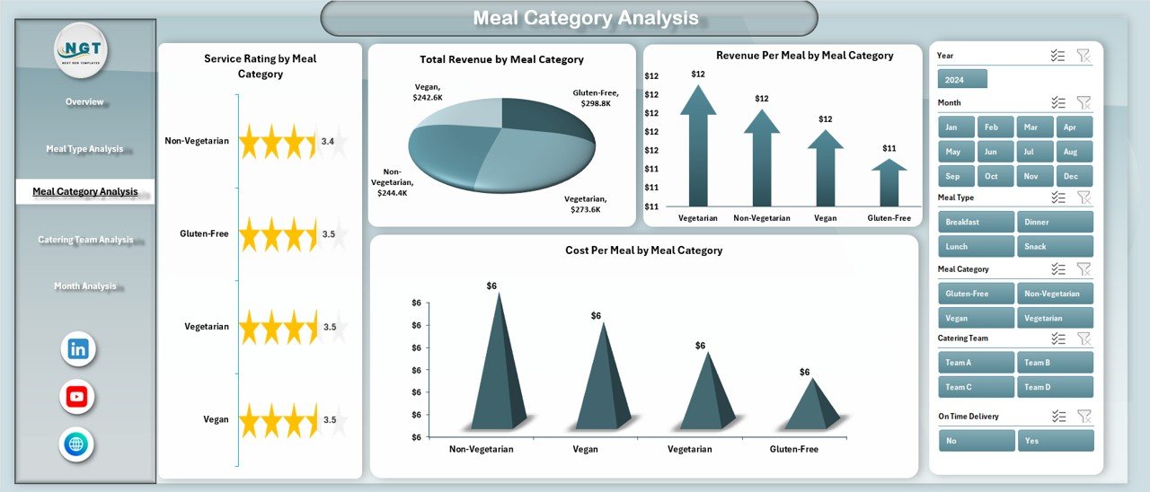
The Meal Category Analysis page gives a more detailed view of meal performance by category. While meal type focuses on broader types, this section helps users evaluate categories based on service and cost behavior.
Charts included on this page
-
Service Rating by Meal Category
-
Total Cost by Meal Category
-
Revenue Per Meal by Meal Category
-
Cost Per Meal by Meal Category
How does this page help decision-makers?
This analysis helps catering managers answer key business questions such as:
-
Which meal categories cost the most?
-
Which category gives better revenue per meal?
-
Which categories need cost optimization?
-
Which categories maintain strong service quality?
As a result, teams can improve menu planning, supplier negotiations, and production efficiency. Moreover, they can focus more on the meal categories that bring the best value.
4) What Insights Does the Catering Team Analysis Page Provide?
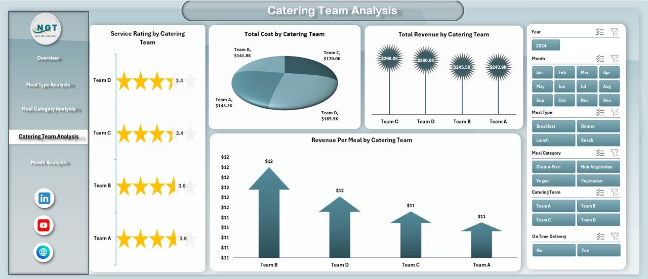
The Catering Team Analysis page measures the performance of different catering teams. Since airline catering depends heavily on execution, this page becomes very important for operational improvement.
Click to Purchases Airline Catering Dashboard in Excel
Charts included on this page
-
Service Rating by Catering Team
-
Total Cost by Catering Team
-
Revenue Per Meal by Catering Team
-
Total Revenue by Catering Team
Why should managers analyze catering teams?
Each catering team may handle meals differently. One team may control costs well, while another may deliver higher service quality. Therefore, managers need a clear comparison of team-level performance.
This page helps users:
-
Measure service quality by team
-
Compare cost efficiency
-
Review team revenue contribution
-
Identify training or process improvement needs
Because of this, the dashboard supports better performance management and accountability.
5) What Can You Track in the Month Analysis Page?
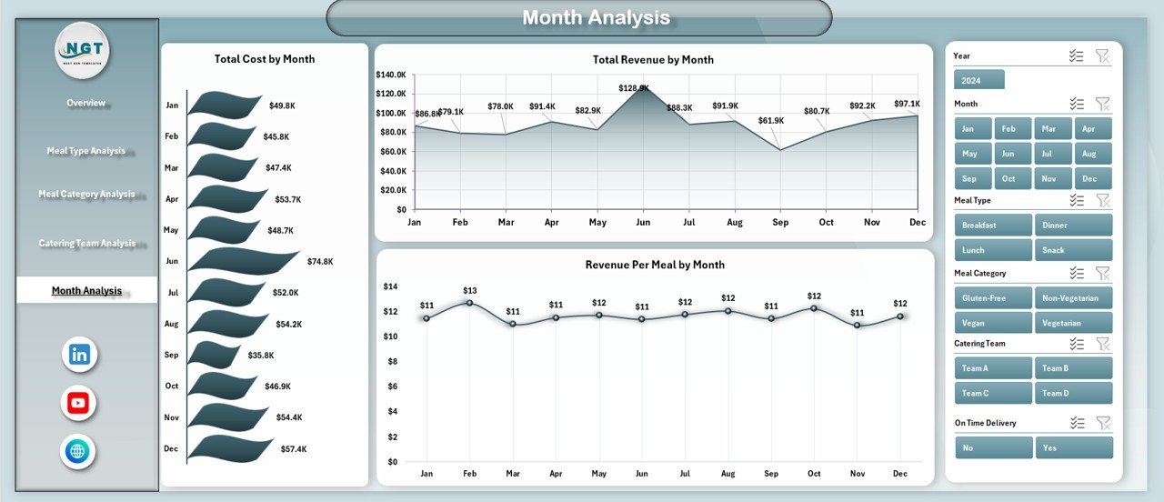
The Month Analysis page focuses on time-based performance. This makes it easier to see trends, patterns, and changes over time.
Charts included on this page
-
Total Cost by Month
-
Total Revenue by Month
-
Revenue Per Meal by Month
Why is monthly analysis useful?
Monthly analysis helps businesses understand whether performance improves, declines, or stays stable over time. For example, managers can review:
-
Seasonal cost changes
-
Revenue growth trends
-
Meal profitability by month
-
Performance patterns during busy travel periods
Therefore, this page supports budgeting, forecasting, and better planning. In addition, users can prepare for peak demand periods more effectively.
What Is the Role of the Support Sheet and Data Sheet?
Along with the five main pages, this dashboard also includes:
Support Sheet
The support sheet usually stores helper tables, backend calculations, lists for slicers, validation data, or formula support. Although end users may not work on this sheet directly, it plays an important role in keeping the dashboard organized and functional.
Data Sheet
The data sheet stores the main raw data used in the dashboard. This may include airline names, airports, meal categories, meal types, costs, revenues, service ratings, months, and catering team details.
Because the dashboard connects to structured data, users can update the source sheet and refresh analysis when new data becomes available.
Which KPIs Can You Track in an Airline Catering Dashboard in Excel?
A strong airline catering dashboard should track both service and financial performance. Based on the dashboard structure, some of the most useful KPIs include:
-
Service Rating
-
On-Time Delivery %
-
Total Cost
-
Total Revenue
-
Cost Per Meal
-
Revenue Per Meal
-
Meal Category Performance
-
Meal Type Performance
-
Airport-Level Catering Cost
-
Team-Level Revenue Contribution
These KPIs help users understand quality, efficiency, and profitability together. As a result, the dashboard becomes much more useful than a simple report.
How Does This Dashboard Improve Airline Catering Operations?
A dashboard should do more than display numbers. It should guide better action. This Airline Catering Dashboard in Excel improves operations in several ways.
Better visibility
First, it brings all major catering data into one place. Therefore, users do not need to open multiple reports.
Faster decision-making
Since charts and KPI cards update the picture clearly, managers can identify issues quickly and act sooner.
Stronger cost control
Because the dashboard tracks total cost and cost per meal across categories, airports, and teams, businesses can control expenses more effectively.
Improved service quality
Service rating and on-time delivery tracking help teams maintain high service standards.
Smarter revenue analysis
Revenue by meal type, category, team, and month helps decision-makers focus on profitable areas.
Easier trend monitoring
With monthly analysis, management can spot performance patterns and plan more effectively.
Advantages of Airline Catering Dashboard in Excel
Using an Airline Catering Dashboard in Excel offers many practical benefits. Since Excel is flexible and user-friendly, businesses can use this tool without investing in a complex system.
1. Easy to use
Excel already feels familiar to many users. Therefore, teams can start using the dashboard quickly.
2. Interactive analysis
With slicers, charts, and page navigation, users can explore data easily and get answers fast.
3. Better cost tracking
The dashboard helps monitor meal cost by category, meal type, airport, and team. As a result, cost leaks become easier to identify.
4. Improved service monitoring
Service rating and on-time delivery metrics show whether the catering operation meets expectations.
5. Supports better planning
Monthly trends help users forecast future demand and allocate resources more effectively.
6. Clear performance comparison
The dashboard makes it easy to compare airlines, teams, meal categories, and airports side by side.
7. Saves reporting time
Instead of creating reports manually every time, users can update data and review ready-made charts instantly.
8. Supports data-driven decisions
Because the dashboard presents facts clearly, managers can make better and faster decisions.
Who Can Benefit from the Airline Catering Dashboard in Excel?
Click to Purchases Airline Catering Dashboard in Excel
This dashboard can help a wide range of users in airline and airport catering operations.
Ideal users include:
-
Airline catering managers
-
Airport food service teams
-
Operations managers
-
Finance teams
-
Quality control teams
-
Airline service performance analysts
-
Catering vendors and service providers
-
Business owners handling food logistics for airlines
Since the dashboard covers service, cost, and revenue together, it supports multiple departments at the same time.
How Can You Use This Dashboard Effectively?
A dashboard gives the best results when teams use it regularly and correctly. Therefore, organizations should follow a simple and structured process.
Step 1: Keep the data sheet updated
Start by entering clean and complete data in the data sheet. Make sure every record includes the correct values.
Step 2: Review the overview page first
Use the overview page for a quick snapshot of current performance.
Step 3: Drill down into detailed pages
After spotting a trend or issue, move to meal type, category, team, or month analysis for deeper review.
Step 4: Compare cost and revenue together
Do not review cost alone. Always compare cost with revenue and service quality.
Step 5: Use the slicers
Filter data by relevant dimensions to analyze performance from different angles.
Step 6: Monitor trends regularly
Review the dashboard weekly or monthly so that problems do not grow unnoticed.
Best Practices for the Airline Catering Dashboard in Excel
To get the most value from the dashboard, users should follow some best practices. These practices improve reliability, clarity, and decision-making.
Keep data accurate
Always use correct and complete source data. If the input contains errors, the dashboard will also show incorrect results.
Standardize categories
Use the same naming style for airlines, meal types, categories, airports, and teams. This avoids duplicate entries and wrong grouping.
Update data on time
Enter new records regularly. Timely updates ensure that reports reflect the latest performance.
Focus on key KPIs
Do not overload the dashboard with unnecessary metrics. Instead, focus on the KPIs that support better catering decisions.
Review monthly trends
Monthly analysis often reveals patterns that daily views may miss. Therefore, use month-based charts for planning and forecasting.
Compare quality with cost
A lower cost does not always mean better performance. Always compare service rating and on-time delivery with financial results.
Train the users
Make sure that the team understands how to use slicers, navigate pages, and interpret charts.
Protect the support sheet
If the support sheet contains formulas and backend logic, protect it from accidental editing.
Use visual consistency
Clear labels, proper formatting, and logical chart placement improve readability and make analysis easier.
Back up the file
Since Excel dashboards hold valuable data and analysis, keep backup copies regularly.
What Makes Excel a Good Choice for an Airline Catering Dashboard?
Many organizations choose Excel because it offers the right balance of flexibility and simplicity.
Reasons Excel works well:
-
Easy to customize
-
Supports pivot tables and pivot charts
-
Allows slicers for interactivity
-
Good for small and medium-sized reporting needs
-
Easy to share across teams
-
Suitable for regular operational analysis
-
Works well with structured data tables
Therefore, Excel remains a strong choice for dashboard reporting, especially for teams that want practical analysis without a heavy software setup.
What Business Questions Can This Dashboard Answer?
Click to Purchases Airline Catering Dashboard in Excel
A well-designed dashboard should answer real business questions. This Airline Catering Dashboard in Excel helps answer questions such as:
-
Which airline has the highest service rating?
-
Are deliveries reaching flights on time?
-
Which meal category creates the highest cost?
-
Which airport has the highest cost per meal?
-
Which meal type generates the most revenue?
-
Which catering team performs best?
-
How does revenue per meal change over time?
-
Which months show strong or weak performance?
Because the dashboard answers these questions visually, decision-makers can act much faster.
How Does This Dashboard Help with Profitability?
Profitability matters in airline catering because food service directly affects cost, customer experience, and contract value. This dashboard supports profitability by showing where money comes from and where it goes.
For example, users can:
-
Identify costly meal categories
-
Review revenue per meal by type
-
Compare team-level revenue contribution
-
Track monthly revenue trends
-
Spot inefficient operations early
As a result, businesses can improve both financial performance and service delivery at the same time.
Conclusion
The Airline Catering Dashboard in Excel is a practical, interactive, and business-focused solution for monitoring airline catering performance. It helps users track service rating, on-time delivery, meal cost, revenue, cost per meal, and monthly trends from one structured dashboard.
Because this dashboard includes five analytical pages, users can move from a high-level overview to deeper operational analysis with ease. In addition, the page navigator, slicers, support sheet, and data sheet make the dashboard organized and simple to use.
Most importantly, this dashboard helps airlines and catering providers improve decision-making, control costs, increase service quality, and understand revenue performance more clearly. Therefore, if you want a better way to manage airline catering operations, this Excel dashboard can become a very valuable tool.
Frequently Asked Questions with Answers
1. What is an Airline Catering Dashboard in Excel?
An Airline Catering Dashboard in Excel is an interactive reporting tool that tracks airline meal service performance, costs, revenues, service quality, and monthly trends using charts, KPI cards, and slicers.
2. Who should use this dashboard?
Airline catering managers, airport operations teams, finance teams, catering vendors, and quality control professionals can all use this dashboard.
3. How many pages are included in this dashboard?
This dashboard includes 5 main analytical pages:
Overview, Meal Type Analysis, Meal Category Analysis, Catering Team Analysis, and Month Analysis.
4. What can I analyze on the Overview Page?
You can review Service Rating by Airline, On-Time Delivery %, Total Cost by Meal Category, and Cost Per Meal by Airport, along with KPI summary cards.
5. Why is meal type analysis useful?
Meal type analysis helps users compare cost, revenue, and service rating across different meal types. Therefore, it supports better menu and profitability decisions.
6. What does the Month Analysis page show?
The Month Analysis page shows Total Cost by Month, Total Revenue by Month, and Revenue Per Meal by Month, which helps track trends over time.
7. Can I update the dashboard with new data?
Yes, you can update the data sheet with new records. After that, the dashboard can reflect the latest performance data.
8. Why is Excel a good platform for this dashboard?
Excel is flexible, easy to use, widely available, and strong for pivot tables, charts, slicers, and interactive analysis.
9. Does this dashboard help reduce catering costs?
Yes, it helps users identify high-cost meal categories, airports, and teams. As a result, businesses can take action to improve cost efficiency.
10. Can this dashboard improve service quality?
Yes, by tracking service rating and on-time delivery, the dashboard helps management monitor quality and improve customer experience.
Visit our YouTube channel to learn step-by-step video tutorials