The airline industry runs on accuracy, timely decisions, and constant performance monitoring. Flight operations, customer service, fuel management, crew efficiency, and cost control demand data clarity every day. However, aviation teams often struggle because they review multiple spreadsheets and outdated reports. This slows down decision-making and hides important insights.
An Airlines KPI Dashboard in Power BI solves these problems. It brings all airline-related KPIs into one clean, interactive, and visually rich dashboard. You monitor performance month-to-date (MTD), year-to-date (YTD), and compare current trends with previous years. Since the dashboard takes input from a structured Excel file, you refresh it anytime without creating new reports.
In this detailed guide, you will discover what this dashboard includes, how each page works, what KPIs it tracks, and how airlines use it for faster and smarter decisions.
Click to Purchases Airlines KPI Dashboard in Power BI
What Is an Airlines KPI Dashboard in Power BI?
An Airlines KPI Dashboard in Power BI is a ready-to-use aviation analytics tool that converts raw Excel data into meaningful visuals. It helps airline management teams track flight trends, operational efficiency, and performance KPIs instantly. Moreover, the dashboard organizes KPI data by groups, trends, and comparisons, which makes it easier to understand real-time performance.
This dashboard supports airline departments such as:
-
Flight Operations
-
Airport Management
-
Finance & Cost Control
-
Ground Handling
-
Route Performance
-
Customer Experience
-
Revenue Management
Since the dashboard updates instantly when you refresh the Excel file, you get real-time clarity across all KPIs.
Click to Purchases Airlines KPI Dashboard in Power BI
Key Features of the Airlines KPI Dashboard in Power BI
This dashboard includes three structured pages:
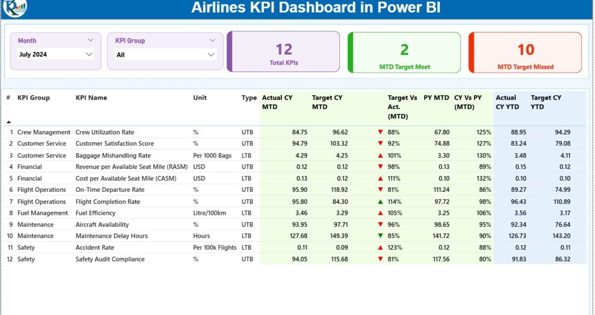
1. Summary Page – The Main Airline KPI Control Center
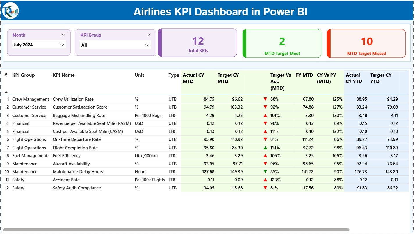
The Summary Page works as the core of the dashboard. It gives an instant view of MTD and YTD performance across all KPIs.
Top Slicers for Quick Filtering
You get two slicers:
-
Month Slicer – Select any month to filter all visuals instantly.
-
KPI Group Slicer – Choose KPI categories for deeper analysis.
These slicers help airline teams switch between months and performance categories without effort.
Insightful KPI Cards
Right below the slicers, you see three important performance cards:
-
Total KPIs Count
-
MTD Target Met Count
-
MTD Target Missed Count
These cards show the overall performance health at a glance.
Detailed KPI Performance Table
The performance table displays all KPI data, including:
-
KPI Number
-
KPI Group
-
KPI Name
-
Unit of Measurement
-
KPI Type (LTB/UTB)
-
Actual CY MTD
-
Target CY MTD
-
MTD Icon (▲ green for good, ▼ red for warning)
-
Target vs Actual (MTD%)
-
PY MTD
-
CY vs PY (MTD%)
-
Actual CY YTD
-
Target CY YTD
-
YTD Icon (▲ / ▼)
-
Target vs Actual (YTD%)
-
PY YTD
-
CY vs PY (YTD%)
This table gives a complete understanding of monthly and yearly performance. Airline managers use this data to analyze delays, fuel consumption, seat occupancy, and cost patterns.
Click to Purchases Airlines KPI Dashboard in Power BI
2. KPI Trend Page

The KPI Trend Page helps you understand performance patterns across different months and years. It answers important questions like:
-
Do we perform better than the previous year?
-
Do certain months show more flight delays or higher costs?
-
Do we meet our annual targets?
-
Should we adjust budgets or operational strategies?
Two Powerful Combo Charts
The page includes two combo charts that show:
-
Current Year Actuals
-
Previous Year Actuals
-
Target Values
You see this data for both MTD and YTD, making comparison effortless.
KPI Selection Slicer
A slicer on the left helps you filter data by any KPI. When you choose one KPI, both charts update instantly.
This feature helps aviation leaders understand patterns such as:
-
Seasonal travel trends
-
Cost behaviour
-
Passenger demand fluctuations
-
Fuel consumption changes
-
On-time performance improvement or decline
3. KPI Definition Page
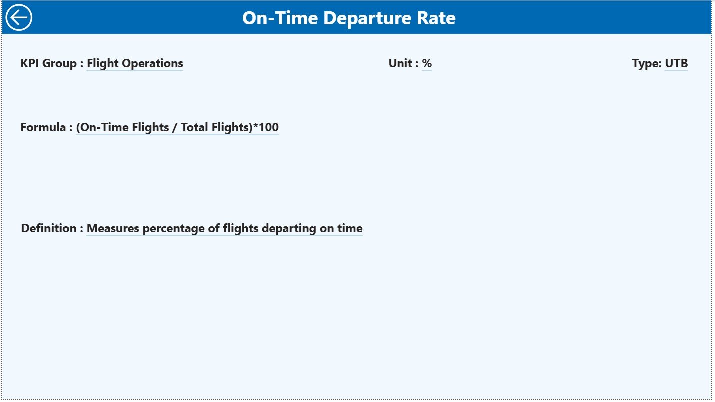
The KPI Definition Page works as a drill-through page. When you click on any KPI in the Summary Page and choose “Drill Through”, you open a detailed explanation of that KPI.
This page shows:
-
KPI Name
-
KPI Number
-
KPI Group
-
Unit
-
Formula
-
KPI Definition
-
Type (LTB or UTB)
This feature provides clarity, especially when new team members join or when performing performance reviews.
You return to the main Summary Page by clicking the Back button on the top-left corner.
How the Excel Data Structure Supports This Dashboard
This dashboard connects to a clean and organized Excel file. You fill three sheets:
1. Input_Actual Sheet
You enter:
-
KPI Name
-
Month (first date of the month)
-
MTD Actual
-
YTD Actual
This sheet holds real performance numbers.
2. Input_Target Sheet
You enter:
-
KPI Name
-
Month
-
MTD Target
-
YTD Target
These values represent airline performance goals.
3. KPI Definition Sheet
You maintain KPI details including:
-
KPI Number
-
KPI Group
-
KPI Name
-
Unit
-
Formula
-
Definition
-
Type (LTB / UTB)
Power BI uses this sheet to provide clarity inside the dashboard.
Click to Purchases Airlines KPI Dashboard in Power BI
Why Should Airlines Use This KPI Dashboard?
The airline industry faces challenges such as:
-
Fluctuating travel demand
-
Rising operational costs
-
Crew management complexity
-
Seasonal revenue variation
-
Changing customer expectations
-
Fuel price volatility
This dashboard helps you manage these challenges because it:
-
Highlights performance strengths
-
Shows gaps in targets
-
Tracks improvements and declines
-
Builds data confidence among teams
-
Reduces dependency on manual reports
Since Power BI offers clean visuals and drill-through features, teams gain better control over airline performance.
Click to Purchases Airlines KPI Dashboard in Power BI
Advantages of the Airlines KPI Dashboard in Power BI
1. Faster and Smarter Decisions
Leaders see real-time performance and respond quickly.
2. Better Clarity Across Departments
Team members understand KPIs clearly because definitions and formulas stay visible.
3. Accurate Trends and Comparison
You compare current performance with targets and previous years.
4. Higher Accountability
KPIs highlight strengths and weaknesses, which improves accountability.
5. Improved Operational Management
You track fuel usage, delays, aircraft performance, passenger volume, and cost metrics easily.
6. No Manual Reporting
You refresh the file and Power BI updates all visuals instantly.
7. Easy to Expand
You add more KPIs whenever your airline operations grow.
Best Practices for Using the Airlines KPI Dashboard in Power BI
1. Keep KPI Names Consistent
Inconsistent names can break visual mappings.
2. Update Actuals and Targets Regularly
Weekly or monthly updates help maintain accuracy.
3. Review Trends Before Meetings
Trend charts show early warning signals.
4. Use Drill-Through for KPI Clarity
Check KPI definitions before making decisions.
5. Share Dashboard Access With Teams
Empower staff to take data-driven decisions.
6. Refresh Excel Data Correctly
Always maintain correct date formats and unique KPI names.
7. Add New KPIs Over Time
Your dashboard must grow with your airline.
How Does This Dashboard Improve Airline Performance?
This dashboard improves performance because it:
-
Shows gaps in MTD and YTD
-
Highlights issues before they become larger
-
Improves coordination between departments
-
Supports monthly and quarterly reviews
-
Reduces time spent preparing reports
-
Increases focus on important KPIs
As a result, airlines improve operational discipline, customer experience, and route profitability.
Conclusion
The Airlines KPI Dashboard in Power BI helps aviation leaders track performance metrics quickly and accurately. It brings all operational KPIs into one clean platform where teams analyze trends, check targets, and compare results with previous years. Since it connects with a simple Excel file, you enjoy fast updates and consistent reporting.
When airlines use this dashboard regularly, they improve decision-making, reduce errors, and strengthen overall performance. This dashboard becomes an essential tool for every aviation department.
Frequently Asked Questions (FAQs)
1. What KPIs do airlines track?
Airlines track on-time performance, fuel efficiency, cost per seat, revenue per flight, passenger load factor, safety KPIs, and crew efficiency.
2. Can I add new KPIs to this dashboard?
Yes, you can add them through the KPI Definition sheet and update the Actual and Target sheets.
3. Do I need Power BI knowledge to use this dashboard?
Basic knowledge helps, but most of the dashboard runs automatically.
4. How often should I update the data?
You can update daily, weekly, or monthly depending on your analysis needs.
5. Does the dashboard support drill-through?
Yes, you can drill through to see KPI definitions and formulas.
6. Can I share the dashboard with my team?
Yes, you can publish it to Power BI Service for organization-wide access.
7. Can I customize the visuals?
Yes, Power BI allows full customization of charts, colors, and layouts.
Click to Purchases Airlines KPI Dashboard in Power BI
Visit our YouTube channel to learn step-by-step video tutorials
Watch the step-by-step video tutorial: