Airport security plays a critical role in ensuring passenger safety, preventing security threats, and maintaining smooth airport operations. Every day, airport authorities manage thousands of passengers, security checks, incidents, and operational activities across multiple security zones and shifts. As airport operations grow, security teams must monitor incident records, processing time, operating costs, complaint levels, and risk indicators efficiently.
However, when security departments rely on scattered spreadsheets or manual reports, they often struggle to identify patterns, track performance, and respond to security risks quickly. Decision-makers need a clear and centralized system that transforms raw security data into actionable insights.
Click to Purchases Airport Security Services Dashboard in Excel
This is where the Airport Security Services Dashboard in Excel becomes extremely valuable.
The Airport Security Services Dashboard in Excel provides a ready-to-use analytical tool that helps airport authorities monitor security incidents, evaluate operational efficiency, track costs, and analyze risk levels across different security zones and shifts. Moreover, the dashboard converts complex data into visual insights using KPI cards, pivot charts, and interactive slicers.
In this comprehensive article, we will explore how the Airport Security Services Dashboard in Excel works, what features it provides, and how airport management teams can use it to improve security operations.
Why Do Airports Need a Security Services Dashboard?
Airports handle large volumes of passengers and cargo daily. Therefore, security teams must monitor many variables simultaneously, including security incidents, inspection processing time, complaints, and risk levels.
Without a proper monitoring system, airport authorities may face several challenges:
-
Delays in incident resolution
-
Difficulty tracking high-risk security zones
-
Poor visibility into operational costs
-
Limited ability to monitor performance across shifts
-
Inefficient reporting and manual analysis
However, when airports implement a security services dashboard, they gain instant access to performance indicators.
For example, airport management can quickly answer questions such as:
-
Which security zones report the highest incidents?
-
Which shift handles the most security events?
-
How long does it take to process incidents?
-
Which areas generate the highest operating costs?
-
When do high-risk incidents occur most frequently?
Therefore, a dashboard helps security teams monitor operations in real time and make faster decisions.
What is the Airport Security Services Dashboard in Excel?
The Airport Security Services Dashboard in Excel is an interactive analytical template designed to monitor security operations across an airport environment.
This dashboard allows airport authorities to track multiple performance indicators such as:
-
Total security incidents
-
High-risk level incidents
-
Security zone performance
-
Processing time for security cases
-
Customer complaints
-
Operating costs
-
Monthly security trends
Because Excel supports pivot tables, slicers, and dynamic charts, users can filter data instantly and analyze security performance from different perspectives.
Moreover, the dashboard organizes information across multiple analytical pages, which makes navigation easy and efficient.
Key Features of the Airport Security Services Dashboard in Excel
The dashboard includes several powerful features that help security teams analyze airport operations effectively.
Page Navigator
The Page Navigator sits on the left side of the dashboard. It allows users to move quickly between analytical pages without scrolling through multiple worksheets.
As a result, airport managers can instantly access different analysis sections.
Interactive Slicers
Each dashboard page includes slicers that allow users to filter data based on different criteria such as:
-
Security Zone
-
Shift
-
Incident Type
-
Month
-
Resolution Status
Therefore, decision-makers can focus on specific security areas when needed.
KPI Cards
The dashboard displays four KPI cards that highlight important metrics such as:
-
High Risk Level Percentage
-
Total Security Records
-
Operating Costs
-
Resolution Status Performance
These KPI cards help airport authorities monitor key performance indicators quickly.
Dynamic Pivot Charts
All visualizations use Excel pivot charts, which means users can update the dataset and instantly refresh the dashboard.
Click to Purchases Airport Security Services Dashboard in Excel
How is the Airport Security Dashboard Structured?
The dashboard contains five analytical pages, and each page focuses on a different aspect of airport security performance.
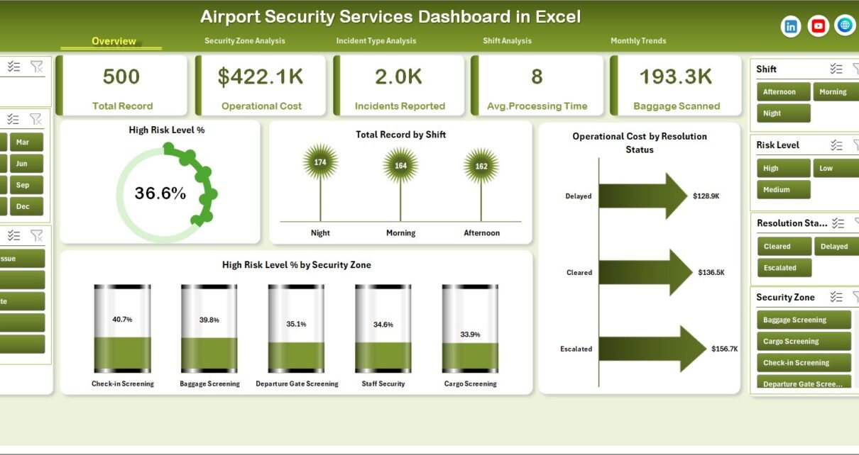
1. Overview Page – The Main Security Performance Dashboard
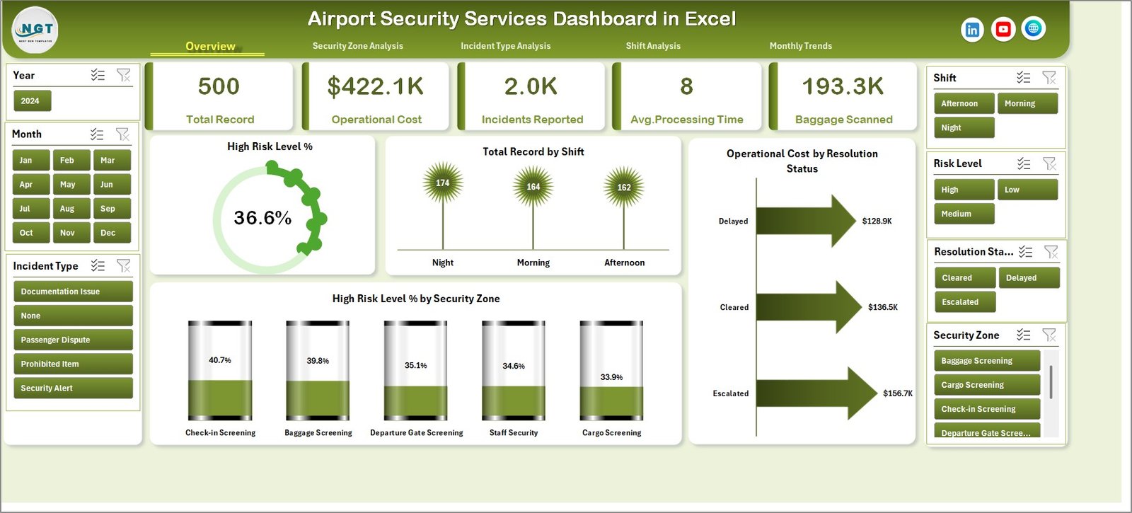
The Overview Page serves as the central monitoring page for airport security services.
This page includes:
KPI Cards
-
High Risk Level %
-
Total Records
-
Operating Cost
-
Resolution Status
Charts
-
High Risk Level % – Shows the percentage of incidents classified as high-risk.
-
Total Record by Shift – Displays the number of security incidents handled in each shift.
-
Operating Cost by Resolution Status – Shows how operating costs vary depending on incident resolution outcomes.
-
High Risk Level % by Security Zone – Highlights zones with the highest risk levels.
Therefore, airport authorities can quickly understand overall security performance.
2. Security Zone Analysis
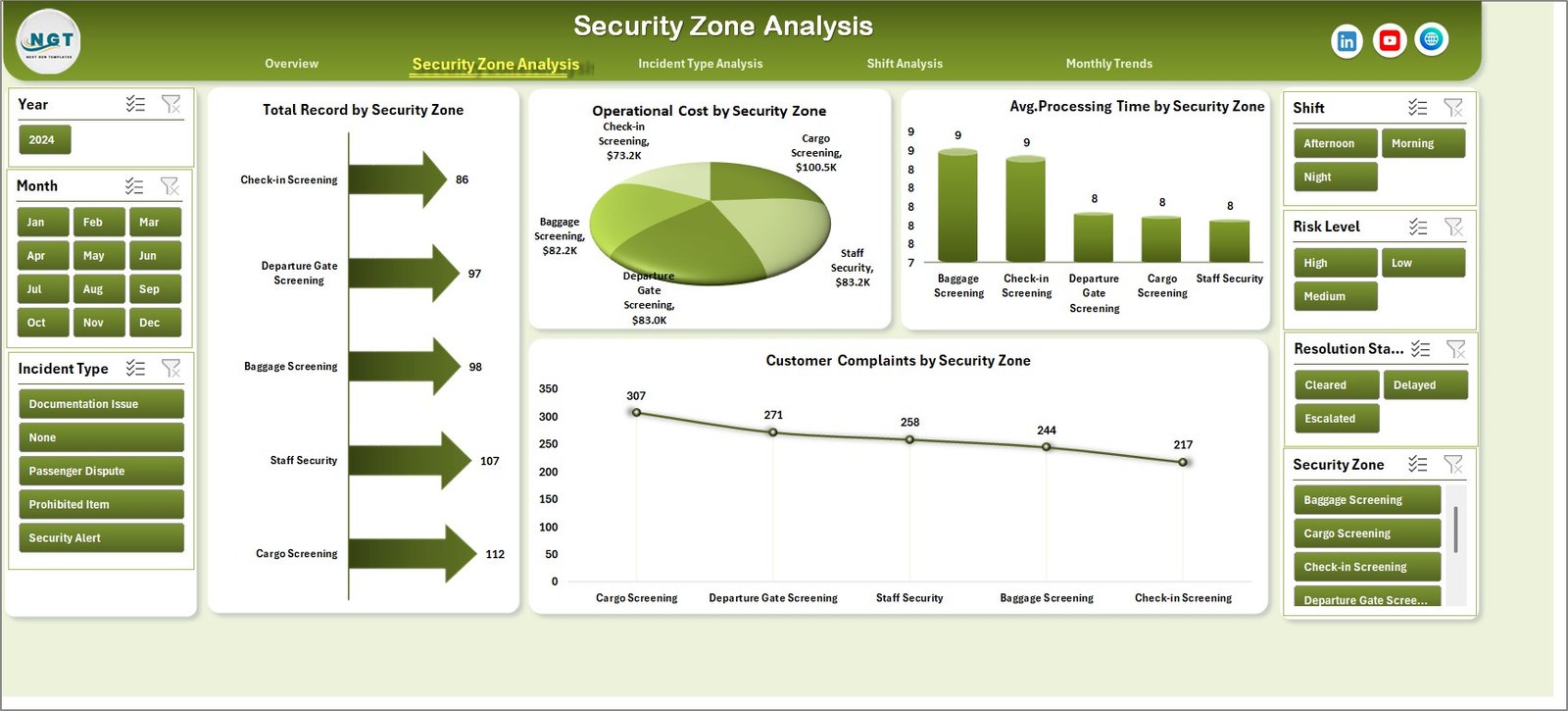
Different airport zones face different types of security challenges. For example, passenger terminals, baggage areas, and cargo zones often show different risk patterns.
The Security Zone Analysis Page helps management understand zone-based performance.
Charts included:
-
Total Record by Security Zone – Shows how many incidents occur in each security zone.
-
Operating Cost by Security Zone – Highlights zones that generate higher security costs.
-
Average Processing Time by Security Zone – Measures efficiency across zones.
-
Customer Complaints by Security Zone – Tracks passenger feedback related to security services.
Therefore, management teams can identify problematic zones and improve security operations.
Click to Purchases Airport Security Services Dashboard in Excel
3. Incident Type Analysis
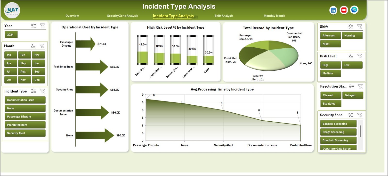
Security incidents can vary widely, including unauthorized access attempts, baggage alerts, restricted item detections, and passenger disputes.
The Incident Type Analysis Page helps teams understand how different incidents impact operations.
Charts included:
-
Total Record by Incident Type – Displays the frequency of each incident type.
-
Operating Cost by Incident Type – Shows which incidents require higher resources.
-
High Risk Level % by Incident Type – Identifies incidents that pose higher security risks.
-
Average Processing Time by Incident Type – Measures how quickly teams resolve each incident category.
As a result, security managers can allocate resources effectively.
4. Shift Analysis
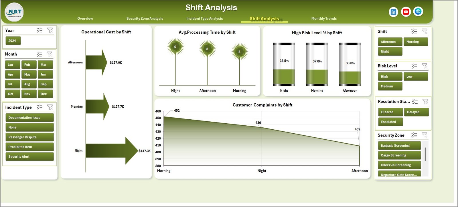
Airport security operates 24/7, and different shifts may experience different workloads and risk levels.
The Shift Analysis Page allows managers to evaluate shift performance.
Charts included:
-
Operating Cost by Shift – Shows cost distribution across shifts.
-
Average Processing Time by Shift – Evaluates operational efficiency.
-
High Risk Level % by Shift – Identifies shifts with higher security threats.
-
Customer Complaints by Shift – Measures service quality across shifts.
Therefore, airport management can optimize staffing and resources.
Click to Purchases Airport Security Services Dashboard in Excel
5. Month Analysis
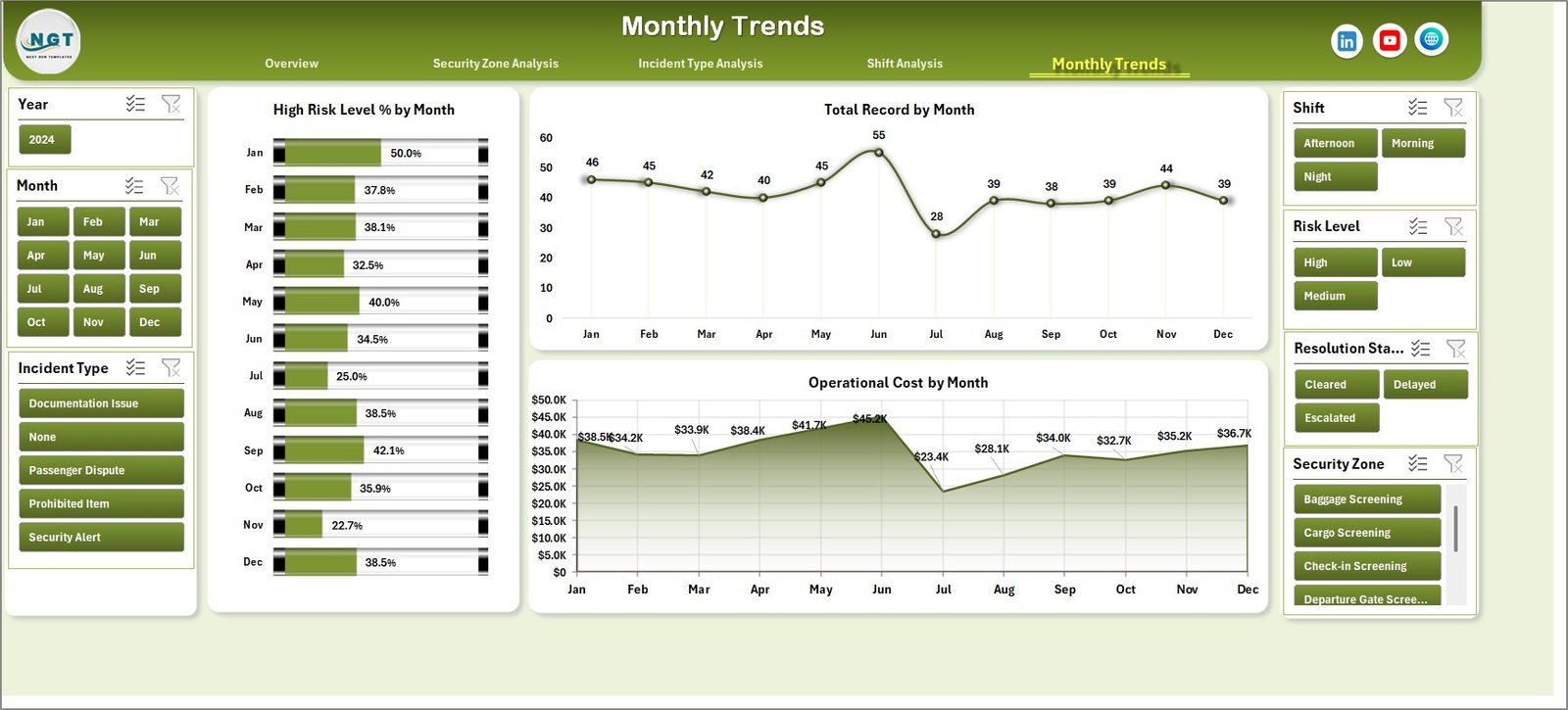
Security patterns often change over time due to travel seasons, passenger traffic, and operational changes.
The Month Analysis Page helps airport teams understand these trends.
Charts included:
-
High Risk Level % by Month
-
Total Record by Month
-
Operating Cost by Month
This page helps airport authorities monitor seasonal trends and prepare for peak travel periods.
Advantages of the Airport Security Services Dashboard in Excel
The dashboard offers several benefits for airport authorities and security teams.
Improved Security Monitoring
-
Helps teams track security incidents in real time
-
Highlights high-risk areas quickly
Faster Decision Making
-
Provides instant insights through visual charts
-
Reduces manual reporting time
Cost Management
-
Identifies zones with high operational costs
-
Helps optimize security resources
Performance Evaluation
-
Measures processing time and incident resolution
-
Evaluates shift performance
Better Passenger Experience
-
Tracks customer complaints
-
Helps improve security service quality
Opportunities for Improvement in Airport Security Analytics
Although the dashboard provides valuable insights, organizations can further improve their security analytics.
Real-Time Data Integration
Integrating real-time security systems can improve monitoring accuracy.
AI-Based Risk Prediction
Machine learning can predict potential security threats.
Integration with CCTV Analytics
Security dashboards can connect with surveillance systems.
Automated Alerts
Systems can send alerts when risk levels exceed thresholds.
Mobile Dashboard Access
Security managers can monitor performance through mobile dashboards.
Best Practices for the Airport Security Services Dashboard
To get the best results from the dashboard, airport teams should follow several best practices.
Maintain Accurate Data
Ensure that all incident records are entered correctly.
Update Data Regularly
Security teams should update records daily.
Standardize Incident Categories
Use consistent incident classifications.
Monitor KPIs Weekly
Review dashboard metrics regularly.
Train Security Staff
Ensure that staff understand how to use the dashboard.
How Does the Data Sheet Support the Dashboard?
The Data Sheet stores the main dataset used to generate pivot tables and charts.
Typical columns may include:
-
Incident ID
-
Date
-
Month
-
Security Zone
-
Shift
-
Incident Type
-
Risk Level
-
Resolution Status
-
Processing Time
-
Operating Cost
-
Customer Complaint
When users update this data sheet, Excel automatically refreshes pivot tables and charts.
How Can Airports Use This Dashboard for Decision-Making?
Click to Purchases Airport Security Services Dashboard in Excel
Airport authorities can use the dashboard in several ways.
Identify High-Risk Zones
Security teams can increase patrols in risky areas.
Improve Incident Response Time
Managers can monitor processing efficiency.
Optimize Staffing
Shift analysis helps allocate staff correctly.
Reduce Operational Costs
Managers can analyze cost-heavy incident types.
Improve Passenger Satisfaction
Customer complaint analysis helps improve service quality.
Conclusion
Airport security operations require constant monitoring, efficient resource allocation, and quick decision-making. However, manual reporting systems often fail to provide clear visibility into security performance.
The Airport Security Services Dashboard in Excel solves this problem by converting complex security data into easy-to-understand visual insights. With KPI cards, pivot charts, and interactive slicers, airport authorities can monitor incidents, evaluate costs, analyze risk levels, and improve operational efficiency.
Moreover, the dashboard helps airport management identify high-risk zones, improve shift performance, and enhance passenger safety. Because Excel offers flexibility and dynamic data analysis, this dashboard provides a practical solution for airport security analytics.
Therefore, organizations that implement such dashboards can improve both security performance and operational efficiency.
Frequently Asked Questions (FAQs)
What is an Airport Security Services Dashboard in Excel?
An Airport Security Services Dashboard in Excel is an analytical tool that helps airport authorities monitor security incidents, operating costs, risk levels, and operational performance using charts and KPI indicators.
Why should airports use a security dashboard?
Airports should use a security dashboard because it helps track incidents, identify high-risk zones, monitor costs, and improve decision-making through visual insights.
What type of data is required for this dashboard?
Typical data includes incident records, security zones, shifts, incident types, processing time, operating costs, and customer complaints.
Can Excel handle airport security analytics effectively?
Yes. Excel supports pivot tables, charts, slicers, and formulas that allow users to build powerful analytical dashboards.
Visit our YouTube channel to learn step-by-step video tutorials