Managing airport operations has never been simple. Airports handle thousands of flights, passengers, baggage movements, and airline operations every single day. Therefore, even a small disruption can create delays, operational losses, and passenger dissatisfaction. Because of this complexity, airport authorities and airline teams need a clear, real-time, and data-driven view of operations.
That is exactly where an Airports Dashboard in Power BI becomes extremely valuable.
Instead of working with scattered reports, static Excel files, or delayed summaries, this dashboard converts raw aviation data into interactive, visual, and actionable insights. As a result, decision-makers can quickly identify flight delays, baggage issues, airline performance, and regional trends.
In this detailed guide, you will learn what an Airports Dashboard in Power BI is, how it works, why it matters, and how each dashboard page supports smarter airport management. Additionally, you will explore its advantages, best practices, and frequently asked questions.
Click to Purchases Airports Dashboard in Power BI
What Is an Airports Dashboard in Power BI?
An Airports Dashboard in Power BI is an interactive analytics solution designed to track, monitor, and analyze airport and flight operations in one centralized platform.
Instead of reviewing multiple reports or waiting for end-of-day summaries, users can instantly monitor:
-
Scheduled flights
-
Delayed and cancelled flights
-
Baggage issues
-
Airline-wise performance
-
Airport code and region-level trends
-
Monthly flight behavior
Because the dashboard runs on Power BI, it remains dynamic, filterable, and visually rich. Moreover, users can apply slicers to drill down into specific airlines, regions, airport codes, or months.
Why Do Airports Need a Power BI Dashboard?
Airports generate massive volumes of operational data every day. However, raw data alone does not support quick decisions. Therefore, airports need analytics that explain what is happening, why it is happening, and where action is required.
An Airports Dashboard in Power BI helps because it:
-
Centralizes all flight and baggage data
-
Highlights delays and disruptions instantly
-
Improves operational transparency
-
Supports proactive decision-making
-
Reduces dependency on manual reporting
As a result, airport operations teams shift from reactive firefighting to proactive management.
How Does an Airports Dashboard in Power BI Work?
The dashboard typically connects to structured datasets such as:
-
Flight schedules
-
Actual departure and arrival data
-
Delay reasons and durations
-
Baggage handling records
-
Airport codes and regions
-
Airline master data
After that, Power BI processes and models this data. Then, it displays the insights through cards, charts, and interactive visuals.
Because slicers are available, users can filter insights by:
-
Airline
-
Airport code
-
Region
-
Flight type
-
Month
As a result, every stakeholder sees exactly the information they need.
What Are the Key Pages in an Airports Dashboard in Power BI?
This Airports Dashboard in Power BI includes five well-structured analytical pages. Each page focuses on a specific operational area and supports data-driven decisions.
Let us explore each page in detail.
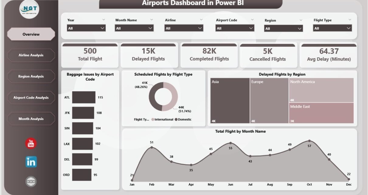
Overview Page: What Is Happening Across the Airport Network?
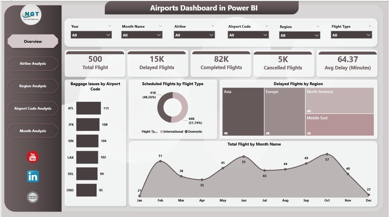
The Overview Page acts as the central control panel of the dashboard. It provides a high-level snapshot of overall airport operations.
Key Features of the Overview Page
This page includes slicers that allow users to filter the data easily. In addition, it displays key performance cards and charts such as:
-
Baggage Issues by Airport Code
-
Scheduled Flights by Flight Type
-
Delayed Flights by Region
-
Total Flights by Month Name
Why Is the Overview Page Important?
Because this page summarizes the entire operation, it helps users:
-
Identify airports with frequent baggage issues
-
Compare scheduled versus delayed flights
-
Detect regional delay patterns
-
Track monthly flight volumes
As a result, leaders can quickly understand where attention is required.
Click to Purchases Airports Dashboard in Power BI
Airline Analysis Page: Which Airlines Perform Better or Worse?
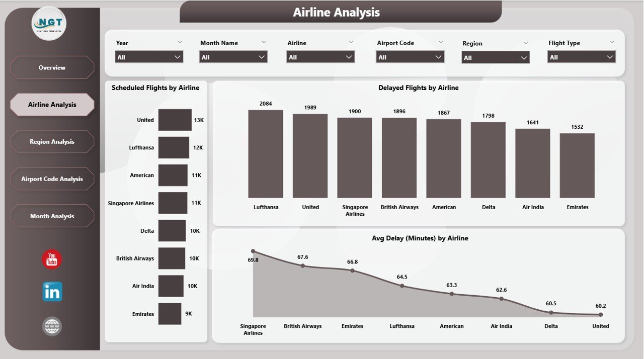
The Airline Analysis Page focuses on airline-wise operational performance. This page becomes critical for both airport authorities and airline partners.
Key Charts in Airline Analysis
The page includes slicers and the following visualizations:
-
Scheduled Flights by Airline
-
Delayed Flights by Airline
-
Average Delay by Airline
How Does Airline Analysis Help?
This page helps stakeholders:
-
Compare airline punctuality
-
Identify airlines with frequent delays
-
Monitor average delay duration
-
Support performance reviews and discussions
Because airline performance directly impacts passenger experience, this analysis becomes essential for improving service quality.
Click to Purchases Airports Dashboard in Power BI
Region Analysis Page: Which Regions Face More Operational Challenges?
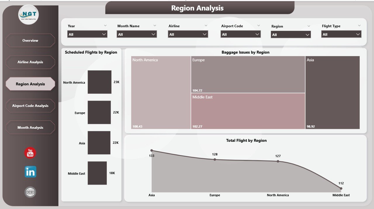
The Region Analysis Page highlights performance patterns at a geographical level. Airports often manage multiple regions, and each region may face unique challenges.
Key Charts in Region Analysis
This page includes:
-
Scheduled Flights by Region
-
Baggage Issues by Region
-
Total Flights by Region
Why Is Region Analysis Valuable?
With this page, operations teams can:
-
Identify regions with higher baggage problems
-
Detect regions with frequent delays
-
Allocate resources more effectively
-
Plan regional improvements
As a result, airport management gains better control over regional operations.
Airport Code Analysis Page: Which Airports Need Immediate Attention?
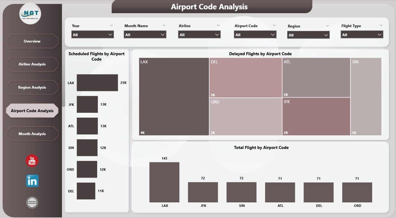
The Airport Code Analysis Page focuses on performance at the individual airport level.
Key Charts in Airport Code Analysis
This page displays:
-
Scheduled Flights by Airport Code
-
Delayed Flights by Airport Code
-
Total Flights by Airport Code
How Does Airport Code Analysis Support Decisions?
This page allows users to:
-
Compare airport performance instantly
-
Identify airports with high delays
-
Monitor workload distribution
-
Prioritize operational improvements
Therefore, airport managers can act quickly where performance drops.
Click to Purchases Airports Dashboard in Power BI
Month Analysis Page: How Do Flights Perform Over Time?
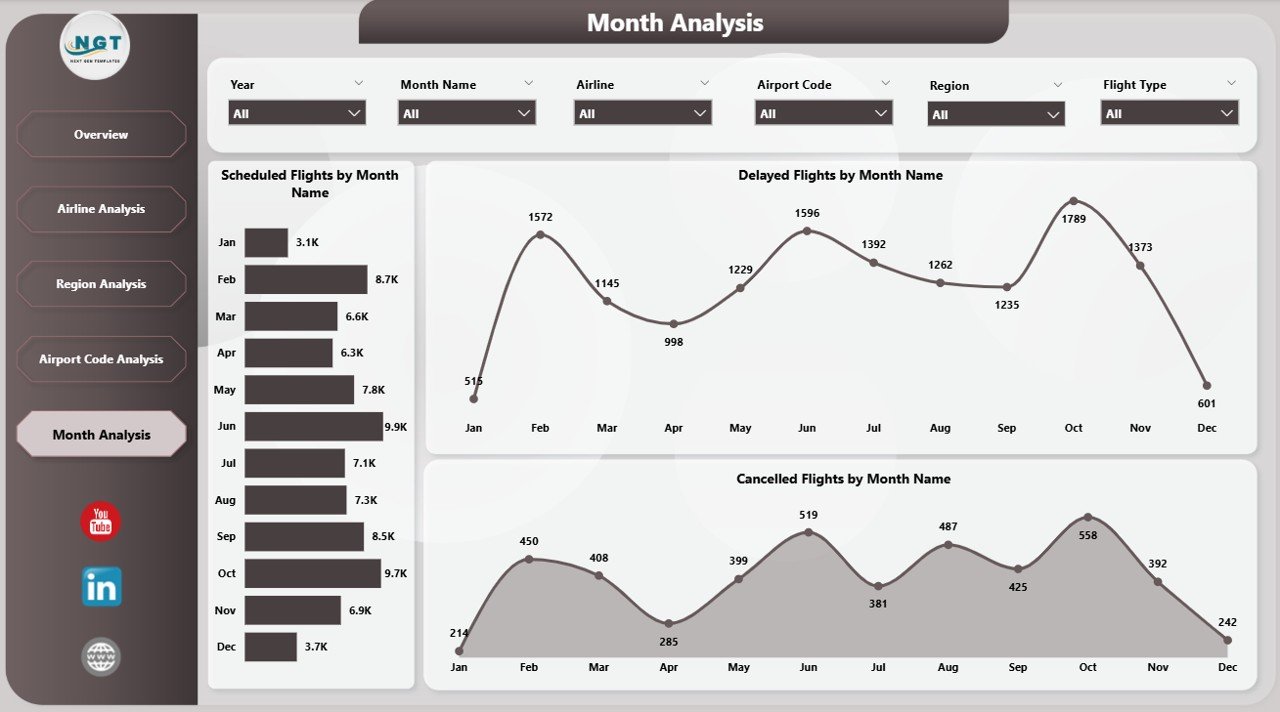
The Month Analysis Page focuses on time-based trends. This page helps identify seasonality and recurring patterns.
Key Charts in Month Analysis
The page includes:
-
Scheduled Flights by Month
-
Delayed Flights by Month
-
Cancelled Flights by Month
Why Is Month Analysis Important?
With this analysis, teams can:
-
Identify peak travel months
-
Detect months with frequent delays
-
Improve seasonal planning
-
Prepare for high-demand periods
As a result, airports improve forecasting and operational readiness.
Advantages of an Airports Dashboard in Power BI
Implementing an Airports Dashboard in Power BI delivers multiple operational and strategic benefits.
1. Real-Time Operational Visibility
Because data updates dynamically, teams can monitor airport operations in near real time.
2. Faster Decision-Making
Instead of waiting for reports, decision-makers instantly see trends and issues.
3. Improved Passenger Experience
By identifying delays and baggage problems early, airports reduce passenger frustration.
4. Better Airline Collaboration
Airline performance data supports transparent discussions and improvement plans.
5. Reduced Manual Reporting Effort
Power BI automation eliminates repetitive reporting tasks.
Who Can Use an Airports Dashboard in Power BI?
This dashboard serves multiple stakeholders, including:
-
Airport operations managers
-
Airline operations teams
-
Ground handling teams
-
Baggage management teams
-
Aviation analysts
-
Senior leadership
Because of its interactive design, each user can customize views based on their needs.
Best Practices for the Airports Dashboard in Power BI
To get maximum value from your Airports Dashboard in Power BI, follow these best practices.
1. Maintain Clean and Accurate Data
Ensure flight, baggage, and delay data remains consistent and validated.
2. Use Meaningful KPIs
Focus on metrics that support operational decisions, not vanity numbers.
3. Design Simple and Clear Visuals
Avoid clutter. Keep charts easy to understand.
4. Apply Consistent Filters and Slicers
Use standardized slicers across all pages for a smooth user experience.
5. Review Dashboard Performance Regularly
Optimize data models to keep dashboards fast and responsive.
How Does This Dashboard Improve Airport Efficiency?
This dashboard improves efficiency because it:
-
Highlights issues early
-
Reduces operational blind spots
-
Improves coordination across teams
-
Supports continuous improvement
Therefore, airports move from reactive problem-solving to proactive optimization.
How Can Airports Customize This Dashboard?
Airports can customize the dashboard by:
-
Adding new KPIs
-
Integrating live data sources
-
Including weather or passenger data
-
Expanding delay reason analysis
-
Creating role-based views
Because Power BI remains flexible, customization becomes easy and scalable.
Conclusion: Why Is an Airports Dashboard in Power BI Essential?
An Airports Dashboard in Power BI transforms complex aviation data into clear, actionable insights. It helps airports monitor flights, delays, baggage issues, airline performance, regional trends, and monthly behavior—all in one place.
By using this dashboard, airport authorities improve efficiency, enhance passenger satisfaction, and strengthen operational control. Therefore, in today’s data-driven aviation environment, this dashboard is not just useful—it is essential.
Frequently Asked Questions (FAQs)
What is an Airports Dashboard in Power BI used for?
An Airports Dashboard in Power BI tracks and analyzes flight schedules, delays, baggage issues, airline performance, and airport efficiency.
Can this dashboard handle large airport data volumes?
Yes, Power BI efficiently handles large datasets when designed with proper data modeling.
Is this dashboard suitable for both airports and airlines?
Yes, both airport authorities and airline teams can use it for operational analysis.
Can the dashboard show real-time data?
Yes, when connected to live or frequently refreshed data sources.
Is Power BI required to view the dashboard?
Yes, users need Power BI Desktop or Power BI Service access to view and interact with the dashboard.
Visit our YouTube channel to learn step-by-step video tutorials