Managing airport operations without clear performance visibility quickly turns into a complex challenge. Airports deal with passenger traffic, flight operations, safety checks, baggage handling, service quality, and revenue performance—all at the same time. Therefore, decision-makers need accurate, real-time insights to keep everything on track.
That is exactly where an Airports KPI Dashboard in Power BI becomes an essential performance management tool.
Instead of working with scattered Excel reports and manual tracking files, this dashboard converts structured airport KPI data into interactive visuals, trend charts, and performance indicators. As a result, airport authorities, operations teams, and management leaders gain instant clarity and take faster, data-driven decisions.
In this detailed guide, you will clearly understand what an Airports KPI Dashboard in Power BI is, how it works, why it matters, how its pages are structured, how Excel data connects to it, its advantages, best practices, and frequently asked questions—all explained in simple and practical language.
Click to buy Airports KPI Dashboard in Power BI
What Is an Airports KPI Dashboard in Power BI?
An Airports KPI Dashboard in Power BI is an interactive analytics solution designed to monitor, measure, and compare key airport performance indicators (KPIs) across time periods.
Instead of manually reviewing operational numbers, this dashboard automatically calculates:
- MTD (Month-to-Date) performance
- YTD (Year-to-Date) performance
- Target vs Actual comparison
- Current Year vs Previous Year trends
Moreover, the dashboard visually highlights performance status using symbols, colors, and percentage indicators. Because of this structure, airport managers easily identify problem areas and improvement opportunities.
Most importantly, the dashboard uses Excel as its data source, which means teams can continue using familiar Excel sheets while Power BI handles visualization and analysis.
Why Do Airports Need a KPI Dashboard in Power BI?
Airports operate in a time-sensitive and safety-critical environment. Therefore, tracking KPIs manually often leads to delays, errors, and missed insights.
An Airports KPI Dashboard in Power BI helps because it:
- Brings all airport KPIs into one centralized view
- Shows performance by month, year, and KPI group
- Enables quick comparison with targets and previous years
- Supports data-driven operational decisions
- Improves management reporting efficiency
As a result, airport authorities move from reactive reporting to proactive performance management.
What Are the Key Features of the Airports KPI Dashboard in Power BI?
The Airports KPI Dashboard in Power BI comes as a ready-to-use dashboard with a clean layout and structured data flow. Let’s explore each feature step by step.
How Is the Airports KPI Dashboard Structured?
The dashboard consists of three main pages inside the Power BI Desktop file. Each page serves a specific analytical purpose.
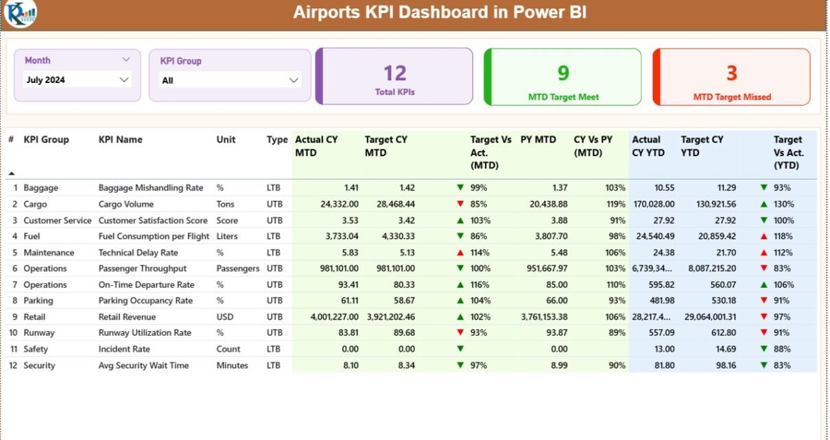
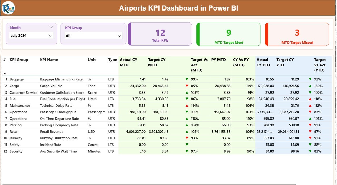
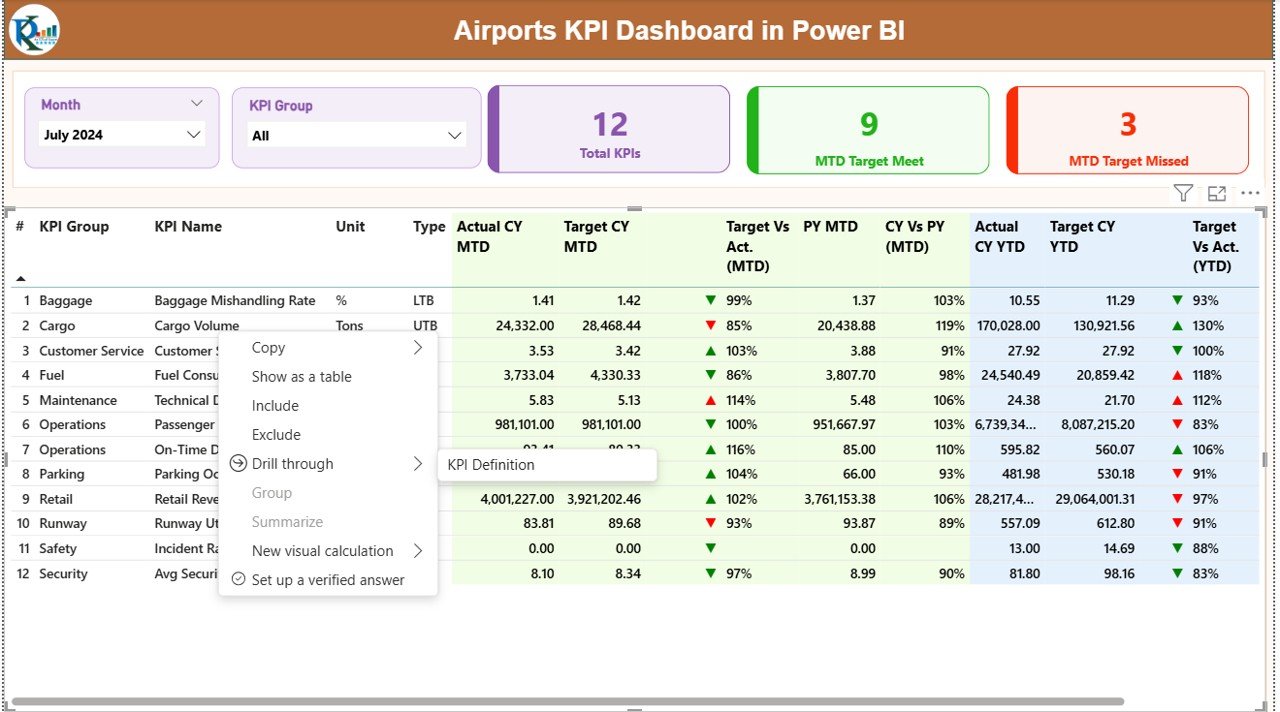
the Summary Page
The Summary Page acts as the main control center of the dashboard. As soon as you open the report, this page provides a complete snapshot of airport KPI performance.
Key Filters on the Summary Page
At the top of the Summary Page, you will find:
- Month Slicer – Select any month to refresh the entire dashboard
- KPI Group Slicer – Filter KPIs by category or operational group
Because of these slicers, users can instantly change analysis perspectives without editing any report logic.
KPI Performance Cards on the Summary Page
Directly below the slicers, the dashboard displays three high-impact KPI cards:
- Total KPIs Count
- MTD Target Met Count
- MTD Target Missed Count
These cards give instant clarity about overall airport performance for the selected month.
Detailed KPI Performance Table
Below the cards, the Summary Page displays a detailed KPI table with comprehensive performance metrics. Each column plays a specific role in airport performance analysis.
KPI Table Columns Explained
- KPI Number
A unique sequence number assigned to each KPI. - KPI Group
Represents the operational category of the KPI. - KPI Name
The name of the airport performance indicator. - Unit
Defines how the KPI gets measured (%, hours, count, etc.). - Type (LTB / UTB)
- LTB (Lower the Better)
- UTB (Upper the Better)
- Actual CY MTD
Shows the current year’s Month-to-Date actual value. - Target CY MTD
Displays the target value for the same period. - MTD Status Icon
Uses: - ▲ Green icon if performance meets or beats target
- ▼ Red icon if performance falls below target
- Target vs Actual (MTD)
Shows percentage using:
Actual MTD ÷ Target MTD - PY MTD
Previous year’s actual value for the same month. - CY vs PY (MTD)
Compares current year and previous year performance using:
CY MTD ÷ PY MTD
Year-to-Date (YTD) Performance Metrics
In addition to MTD values, the dashboard also tracks YTD metrics for deeper trend analysis.
- Actual CY YTD
- Target CY YTD
- YTD Status Icon
- Target vs Actual (YTD) using Actual YTD ÷ Target YTD
- PY YTD
- CY vs PY (YTD) using CY YTD ÷ PY YTD
Because of this dual MTD and YTD structure, airport managers gain both short-term and long-term visibility.
Click to buy Airports KPI Dashboard in Power BI
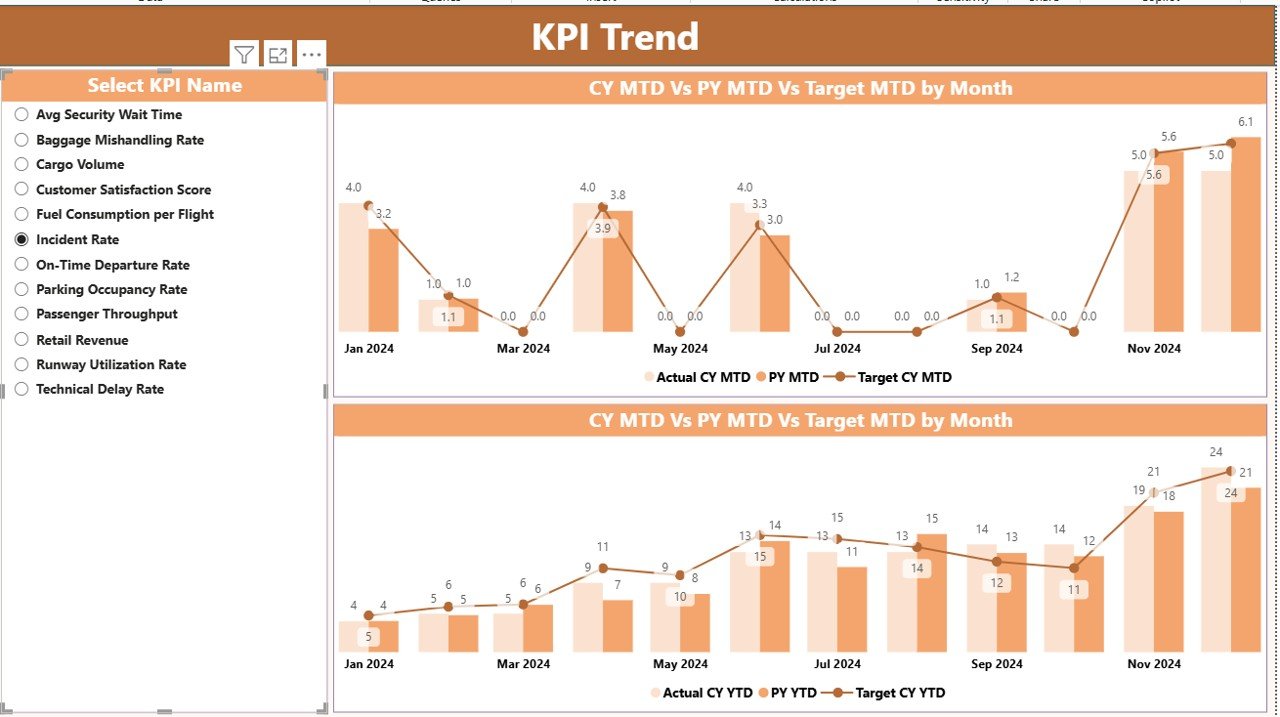
KPI Trend Page
The KPI Trend Page focuses on time-based analysis.
Instead of looking at one-time numbers, this page helps users understand how each KPI behaves over time.
Key Features of the KPI Trend Page
- Displays two combo charts
- One for MTD
- One for YTD
- Each combo chart shows:
- Current Year Actual values
- Previous Year Actual values
- Target values
Because of this setup, users quickly identify seasonality, improvement trends, or recurring performance gaps.
KPI Selection Slicer
On the left side of the page, a KPI Name slicer allows users to select any KPI.
Once selected:
- Both MTD and YTD charts update automatically
- Targets and historical trends become visible instantly
As a result, performance reviews become faster and more focused.
Click to buy Airports KPI Dashboard in Power BI
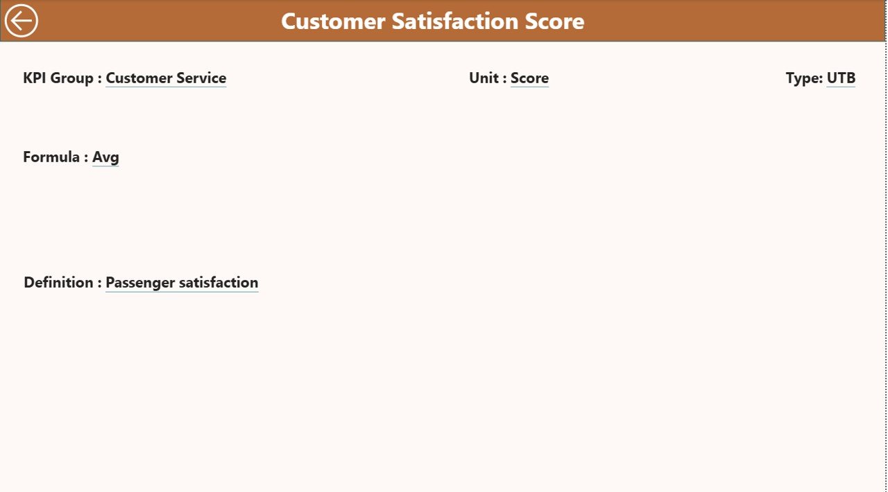
KPI Definition Page
The KPI Definition Page acts as a reference and documentation layer within the dashboard.
Purpose of the KPI Definition Page
- Displays KPI Formula
- Shows KPI Definition
- Clearly explains KPI intent and calculation logic
This page works as a drill-through page, which means:
- It stays hidden from default navigation
- Users access it directly from the Summary Page
To return to the Summary Page, users simply click the Back button placed at the top-left area.
Because of this mechanism, the dashboard stays clean while still providing deep KPI clarity.
Click to buy Airports KPI Dashboard in Power BI
How Does Excel Data Connect to the Airports KPI Dashboard?
The Airports KPI Dashboard uses Excel as its data source, which keeps data management simple and familiar.
The Excel file contains three structured worksheets.
Input_Actual Sheet
The Input_Actual sheet captures actual KPI performance data.
Required Fields
- KPI Name
- Month (use the first date of the month)
- MTD Actual Value
- YTD Actual Value
By regularly updating this sheet, the dashboard refreshes automatically without complex transformations.
Input_Target Sheet
The Input_Target sheet records planned or expected performance.
Required Fields
- KPI Name
- Month (first date of the month)
- MTD Target Value
- YTD Target Value
Because of this structure, users easily compare planned versus actual performance.
Click to buy Airports KPI Dashboard in Power BI
KPI Definition Sheet
The KPI Definition sheet stores master data.
Required Fields
- KPI Number
- KPI Group
- KPI Name
- Unit
- Formula
- KPI Definition
- Type (LTB / UTB)
This sheet directly supports the KPI Definition Page inside Power BI.
Advantages of Airports KPI Dashboard in Power BI
The Airports KPI Dashboard in Power BI delivers strong operational and strategic benefits.
Key Advantages
- Centralized KPI tracking
- Clear MTD and YTD visibility
- Visual performance indicators
- Easy Excel-based data updates
- Target vs Actual comparison
- Previous Year trend analysis
- Drill-through KPI documentation
- Faster decision-making
Because of these advantages, airport teams improve performance discipline and accountability.
How Does This Dashboard Improve Airport Decision-Making?
The dashboard improves decision-making because it:
- Highlights underperforming KPIs instantly
- Prioritizes action areas using visual cues
- Reduces manual reporting effort
- Supports evidence-based discussions
- Enables consistent monthly reviews
As a result, airport leaders focus more on improvement and less on data preparation.
Best Practices for Airports KPI Dashboard in Power BI
To get the best results, follow these proven best practices.
Best Practices Checklist
- Keep KPI definitions clear and consistent
- Use the same month start date across all sheets
- Update actual and target data regularly
- Review both MTD and YTD trends together
- Limit KPI count to meaningful indicators
- Align KPI targets with airport objectives
- Train users on KPI interpretation
When teams follow these practices, dashboard value multiplies.
Who Can Use the Airports KPI Dashboard?
This dashboard suits a wide range of users, including:
- Airport operations managers
- Airport authority executives
- Performance planning teams
- Strategy and analytics teams
- Consulting and audit professionals
Because Power BI supports easy sharing, multiple stakeholders can access insights simultaneously.
Conclusion: Why the Airports KPI Dashboard in Power BI Is a Must-Have Tool
Airports operate under constant pressure to deliver safety, efficiency, and service excellence. Therefore, relying on traditional reports no longer works.
The Airports KPI Dashboard in Power BI transforms raw Excel data into actionable intelligence. It combines MTD and YTD metrics, target comparisons, visual status icons, and trend analysis into one powerful solution.
Most importantly, it enables airports to make faster decisions, improve accountability, and drive continuous performance improvement.
Frequently Asked Questions (FAQs)
What KPIs does an Airports KPI Dashboard track?
The dashboard tracks operational, efficiency, service, and performance KPIs defined by airport management.
Can non-technical users update the dashboard data?
Yes. Users only need to update Excel sheets. Power BI handles all calculations and visuals automatically.
Does the dashboard support historical comparison?
Yes. It compares current year MTD and YTD values with previous year data.
Can we customize KPI groups and definitions?
Absolutely. You can fully customize KPI groups and definitions through the Excel KPI Definition sheet.
Is Power BI Desktop required to use the dashboard?
Yes. You need Power BI Desktop to open, refresh, and publish the dashboard.
Can this dashboard support multiple airports?
Yes. You can extend data structure to include airport identifiers for multi-airport analysis.
Click to buy Airports KPI Dashboard in Power BI
Visit our YouTube channel to learn step-by-step video tutorials
Watch the step-by-step video tutorial: