In today’s digital era, arts and culture organizations must balance creativity with efficient management. Museums, cultural institutions, art festivals, galleries, and event organizers handle multiple activities simultaneously, including budgeting, artist coordination, visitor engagement, and performance tracking. However, many organizations still rely on scattered spreadsheets and manual reports. As a result, decision-making becomes slow and inaccurate.
Therefore, organizations increasingly adopt data-driven dashboards to monitor cultural activities effectively. One powerful solution is the Arts and Culture Dashboard in Power BI — an interactive analytics platform designed to transform cultural event data into meaningful visual insights.
In this comprehensive guide, you will learn everything about the Arts and Culture Dashboard in Power BI, including its structure, features, benefits, implementation methods, best practices, and frequently asked questions.
Click to buy Arts and Culture Dashboard in Power BI
What Is an Arts and Culture Dashboard in Power BI?
An Arts and Culture Dashboard in Power BI is a business intelligence solution that helps organizations track and analyze cultural events using visual reports and key performance indicators (KPIs).
Instead of reviewing multiple files separately, teams can monitor budgets, event performance, visitor satisfaction, artist participation, and revenue from a centralized dashboard. Consequently, managers gain clear insights and make faster decisions.
Power BI enables organizations to:
- Visualize cultural event performance in real time
- Compare budget vs actual costs
- Monitor visitor engagement and satisfaction
- Analyze performance by region, venue, and organizer
- Identify trends and improvement opportunities
Because Power BI provides interactive filters and dynamic visuals, users can explore data quickly without technical expertise.
Why Do Arts and Culture Organizations Need a Dashboard?
Cultural institutions manage diverse activities daily. However, without structured analytics, teams struggle to evaluate performance accurately.
Common Challenges Faced
- Difficulty tracking multiple events simultaneously
- Budget overruns and cost inefficiencies
- Limited visibility into audience satisfaction
- Manual reporting delays
- Lack of performance comparison across regions or venues
Therefore, organizations need a centralized system that simplifies monitoring and reporting. A Power BI dashboard solves these problems by converting raw data into actionable insights.
Key Features of the Arts and Culture Dashboard in Power BI
This dashboard includes five analytical pages and one advanced decomposition view, each designed to answer specific business questions.
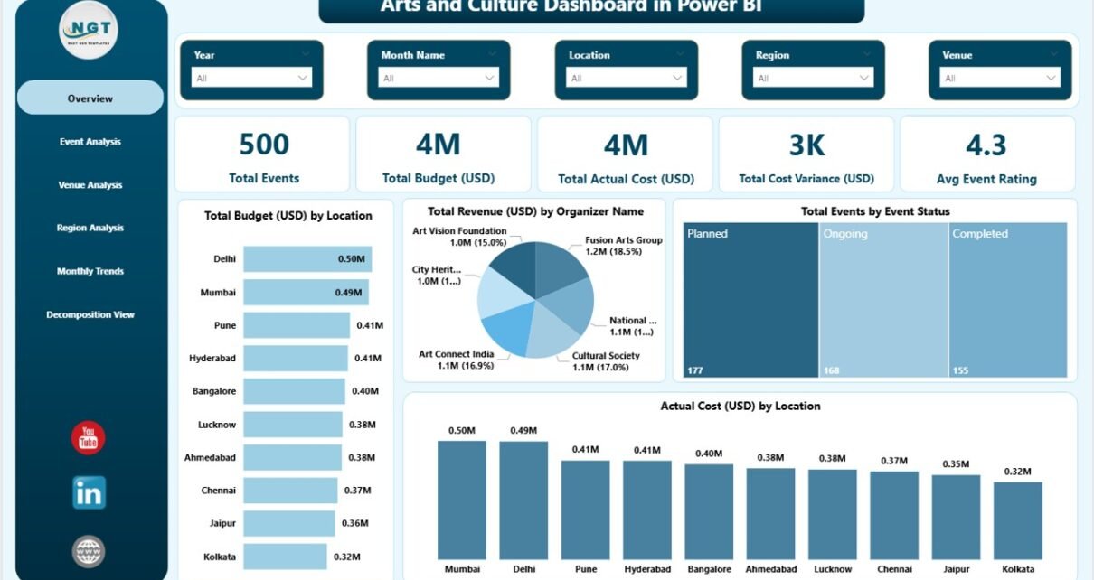
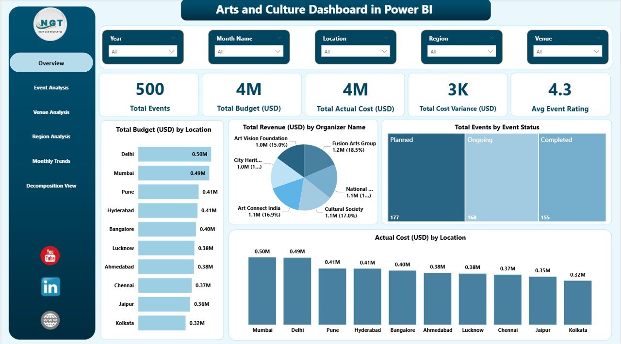
Overview Page – How Does Overall Performance Look?
The Overview Page acts as the main control center of the dashboard. Users immediately understand overall performance through KPI cards and visual summaries.
KPI Cards Included
- Total Events
- Total Budget (USD)
- Total Actual Cost (USD)
- Total Cost Variance (USD)
- Average Event Rating
These KPIs provide a quick snapshot of organizational performance.
Charts Available
- Total Budget (USD) by Location
- Total Revenue (USD) by Organizer Name
- Total Events by Event Status
- Actual Cost (USD) by Location
Because slicers allow filtering, users can instantly analyze specific periods, organizers, or locations.
Click to buy Arts and Culture Dashboard in Power BI
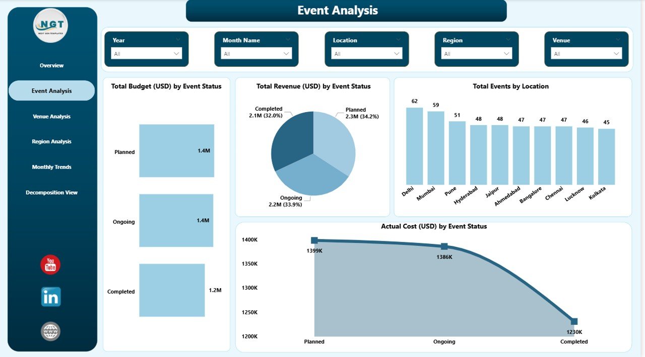
Event Analysis Page – Which Events Perform Best?
The Event Analysis page focuses on evaluating event performance based on status and operational outcomes.
Key Visualizations
- Total Budget (USD) by Event Status
- Total Revenue (USD) by Event Status
- Total Events by Location
- Actual Cost (USD) by Event Status
This page helps managers answer important questions such as:
- Which event types generate higher revenue?
- Which events exceed budgets?
- Where do operational improvements help most?
As a result, planners optimize future events using historical insights.
Click to buy Arts and Culture Dashboard in Power BI
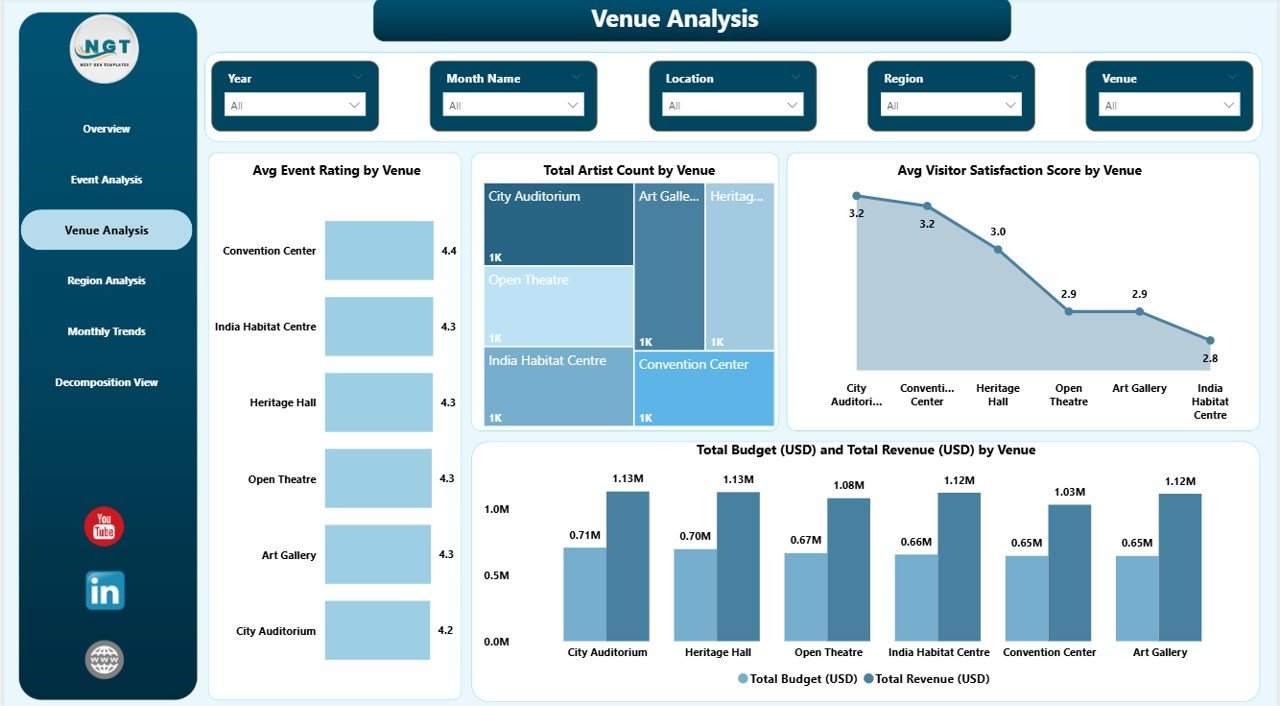
Venue Analysis Page – Which Venues Deliver the Best Experience?
Venue performance significantly affects audience satisfaction and event success. Therefore, this page analyzes venue-level metrics.
Charts Included
- Average Event Rating by Venue
- Total Artist Count by Venue
- Average Visitor Satisfaction Score by Venue
- Total Budget and Total Revenue by Venue
Using this analysis, organizations identify high-performing venues and improve underperforming ones.
Click to buy Arts and Culture Dashboard in Power BI
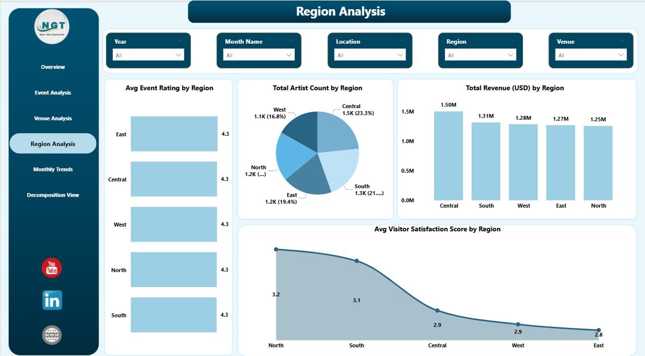
Region Analysis Page – How Do Regions Compare?
Cultural programs often operate across multiple regions. Hence, comparing regional performance becomes essential.
Visual Metrics
- Average Event Rating by Region
- Total Artist Count by Region
- Total Revenue by Region
- Average Visitor Satisfaction Score by Region
This page allows leadership teams to allocate resources strategically and promote balanced cultural development.
Click to buy Arts and Culture Dashboard in Power BI
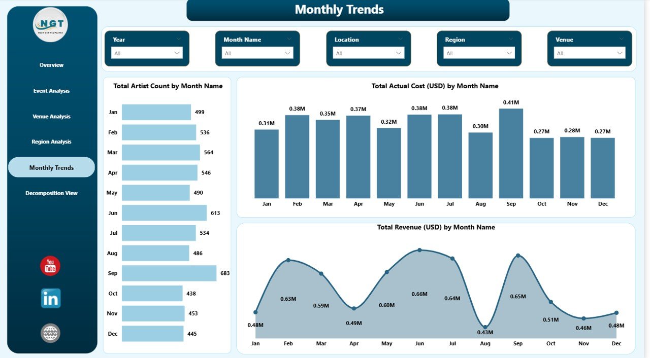
Monthly Trends Page – What Patterns Appear Over Time?
Trend analysis helps organizations plan future programs effectively.
Charts Included
- Total Artist Count by Month
- Total Actual Cost (USD) by Month
- Total Revenue (USD) by Month
Because monthly patterns become visible, organizations can identify peak seasons, budget cycles, and revenue trends.
Click to buy Arts and Culture Dashboard in Power BI
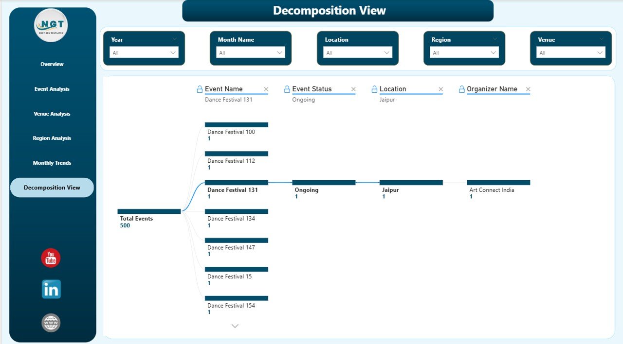
Decomposition View – Deep Dive into Event Performance
The Decomposition View enables advanced data exploration.
Users can analyze performance by:
- Event Name
- Event Status
- Location
- Organizer Name
Therefore, decision-makers uncover root causes behind performance variations.
Click to buy Arts and Culture Dashboard in Power BI
What Insights Can You Gain from This Dashboard?
The dashboard provides actionable intelligence such as:
- Budget utilization efficiency
- Revenue generation patterns
- Audience satisfaction trends
- Artist participation levels
- Regional performance comparison
- Event success indicators
Consequently, organizations move from reactive management to proactive planning.
Advantages of Arts and Culture Dashboard in Power BI
Implementing this dashboard delivers several operational and strategic benefits.
Improved Decision Making
Managers access real-time insights, which helps them make informed decisions quickly.
Centralized Data Management
All cultural data appears in one platform, reducing confusion and duplication.
Better Budget Control
Organizations compare planned budgets with actual costs instantly.
Enhanced Visitor Experience
Audience feedback analysis improves event quality continuously.
Performance Transparency
Stakeholders easily evaluate program effectiveness.
Time-Saving Reporting
Automated visuals eliminate manual reporting tasks.
How Does Power BI Improve Cultural Event Management?
Power BI strengthens cultural management through interactive analytics.
Key Capabilities
- Dynamic filtering using slicers
- Automated calculations
- Interactive drill-down analysis
- Real-time updates
- Visual storytelling through charts
Because of these capabilities, organizations transform data into strategic assets.
Who Can Benefit from an Arts and Culture Dashboard?
Many professionals gain value from this solution.
Ideal Users
- Cultural event organizers
- Museums and galleries
- Government cultural departments
- Art festival planners
- Non-profit cultural organizations
- Tourism boards
- Creative industry managers
Each stakeholder accesses relevant insights tailored to their role.
How to Implement an Arts and Culture Dashboard in Power BI?
Follow these steps to implement the dashboard successfully.
Step 1: Collect Data
Gather event details, budgets, revenue, ratings, and visitor feedback.
Step 2: Prepare Data
Clean and structure datasets in Excel or databases.
Step 3: Import into Power BI
Load data using Power BI Desktop.
Step 4: Create Relationships
Connect tables logically for accurate calculations.
Step 5: Build Visualizations
Add KPI cards, charts, and slicers.
Step 6: Publish Dashboard
Share reports securely via Power BI Service.
Best Practices for the Arts and Culture Dashboard in Power BI
Organizations achieve better results when they follow proven practices.
Define Clear KPIs
Focus on measurable cultural performance indicators.
Maintain Data Accuracy
Update event data regularly to ensure reliability.
Use Interactive Filters
Enable users to explore insights independently.
Keep Visuals Simple
Avoid overcrowded visuals for better readability.
Monitor Trends Regularly
Review monthly insights to adjust strategies early.
Train Users
Provide basic Power BI training for stakeholders.
Future Trends in Arts and Culture Analytics
Data analytics continues evolving rapidly.
Emerging Trends
- AI-driven audience prediction
- Real-time visitor analytics
- Interactive storytelling dashboards
- Mobile analytics access
- Integration with ticketing systems
As technology advances, cultural organizations will rely more on analytics-driven strategies.
How Does This Dashboard Support Strategic Planning?
The dashboard connects operational data with long-term planning.
It helps organizations:
- Allocate budgets effectively
- Improve event planning strategies
- Increase audience engagement
- Optimize venue selection
- Strengthen cultural outreach programs
Consequently, leaders align artistic goals with measurable outcomes.
Conclusion
The Arts and Culture Dashboard in Power BI transforms how cultural organizations manage events, budgets, venues, and audience experiences. Instead of relying on manual reports, teams gain real-time visibility into performance through interactive analytics.
Moreover, the dashboard promotes transparency, improves decision-making, and enhances operational efficiency. Because it combines financial, operational, and engagement metrics in one platform, organizations can plan cultural initiatives confidently.
Ultimately, adopting a data-driven approach allows arts and culture institutions to preserve creativity while achieving measurable success.
Frequently Asked Questions (FAQs)
- What is the main purpose of an Arts and Culture Dashboard in Power BI?
The dashboard helps organizations monitor event performance, budgets, revenue, and audience satisfaction using interactive analytics.
- Can small cultural organizations use this dashboard?
Yes. Power BI works for both small and large organizations because it scales easily.
- Does the dashboard require coding knowledge?
No. Users can interact with visuals without programming skills.
- How often should data be updated?
Organizations should update data weekly or monthly for accurate insights.
- Can this dashboard track multiple events simultaneously?
Yes. The dashboard supports analysis across multiple events, locations, and organizers.
- Is Power BI suitable for non-profit organizations?
- Absolutely. Non-profits benefit from improved reporting and transparency.
- What data is required to build this dashboard?
You need event details, budgets, revenue, ratings, artist information, and visitor feedback data.
Watch the step-by-step video tutorial:
Visit our YouTube channel to learn step-by-step video tutorials
Click to buy Arts and Culture Dashboard in Power BI