Automation units play a crucial role in modern industries. They help organizations increase productivity, reduce manual effort, and maintain consistent quality. However, automation alone does not guarantee success. You must track performance regularly to understand whether automation delivers real value. That is exactly where an Automation Units KPI Dashboard in Excel becomes essential.
In this detailed article, you will learn what an Automation Units KPI Dashboard in Excel is, why it matters, how it works, its worksheet-wise structure, advantages, best practices, and frequently asked questions. Moreover, this guide explains how a ready-to-use Excel KPI dashboard helps managers, engineers, and operations teams make faster and smarter decisions.
Click to buy Automation Units KPI Dashboard in Excel
What Is an Automation Units KPI Dashboard in Excel?
An Automation Units KPI Dashboard in Excel is a centralized reporting tool that tracks, measures, and visualizes key performance indicators related to automation systems. Instead of reviewing multiple Excel sheets or raw data files, users monitor all KPIs from a single interactive dashboard.
Because Excel supports formulas, pivot tables, charts, slicers, and conditional formatting, this dashboard remains flexible and powerful. Moreover, teams can update data easily without advanced technical skills.
Why Do Automation Units Need KPI Tracking?
Automation units involve high capital investment. Therefore, businesses must ensure they run efficiently. KPI tracking helps you:
- Measure automation effectiveness
- Identify downtime issues early
- Compare actual performance with targets
- Analyze trends over time
- Improve operational reliability
As a result, KPI dashboards become decision-support tools rather than just reporting files.
Why Use an Automation Units KPI Dashboard in Excel?
Many organizations still rely on basic reports. However, those reports often create confusion instead of clarity. An Excel-based KPI dashboard solves this problem effectively.
Key Reasons to Use Excel for Automation KPIs
- Excel remains widely available across organizations
- Teams already understand Excel
- No additional software cost
- Easy customization and scalability
- Quick deployment compared to BI tools
Moreover, Excel dashboards work perfectly for small, medium, and even large automation setups.
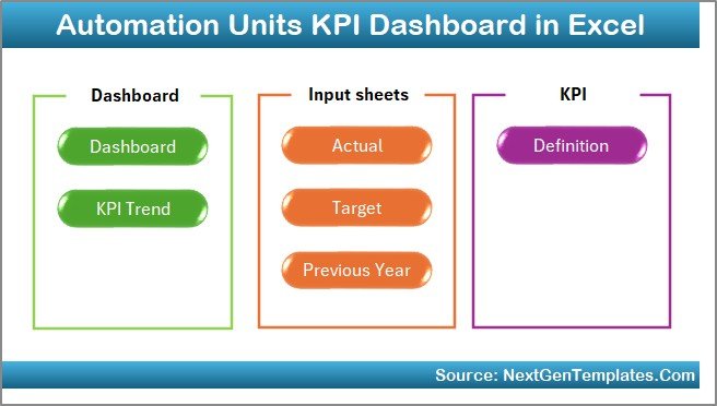
Overview of the Automation Units KPI Dashboard Structure
The Automation Units KPI Dashboard in Excel comes with a well-structured design. It includes 7 worksheets, each created for a specific purpose. This structure ensures clarity, ease of navigation, and accurate analysis.
Let us explore each worksheet in detail.
Summary Page
The Summary Page works as an index or navigation hub for the entire dashboard.
Key Features of the Summary Page
- Clean and simple layout
- 6 navigation buttons
- One-click jump to any worksheet
- User-friendly design
Because users do not need to scroll or search for tabs, navigation becomes fast and efficient. As a result, even first-time users can explore the dashboard comfortably.
Click to buy Automation Units KPI Dashboard in Excel
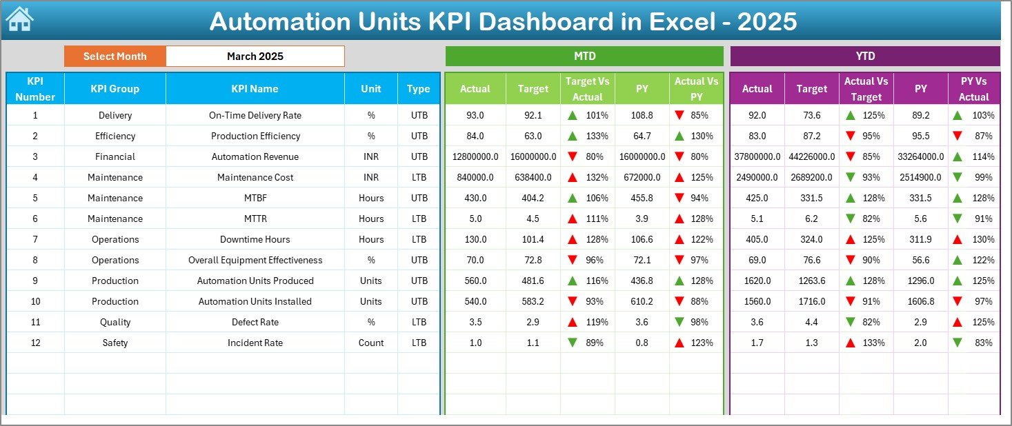
Dashboard Sheet
The Dashboard Sheet serves as the main reporting page. It displays all important KPIs in one view.
Month Selection with Drop-Down
- Month selector available at cell D3
- Selecting a month updates the entire dashboard
- No manual recalculation required
This feature ensures real-time analysis and faster reporting.
MTD Performance Analysis
On this sheet, you can analyze:
- MTD Actual
- MTD Target
- MTD Previous Year
Moreover, the dashboard shows:
- Target vs Actual
- Previous Year vs Actual
Conditional formatting with up and down arrows highlights performance instantly. Therefore, users identify issues without reading numbers deeply.
YTD Performance Analysis
The dashboard also displays:
- YTD Actual
- YTD Target
- YTD Previous Year
With the same comparison logic, users track long-term performance effectively.
Click to buy Automation Units KPI Dashboard in Excel
Trend Sheet
The Trend Sheet focuses on deep KPI-level analysis.
KPI Selection Drop-Down
- KPI selection available at cell C3
- Users analyze one KPI at a time
- Reduces information overload
KPI Information Display
For the selected KPI, the sheet shows:
- KPI Group
- KPI Unit
- KPI Type (UTB or LTB)
- KPI Formula
- KPI Definition
Because all details appear on the same screen, users understand the KPI clearly.
Trend Charts for Better Insights
The Trend Sheet includes:
- MTD trend chart
- YTD trend chart
- Actual vs Target vs Previous Year
As a result, trend analysis becomes visual, intuitive, and fast.

Click to buy Automation Units KPI Dashboard in Excel
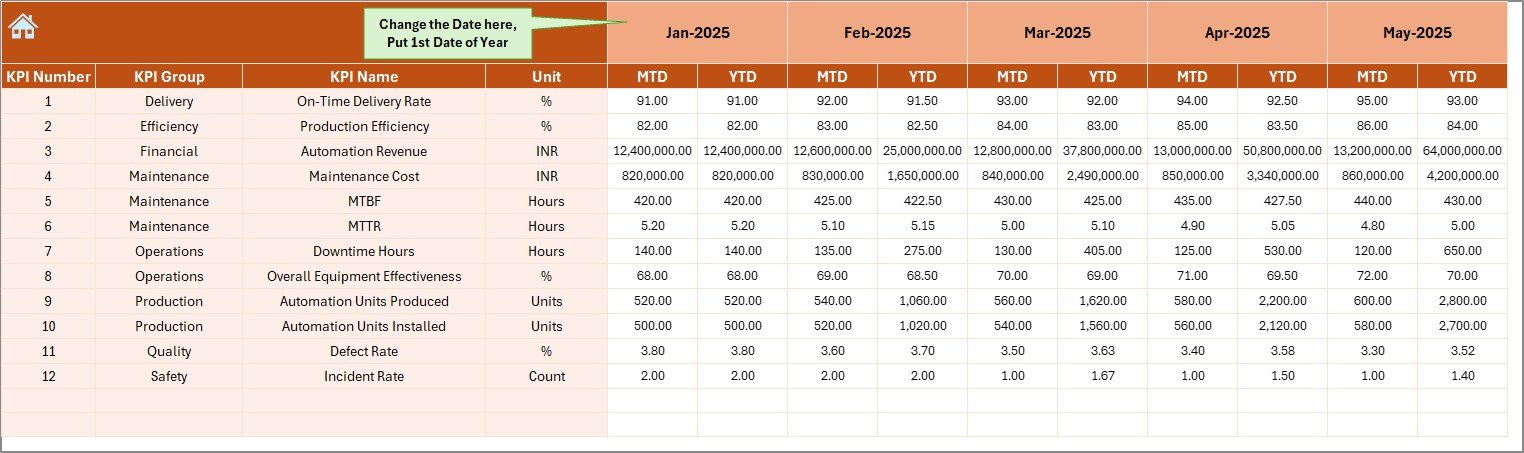
Actual Numbers
The Actual Numbers Input Sheet acts as the main data entry sheet.
Month Configuration
- Enter the first month of the year in cell E1
- Dashboard adjusts automatically for the full year
Data Entry Simplicity
- Enter MTD and YTD actual values
- One row per KPI
- No complex formulas required
Because data entry remains simple, errors reduce significantly.
Click to buy Automation Units KPI Dashboard in Excel
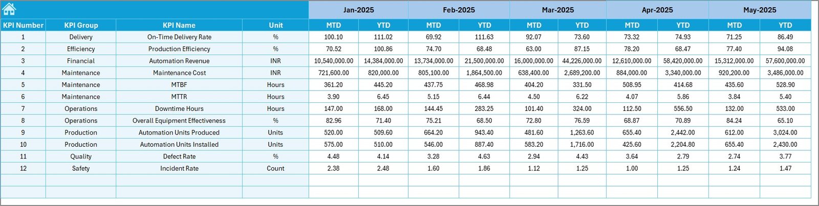
Target Sheet
The Target Sheet stores performance benchmarks.
Target Data Entry
- Monthly MTD targets
- Monthly YTD targets
- Separate target values for each KPI
This separation ensures accurate comparison between actual and planned performance.
Click to buy Automation Units KPI Dashboard in Excel
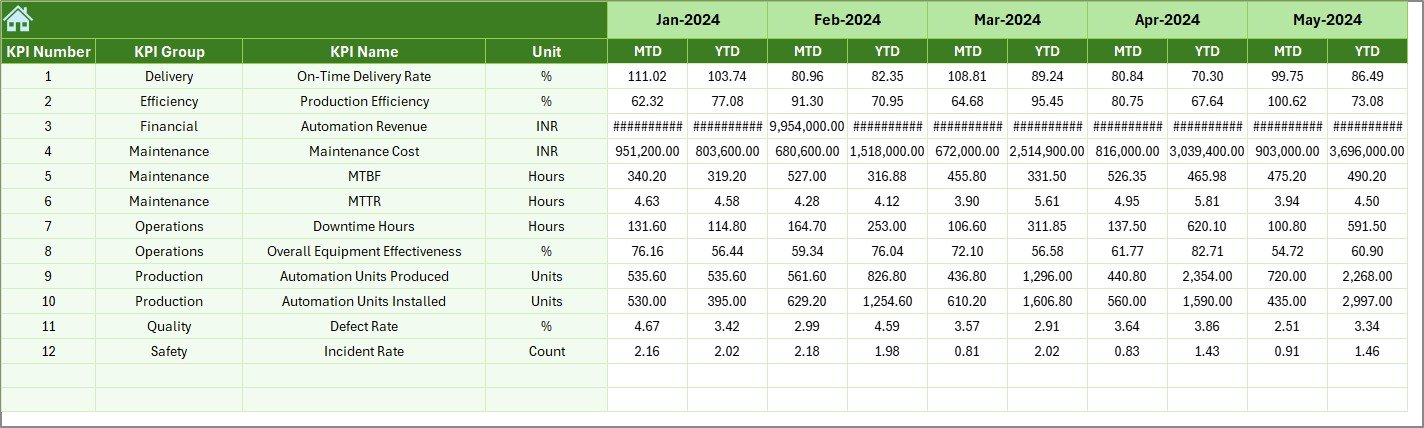
The Previous Year Number Sheet allows historical comparison.
Benefits of Previous Year Comparison
- Identify growth patterns
- Measure improvement over time
- Understand seasonal variations
By entering last year’s data in the same format, the dashboard generates year-over-year insights automatically.
Click to buy Automation Units KPI Dashboard in Excel
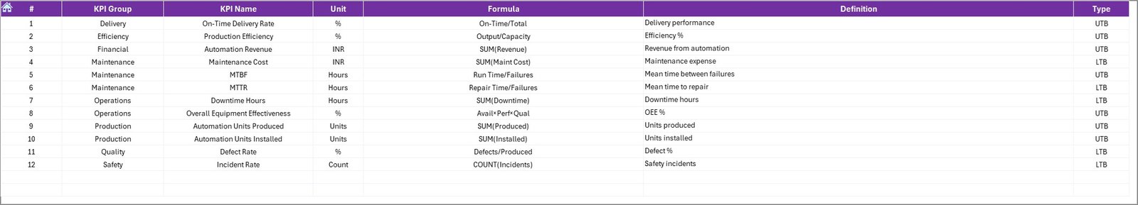
KPI Definition Sheet
The KPI Definition Sheet ensures standardization and clarity.
Information Stored in KPI Definition Sheet
- KPI Name
- KPI Group
- Unit
- Formula
- Definition
Because definitions remain centralized, teams avoid confusion and misinterpretation.
Click to buy Automation Units KPI Dashboard in Excel
What KPIs Can You Track in an Automation Units KPI Dashboard?
An Automation Units KPI Dashboard in Excel supports a wide range of KPIs, such as:
- Automation Uptime Percentage
- Downtime Hours
- Mean Time Between Failures (MTBF)
- Mean Time to Repair (MTTR)
- Automation Efficiency Rate
- Energy Consumption per Unit
- Production Output from Automation
- Maintenance Cost of Automation Units
- Defect Rate from Automated Processes
- System Availability
Because the dashboard remains flexible, you can add or modify KPIs easily.
Advantages of Automation Units KPI Dashboard in Excel
Using an Automation Units KPI Dashboard in Excel offers several advantages.
Key Advantages
- Centralized Performance Tracking
All KPIs remain available in one dashboard. - Faster Decision-Making
Visual indicators highlight issues instantly. - Real-Time Month Selection
Month-wise analysis becomes effortless. - MTD and YTD Visibility
Short-term and long-term performance tracking improves. - Cost-Effective Solution
No additional BI tool investment required. - Customizable Design
Modify KPIs, targets, and layouts easily.
Who Should Use an Automation Units KPI Dashboard in Excel?
This dashboard suits various professionals and industries.
Ideal Users
- Automation engineers
- Operations managers
- Plant managers
- Maintenance teams
- Production supervisors
- Continuous improvement teams
Moreover, both small plants and large industrial facilities benefit from this dashboard.
How Does This Dashboard Improve Decision-Making?
An Automation Units KPI Dashboard in Excel transforms raw data into actionable insights.
Decision-Making Benefits
- Identify underperforming automation units
- Prioritize maintenance activities
- Improve resource allocation
- Monitor target achievement
- Support data-driven discussions
Because insights remain visual and structured, decision-making becomes faster and more confident.
Best Practices for the Automation Units KPI Dashboard in Excel
Following best practices ensures maximum value from the dashboard.
- Define KPIs Clearly
Always define KPIs clearly in the KPI Definition Sheet. Clear definitions prevent misinterpretation.
- Update Data Regularly
Update actual, target, and previous year data monthly. Consistent updates improve accuracy.
- Use Realistic Targets
Set achievable and meaningful targets. Unrealistic targets reduce dashboard usefulness.
- Validate Data Entry
Double-check data inputs to avoid calculation errors.
- Review Trends, Not Just Numbers
Focus on trend charts to understand long-term performance patterns.
- Limit KPIs to What Matters
Track only relevant KPIs. Too many metrics reduce clarity.
Common Mistakes to Avoid While Using Automation KPI Dashboards
Even powerful dashboards fail if users make mistakes.
Mistakes to Avoid
- Ignoring KPI definitions
- Entering inconsistent data formats
- Skipping previous year data
- Overloading the dashboard with too many KPIs
- Not reviewing trends regularly
Avoiding these mistakes improves dashboard effectiveness significantly.
How Does This Dashboard Support Continuous Improvement?
Continuous improvement depends on visibility and measurement.
Improvement Support Areas
- Detect automation bottlenecks
- Reduce downtime gradually
- Improve efficiency month by month
- Track impact of improvement initiatives
Therefore, this dashboard supports long-term operational excellence.
How to Customize the Automation Units KPI Dashboard in Excel?
Customization remains one of Excel’s biggest strengths.
Customization Options
- Add new KPIs easily
- Modify targets based on strategy
- Change chart styles
- Update conditional formatting rules
- Add additional analysis sheets
Because the structure stays modular, customization does not break existing analysis.
Conclusion: Why You Should Use an Automation Units KPI Dashboard in Excel
An Automation Units KPI Dashboard in Excel offers a practical, flexible, and cost-effective solution for tracking automation performance. It combines structured worksheets, interactive dashboards, trend analysis, and clear KPI definitions into one powerful tool.
By using this dashboard, organizations gain better visibility, improve operational efficiency, and support data-driven decision-making. Moreover, Excel’s familiarity ensures quick adoption across teams.
If you want to monitor automation performance effectively without investing in complex software, this dashboard provides the perfect solution.
Frequently Asked Questions About Automation Units KPI Dashboard in Excel
What is an Automation Units KPI Dashboard in Excel used for?
It tracks, analyzes, and visualizes automation performance KPIs such as uptime, efficiency, downtime, and output.
Can beginners use this KPI dashboard?
Yes. The dashboard uses simple Excel features and clear layouts, making it beginner-friendly.
How often should I update the dashboard?
You should update it monthly for accurate MTD and YTD analysis.
Can I add more KPIs to the dashboard?
Yes. The dashboard supports easy KPI additions through the KPI Definition and input sheets.
Does the dashboard support year-over-year comparison?
Yes. The Previous Year Number Sheet enables year-over-year performance comparison.
Is this dashboard suitable for large plants?
Yes. With proper KPI selection and data management, it works for both small and large automation units.
Watch the step-by-step video tutorial:
Visit our YouTube channel to learn step-by-step video tutorials
Click to buy Automation Units KPI Dashboard in Excel