Autonomous vehicles are no longer a futuristic idea. Instead, they already operate on roads, in testing zones, and within logistics networks. However, autonomy without measurement leads to uncertainty. Therefore, organizations working on self-driving technology must track performance, safety, efficiency, and progress using the right metrics. That is exactly where an Autonomous Vehicles KPI Dashboard in Power BI becomes essential.
In this detailed guide, you will learn what an Autonomous Vehicles KPI Dashboard in Power BI is, how it works, why it matters, how it is structured, and how teams can use it to make better decisions. Moreover, this article explains the dashboard pages, data model, KPIs, advantages, best practices, and common questions in a clear and practical way.
Click to Purchases Autonomous Vehicles KPI Dashboard in Power BI
What Is an Autonomous Vehicles KPI Dashboard in Power BI?
An Autonomous Vehicles KPI Dashboard in Power BI is a centralized analytical tool that tracks and visualizes key performance indicators related to autonomous vehicle development and operations. Instead of reviewing raw Excel data or technical logs, teams can monitor critical KPIs from one interactive dashboard.
This dashboard uses Excel as the data source and Power BI as the visualization layer. As a result, users can enter data easily while still enjoying powerful analytics, slicers, and visuals. Moreover, decision-makers can compare targets, analyze trends, and track improvements without technical complexity.
Why Do Autonomous Vehicle Programs Need KPI Dashboards?
Autonomous vehicle projects involve software, hardware, safety, compliance, and real-world testing. Therefore, teams must measure progress across multiple dimensions at the same time.
A KPI dashboard helps because:
-
It converts complex data into simple insights
-
It highlights performance gaps instantly
-
It supports data-driven decisions
-
It improves accountability across teams
-
It saves time spent on manual reporting
As a result, organizations can focus more on innovation and less on reporting.
How Does an Autonomous Vehicles KPI Dashboard in Power BI Work?
The dashboard follows a simple yet powerful flow.
-
Data Entry in Excel
Teams enter actual values, target values, and KPI definitions in structured Excel sheets. -
Data Modeling in Power BI
Power BI connects to the Excel file and builds relationships between actuals, targets, and KPI metadata. -
Visual Analysis
Power BI displays KPIs using tables, cards, slicers, and combo charts. -
Performance Comparison
Users compare MTD, YTD, target vs actual, and current year vs previous year.
Because of this workflow, even non-technical users can operate the dashboard confidently.
What Are the Key Pages in the Autonomous Vehicles KPI Dashboard?
This ready-to-use dashboard includes three powerful pages, each designed for a specific purpose.
1) What Does the Summary Page Show?
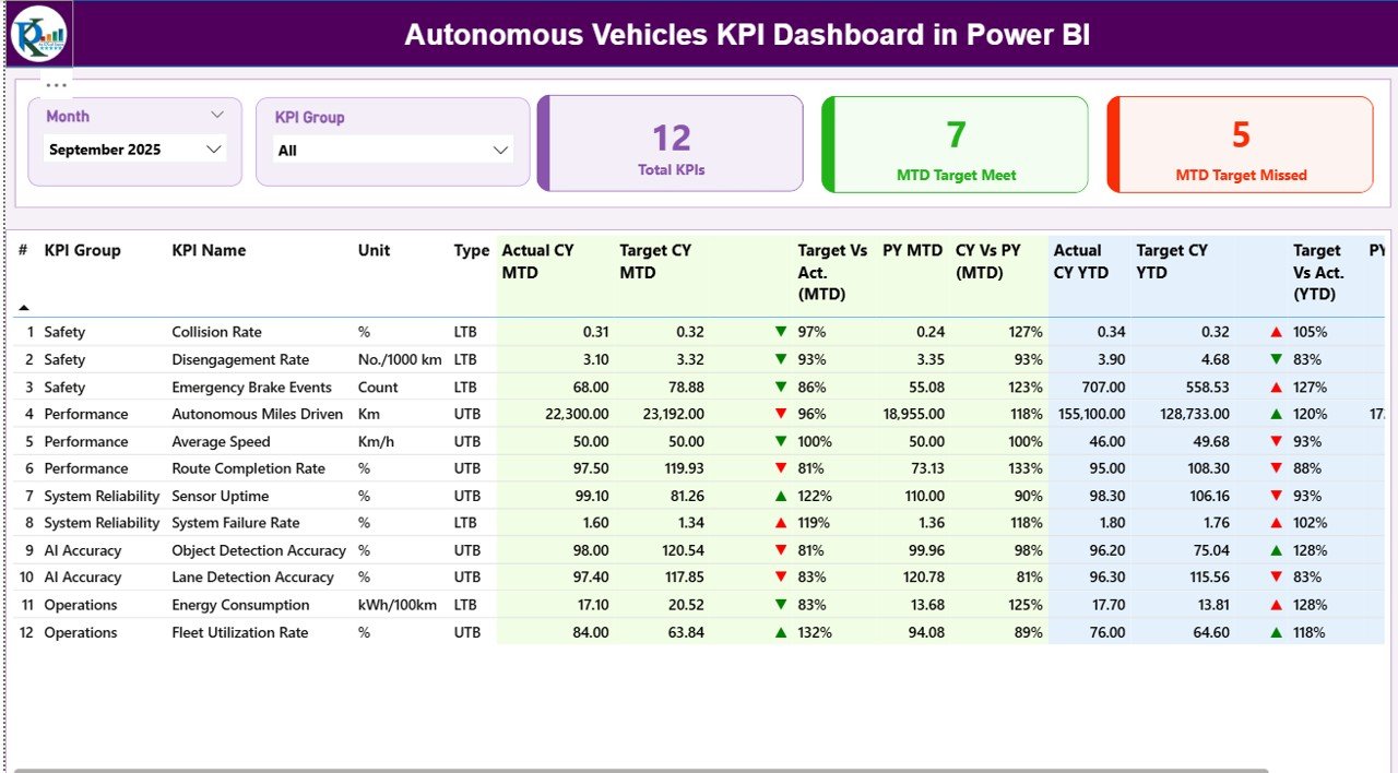
The Summary Page acts as the main control center of the dashboard.
Key Filters and Slicers
At the top of the page, you will find:
-
Month slicer – Select the reporting month
-
KPI Group slicer – Filter KPIs by category
Because of these slicers, users can instantly adjust the view without changing the data.
KPI Cards on the Summary Page
The dashboard displays three high-impact cards:
-
Total KPIs Count
-
MTD Target Met Count
-
MTD Target Missed Count
These cards provide an instant health check of autonomous vehicle performance.
Detailed KPI Table Structure
Below the cards, the dashboard shows a detailed KPI table with rich insights.
Columns included in the table:
-
KPI Number – Sequence number of the KPI
-
KPI Group – Category or domain of the KPI
-
KPI Name – Name of the performance metric
-
Unit – Unit of measurement
-
Type – UTB (Upper the Better) or LTB (Lower the Better)
MTD Performance Metrics
The Summary Page tracks Month-to-Date performance using:
-
Actual CY MTD – Current year actual MTD value
-
Target CY MTD – Current year target MTD value
-
MTD Icon – ▲ or ▼ icons with green/red color
-
Target vs Actual (MTD) – Actual ÷ Target
-
PY MTD – Previous year MTD value
-
CY vs PY (MTD) – CY MTD ÷ PY MTD
As a result, users can quickly identify performance improvements or declines.
YTD Performance Metrics
The dashboard also tracks Year-to-Date performance:
-
Actual CY YTD – Current year actual YTD
-
Target CY YTD – Current year target YTD
-
YTD Icon – ▲ or ▼ indicator
-
Target vs Actual (YTD) – Actual ÷ Target
-
PY YTD – Previous year YTD
-
CY vs PY (YTD) – CY YTD ÷ PY YTD
Because of this structure, long-term progress becomes easy to track.
2) How Does the KPI Trend Page Help?
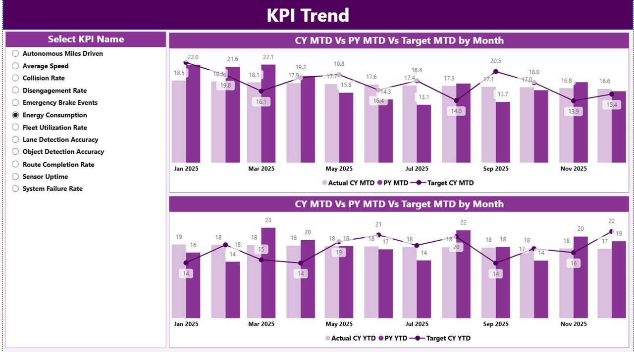
The KPI Trend Page focuses on performance movement over time.
Key Elements of the KPI Trend Page
-
KPI Name slicer on the left
-
Two combo charts:
-
MTD Trend chart
-
YTD Trend chart
-
Each combo chart displays:
-
Actual values for the current year
-
Actual values for the previous year
-
Target values
Therefore, users can visually compare trends and spot deviations early.
Click to Purchases Autonomous Vehicles KPI Dashboard in Power BI
Why Are Trend Charts Important?
Trend charts help teams:
-
Identify seasonal patterns
-
Detect performance drops early
-
Compare targets against reality
-
Support planning and forecasting
As a result, teams can act before issues escalate.
3) What Is the KPI Definition Page?
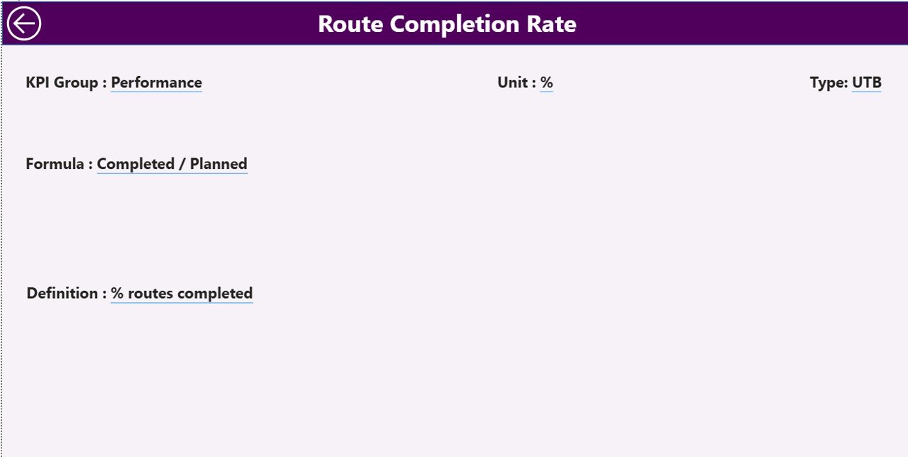
The KPI Definition Page acts as a drill-through and reference page.
Key Characteristics
-
The page remains hidden by default
-
Users access it by drilling through from the Summary Page
-
A Back button allows quick navigation
What Information Does It Show?
This page displays:
-
KPI Number
-
KPI Group
-
KPI Name
-
Unit
-
Formula
-
Detailed KPI definition
-
KPI Type (LTB or UTB)
Because of this page, everyone interprets KPIs consistently.
What Excel Data Is Required for the Dashboard?
The dashboard uses a structured Excel file with three worksheets.
1) Input_Actual Sheet – What Data Goes Here?
In the Input_Actual sheet, users enter:
-
KPI Name
-
Month (use the first date of the month)
-
Actual MTD value
-
Actual YTD value
This sheet captures real performance data.
2) Input_Target Sheet – How Are Targets Managed?
In the Input_Target sheet, users enter:
-
KPI Name
-
Month (first date of the month)
-
Target MTD value
-
Target YTD value
As a result, Power BI can compare goals against reality.
3) KPI Definition Sheet – Why Is This Sheet Important?
In the KPI Definition sheet, users maintain:
-
KPI Number
-
KPI Group
-
KPI Name
-
Unit
-
Formula
-
KPI Definition
-
KPI Type (LTB or UTB)
This sheet ensures clarity and consistency across the organization.
What KPIs Can You Track for Autonomous Vehicles?
An Autonomous Vehicles KPI Dashboard can track a wide range of metrics, such as:
-
Autonomous miles driven
-
Safety incidents per million miles
-
System disengagement rate
-
Sensor accuracy rate
-
Software reliability metrics
-
Energy efficiency
-
Fleet utilization rate
-
Compliance metrics
Because the dashboard is flexible, organizations can customize KPIs easily.
Advantages of an Autonomous Vehicles KPI Dashboard in Power BI
Click to Purchases Autonomous Vehicles KPI Dashboard in Power BI
1) Centralized Performance Monitoring
The dashboard consolidates all KPIs into one screen. Therefore, teams avoid scattered reports.
2) Faster Decision-Making
Real-time insights help leaders act quickly. As a result, response time improves.
3) Clear Target vs Actual Visibility
Visual indicators instantly show whether KPIs meet targets.
4) Trend-Based Insights
MTD and YTD trend charts highlight long-term patterns.
5) Easy Data Entry with Excel
Teams use familiar Excel sheets instead of complex systems.
6) Scalable and Customizable Design
Organizations can add new KPIs or groups without redesigning the dashboard.
Opportunities for Improvement in Autonomous Vehicle KPI Tracking
Although the dashboard delivers strong insights, teams can enhance it further by:
-
Automating data collection from vehicle logs
-
Adding alert-based notifications
-
Integrating real-time telemetry data
-
Including predictive analytics
These improvements can take KPI tracking to the next level.
Best Practices for the Autonomous Vehicles KPI Dashboard in Power BI
1) Define KPIs Clearly
Always document KPI definitions and formulas in the KPI Definition sheet.
2) Use Consistent Units
Ensure consistent units across actuals and targets to avoid confusion.
3) Update Data Regularly
Frequent updates keep insights accurate and relevant.
4) Review Trends, Not Just Numbers
Always analyze trends along with current values.
5) Focus on Actionable KPIs
Track metrics that support decisions, not vanity numbers.
6) Use LTB and UTB Types Correctly
Set KPI types properly so icons and comparisons work accurately.
Who Should Use an Autonomous Vehicles KPI Dashboard?
This dashboard benefits:
-
Autonomous vehicle development teams
-
Fleet operations managers
-
Safety and compliance teams
-
Data analysts and BI professionals
-
Executive leadership
Because of its simplicity, both technical and non-technical users can rely on it.
Conclusion: Why Does an Autonomous Vehicles KPI Dashboard in Power BI Matter?
An Autonomous Vehicles KPI Dashboard in Power BI transforms raw performance data into meaningful insights. Instead of struggling with spreadsheets, teams gain a clear view of progress, risks, and opportunities.
Because the dashboard combines Excel simplicity with Power BI power, it supports smarter decisions, better accountability, and faster innovation. In a fast-moving autonomous vehicle industry, such clarity makes a real competitive difference.
Frequently Asked Questions (FAQs)
What is an Autonomous Vehicles KPI Dashboard in Power BI?
It is a Power BI dashboard that tracks and visualizes key performance indicators related to autonomous vehicle development and operations using Excel as a data source.
Can I customize the KPIs in the dashboard?
Yes. You can add, remove, or modify KPIs by updating the Excel sheets.
Does the dashboard support MTD and YTD analysis?
Yes. The dashboard includes both MTD and YTD metrics with target comparisons.
Is Excel mandatory as a data source?
In this setup, yes. However, Power BI can later connect to databases or APIs if needed.
Who can use this dashboard?
Anyone involved in autonomous vehicle programs, including engineers, managers, and executives, can use it effectively.
Visit our YouTube channel to learn step-by-step video tutorials