The world of blockchain and cryptocurrency moves fast — where every second counts, and every transaction holds value. In such a dynamic space, tracking your performance, costs, wallet balances, and profits can feel overwhelming without the right analytical tools. That’s exactly where the Blockchain & Cryptocurrency Dashboard in Power BI steps in — a powerful, interactive, and ready-to-use data visualization solution that brings clarity to complexity.
This Power BI dashboard helps blockchain professionals, crypto traders, financial analysts, and enterprise teams monitor transactions, network fees, wallet balances, and profit metrics in real time — all in one centralized dashboard powered by Excel and Power BI.
In this detailed guide, we’ll explore what this dashboard is, how it works, its benefits, best practices, and why it’s a must-have tool for anyone working in blockchain analytics.
Click to Purchases Blockchain & Cryptocurrency Dashboard in Power BI
What Is a Blockchain & Cryptocurrency Dashboard in Power BI?
A Blockchain & Cryptocurrency Dashboard in Power BI is a modern analytics solution designed to help you visualize and interpret large sets of crypto-related data with ease. It connects your Excel-based transaction data or real-time data feeds and transforms them into powerful visuals that reveal insights such as wallet balances, transaction types, network performance, and profitability.
Power BI acts as the analytical engine, while Excel serves as the foundation for data storage. This combination ensures flexibility, transparency, and automation — empowering users to explore crypto performance metrics without writing a single line of code.
Structure of the Dashboard
The Blockchain & Cryptocurrency Dashboard in Power BI is organized into five analytical pages, each focused on a key aspect of blockchain data. Together, they create a seamless experience from top-level summaries to deep-dive departmental analysis.
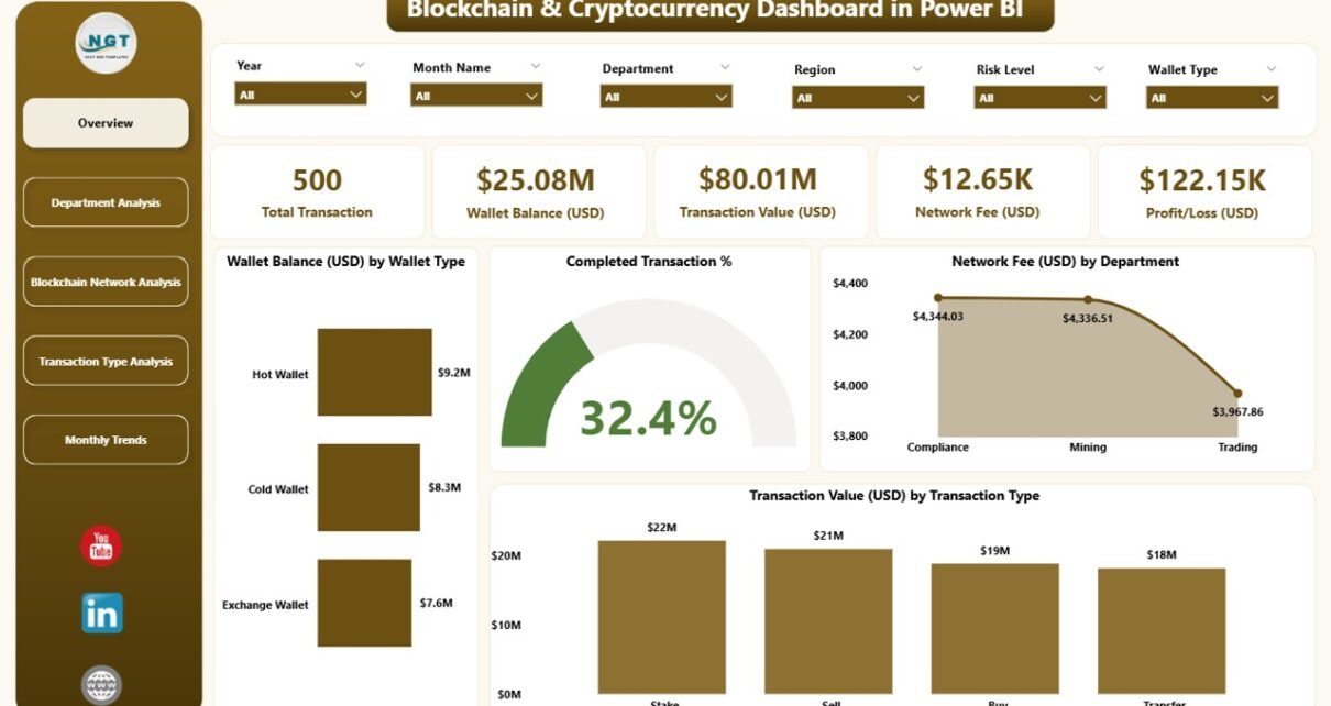
1️⃣ Overview Page
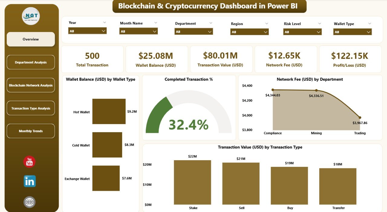
The Overview Page is your control center.
Here, you can see:
-
Wallet Balance (USD) by Wallet Type – Tracks distribution across wallets (Hot, Cold, Exchange, Custodial, etc.).
-
Completed Transaction % – Monitors operational efficiency in transaction success rates.
-
Network Fee (USD) by Department – Reveals how different teams or divisions contribute to fee consumption.
-
Transaction Value (USD) by Transaction Type – Displays how much value each category (Transfers, Staking, Payments, etc.) contributes to total activity.
The top section includes five KPI cards that summarize total wallet balance, transaction value, completion rate, profit/loss, and fee totals for quick reference.
2️⃣ Department Analysis Page
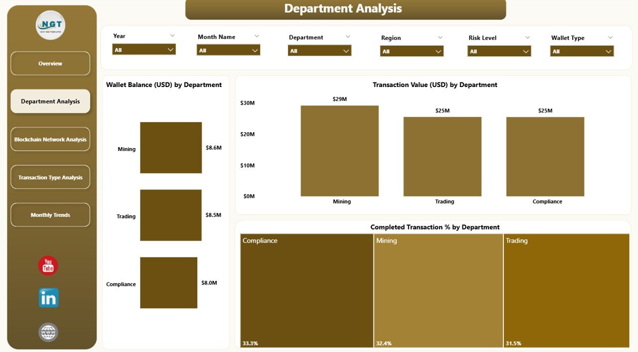
The Department Analysis page dives deeper into performance at the organizational level.
It answers critical questions like:
-
Which departments handle the largest wallet balances?
-
How does each department perform in transaction completion rates?
-
What are the network fees per department, and how can we reduce them?
Charts included:
-
Wallet Balance (USD) by Department
-
Transaction % by Department
-
Network Fee (USD) by Department
-
Completed % by Department
This page helps senior managers identify cost centers, optimize processes, and improve accountability across departments handling crypto transactions.
3️⃣ Blockchain Network Analysis Page
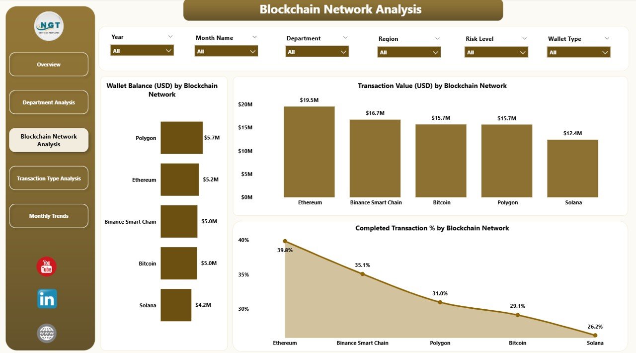
Blockchain networks differ in speed, cost, and performance — and this page is built to compare them efficiently.
It displays:
-
Wallet Balance (USD) by Blockchain Network – Helps identify which blockchain holds the most assets.
-
Transaction % by Chain Network – Compares efficiency across Ethereum, Bitcoin, Binance Smart Chain, Solana, or any other integrated chain.
-
Network Fee (USD) by Chain Network – Visualizes how much cost each network generates.
-
Completed % by Chain Network – Measures stability and reliability across blockchains.
This page is essential for teams managing multi-chain portfolios, helping them understand where value is locked and which networks deliver optimal transaction efficiency.
4️⃣ Transaction Type Analysis Page
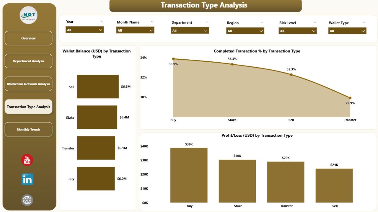
The Transaction Type Analysis page focuses on understanding profitability and efficiency across different transaction categories.
Charts displayed:
Click to Purchases Blockchain & Cryptocurrency Dashboard in Power BI
-
Wallet Balance (USD) by Transaction Type
-
Transaction % by Type
-
Profit/Loss (USD) by Transaction Type
-
Completed % by Transaction Type
Users can filter by transaction category — such as trading, staking, payments, or cross-border transfers — to identify which ones generate profit and which need performance improvement.
5️⃣ Monthly Trends Page
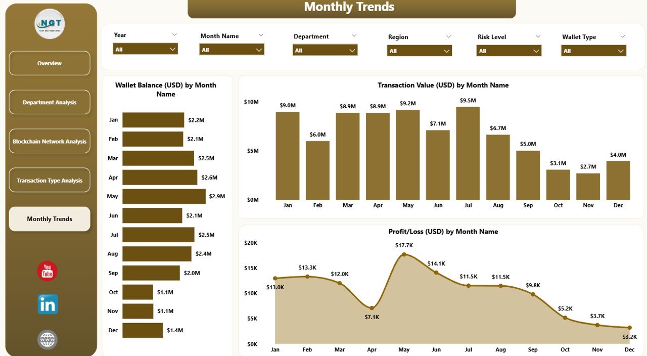
The Monthly Trends Page provides a temporal perspective — allowing you to track growth, cost, and profitability trends over time.
Charts include:
-
Wallet Balance (USD) by Month
-
Transaction Value (USD) by Month
-
Profit/Loss (USD) by Month
This page helps crypto firms and analysts observe seasonal performance, detect anomalies, and plan for future investments based on data-driven patterns.
Why Use a Blockchain Dashboard in Power BI?
In the cryptocurrency industry, data is power. Every wallet transfer, staking operation, or network fee holds valuable insights that can shape decision-making. Power BI turns this complexity into clarity.
Here’s why this dashboard is invaluable:
-
📊 Real-Time Insights: Monitor live wallet balances and transaction flows.
-
🔍 Transparency: Understand every fee, transaction, and balance movement.
-
⚡ Automation: Connect Excel or API data for auto-refresh without manual updates.
-
💬 Collaboration: Share dashboards securely with teams via Power BI Service.
-
🧮 Customizable Visuals: Add or modify KPIs, metrics, or filters anytime.
Whether you’re an individual crypto trader, a blockchain company, or a financial analytics team, this dashboard gives you the tools to see, analyze, and act on your data instantly.
Advantages of Blockchain & Cryptocurrency Dashboard in Power BI
1. Enhanced Visibility
All blockchain and crypto data — balances, transactions, fees, and profits — come together in one unified view. This transparency reduces confusion and improves operational control.
2. Better Decision-Making
With visual insights, teams can make informed decisions faster. Power BI’s drill-through capability allows exploration from summary to granular transaction levels.
3. Improved Efficiency
Manual tracking wastes time. This automated dashboard calculates all metrics using built-in formulas, freeing teams from repetitive work.
4. Real-Time Monitoring
Integrating Power BI with live APIs or scheduled Excel refreshes ensures data stays up to date, providing accurate, current insights at any moment.
5. Performance Benchmarking
Comparing transaction success rates or network fees across chains and departments helps optimize resources and reduce costs effectively.
6. Scalability and Customization
As your crypto operations grow, you can easily extend the dashboard — add new metrics, wallets, or networks without disrupting the existing structure.
🔍 Use Cases of the Blockchain & Cryptocurrency Dashboard
1. Crypto Exchanges
Monitor trading activity, wallet balances, and transaction fees across multiple blockchain networks to optimize liquidity and profitability.
2. DeFi Platforms
Track smart contract transactions, staking returns, and performance of various DeFi pools across Ethereum or BSC.
3. Corporate Treasury Teams
Analyze crypto reserves, allocation across wallets, and monthly performance to ensure compliance and transparency.
4. Blockchain Developers
Identify performance bottlenecks in network operations, such as slow transaction confirmation rates or high fees.
5. Crypto Investors and Analysts
Visualize wallet diversification, profitability trends, and market-driven fluctuations to make informed investment decisions.
How Power BI Enhances Crypto Analytics
Power BI is a leader in data visualization — and when paired with blockchain data, it unlocks next-level analytical potential.
Interactive Features Include:
-
Dynamic Filters and Slicers for wallet, department, and month.
-
Drill-Through Functionality for exploring detailed transactions.
-
Conditional Formatting for identifying profit/loss trends visually.
-
KPI Cards that show instant metrics.
-
Custom Tooltips explaining each chart for better understanding.
This interactivity transforms static data into actionable insights — turning complex blockchain data into decisions you can trust.
How to Use the Dashboard Effectively
Step 1: Connect Data
Import your Excel file with crypto transaction data into Power BI. Ensure columns like Wallet Type, Department, Transaction Type, and Network Fee are correctly mapped.
Step 2: Apply Filters
Use slicers for months, departments, or transaction types to refine your view.
Step 3: Explore Charts
Hover over visualizations to view detailed insights — for example, how network fees vary by blockchain or how monthly profit changes over time.
Step 4: Share Reports
Publish the dashboard securely to Power BI Service and share it with your team for collaborative insights.
Best Practices for the Blockchain & Cryptocurrency Dashboard
To get the most out of this Power BI dashboard, follow these best practices:
✅ Keep Data Clean: Regularly update and validate Excel data sources to maintain accuracy.
🔄 Schedule Refreshes: Automate data refresh to ensure timely insights.
🎯 Use Consistent Units: Standardize currency and units across datasets for clarity.
📈 Monitor Key KPIs Weekly: Track wallet balances, transaction volume, and network fees periodically.
🔐 Control Access: Restrict sensitive financial data to authorized team members.
🧩 Leverage Power BI Themes: Apply custom color schemes for better visual branding.
💡 Add Tooltips: Help users interpret visuals quickly by embedding context information.
🏁 Conclusion
Click to Purchases Blockchain & Cryptocurrency Dashboard in Power BI
The Blockchain & Cryptocurrency Dashboard in Power BI transforms raw data into strategic insights. It bridges the gap between technical blockchain transactions and business decision-making by visualizing wallet balances, transaction trends, and network performance in a single view.
By integrating Excel with Power BI, this dashboard becomes a versatile tool — equally valuable for crypto startups, blockchain enterprises, and independent traders. With automation, real-time analytics, and stunning visuals, it empowers users to make data-backed decisions confidently in the fast-paced world of crypto.
Whether you’re managing a small portfolio or analyzing large-scale blockchain data, this dashboard gives you the clarity and control needed to stay ahead.
❓ Frequently Asked Questions (FAQs)
1. What is the purpose of a Blockchain & Cryptocurrency Dashboard in Power BI?
It helps users visualize, analyze, and track key blockchain metrics such as wallet balances, transaction volumes, and profits — all in an interactive, easy-to-understand Power BI environment.
2. Can this dashboard connect with real-time data?
Yes, it can. You can connect Power BI to APIs or real-time data feeds for continuous updates beyond Excel data.
3. Who should use this dashboard?
It’s ideal for crypto traders, blockchain companies, finance teams, and data analysts who need insights into crypto operations and profitability.
4. Is this dashboard customizable?
Absolutely! You can modify visuals, KPIs, or even add new pages to match your specific analytical needs.
5. Can non-technical users operate this dashboard?
Yes. The dashboard is designed with a user-friendly interface — anyone familiar with Power BI or Excel can navigate and interpret the insights easily.
Visit our YouTube channel to learn step-by-step video tutorials